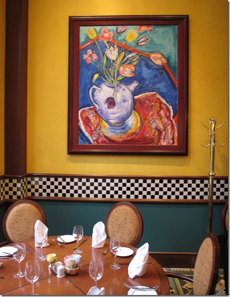
My sister Elizabeth and I took our mom to Griffin’s in the Hotel Vancouver for her birthday lunch a few weeks ago and of course I had to snap a photo of the restaurant and do my usual analyzing.
Loved this happy piece of art in addition to the black and white mosaic chair rail.
I’m guessing that this yellow is close to Benjamin Moore’s 2155-40 Semolina.
This restaurant has a Provence bistro feel to it and I love it. Notice the undertone of the chairs though. Don’t they look very peachy/pink next to the yellow?
What was interesting about this fabric is that up close it looked like it was a match to the wall colour but because of the other colours mixed in it, the ‘read’ was entirely different when viewed farther away.
Some fabrics can be tricky like that. You have to actually place them in front of the wall colour and walk away to make sure it reads the colour you want. A lesson that one should never select a fabric without being in the actual space with a larger painted sample of the wall colour (if it’s not already painted).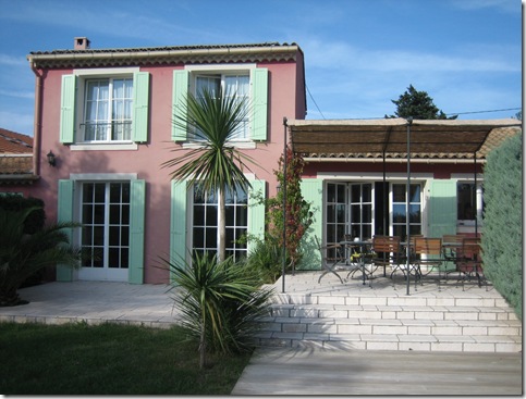
I was in Provence 2 years ago and this was the villa we stayed in. Only there could you get away with pink stucco and mint green shutters. Mint green was everywhere in Provence.
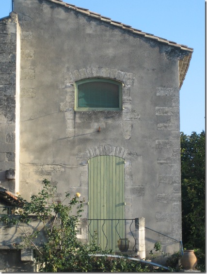
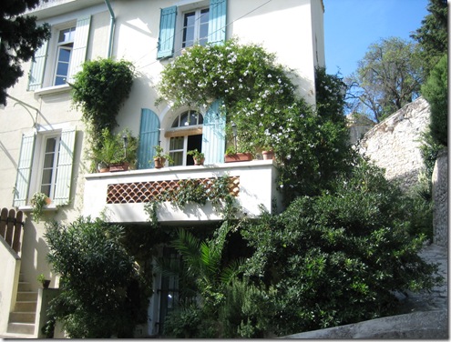
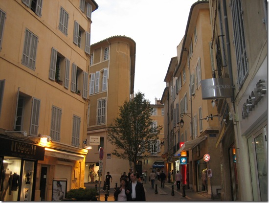
The sun was setting when I took this photo (below) the buildings were lit so beautifully (this image doesn’t even do it justice).
Years ago, when I first started specifying exterior colour, I was absolutely terrified. If it’s wrong, EVERYONE KNOWS! And, because I was already working for Benjamin Moore I had to learn quickly! So I just drove around and walked right up to houses with my fan deck (I would ask the owner of course) and matched the colour so I could start wrapping my head around what the chip looked like compared to the end result. In fact, you could do that with interiors too if you really wanted to learn fast!
I’ll be talking a lot more about exterior colour starting in the Spring.








Wow! You are such a great photographer !
Great post Maria – I really appreciate your opinions on restaurants; Love to send you some photos for your comments.
Your blog is always bright!
Terreeia
wonderful images! Provence looks to be a special place. Someday!!!
I especially like the las pic…
Happy Sunday!
Wow…you stayed in THAT villa…so nice! I love the colours of Provence.
Great post 🙂
I love your new header!
What beautiful pictures of Provence. I remember Joni once posted on authentic French houses, and one thing that stuck in my mind was the style of the shutters – not slats, like what is commonly done in the US – but either a solid piece of wood or vertical strips of wood, like the ones you show in your post. Also, the shutters are always fully functioning, so match the size of the windows.
I have decided that I need to look at all of your posts on my Mac upstairs, which has the best color (so much better than my old laptop). Your posts are really so interesting about the different shades of color, and it is important to see the color as purely as possible!
I’ll definitely be visiting your blog regularly come spring so that I can learn more exterior paint colours (we’re painting our house)! In the mean time, I’m just going to gaze longingly at your beautiful photos of Provence… one day I’ll go there!
Victoria (one half of DesignTies)
I wish more people were as open to colour as the people in Provence!! So many houses here (the newer ones in particular) are brown stone. Nice enough, but boring when every second house you see is brown stone.
Your post has inspired me to go ahead with my plan to paint our front door a fun, bold colour when spring arrives 🙂
Your pictures are wonderful — thanks so much for sharing them 🙂 I think I have a new appreciation for mint green!!
Kelly
love love love these photos!!! I would love to paint one of them!!!
just added you to my Friends and Favorites list…
Laura
Your new header is GREAT!!!
One of these days, I’ll get to see the colors of Provence for myself, in person. For now though, I’m happy to look at beautiful photos like yours and to use the colors in my own home as much as possible. Thanks for sharing.
I was feeling cold, and had to come back to look at your warm post. 🙂
* FANTABULOUS!!! Oh, my! I am SOOO there right now~~~ at least in my heart! THANK YOU!!!!!!
Linda in AZ *
I would love a suggestion for Paint Chip for Provence Bleu, the classic colors of the shutters in Provence.