I am a huge fan of Eileen Kathryn Boyd and her work. I had the pleasure of meeting her in New York at Blogfest last year!
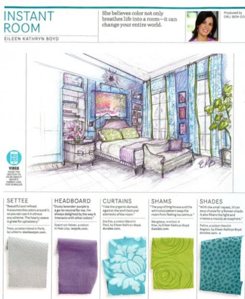
And she was in this June’s House Beautiful! here’s a bedroom she designed using her fabrics from Duralee. I recently interviewed her for my blog and here are her answers:
What is your favourite colour?
Purple. In the lightest shade it can be a neutral and in a deeper tone it can be a wonderful accent color. It’s amazingly versatile and fashionable. Gives vibrancy to so many other colors, especially blues, greens, pinks, chocolates & black.
What was your biggest colour/design mistake?
If you’re going to use a bold, strong color, make sure it has an earth tone to it – so it’s not too potent. Otherwise the room can start looking too carnival.
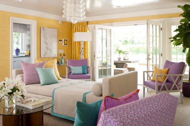
Hamptons Showhouse – Pool house by Eileen Kathryn Boyd
What was the best colour lesson you’ve learned?
Picking a nice neutral and painting the same color on the walls and trim to make the space feel harmonious – a perfect backdrop for the color layering of furniture, textiles, accessories and artwork.
Which colour do you think is timeless?
Navy Blue. The most everlasting of color stories…navy & white. It’s the military, a linen blazer, an awning stripe – it makes us think of summer. But it can also be very Madison Avenue mixed with grays and creams.
Beach bags made from her fabrics by Duralee
What are your favorite color trends?
I’m loving neon’s paired with neutrals. I love the return of the watercolor pastels, particularly mint green – which is really pretty. Also love color blocking – using complimentary bold colors pieced together.
What do you think is the biggest mistake homeowners make with colour?
I don’t think homeowners put together a color story where the rooms connect and speak to each other.
Thanks Eileen!
Related posts:
Colour Vibe by Eileen Kathryn Boyd
Bright Colour needs a Healthy Dose of White
What is Beauty? Three ways to Know
Download my eBook, to learn what you didn’t get in Colour Theory – How to Choose Paint Colours – It’s All in the Undertones.
If you would like your home to fill you with happiness every time you walk in, contact me.
To make sure the undertones in your home are right, get some large samples!
If you would like to learn to how choose the right colours for your home or for your clients, become a True Colour Expert.


![hamptons-showhouse-poolhouse-2011_thumb[2]](https://mariakillam.com/wp-content/uploads/2012/07/hamptons-showhouse-poolhouse-2011_thumb22.jpg)


Her work is beautiful and so are her line of fabrics! I never thought of purple being a neutral before. I do find it interesting though that most of the designers interviewed don’t truly answer your question, “What was your biggest design/color mistake”. Instead, usually a design tip is given. Is the piece of advice related to the “mistake”? Am I misunderstanding the question?? Thanks for sharing the interview!!
I love Eileen’s style!! I love her use of color- her fabrics are the best. I love navy blue too- timeless! I wrote a blog showing her design work- Eileen actually wrote and said thank you! She is one of my top designers.
Thank you for introducing me to this designer, Maria. i love her work and fabrics and her advice! YAY for navy!
Oh I am just so into blues, navy in particular, but I am worried it will look too too dark or cold. Great advice about making sure a bold colour has earth tones in it, I guess that means blues and purples with a greyer look to them.
I love the colors of her Instant Room! I LOVE purple too.
Just read this on line! Definitely something to consider when decorating your home!!
“It’s so important that your home reflect who you are and what you love. Don’t fake it! You should surround yourself with things that have meaning to you. I’m not a fan of “meaningless.”
– Michael Herold (House Beautiful, June 2012)