Whether you are shopping for a new house or planning to build your dream home, here are some great examples of what not to do. Sure, you want this next house to create the look and feel you love and but some just don’t have what it takes to be classic house.
Keep reading to find out why.
This not-to-be-missed post about what kind of house to shop for and what constitutes ‘good bones’ in an exterior or interior has been percolating in my head for months. I could not figure out the best way to articulate it, until today.
Sadly, I did not write this post. Joni from Cote de Texas did instead. However, it is so good, I want to make sure you don’t miss it because I was nodding Amen throughout the whole thing.
There are so many houses that I see with awkward and unnecessary high ceilings, corner fireplaces, rooms that make furniture arrangement a nightmare, in addition to windows that are impossible to cover. Who builds these houses I’d like to know?
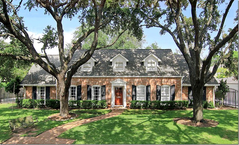
Don’t get me started on exterior. In the west coast, our weather doesn’t require brick homes so instead we use stone and/or brick as decoration. There are so many multi-million dollar homes that I would never remotely consider past the exterior because there’s so much unnecessary decorative stone with clashing brick.
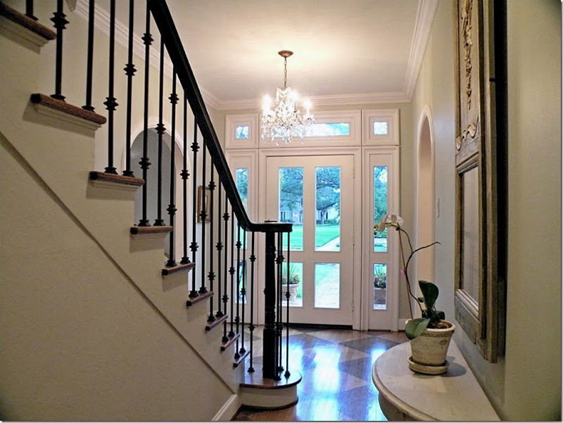
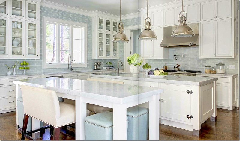
She also talks about classic finishes and big surprise, wood flooring throughout and subway tiles are high on the list.
I totally agree with Joni when she says you should have your designer look at the house you’re about to buy to make sure you can create the look and feel you want. Many homeowners will say ‘I have had no problem decorating my last four houses, but this one has me totally stumped.’
Well, when you’re dealing with some of the design challenges Joni brings up in her post, it’s no wonder!
Images from Cote de Texas
The best part about blogs is the individual and unique way bloggers look at the world and there are some posts that change the way we look at the world, forever.
This post is one of those.
Related posts:
Do you Follow the 10 Year Rule?
Rules are for Amateurs, Exceptions are for the Professional
The Debate on Interesting and Trendy vs. Timeless
If you would like your home to fill you with happiness every time you walk in, become a client
Download my eBook, How to Choose Paint Colours – It’s All in the Undertones to get my complete step-by-step system on how to get colour to do what you want.
To make sure the undertones in your home are right, get some large samples!
If you would like to learn how to choose colour with confidence, become a True Colour Expert.











Very interesting indeed, thank you for sharing it with us!
Thanks Maria, I’ll go check it out – thanks!
What a small world we live in! I read the Cote deTexas blog last night via Tara Dillard. The three of you should be on retainer for the realty and/or construction world. Have you started your landscaping yet? Waiting with baited breath.
You’re so correct! What may be classic to one, may not be classic to another. Subway tiles and hardwood flooring are a must in my world. Beautiful pictures!
Her post is a cool guide, could be a little booklet to carry around when buying a house!
But putting the dog beds in a laundry room? Dogs belong with their family, it’s their pack nature, not stashed away with dirty socks in the name of design. And there are beautiful classic or contemporary dog/cat beds to be found. Toys and beds can be temporarily moved for an elegant gathering. If 4-legged clutter bugs someone that much, maybe a furry family member isn’t the right choice.
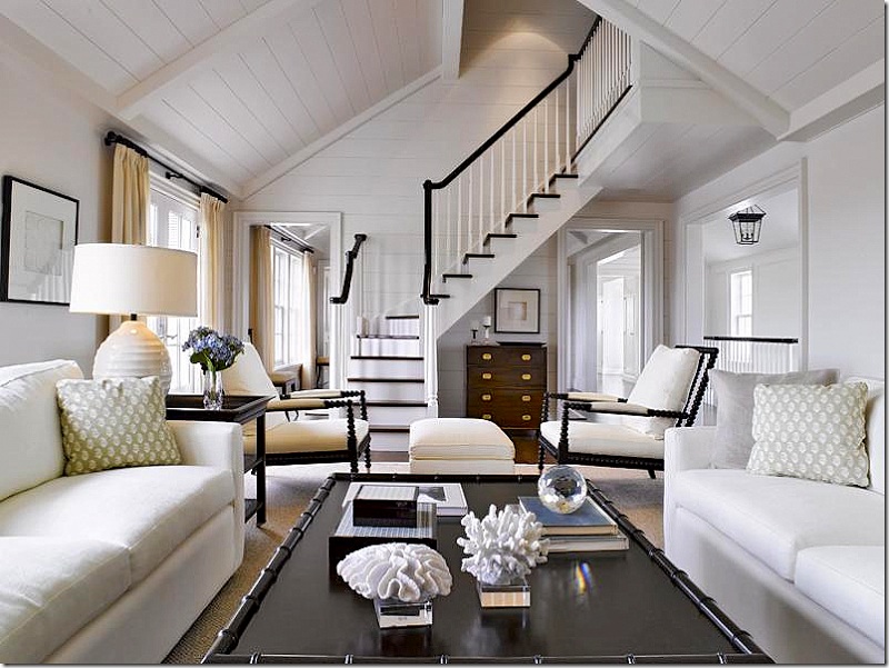
The bottom photo here gave me pause (not paws). The lighting for the camera makes the white walls and furniture look gorgeous, but in real life there’s a difference between a shiny, small photo and being surrounded by so much white. It usually feels cold, sterile or dingy, depending on the white.
P.S. Maria, I’m counting on an e-book from you on “scapes” – table, bookcase, shelf, mantle… just thought of this looking at the effortless look of the coffee table above.
Second choice: a long blog entry, like the Cote de Texas one on buying a house.
Hi Maria,
You need to write that post anyway!!!
You have your own voice, and Joni has hers.
They are not the same voice, though.
Each of you has a different area of primary expertise.
And, think of the solutions you came up with to fix the
troubling parts of your house (banister on the dining
riser, cabinetry, landscape, etc.)
xo
Great post – and I just read Joni’s too – fantastic. My husband and I are all about making a cozy home – no cathedral ceilings for us. We do have one odd window situation, but sometimes you just need to select from the homes that are available even if it isn’t perfect. Great list of what to look for in our next home though.
Wish I’d seen this before buying my current home.
I have the dreaded corner fireplace and it’s awkward when placing furniture. The builder was trying to save money! I keep looking for my dream home and your blog today was so helpful.
Thanks,
Angela
I have thoroughly enjoyed the Cote de Texas posts–you need a cup of coffee or tea and time to absorb them! Thanks Maria for sharing these.
I am going to send you a quick link–separately–to a house my brother is considering. After an initial look at the photo of the built house, I said to my bro,
“There is something so wrong with the elevation of this house.” The pitch was off, there were an incorrect number of posts on the front porch,the windows were out of proportion to the gable,etc….well I fiddled around the builders website on Google and found the original architect’s rendering of that model. WHOA..lo and behold all of those elements had been changed and cheapened by the builder. What had been a charming cottage, now looked like ugly postwar housing! And the price tag (2000 sq. ft.) was close to $300,000! Builders THINK they can do it better and cheaper, by eliminating all the things that give a home style–especially the proportions!!! It makes me crazy. I advised my bro to keep looking.
You are the first person I have heard talk about how both stone and brick on the exterior clashes. I thought I was the only one who thought that. Every time I see a house with it, I wonder how in the world they think that looks good. Fortunately, it seems to be a trend that did not stick.
What a wonderful post and great advise for us all.
Thanks Maria for sharing.
In my previous life as a Project Manager for new residential home construction, I always gave careful consideration to keeping elements timeless. Working right along side the plan designer of each new home making sure each detail of the completed home would suit any lifestyle..Simple worked!
I think one of the best complements I ever received was from a Developer/Builder. His words, ” A woman was involved in this design, the home is functional and the attention to detail is incredible. Nice to hear those words.
I couldn’t agree more, one of the best blog posts I’ve ever read. How sweet of you to bring it to the attention of those who may have missed it.
It’s a good thing you can copy home plans before 1990…I have a collection of 1920’s to 1930’s home plans that we will use….I agree with your post & you should write one too! My favorite thing to do is to drive through old neighborhoods….the best architecture!!!! Love your blog!
Maria, I agree with Ellen. I would love to hear (your) additional thoughts on the blog Joni did. I read her blog and LOVED her perspective, I, too was saying “Amen” but would always enjoy your perspective as well:)
Thanks so much for the shout out!! btw – we have 3 dogs and they sleep with us and hang with us – not in a mud room. But some people do like to keep a crate for when they aren’t home and the mud room is a perfect place to hide that ugly beast of metal!!!
thanks again,
Joni
Hi Maria. Wow, that wasn’t a post, it was a book. Many of her comments were spot on. I disagree with her preference for the laundry and mud room to be combined on the main floor. I like the laundry close to where the bedrooms are. But that’s the joy of our business – we provide choice. Keep going, you are doing great!
Always love Joni’s posts. And this one was at the top of the list. Just wish I had had that post and her wonderful advice several years ago when we were in a hurry to find a house quickly and are now stuck with a very strange layout.
Thanks for sharing her posts and love it when she also shares your wonderful posts, Maria!
I sent this post to a couple of friends and we spent an
hour chatting about it. I fell she is right on 99% of the time. All of the bedrooms in my house are upstairs
and the laundry room is next to the master love it.
I think it depends on your stage in life too. If your
master is on the main and you are empty nesters
of course it makes the most sense to have it on that
level. If however you have 4 children and 5 bedrooms
and only the master on the main why would you want to lug all that laundry up and down. Been there down
that would have loved to have had laundry upstairs in
those days.
Hi Maria,
Fantastic article, thanks for the link. All these tips are basically what you advised for the renovation of our 1912 home and while we are still slowly furnishing it we love how the hardwood, marble and subway tile look throughout.
We are blessed to have a “classic home”. It has many of the attributes shown: 2 story, red brick (dark & solid -not “used”), symmetrical design, 2 story front porch with 4 very large columns, leaded glass surrounding double front doors. The dilemma … The doors and shutters are a dark evergreen color & have been for 20 years. I will be getting new paneled shutters (louvered now) but would like to change the color of the front doors & shutters. The house has white trim. Any suggestions?
Black. Maria
Thanks, Maria. Yes, black is on the list … Very predictable.
Maria,
Great kitchen scenarios with classic wood. Also enjoyed the link to Cote de Texas Classic Home blog … it really brings “home” how lacking the last decade of builder spec homes are, and how the scale and proportion of classically designed homes suit their human occupants.
Thanks!
I noticed in your photos that use subway tile, sometimes the grout is white and other times light grey. Do you have a preference? I’m thinking of using a light grey grout in my shower for easier cleaning. Your thoughts? Thank you
If it relates to the space and won’t look busy compared to your other finishes then I think it’s a great idea. Hope that helps, Maria
This post (and the CotedeTexas post), now eight and a half years old is proof of the power of classic design. Every one of the classic photos shown still holds today despite trends having changed from 2013 to 2021!