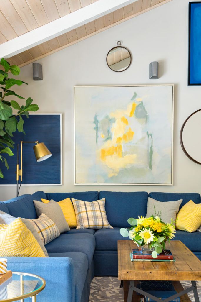
What’s in a paint colour name? Not that much really, but sometimes really great colours have unfortunate names that turn people off, and sometimes ho hum colours have great names that bring them more fame than they deserve.
Today I’m taking a look at the popular Sherwin Williams colour Accessible Beige. It’s a prime example because where beige is desired, it’s a welcome colour, and where beige is unwelcome, people will bypass it.
And beige is always polarizing. But is it really beige at all?
Neutral colors have subtle differences that matter
Basically, neutrals are nuanced.
Colour trends have been warming up for a few years now as the either-paint-it-white-or-black-trend quickly wanes. And along with the comeuppance of warm neutrals is the expected confusion around describing nuanced colours.
Clients in my eDesign department have been asking for “darker whites” and “creamy neutrals” for a few seasons now. And it is clear that it’s an emergency to get my System for Understanding Undertones out into the world at large quickly!
Because the popular language communicating and describing neutral colours out there is completely bloated and useless. It’s all just babble. Can someone come up with some standards so we can understand each other?
Well that’s just what I did.
Paint Colour Review: Sherwin-Williams Accessible Beige
Sherwin Williams Accessible Beige is trending as folks are becoming more beige curious, but is it really beige at all?
Find out over on my Youtube channel.
Become the go-to colour expert in your area
I received a great question from a follower on Instagram the other day:
Is your True Colour Expert Training specific to colour vs. design? Is it accurate to assume design isn’t part of the mix?
Here’s the answer. You’ll learn:
- How to decorate (plus, the Colour Balancing Method)
- How to choose finishes for everything for the home
- How to use the Killam Colour System where you’ll learn how to compare colours so you can not only prove to yourself but also your client that you have chosen the right colours, and when you do this accurately, you can immediately see that you’ve made the right choice.
The biggest hurdle in choosing colours for everything for the home is that you feel like you’re mostly guessing until it’s installed which by then it’s way too late to pivot and make another choice.
In fact, the feedback we’ve received is that the course should cost way more for the value you receive.
Learn more about True Colour Expert Training here.
Find my eDesign packages here.
Related posts:
The Truth About the Most Popular Paint Colours
The Best Sherwin Williams Paint Colours for Warm Kitchens
Colour Trends to Try in your Home


This past week I was looking at SW Natural Linen vs Assessable Beige for beach condo remodel. The SW website actually told me the undertone and put the two colors side by side and explained what the undertone color meant in terms of ex. pink, yellow.
The6 must be watching YOU the COLOUR EXPERT!
Robin, Could you explain how you found the color undertones on the SW website. I can’t seem to find that info–and would love to! Thank you.
Baby Fawn! 🥲 What a perfect story to illustrate your point, to not get caught up in a name. Thanks, Maria.
I love this blog post! Earlier this year I redid my master bedroom — new flooring, crown molding, new window treatments and wall paint. Plus lighting.
I used your color wheel To help me get the undertone correct once the hickory hardwood floors were installed. The colors I thought would work did not work at all. Your color wheel came to the rescue! What color did I finally go with? Baby Fawn. I had to check out today’s blog post when you were talking about accessible beige and was happy to see you feature baby fawn or Edgecomb Gray. It is so important to ignore the Color name and go for the undertone.
Hello Maria, you got me with your post about black and white. Two different designers I talked with when we purchased our century home last year gave me opposite advice on what to do about the abundance of glossy wood doors and trim that I find very unattractive. One said to paint them all white, while another said to paint them all black. Other designers I see on line seem to believe it is an unforgivable sin to paint them at all. I LOVE what you said about fads vs balance and timeless appeal.
We have done many renovations and three new builds, but colour is definitely not my forte, and my spouse has NO concept. (For one renovation, we started out with Benjamin Moore simply white (OC117), then when we ran out of paint, my husband naively picked up some plain white paint from the shelf at Home Depot to finish. It was on different walls in a darkish room, so we didn’t bother to correct it) We have also never owned a century home before, and everything about it is overwhelming, so I feel frozen. It’s one thing to choose a colour or two, but what to paint and not paint is a puzzle to me. Can you help please?