A few weeks ago I accidentally turned onto a street in Langley filled with nothing but gray buildings which had been built in the last two to three years.
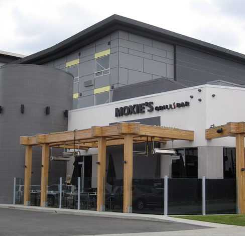
I recently had a conversation with a colourist who specializes in choosing colour for commercial exteriors. He said specifying a trendy neutral for an exterior commercial building dates it faster than anything else.
What do you think? Are you inspired to share this post with all your friends or is it just too much gray for you?
Download my eBook, It’s All in the Undertones. If you have a computer, you can download my book!
If you would like your home to fill you with happiness every time you walk in, contact me.
To make sure the undertones in your home are right, get some large samples!
If you would like to learn to how choose the right colours for your home or for your clients, become a True Colour Expert.
Related posts:
The Problem with an All Gray Room

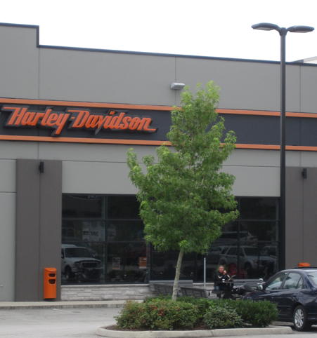


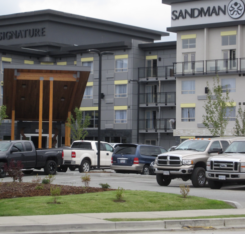
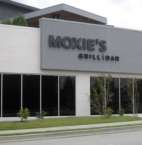


As none of them really have architectural appeal, I personally think the gray gives them substance.
In my area they just completed a massive addition to a College campus and with its overdose of colour in materials combined with green tinted windows, it is quite an eyesore as the building just ‘screeeeams’ at you. I am being kind when I call it ugly. -Brenda-
I don’t get it. Why have a gray building set in a gray parking lot? Blah! Why be trendy anyway?
Congrats to Laura for winning the Giveaway.
At first glance my gut instinct is to say Nay. When I think about it I realize that we’ve been using gray/beige/taupe/brown for commercial buildings for decades and perhaps these neutrals are not trends for commercial buildings after all.
Would I really want to look out my window to see colourful buildings eventhough I don’t like looking at the gray concrete that surrounds me either? If they were more colourful would they suit the North American climate and culture and look less sophisticated? Or are we just used to all the gray and can’t envision buildings in any other colour? Do we want our buildings to be like our sofas – neutral (except for those of us who love coloured sofas 😉 ) – and the signage in colour like our accessories?
Maybe we need a balance. Office buildings in grays and businesses who want to lure customers can use some grayed colours so that they are enticing and still blend nicely with office buildings in the area. I find it difficult to believe that all businesses would use gray as their corporate colour.
Another thing to consider is if the street pictured above was built by one builder. The builder may have had stipulations in their contract that forbids renters/owners from using any other colour so that the builder can maintain a certain look for his units. I know some builders do that with residential homes.
I can’t pick Yay or Nay. I like a balance of neutral and colour.
I had an answer, but I like yours better:)
Some of these buildings look depressing to me because they lack that balance you mentioned… too much dark gray and little to no contrast, or the wrong type of contrast, relating to nothing. The 3rd picture feels like they got it right. I wouldn’t have liked that sign against the darker color, though. Personally, my preference has always been toward gray rather than brown, so Ive been liking this current trend…just not so much these particular examples. It’s not even really the gray, but the darkness and heaviness created that bothers me. Still, even when gray (or brown) is done poorly, it is less jarring than some of the alternatives. I don’t want multi colored buildings (if they can’t get gray right, do we really want to trust them with fuchsia??). That’s not to say I don’t enjoy different colors, but there’s a feeling of stability when commercial buildings are more neutral. The signs are usually colorful enough.
Holy smokes Batman! It’s Gotham City!
NAY
Lol. That was funny:)
I think gray is ok for commercial buildings, but not all on one street. There really isn’t much to make one stand out amongst all the rest.
If I had to choose between gray and some of the poor color choices I’ve seen, I would have to choose the gray. I live in a city with lots of brick buildings and although there is some variety in the color of the bricks, it provides a nice “neutral” background for the colorful logos, signage, and banners.
I think the buildings look cold, institutional, and uninviting. I’d even go so far as to say they look depressing. The landscaping helps a little, but that will disappear in winter. Just my opinion!
I agree 100% with you. No, make it 110%.
I say Yay for commercial buildings. It looks very neat and tidy, not busy with a bunch of different colors and patterns. Gray can stay on those buildings, but not in my home.
I think the look is sleek and sophisticated, but a bit too ‘Stepford’.
Gray, in my opinion, is the worst color ever! It is so drab to see gray streets and gray buildings. I live in South Florida so I think it is safe to say I am a fan of a lot of color.
Maybe it is chosen for it’s neutrality, in that isn’t necessarily desirable but on the other hand isn’t hated either. Neutrals are ‘please everyone’ type of colours on some level. On some levels they do work..the different signage stands out above the actual building facade and the whole neighbourhood is cohesive in its look from the street. This is something I quite like, but on the other hand when I see a building stand out because it is well designed and the colour fits the design perfectly, the brand is instantly brought to mind and admired.
Compared to many other countries, especially Central and South American, we North Americans tend to be a bit drab with the exterior of our buildings. Gray epitomizes that. Ewww.
I was fortunate to travel to Chile this year where each building is a different color. Strong, bold, exciting. Definitely different than what I’m used to (me, with my white house and green shutters). But it was beautiful. I took lots and lots of pictures.
Gray has always been a favorite color of mine. I remodeled my home 2 yrs ago and used greys throughout. Lucky me.
Love flying over Vegas seeing all the homes mostly greys with the same color of roofs. Looks stately to me.
Too much gray is without much relief is depressing.
I really like the grey, but the pops of colour or wood accents could be more WOW factor-y. They need to consult with you Maria!
In an area that receives little sun, I dislike grey. For instance, since I live in the Pacific Northwest, I would never paint my home’s interior grey. I once bought a grey house and could hardly wait to repaint it. Grey is too dreary. My preference would be a medium creamy beige or a deep vanilla color. That would be for both exterior or interior. Those are upbeat cheerful colors instead of depressing ones.
Maybe it’s just the dreary day, but they look very dark to me. The stark commercial architecture in the dark colors looks very industrial and uninviting to me.
On the other hand, that same generic architecture looks like it would be very easy to repaint in 10 years when gray is out and instantly look like it had been designed to be that color (I think I’ve seen the exact same buildings in beige)
I think the gray looks depressing and plain. It would not make me want to go into anything in that complex.
Touches of gray might work, but solid grey is dreary especially in a cold or wet climate.
I LOVE gray. I chose gray-flecked brick, instead of beige-flecked, for my new-construction home in 2002 and I have NEVER regretted the choice. And I will continue to love it for the next 50 or so years I think.
I do not make my decisions based on the color du jour. I choose based on visceral emotional and aesthetic reactions. That’s the way to go, in my opinion. I have consistently gone against “fashion” and love my choices long after friends are changing major components out because they chose by fashion.
And I love all the gray buildings. They’re very tastefully done.
Gray is my favorite color, together with white. However, I would never choose it for the exterior of any building. It feels too industrial and reminds of pure concrete too much. Commercial buildings should use colors to add warm, welcoming and inviting feel to it. I live in Italy where almost all biuldings have a warm earthy feel and I love it even though I personally don’t like earthy colors. I live 45 minutes out of Venice and there are few places in Venice that have swithed to black/gray/white trend lately (stores and restaurants). I avoid those places at all cost because they seem too trandy and you know you will pay for a trendy feel in those stores, not the quality. I still wonder why would you go black&white in VENICE? Too crazy.
Grey (gray) for commercial exteriors… a definite yay from me.
michelle
I did not like all that grey. Now grays in different shades wouldn’t be so bad. But those photos looked like a dreary day.
What I loved were the buildings north of San Antonio in the trendier part. (We didn’t go there, but I took photos that I meant to send to you.) The colors were really pretty bold but not too much so. They looked really pretty in a town that was very arid and dry. Sort of ‘Spanish’ themed. I guess it depends on the climate and the area and it’s surrounding architecture. But gray for everything seems kind of sad when there are so many beautiful colors to pick from even within the neutral category. I like color. :o)
Donna
Nay! There is nothing distintive about these buildings. I can see giving directions: to the gray building on Smith Street, the one with the yellow undertones….
These companies should be working with a marketing person to design a program for them that sets them apart. Like Coke, You see red, you think Coke, and it is not out dated. It is consistant and has stood the test of time.
They say that the colors that are popular are a reflection of our feelings about the economy. If we can get everyone to pick up beat colors, would it change the economy??
I like the Harley orange against the grey. But that is about it. The Best Western………Is it still a motel? If it is an apartment building then grey is okay but they shouldn’t camouflage the entrance.
I have always found grey to be a cold, off putting and depressing color. There are so many other neutrals and warmer colors that can make a subtle or not sop subtle statement.
People are so ready for color! As a retailer as well as a designer, I’m going out on a limb and giving it to them. I am in the process of renovating my shop and my go to words are a happy fun shopping experience with unexpected finds. Of course this is all being done on a very tight budget and my product mix needs to be middle to upper middle….So wish me luck!!
PS…Maria, with color being relative, at what point does gray become beige, beige become cream and cream become white? Is there a specific demarcation point? I hear gray/beige/greige/taupe but when does the crossover occur? A couple buildings didn’t seem that gray to me. Maybe I need a new monitor. Yeah. That must be it. Maybe you could convince my husband I need a new one:)