Last week I flew to Houston to help a client (in the middle of her renovation) with a colour dilemma.
Before she called me, she had interviewed 3 designers and the local paint store consultant had also been to her house to talk about colour.
 Photo by Maria Killam (We tweaked the exterior colour too, more on that soon)
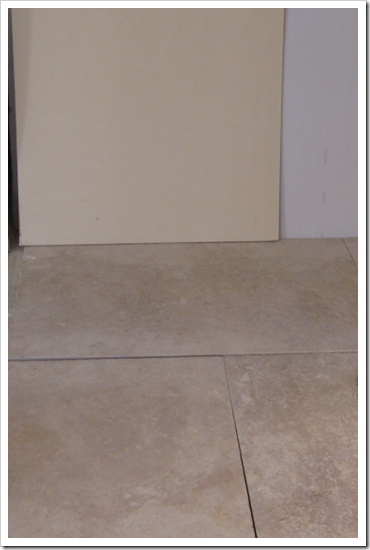
All but one confirmed that pinky beige (specifically Sherwin Williams Kilim Beige 6106-on the left with the molding attached to the bottom) was the best colour to go with the porcelain travertine that she had chosen (below).
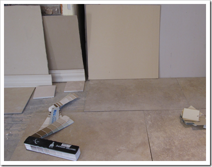
This caused her great concern because she was clear that ‘pinky beige’ was not going to work with her furniture. Prior to my arrival, she had shown the tile to three different people. One said, “I see gray”, one said “I see red” and another said, “I see beige”.
And the scariest part was that all three were correct, but which colour would be right for the walls, and also work with her furniture? Should her cabinets be French walnut or painted, what colour should the countertop be? How would we create flow throughout the rest of the house?
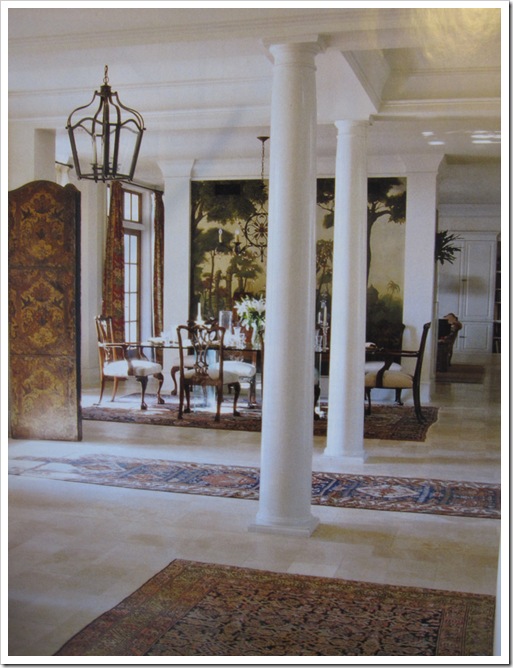
Travertine generally has a lot of pink in it (above photo from a magazine) and when she took me to another house in Tanglewood (Joni, I was this close to you) that her builder was finishing, every room had been painted a lighter or darker version of pinky beige (probably the same strip right next to Kilim Beige).
This is not the way to create flow in your house by the way—taking one colour and going from light to dark.
She had also tested this colour (which was also Sherwin Williams but I can’t remember the name of it now); it was very close to BM HC-35 Powell Buff. You can see that this colour also works with the tile and I confirmed that it was perfect for the main areas of her house!
When she took me to the showroom to see what it looked like installed, I held up my paint chip of HC-35 to the walls in the store and it was an exact match. This was a total coincidence but it was great for her to see that it was the perfect shade to go with the travertine in her home.
It also proves that our instincts are many times accurate but when it’s not our area of expertise it’s too easy to second guess ourselves.
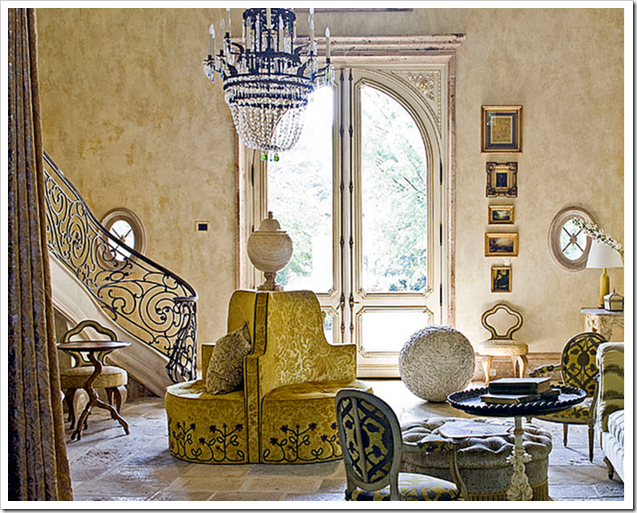
Joni from Cote de Texas just posted this Chateau in Charlotte, North Carolina on her blog and she wrote that she loves stone floors because of the sense of permanence they add to a home and I agree!
I now understand her obsession with French design because that’s Houston. Everything there is French inspired and many of the homes are like a French chateau!
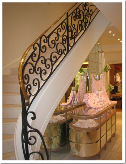
The woodwork and detail is extraordinary (we don’t have anything like this in Vancouver). Look at that staircase (above)!! So beautiful!
I snapped this photo (above) when I was in Paris 3 years ago. I remember the clerk giving me the hairy eyeball because I so obviously looked like a tourist—instead of a real shopper– in my comfortable shoes and backpack. The one in the previous image is way more beautiful in my opinion!
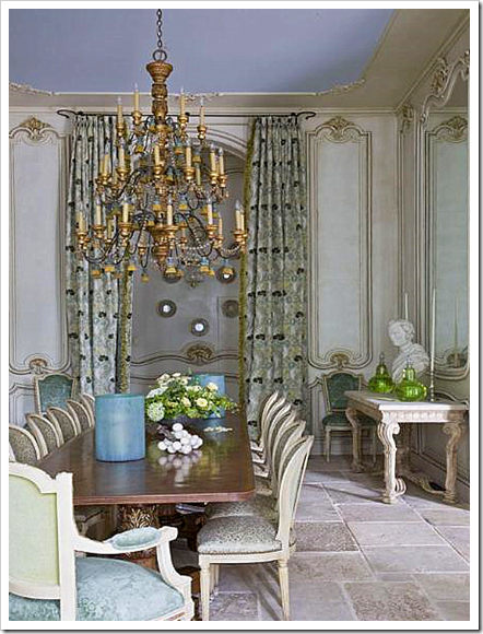
Here’s another image from Joni’s post! Look at the ceiling, isn’t that colour gorgeous? It’s not the ‘real french blue’ (apparently there’s a real name for ‘french blue’ if anyone knows what it is please post a comment), but I found out exactly which colour it is on my trip. Stayed tuned for that in my next post!
And what happened with my client? Well I miss her already, we immediately became friends! It was a whirlwind—almost 2 days—we picked out fabrics for drapery and bedding, tile for the bathrooms, and it was all wrapped up in the colours we had chosen for her 5,000 square foot home! We are also using the green in the chairs below and some other blues and golds.

Travertine is so huge in European influenced design, I have come to the conclusion (especially after this trip) that travertine is like jeans, it goes with a lot of different colours but I’m guessing the French aren’t that fussed that it’s got a lot of pink in it. Just like in Europe they don’t care that the area rugs match the decor, it’s the same with travertine!
What do you think? Do you agree with my theory?
Need help choosing the right neutral or colour? My How to Choose Paint Colours: It’s all in the Undertones ebook takes the hundreds of choices down to 9 neutral undertones along with list of all my other go-to best grays, broken down into 3 undertones, green, blue and purple. The beige undertones of pink, yellow, green, gold, orange and taupe along with the best greens and blues.
My bonus book of colours is worth the price of the ebook alone but you will also get my system of understanding undertones so you can stop making mistakes when sourcing tile, carpet, countertops, etc.
The only way to choose the right colour every time is to combine my system of understanding undertones with the most indispensable colour tool available. You can purchase your own set of my curated large colour board collections here.
If you would like to transform the way you see colour, become a True Colour Expert.
Related posts:
Does your Home have Colour Flow? Take the Toss Cushion Test.
How to Know if the Tile you have selected has the Right Undertones
10 Things I learned from my Designer; by a Happy Client
If you are new to this blog, click here to see the Best of Colour Me Happy
While you’re here, subscribe to this feed so you don’t miss out!



indeed, travertine is very popular in europe. we use it a lot in portugal too (people like it to keep the house "fresher" yet opponent, if you know what i mean). You found the right analogy: it's like jeans, it goes with many colours. i love to see green with it, like you show on last pic, or even darker – gives a nature feeling
Love the color you suggested and she decided on. I understand the permanence idea because I also think that way about hardwood floors. I do love the look of a stone floor and I love the first pictures you shared from Joni's blog. I'm a big fan of French inspired design and decor; I'm sure I would have loved seeing those homes!
Such a lovely post. I love the colour, I love stone, where it fit's and I love your enthusiasm for all those pretty French details.
The only word I can think of for French blue is ultramarine or perhaps lapis lazuli, since this is where the colour derives from.
XX
Victoria
Maria: I do agree Maria, Travertine has a lot of pink in it and can be difficult for most to select a paint color to go with it. We just put Travertine in our kitchen and our entry. It was amazing how each piece was so different. I actually drove my contractor crazy because I had him make piles for the "too pinky" tiles and "too yellow" tiles. Luckily I had plenty of "my favorites" and didn't have to order another palette. I've had clients where we order several palettes so they can pick out all their favorites and get rid of the "too pink" or "too yellow" ones.
Fun post Maria.
Ruthie
I selected travertine for my bathroom remodel several years ago, and a designer friend recommended BM pale almond to go with it – this shade works beautifully with my travertine.
I love the warm color of my travertine, but after going to a beach house in California that had limestone, my initial reaction when returning home was that my travertine seemed so busy after the more monolithic limestone. However, the limestone in the CA bathroom is a nightmare – etches like crazy, and my travertine is still beautiful after all these years.
Have you ever seen onyx in a bathroom? I saw a sample of this, and it was beautiful – translucent. I wonder about how durable it is.
PS – I reader emailed me the house in Joni's post a few months ago – I had forgotten about it! She did a great job walking us through the house.
Maria, as i promissed some time ago, here's a link for colour trends for 2010. The website is in portugues though, but it's very easy to navigate. http://www.cintendencias.com/
as soon as i get the catalogue, i'll send it to you over.
Have a good week.
I'm not sure which French blue you're thinking of, maybe Cornflower blue? Or the Castaing blue? I have been meaning to go into the Castaing boutique I read this post about it, I must have passed by it numerous times but never noticed it. To die for.
http://littleaugury.blogspot.com/2009/05/grand-mere-grand-madeleine.html
I think it is pinkish and a great stone to work with. Also I think the lighting affects how it looks a lot. Great post.
Great post. I always learn something here…and in such an entertaining manner. Love the blue jeans analogy, and had to laugh at the "hairy eyeball"…never heard that one before!
Sue
"Travertine is like jeans" is possibly my most favorite quote from your blog ever! AND makes complete sense!
I think travertine is pink, beige and yellow. Sorry. Not helpful. I know!
Coco of COCOCOZY
HI Cococozy,
And you are right as well!! Just means there is certainly more than one option!!
Maria
Dear Just a Girl,
I just thought I should add that I think when travertine is used in the main areas of the house it's like jeans (and hopefully it's not all pink but a mixture) but if you install travertine in a bathroom and it's very pink, it stops being so neutral. So it's context again!!
Maria
Exactement! Travertine ranges from pinky beige to yellow- and has a warm cast to it – I love it paired with creams, beige and even gray. I think the ceiling is not as yellow as "palladium blue" but has a hint of red a "lavendar" – Love that blue that permeates so many pretty things in France.
pve
I can't believe you were in Houston and didn't call me. 🙁
Joni
Travertine has always intimidated me a little bit..but this post was so helpful. Love the 'hairy eyeball' comment – haven't heard that one since I was kid!
well I don't know about the blue, I'd love to know what you find out about it, as you know I like contemporary tradition (ie provincial style) in my home, and I have blue everywhere… not quite that blue, the blue you show is darker, mine is more a baby blue (or a strong baby blue – is that possible??), anyways, I do love natural flooring, eg. travatine, slate, timber etc… they are all timeless classics imo! (I'm not going to even discuss the "pink or yellow" question after my terrible beige I had to repaint thru my home!!!) thanks for reminding me of the dreaded undertones…!
How exciting to see your travels! We will have to post bout our adventures in New York! hehe two crazy girls getting in trouble!
Kilim Beige acccording to SW is a true neutral. It is rarely described as a pinky beige. It is used with many colors and stands alone and tends to stay true not going yellow or red even if paired with such.
Great post Maria, I love travertine!!
You always make terrific choices that work for the client. Better call Joni Next time!
Dear Anonymous,
If you compare Kilim Beige to 6141 Softer Tan (to start with) you can see that it's pink. I'm not saying that it wouldn't work as a good 'neutral' depending on the context of the space though! There are certainly many other beige tones that look much pinker than that one!
However it is definitely not a true yellow beige.
Maria
I just wanted to let you know that I refer to one of your blogs in my recent blog post "Mini Home Tour".
I thought you might like to know. It was the post you had about light colors never coming to life in a darl space.
As long as you are talking about floors, do you have a post about paint colors that work well with Saltillo tile? I live in New Mexico and have saltillo tile thru my home and I don't particularly care for yellow or red which is what is usually used with it! However I do love whites and grays and greens.
Thanks, I absolutely love opening my emails each day to see what you post. I have learned so very much. Keep up the great work.
Light is everything when it comes to color. I just had a client do a bathroom remodel with travertine. It was two rooms. The entry had 2 sinks and no natural light. The room with the shower had a small window that faced north. The travertine shifted gold. We went with SW Irish Cream for the walls and SW Black Bean for the cabinetry. Clean and contemporary.
Some designers feel travertine is passe. It's all in what you do with it!
Hi Maria,
The name you might be looking for is woad. (aka isatis tinctoria) It's a plant/pigment used for textiles and paint for centuries before the introduction of indigo to Europe. It produces more complex and more lovely blues than indigo, and creates that slightly muddy, slightly warm blue we think of as "French blue"
Hi Pamela,
Without seeing your furniture it is impossible for me to specify one of the colours you mentioned, email me for my on-line rates. You're right yellow is pretty common with that tile!
Mary-Frances
I don't think Travertine in a French-Inspired Chateau could ever be considered passe, and I agree with you, context is everything!
Maria
Julie,
That might be too technical of a term I think there's another one still. . . but I could be wrong. Thanks for posting your take on it!
Maria
I love the jeans analogy! It's perfect, and I love the color you picked. While I think travertine tends towards the pinky side, the best part of natural stone is that you get all of the inherent shading. And just think about all of the colors in nature – have you ever thought that natural stone clashed with its outside surroundings? Of course not! 🙂
Interesting! I never thought of travertine as being pink….more of a yellow or camel. I will have to pay more attention next time! Limestones definitley come in shades of pink, grey, greige,blue, and green. Great post!
I love your blog. I too am a color consultant but from a small county in Maryland. I went to the Art Institute of Chicago many years ago. A yellow beige or pink beige, this is troubling. I think you are spot on. Again love your site. Just started my own free blog.
Thanks for the inspiration.
Looking at the pic of the three paint smaples, my eye went directly to the one on the right. It appeared seamless with the floor. Having lived in Houston for 20 years and now Oklahoma, I am beginning to think our lighting wants yellow tones! Or it could be the influence of our resident designer, Charles Faudree! Thanks for all the fabulous information!
Maria, thank you for your insightful blog about travertine. As a fellow designer, who stares at colors everyday, in search of that "perfect shade" for each design challenge, I find great inspiration in your blogs. It's amazing how a fresh analogy or a new perspective can truly add focus – or an interesting twist! – to almost any design project. Your blog is not only interesting, but it is also quite entertaining (i.e., "the hairy eyeball" haha)! Yours is one of my very favorite blogs! Thanks for sharing!
Hmmm…I always thought of it more yellow ar even light gold. But depending on where it comes from and the lot, it could also have pink tones. I can see why a client would have you come to the states….choosing paint for this situation could send the average person into therapy!
Wow, how cool that you went down to Texas for a design job!!
It looks like you picked a great colour to work with the travertine tile. Having lived with a pinky kitchen for 8 years, I'm sure your client would NOT have liked it if her house was painted pinky beige to match the tiles. It's just not a happy colour.
Hope you'll post some pictures of this house when the decorating is all done 🙂
Kelly
You need to announce these things BEFORE you go. I'd have paid for a bit of your time here in Houston as well!
What a fun adventure that must have been, flying off to Texas for a 2 day design consult! Good thing she brought you in because why-oh-why would that Kilim Beige be recommended for her home with those floor tiles? If the paint question was "Which paint looks most like the floor tile?" then Kilim Beige is the answer. In the photo, they look exactly the same. But wall color selection should not be made based predominantly on what MATCHES a material. Wall colors need to create the right mood for a space…and usually they need to contrast the floor color, not be its twin.
The color you helped your client select is much warmer, therefore it creates a "happier" mood…and creates a nice contrast to the grey and pink undertones in the travertine. I bet your client was thrilled to know that she wasn't crazy, despite what all the other color "experts" said.
I almost always agree with you, Maria. After all, you're the expert. I specifically chose the travertine in our hall bath because of all the yellow in it. The soft blue on the walls compliments it beautifully I think. But your more trained eye may see something different. We were thinking of installing the same travertine in our master, but I'm changing my mind about it now that I am considering a carrera marble countertop.
I think you are right about another term for French blue. It's on the tip of my brain. Hope someone thinks of it so I can put it to rest.
~ Victoria
And I'm with poster Nancy. If I had known you were coming to Texas, I would have paid for you to come to the Dallas area to consult too.
When I read this post I thought, great, one day when I'm looking for tiles I'll know something about travertine.
Little did I know that this information would come in handy with coffee tables. I'm searching for a coffee table and found one with a travertine top. Since I now know that travertine has a pink undertone I knew right away that it wouldn't work.
Thanks again Maria. It would have been a big mistake if I had bought the table.
The french use a copper based solution to paint their shutters and doors…can't find the reason why or what it is called.
As for that elusive french blue/gray/green, they call it tendre gris. It morphs from blue to green with a gray in there somewhere. Anyone know of a paint color that does this?
Materials that consist of multiple colors can be tricky to navigate!! It’s a similar situation to trying to find a paint color that can unite a pinky-beige sofa with golden-beige carpet (how many times has that come up?).
I agree that lighting is quite influential, it can dictate how much color saturation a room can accommodate. I also like using colors that are complex or full-spectrum. This means they have multiple pigments in the formulation, so the is color of the paint connects to all the different flavors of the travertine, whether it’s pink, gray, beige or gold.
Maria
I had a travertine fireplace surround installed in travertine, and was disappointed in the look – you say that clean trumps dirty colors and I agree. My travertine looks dingy and it was very hard to select a wall color. I ended up with SW lotus pod and painted the mantel SW Sable.
The room is on the North side of the house which does not help. If I had a do over I would have picked a cleaner color for the tile (something other than travertine), a cleaner wall color and achieved a fresher look. I may try repainting the mantel in cream to see if that wakes up the room a bit.
I am so glad I found your blog, if not simply for the reassurance that I’m not crazy to notice undertones (not saying I’m not crazy in other ways, lol). I don’t always recognize what is wrong or how to fix it, but I notice. My builder special home offered 5 carpet choices in addition to travertine tile. After it was installed, I realized that when making my choices, I made the mistake of looking directly down on the samples, rather than at an angle (as you typically see it across a room). Since none of the other carpet samples seemed to work, I picked the one I thought best. After installation, though, it was abundantly clear the carpet and tile did NOT work and I couldn’t find one shade of paint to go with both (open floor plan). I wound up picking two similar but different tones of paint, using one against the carpeted walls and the other where there was tile. I understand now it was the undertone I was seeing. Most people couldn’t tell the difference, but I could. It worked, but I agonized over the decision, painted multiple paint boards, and am still not sure I did the right thing (I don’t live there anymore). I score a 100% on the FM 100 hue color vision test (as I’m sure you would, Maria). It’s a test used, in part, for those who classify diamonds based on their subtle differences in clarity and color. It must be strictly administered under specific lighting conditions, so the online version is not as stringent, therefore easier to pass…still a starting point, though. The test also highlights those who are going to be hypersensitive to color. Training to recognize color nuances clearly helps fine tune the existing ability. I fear, though, that many in the industries associated with selecting color aren’t self aware enough to recognize their own visual limitations and are spreading color mistakes faster than they can be corrected. Soooo glad you’re trying!!! Every time I hear it’s “close enough”, I wonder whether it’s a lack of physical ability, a difference in taste, or an “I don’t care enough to get it right” attitude. Regardless, I find myself asking, “OMG, why would they pick THAT?! Sorry, my very long way of saying thank you!
Maria ~ I am reading this 2010 blog posts (relevant to my situation today) and the photos won’t load. Is something wrong with my computer? Or are the photos no longer accessible? Help!