image source
15 years ago, when I was discovering and creating my Understanding Undertones™ system, by doing consultation after consultation (which added up to thousands), I would often encounter this scenario:
I would arrive at a beautiful house in an expensive neighbourhood where after I was greeted by the wife upon entering the house, her husband would walk out of his home office, say hello and walk back in.
I decided then and there, that would be ME one day, and now it is (well the working from home part, not the expensive neighbourhood part ; )
So, if you love colour or if you’ve decided this is the year you’re going to have colour be your strongest skill, my course is the Here’s-how-you-do-it-in-the-real-world no fluff, just the best colour course you’ll do this year.
Stay tuned for a colour lesson (from the hotel our course was at in Corte Madera) at the very end of this post!
One of the best things that happened in my business last year was getting approved for a Visa to be able to hold my courses anywhere in the US. In order for that to happen, we had to prove that over 75% of my business came from the United States already, we had to show significant revenue for three years in a row plus I had to have a unique niche that no one else could teach.
Luckily our approval went down without a hitch!
Our first course was held in Chicago in May at the Harrington College of Design. My Visa was approved four days before we flew down. Terreeia and I were sweating bullets, losing sleep at night, worrying what would happen if we didn’t get approved!
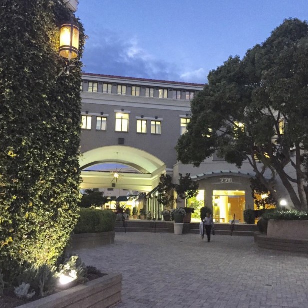
My next course in the Fall was in Corte Madera, located right over the Golden Gate Bridge (below) right across from the most beautiful outdoor shopping mall I have ever seen (above).
With all the travelling I did last year including our 3 week vacation to Italy and then a week long cruise after that, suddenly my dresses didn’t fit : ( no surprise right?
I have worked out on my own and with a personal trainer for years now, there’s some muscle underneath the extra pounds for sure ; ) ; ) but I had just gotten lax about my eating habits. Plus if you’re trying to lose weight as a vegetarian it’s more difficult because I can’t just eat chicken and salad for lunch. That’s when I discovered Millet. It’s amazing! It fills me up so I’m not walking around hungry 2 hours later and it’s a super healthy grain, I’ll post a recipe on a future blog if you’re interested.
It’s easier to travel when you know all your clothes fit so I’m back on a healthy eating plan that I’ll need to figure out how to maintain with all my travel this year!
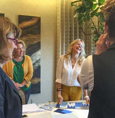
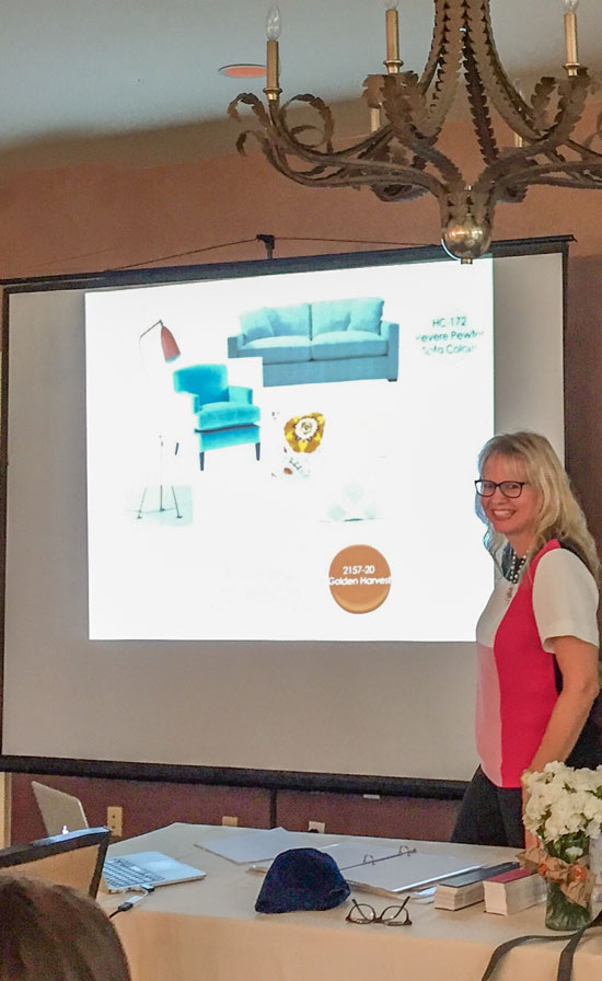
Here I am talking through one of the in-class projects. We really do have fun in my courses!
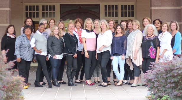
Back Row: Carla Ernst, Malissa McLeod, Judie Tull, Lori Knicely, Alison, Lisa O’Neill, Scotti Moser, Karen Archuleta, Elizabeth Francis
Front Row: Ruth Banks, Keira Williams, Tammy Griffiths, Laura Neuman, Annette Galloway, Maria Killam, Jennifer Grey, Addy Levitch, Karen Jacobsma, Christine Spillar, Lisa Rousseau
Then shortly after Corte Madera in October, we flew down to Houston, my class was held at the Bay Oaks Country Club.
Here I am in a new Kate Spade top and matching shoes! And some new specs from Italy!
Ellen Rhett volunteered to help out in this class! She participated in my True Colour Expert Training in 2011 so this was a good re-fresher for her since my course is never the same and I am constantly working on ways to make my Understanding Undertones™ system easier and easier for students to learn! Here’s what Ellen said after this course:
I liked Maria’s course so much that I have been a two-time attendee!
The course just keeps getting better and better.
So many things have changed in design trends since I first attended in early 2011, but the advice Maria gives and the techniques she teaches, are TIMELESS.
Maria has a system, and it is a system that works beautifully. You will never look at colour the same way again.
Design professionals: this will become one of the most important arrows in your quiver.
Design enthusiasts: if you are a DIYer, you will come home with the knowledge to select your own paint colours, fabrics and fixed finishes with confidence.
Back row: Ellen Rhett,Gina Roth, Cassie Murphy, Jancy Ervin, Alice Gucwa, Lisa Lato,Teresa Dornhorst, Diane Higgins, Patti Allen, Becky Pipka, Cate Sleigh, Maha, Turkmani, Phyllis Palmer
Front row: Terreeia, Arianne Bellizaire, Tamra Armstrong, Toula Stegman, Maria Killam, Kelly Barry, Keti Abazi, Greer Blair, Mercedes Behm, Sharon Trial
Photographer & participant: Laura Wardlaw (not shown)
Here’s a video testimonial from one of my fabulous students Keti Abazi from Dallas:
[youtube_sc url=”https://youtu.be/xcy-Yer0JAQ” rel=”0″]For mobile users click here to see the video
For full details and registration for an upcoming course go here.
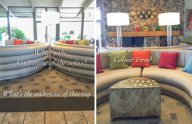
Okay so for all the colour enthusiasts out there, here is the lesson of the day. At the hotel in Corte Madera, this was the lobby (below):
The lobby had two dramatic, curved sofas. You can see that there are two different neutral undertones in the space and we have a hit of colour with bright artwork and pillows.
What are the undertones in the photos below (including the fireplace stone) and what works and what doesn’t work about this room? Post your assessment in the comments below and I’ll post my answer in a few days.
Can’t wait to meet you in one of my courses! xoxo Maria
Register here. if you’d like to transform the way you see colour!
Related posts:
What it Looks like to be In a Private Forum








Hmmmm. In the picture on the left, sofas seem grey with blue undertone (but in the picture on the right the sofa seems to have warmer undertone–don’t know which lighting is more accurate.) The flooring has a yellow undertone. The pillows, except for the blue one, have a warm undertone and work well with flooring and fireplace. Sofas seem too cool in temperature compared to floor, stone wall, and pillows.
Bay Oaks? That’s my mom’s country club. Wish I had known, with her age I visit more often & would have been there to see you .
Small small world.
Congrats on the USA approval for classes. I’m swamped studying for testing for licensing for a commercial job in Virginia. Have never felt so frustrated or as if tears were about to arrive with the frustration, never.
Happy New Year…..Good seeing all you have planned, so far. XOT
I’m not sure what works – the windows?! Not keen on the sofa style – they look like blow up paddling pools from the back. The grey and the yellow(?) beige don’t look good together and the coloured cushions don’t do anything for me. Even the carpet design looks rather old-fashioned, although I suppose the colour tones with the beige sofa. I like the wooden mantel and the stone fireplace -and the lamps are nice! Maybe the whole thing looks different in real life!
Maria
Since im on a diet lots of fruits and veggies .
I also have millet and Quinoa
Would love your recipe as im always searching for healthy recipes 🙂
Enjoyed your post as always .
Thanks
Nancy
Undertone is yellow.
Color trend – not sure exactly but I’d say “yellow-grey” with pops of bright to add fun.
Yes, I’m not surprised you liked the old world style Town Center mall in Corte Madera after your trip to Italy! When we lived in that area briefly I loved wandering there, looking at the murals and enjoying fountains and plants. Your readers can google and click “images” to see some photos.
Just over the freeway, The Village with Macy’s and Nordstrom is also lovely, but not as charming. It’s a gorgeous area right next to the SF Bay.
Well, oops! I see by the picture I missed above that it was The Village mall you thought was so beautiful–it is! Your hotel is just across the street from the Town Center, so I assumed you meant that one. I hope you didn’t miss it. 🙂
I don’t understand what you mean by that first two paragraphs, sounds like your a little full of yourself to me. What does that have to do with the rest of the article?
She explains it in the 3rd paragraph – that she’d love to work from home 🙂
Don’t know why you think Maria is full of herself. She’s one of the most giving people I know.
Full of herself? That’s a little harsh, especially on Maria’s own website for her followers to all read. I believe Maria was encouraging us to take her course to help equip designers to increase their skillset so we could choose to work from home, if we wanted, like Maria did after seeing others in their home work environment and wishing that for herself. She wasn’t full of herself at all, just pointing out a scenario that ties in nicely with her offered courses.
Maria, It is hard to see the picture clearly but it looks like two colors of the same sofa. One looks yellow beige and the other is a blue grey. The rug looks like a green beige and the fireplace looks like both grey and butterscotch. Whom ever put the room together needs your course. lol Can’t wait to hear your analogy
So glad that you got your visa and can now travel freely in the U.S. You will be a very well traveled gal.
Happy New Year!
I think the whole thing is thrown off by some nice north light that changes the colors….I see pink beige sofas on green-beige carpet, all poorly accented by the natural orange & charcoal stone with orange oak mantel. I bet it looks much better at night with different lighting.
The commanding stone fireplace, with butterscotch undertones has been completely ignored and is at odds with the blue grey and greeny beige minimalist Italian leather sofas, overly colorful pillows and mantle decor, and cool silvery white lamping. Dated flooring has greeny gold undertones.
I see green beige in the rug and sofa . Also blue gray sofa which doesn’t work. The fireplace is tricky because looks like the lights in the middle cast a yellow tone. The white lamps are too cool for the beige sofa but look good with the gray blue one. The pillows are muted or warm and are ok except for maybe the blue one looks cooler. It’s all
Oops …didn’t finish. The mantle to me doesn’t work …its too orange or butterscotch. Too much pattern on the rug with the busy fireplace. No focal point with all that’s going on to me.
Mary .
I really dont understand your blog.
Im not sure that when one shares part of their life , how you would think that is being full of themself?
I see nothing wrong with being
Honest and real .
Thanks, Nancy. One reason I read Maria’s posts is that she is a real woman trying to make a difference in the world and taking all of us along on the ride. Her personality and honesty are my reason to care about her and what she writes. Yours is a good response to a careless comment.
If the colours in the sofas are accurate, the one on the left is grey and cool undertones, the one on the right is a caramel with warm undertones. Nothing to tie it all together so an effort was made to brighten it with a collection of pillows that do nothing but confuse it further. The lamps are too tall and the shades match nothing. So, take away the grey sofa, the coloured pillows, and replace with a dark brown or deep taupe sofa and matching lampshades on a chrome lamp base, and other chrome/silver accents and caramel accents and it will all work. 🙂 Also could choose one accent colour such as burnt orange and it will be fabulous! The other pillows…gone. The rug and flooring work well with the fireplace, but adding all those bright pillows is a huge mistake.
I see a green-beige sofa and a blue/green-gray sofa that appears to coordinate with the oranges and grays in the fireplace. I see green undertone in the rug as well as the patterned carpeting. It looks like the neutral palette has been there a while (original to the room?) and the designer introduced the color trend more recently with a blue-gray wall and accents of green, orange, red and blue on the mantle, wall art and pillows.
I also see blue-gray in one couch, yellow-beige in the other, with the rug being more green-yellow. For me the orange and pink pillows seem off.
The sofa on the left looks to have a cool blue undertone, while the one on the right has a warmer yellow one… The rug looks to have a green tinge to me. Colour trend? Busy? Eclectic? Clashing?
Maybe I need to do the course!
Hi Maria,
I think one sofa is grey with blue undertone and the other has a grey green tone. The lamps don’t work cause I think they are white and clean versus the dirty tones of the place. The rug looks yellow undertone, as does the stone…actually a bit greenish in undertone. The color pillows look out of place. I really don’t care for the set up.
I can’t wait to read the answer! Have a good day,
Gretchen
I would love a great millet recipe!
PS: DO post your Millet recipe!!!
Thanks, Maria!
I wil very soon 🙂
Re the undertone of the rug; these old eyes in one frame is seeing yellow whereas in the other frame it appears to be green. (Okay where is my piece of white foam core board and not to mention my eyeglasses.) ☺ -Brenda-
The overall undertone of the area rug is green beige and you can see that it was installed in the brown trend or even before. The sofas are new, they are green grey, with the addition of the colourful art and pillows, makes it look like the rug is being totally ignored. And as I talked about in this post: https://mariakillam.com/charcoalsofa/ you must have small, medium and large gradations of the accent colour so it looks intentional.
Omg
Maria. I just now saw this post and it’s all because of Kristen Barnett. 🙂
I am so glad this post is out there.
And I truly loved the class, I learned so much. And I think anyone who is serious about their career in staging and design should take it.
Cheers