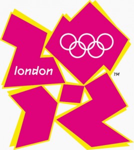
Have you noticed how huge the exact shade of Honeysuckle pink from 2011 is at the London Olympics?

This is just one of the colourful logos.

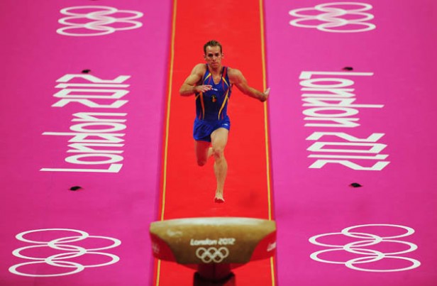
Hot Pink and Red:
Red is grounding and Hot Pink is Artistic: Great combinations for the Gymnastics competition!

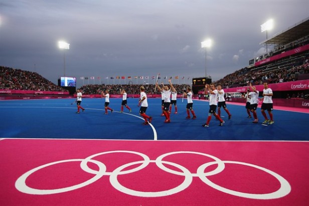
The boring green turf has been ditched in recent years for Electric Blue for field hockey and the ball changed to yellow to make it easier to see. The hot pink was added to coordinate with the colours of the Olympics.
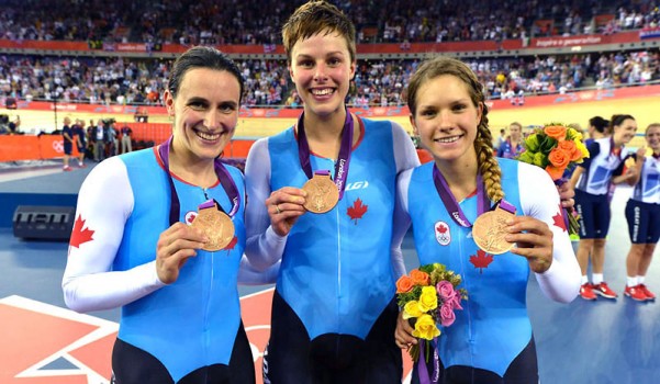
My favourite uniforms happen to be Canadian. I just loved the blue, black, and white with the red Canadian flag!
The combinations and colours of the Olympics this year are simply a happy celebration of the world coming together! Am I just noticing extreme colour because I am in the colour business or have you noticed it too?
I predict more pink in our colour future – and with this much hot pink around, maybe the men will get into it too (back to the 80’s here we come, haha).
What do you think my lovelies?
ps. I was wondering why my regular readers did not comment on my “What’s an Undertone”, post from today, but that’s because you didn’t get it in your in-box,this morning, oops. Anyway, if you need a fresh tutorial, here it is.
Day 10 in my 37 Days of Learning Undertones Series continues on Facebook. Don’t miss it!
Related posts:
How to Get a Man to Embrace Pink
Trend Alert: Blue is Getting Brighter and Happier
An Exception to Mixing Clean & Dirty Colour


I’m thinking when the committee made the color selections it was 2011 and they didn’t project the new colors for 2012. It’s all good, though! Love me some pop of pink!
actually you are right… and knowing how early graphics had to get started in preparation for our winter olympics in 2010, you can be certain they have been working with those colours for at least the past 4 years, maybe even since 2007 when the logo was unveiled with its colour palette.
I wouldn’t say the pink is in any way dated, since they would have been working on all the colours for the past few years, they were most definitely on-trend. I’m loving all the bold hot pink!
Maria
I agree! I love the colour!
I’m also loving all the purple around the Olympics – is it a reflection of the colours which are trending right now or is it a statement for the Royal family?
How about Team USA’s gray podium jackets and the opportunity to discuss the undertone:) The athletes, purple ribbons and bouquets stand out beautifully…but not so patriotic.
Well the original Olympics (back in 776 BC) probably didn’t have this much color 😉 Wonder what they would say about the colors used…..
Also, has anyone else wondered how far some of these “olympic games” have strayed from anything remotely akin to what they would have done at the those games? It’s fun to read about the original events and history!
As to the color of modern day Olympics….honestly I haven’t really noticed. I was thinking this was a sporting event…hahah 😉 hence I have only watched a few minutes here and there.
The new hot pink will go well with pinky beige!!
Well, I love hot pink too but wow, it was hard on the eyes during the Gymnastics competition. Very HOT.
Maria, I started to comment about the undertone post, and somehow never sent in the comment. What a great series and I am looking forward to the refresher! Here is my question: I am honestly having a hard time seeing the butterscotch undertone in the rug in photo #1. I see green, just like in the wall color. I do see butterscotch in the binders on the shelving and in the window treatment fabric. What am I missing here?
Hi Ellen,
It’s borderline, it could be pink beige too but with my computer it seemed to relate to the drapery. Maria
Thank you for clarifying! Hope you are enjoying your vacation! xo
I haven’t noticed the colours, just the incredibly talented athletes.