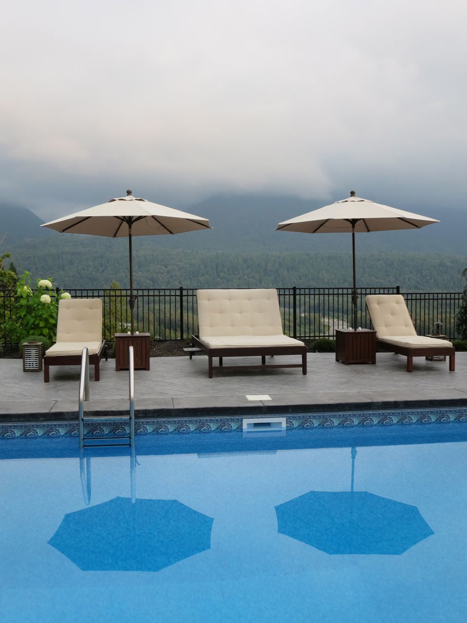
The view from their house in the summer
I usually get involved with a project AFTER the renovation, when it’s time to decorate.
However, I have spent countless hours with clients helping them navigate and plan the colours and finishes for their renovation .
What you should do first.
What you should do second.
What colour is your foundation palette? White or Cream?
What is the look and feel of your new house going to be?
What are the colours? This is the easiest part for me, but the hardest part for so many.
Anyway, remember the summer house I decorated two years ago (above)? Well we are about to start the renovation on the main house. My clients are staying in this house because their brand new pool and guest house is next door. They were newlyweds 8 years ago when they built this house, so instead of moving and renovating another house, they just want this house to get updated from the Tuscan Brown trend into a much fresher, timeless and classic look.
Habitat for Humanity will take all the millwork and countertops (in case you’re wondering).
The view from both houses is incredible (here’s a glimpse above). You already feel like you’re in the middle of nowhere when you look out the window so why drive 5 hours to see the same thing somewhere else? So smart.
Crystal wanted me to decorate her house but first it needed the renovation. So I called my friend Jan Romanuk and she agreed to design all the new millwork, etc.
So here’s what Crystal’s house looks like right now.
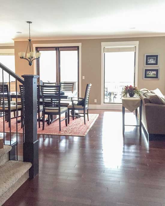
The engineered floors are too red and will be replaced with a new light hardwood which will be installed on the second floor of the house as well.
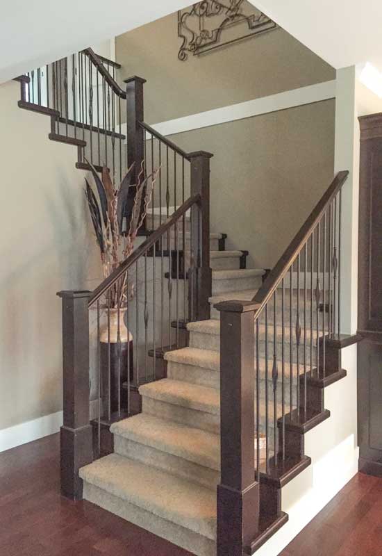
The staircase will be painted and the carpet replaced.
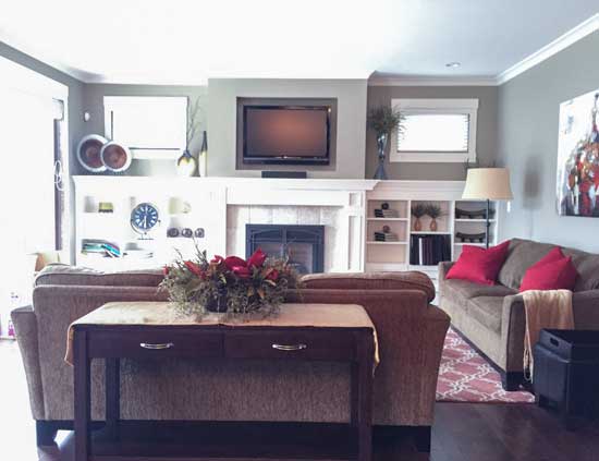
The millwork in the great room is white so it can stay. It will simply need a new coat to go from the existing cream colour to white.
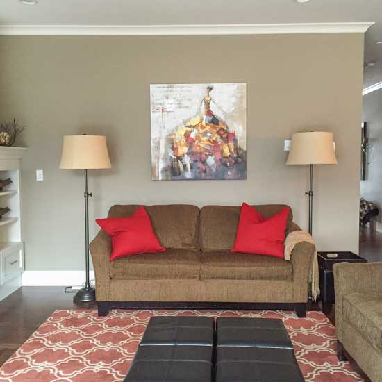
The other side of the living room. The earthy wall colour and furniture needs an update.
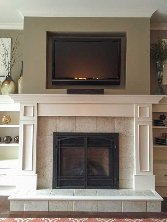
The tile will be replaced.
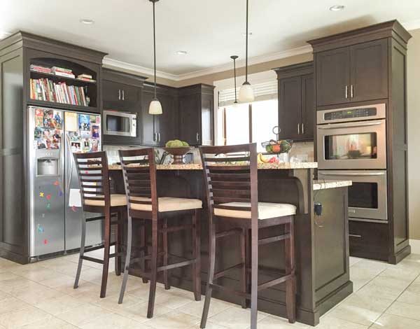
Here’s the kitchen. Crystal’s husband Rob is a gourmet cook so they are installing a Wolf/Sub Zero appliance package. This time, they will have an integrated fridge.
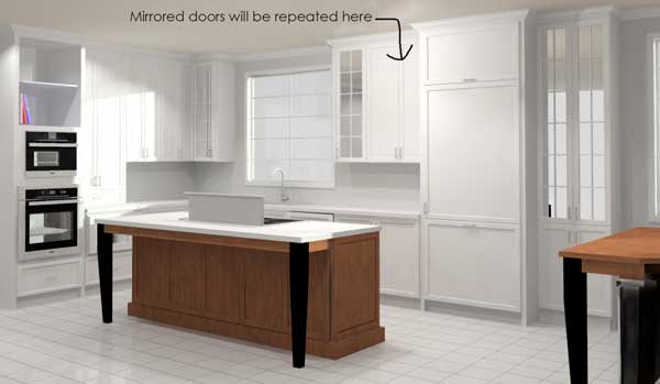
The kitchen will be white this time, however the island will be made of walnut.
The reason why the downdraft is staying (update based on the comments), is because you can’t move the range and have it underneath the window or beside the window. If you move it to the wall where the wall ovens are now, then you’d have to move the wall ovens beside the fridge, and when you bundle your appliances together it’s hard to make it look beautiful. The entire bank of 72″ of appliances now becomes the focal point of the kitchen.
And Rob likes entertaining his guests while he’s cooking; he does not want to look at a wall.
And truth be told, most people use their hood fan very rarely (that’s certainly true in my house). This is a large room where smells will not stick around. If ethnic cooking was a primary focus, having a hood fan would become more important, but for this family, it’s not a concern.
The island legs will look like this inspiration picture below:
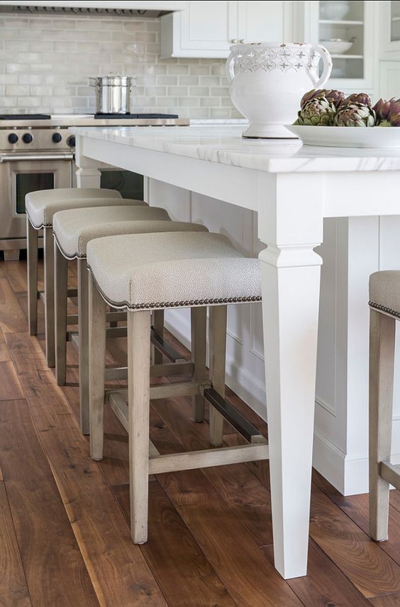
via HomeBunch
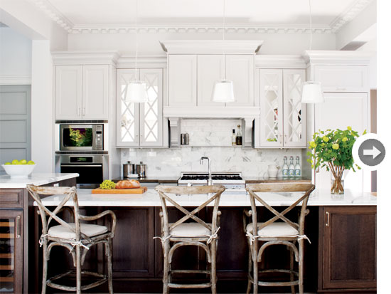
Instead of glass doors where you are suddenly heavily restricted to displaying glassware or white dishes, they will be mirrored doors, similar to this picture (below).
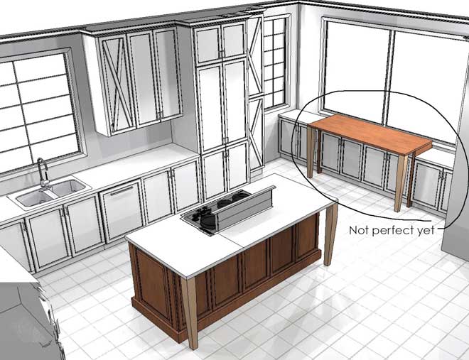
Okay so here’s where I would love your input! This is the first tentative drawing of the kitchen eating area.
Currently, Crystal doesn’t like the fact that essentially they have two dining areas almost beside each other because the dining room is opposite the kitchen island.
She says they rarely use the dining table (below) and that bothers her.
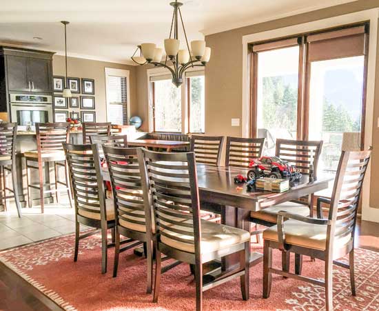
What she does need on this side of the kitchen (below right) is an area where they can store all their glassware and liquor and have it also be a bar area where drinks can be served during parties.
You can see that in the current plan (above), the new table has been designed so that it’s higher than the cabinets because then it will be counter height (approx 37 inches). The windows are lower (34 1/2 inches) which eliminates the possibility of a counter height row of cabinets.
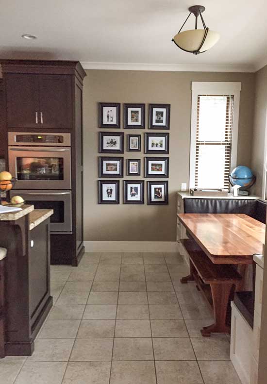
As you can see by the first drawing (above) the integrated fridge will now go on this wall with another bank of pantry cabinets extending into the wall area (above). The island will be 10 inches longer.
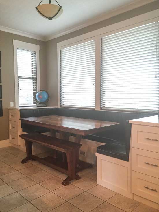
Here’s another view (above).
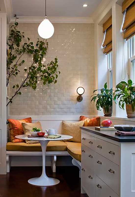 via Pinterest
I like the idea of a smaller corner dining area with a small round table, and then we either need more millwork on the other side or a sideboard which could be a bar but it’s awkward because it’s a narrow space and not wide. And there’s another low window on the other side (below):
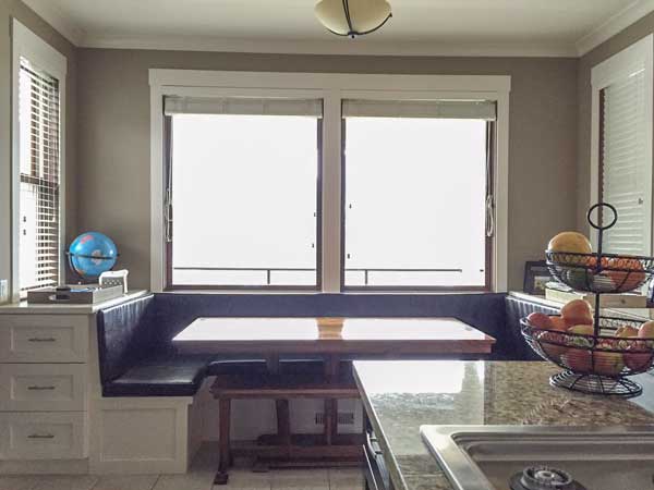
The low windows aren’t a problem if the built in banquette was staying (below) but the problem with this kind of arrangement is you’re facing away from their incredible view as well.
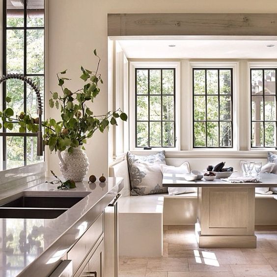
Renovations are never going to be as perfect as a new build. First you have to work with what’s already existing in the space and of course the budget needs to be considered as well. Here the dilemma is the lower windows and the narrow space.
Sometimes the ONLY solution is custom millwork, and sometimes you need to find the right custom pieces of furniture in order to make something work really well.
However, none of us feel like the first solution is the perfect one so I thought I’d post about it before we come up with a new drawing because every time I have a dilemma, my brilliant community of readers (you) always have the best solution.
This will be a fun project to follow and when Spring comes, I will post a better picture of Crystal and Rob’s spectacular view.
My Vancouver Specify Colour with Confidence™ Event was amazing; I had an incredible group of 25 women who were talented, generous, creative & inspiring who bonded and created their own groups! And the best part is we all get to continue the conversation to support each other on my private True Colour Experts Facebook page.
If you would like to transform the way you see colour, become a True Colour Expert.
Related posts:
Ignorance is Truly Bliss: Before & After
Professionals Know When to Avoid the Obvious
How to Choose the Colour of your Flagstone: Before & After






I see your delima! It is hard to give suggestions without seeing the whole footprint. Would an induction cook top solve anything? I know they are expensive but does eliminate some of the odors. Also how would just a glass top pub type, counter height, round table look in the corner with two or three bar stools? That way they could still see the view and leave enough space for a wine cooler. If the stools were backless they would then tuck under the table. I am having a similar problem with a client right now only they don’t have a view. I have looked at some good looking pub tables that take up less space.
Good luck. I know it is easy for all of us to say!
I think that with the expansion of the fridge area into the current eating area space and with the larger island, I’d be inclined to do away with that banquet eating area and just have storage/countertop for a bar area.
The dining table should be replaced with something she feels comfortable using daily – why have such a nice area and not use it.
Great comments, agreed! I am moving into a home next month with a kitchen that works better to have an island in center of room (will add two bar stools) than a small eatin area and my dining room is so close I realized why have two tables for dining. It’s funny how we all have preconceived notions regarding these concepts. When you allow yourself to throw out the rules and focus on what you need, it’s relatively easy to move forward. My website is coming. Love reading your emails Maria!! Will take your class asap!!
Observations–plenty of light from wall of windows and slider. Does not appear to be much counter/prep space for a gourmet cook. Here’s what I would do. Put cooktop where sink is, eliminating window for code compliance. Attractive vent over becomes a feature. Move sink and dishwasher to island, widening island to eliminate wet zone issues. More time in kitchen is spent at sink/prep areas than cooking area so more social location. Add large oven under cooktop (for those holiday dinners) with drawers adjacent for cooking utensils and pot and pan storage. Uppers for spices oils etc. Retain the smaller wall oven and mico as placed, drawer under for storage. Move cookbooks to bookcase at end of extended island. Cabinet over wall oven can be vertical storage for trays, cutting boards, cookie sheets. Upper and lowers to right of wall oven/mico to retain additional counter space. Small corner banquet to right of frig and pantry as per example is great and can be a place to work on computer. Small window behind could be retained there. L-shaped cabinet bank under the larger window and remaining small window with drawers or pull-outs for additional storage of linens or files. Surface of this cabinet bank is multi-functional. Additionally, I would place a server/buffet behind the couch in place of the console table. This can be utilized as a bar or serving area while entertaining–everyone hangs around the bar during a party so this spreads the guests across more space. Personal preference– am not a big fan of mirrored cabinet face in kitchen area. Don’t mind it in the decorative pantry to right of frig.
If at all possible, no downdraft, EVER! They don’t work and you are ruining the island. Try centering the range between the exterior windows: direct vent to ourside and now you can have a drop dead gorgeous hood and the range will make a statement.
OMGosh, I was thinking the same thing. Downdrafts are a nightmare of upkeep, smells grease, co etc, all over the kitchen. Most things go up so use an overhead exhasut that vent outside. Move the cooktop over to the wall where the old fridge was and install a Vent-a -Hood (or between the windows as suggested above). Better to have a bar sink in the island and use it as a prep area or put the DW there and use that as the dish clean up space.
I know this doesn’t address the question of this post, but I couldn’t let it pass. 🙂
If the homeowner is a gourmet cook, I think it is a bad idea to have a cooktop in an island with downdraft. Downdraft is not as effective at capturing smells and steam as a hood is. I’d probably put a range with a beautiful focal point type of hood on that back wall where you’re planning the fridge.
If you don’t put any cabinetry in the nook area I’m wondering if there’s enough aisle width to just extend the island toward the nook. Perhaps with a bigger island he can have a prep sink and an under counter secondary oven; avoid the need for a double oven stack and keep the fridge in it’s present location.
A pet peeve of mine is when a fridge is not at the entrance of the kitchen and people have to walk through the kitchen to grab a drink or snack. If someone were to grab a glass of water would the cook at the cooktop have to move out of their way?
The reason why the downdraft is staying (update in the copy above based on the comments), is because you can’t move the range and have it underneath the window or beside the window, if you move it to the wall where the wall ovens are now, then you’d have to move the wall ovens beside the fridge and when you bundle your appliances together it’s hard to make it look beautiful. The entire bank of 72″ of appliances now becomes the focal point of the kitchen.
And Rob likes entertaining his guests while he’s cooking, he does not want to look at a wall.
And truth be told, most people use their hood fan very rarely (that’s certainly true in my house), this is a large room where smells will not stick around. If ethnic cooking was a primary focus, having a hood fan would become more important, but for this family, it’s not a concern.
They will have a wolf down draft which is the best on the market.
I am putting an island cook top in my new home build and I didn’t want a downdraft or a hood. I found this flush ceiling mount hood I am going to use.
http://www.bestrangehoods.com/store/products/productdetail.aspx?id=b7b66c7a-8d84-42b8-99f3-1630e77c7102
It is made by Best and the model is Cirrus. My subcontractor said he just installed one and it works great. They have an option that allows the panels to be painted (instead of stainless steel). Zephyr is now also making a flush mount ceiling hood. The model is Lux Island.
This option won’t contain the splatters to the cooktop. Your fumes and steam will certainly blow up and out but grease will be all over your counters and anybody sitting at the island.
I dislike having a table in the kitchen when there is another table nearby in the dining area. Especially in a case like this where there is already a breakfast bar, the dining is open to the kitchen, and the dining table is steps away from the kitchen. I would completely eliminate kitchen seating and get a dining table and chairs they would actually use.
The existing dining table is not too precious to use (we will replace the chairs) she simply doesn’t want two dining areas (as you’ve said), so we need a better solution that looks good with a smaller dining area with all the storage on the other side. And it can’t really be counter height because of the windows. That’s the challenge.
Maria
I guess I’m confused on why you are trying to come up with a dining area solution for that area when she already has seating at the island and in the dining room.
I thought her issue was she DIDN’T want two dining areas so close?
As far as the cooktop in the island debate, I have the exact configuration with a jean air downdraft and a gas cooktop. I rarely if ever use the downdraft. I also rarely if ever cook greasy food on my cooktop. Burgers, bacon etc we cook on the grill. The proposed size of the island is big enough so people aren’t on top of the cooktop anyways.
If you weren’t planning island seating, I’d do the corner table nook, but with that and the dining table I don’t think you need any other eating space. In addition, It looks like it would be really cramped and with the additional cabinetry and fridge moving down it will be nice to have space to move around at that end of the kitchen without navigating around chairs/and a table.
Definitely move the stove! I don’t know what the family dynamics are, do they have kids? What about tearing out the built ins and replacing it with a settee (or two) and a very small round table for a comfy breakfast, tea area? It could be a wonderful conversation area with the cook and pretty to sip coffee while enjoying the view. They need to replace their big table with something they will enjoy using!
Wouldn’t replacing the windows with ones that fit higher up help the situation?
Yes but they don’t have an unlimited budget 🙂
Why do you even need a smaller dining area? Even with a small round table? Is it to sit the children or for a quick snack area? You have the island for that. So from my personal experience I would say use that smaller, limited area for the cabinets alone – no table at all of any size or configuration. The area would look better and can be designed to fit the windows that are there. I thought I ‘needed’ the second smaller table area only to find we sit at the counter because we use our dining room all the time which like this is close!
The view is the best from that corner which is why a small area to have a coffee with a friend to enjoy the view would be optimal. Thanks for your comment!
A free standing buffet along the longer expanse of window where the current eat-in area is (possibly with some art work hung above it) and 2 upholstered chairs to either side for coffee and conversation.
I agree with Sharon
I also agree with Sharon. The client is complaining that she has seating she doesn’t use. I would eliminate one. The current configuration is that most of the seating at the nook faces away from the window, which defeats the purpose of sitting there for the view. If they place chairs facing the window as shown in the new design then that configuration is not great for having conversation. I would do away with the breakfast nook and continue the cabinets (especially where the frames are now). Make the island large enough for storage and seating, and change the dining room set for something less formal and more inviting that can and will use daily. I also don’t like to have spaces that I don’t use or are not lived it. What’s the point? I can’t wait to see how it all turns out. I’m sure it will be fabulous!
What if instead of a small corner sitting area you had a built in desk area. A place to keep a tablet for searching for recipes, some shelves for cookbooks etc. Not a home office area where you would drop mail and keep keys. I am thinking office/desk seating for the chef, away from the food prep area. Cute and comfy for reading/creating recipes or searching the internet or reading cookbooks.
I like it!
I’m thinking that if they rarely use the DR table they must not entertain family& friends very often. So why not convert that space into a seating area with a large drop leaf table pushed to side when they do have company? I am thinking 4 comfy upholstered chairs around a tallish round coffee table all in the middle of the room! Extra dining chairs can be stored elsewhere.
The nook is difficult to work with, maybe a bar, back from the windows with stools turned towards the view? but for the island i have a row of cupboards in my new kitchen that are 30cm deep and come about 30cm higher than the benchtop, so it hides my sink and prep area a little but isn’t heavy, and is functional, i keep all my glasses in it. I can send a pic if you’re interested.
How about finding an interesting freestanding piece, with glass fronts, low enough to stand under a window, and serve as a bar area? It will break the cabinetry a bit, and might be of different color or provenance, and it might be a good thing-making for a special kitchen. And you can always put flowers on top:) And cookbooks, and pretty tray with drinks or coffee..
Then, when the dining table is the only place to actually sit-it will be much more heavily used, I guarantee:) It can be made happier, with pretty new chandelier that family likes, and stuff like that. Maybe it it’s more casual, they will be more inclined to use it too?
The only thing that would make me hesitate-it’s a pity not to have a sitting area in that window corner, since it has a great view as I understand.
But really, not that this view is so far away..:)
You still enjoy it all the time you’re in the room.
I agree! I’m also glad to hear that the chairs will be replaced. All those horizontal lines seems kind of busy and distracting in the space.
I really love the mirrored cabinet door fronts when done purposefully as in the beautiful inspiration picture. Note the perfect symmetry in that kitchen. Virtually all gorgeous kitchens have symmetry and a focal point. I don’t mean this critically, but in the design for the new kitchen, I don’t see any symmetry or a focal point. It’s a nice big kitchen so there is room for it. But to me it looks like cabinets and appliances are placed wherever they fit.
I am trying to figure out why there is a mirrored cabinet front on a standard cabinet and then mirror again on a long pantry. Generally the mirrors are creating or part of a beautiful focal point.
In order to have a long wall to use to create a focal point and symmetry, you could possibly consider reconfiguring the windows in the banquette area. They could have a nice long wall of cabinetry if you get rid of the last window on the kitchen sink wall– the one in the banquette area. That would give you the space you need for a focal point and for symmetry.
I’d also remove the window one opposite that one (for symmetry). I’d raise the two remaining center ones and have cabinets below it. Having the cabinets flow the length of the room would allow for a longer island as others have said. I know these things cost money but I’d either do it fully or have the cabinets sprayed white, put in a new backsplash and countertop and call it done.
I agree with all the comments about the down draft and the refrigerator placement.
They have a great space to work with. Just needs some tweaking!
I love the idea of a counter top with cabinets underneath. But the counter needs to be deep enough to put a couple chairs/ stools under it facing out to the view. Then the family can use this area for schoolwork, recipes, Internet, laptop, etc. plus it functions as a bar/serving area.
I REALLY like this idea!
If this were my kitchen and you were helping me renovate it, I’d beg you to find a way to integrate that small round table in the corner or some other alternative so I could share a morning cup of coffee with my gourmet hubby while enjoying the beautiful view. And, yes, the dining room table is right on the other side of the island but two people sitting at a large table, even if both have a view outward, isn’t the same thing. If a version of the Pinterest corner round table with cabinets doesn’t balance just right, then perhaps use the “not perfect yet” table with two comfy, turnable chairs/stools where both could look out the window at the view and could also turn a bit toward one another for conversation.
I had an island with a cook top in it and it worked great. Made mine wider than above to have seating on the other side. Being wider the seated people didn’t get spattered on while cooking and it was a wonderful area for serving for buffets. People could serve themselves very easily going around the large island.
Get rid of the banquet area to use as a bar. Drinks are messy so have a sink deep enough to do the job and have a small fridge and/or ice maker depending on how often you entertain. Don’t forget lemons are acidic and will mar marble. You could always use the area for serving dessert and tea or coffee. The bar area will then help to keep the kitchen area less chaotic when you entertain.
I agree iwith Cindi. Two tables in such close proximity looks wrong and is a waste of space. Expand the kitchen into the nook area creating a bigger island and more storage. Put a smaller table (extensions when needed) in the dining area with comfortable, upholstered chairs that they can use every day. They will still have a view through the patio doors.
If you put the cooktop on the island then it will not be a good area for seating. My kitchen designer wanted to do the same. I switched the sink and cooktop. I like my guests to be able to sit and chat while I prep.
Looking at the second to last pic … you could keep the symmetry much as it is now, cabinet on either side, wider though and with doors not drawers, shelves inside, perhaps a drawer above the doors. Plenty of storage for glasses and booze. In-between them, take out the current built-in seating and put a half (round) table attached to the wall, no legs. You could then place two low back chairs or stools, perfect place to have a cuppa and enjoy the view with a pal. Chairs/stools could be tucked under neath the table when not in use, and the table provides beverage set up area for parties.
Don’t know if there is enough room if the island comes out another 10″ towards that area though. Would it work if the island was a foot bigger towards the dining table, rather than towards the windows?
Re: the lower windows versus slightly higher cabinetry…I had the same dilemma and this was neatly resolved with a simple ‘window well’ which is where our potted herbs thrive. 2 for 1 duty. So you see the herbs but not the elongated pots, which end to end fill the sill and look just fine from the outside. Convenient for the cooks too!
Hate the downdraft. Could they make the island deeper and hang an attractive hood above the range (is it a range or a stovetop?)? The deeper island would provide enough space for guests to sit and chat while he cooks, and I can’t see any great focal point that a hood would obscure. The cooking area would become the focal point of the room.
The existing banquette with storage drawers looks crowded, so glad that’s going. The entire kitchen doesn’t seem large enough to include a round table plus something else–really, anything else, including storage. A small round table and two chairs under the window, with nothing else, would give the kitchen breathing space, which I think it needs. Two chairs and a small table don’t look like a duplicate dining area
A bar area could be set up in the dining room. (One doesn’t have to have a sink.) And I hope they get different DR chairs–the existing ones are so busy with all those horizontal slats. Or slipcover them, if the chairs are comfortable and they like that look.
My tuppence worth.
1. What is the objective
– a. to put the chef and the diners closer to each other
– b. ‘access’ the intimate view of the mountains from the nook.
What is the priority? If a) then give him more open prep space. That doesn’t mean width but length.
Putting the fridge there has changed the shape and workability of the kitchen BUT if the long cupboards adjacent to the fridge changed to where the fridge was then it would change what you could do with the nook / niche.
2. Put a credenza at the back of the sofa – such that it is head height when seated on the sofa – this makes that space ‘useful’ instead of merely decorative – gives a focal point and a separation of function. Additionally it can act as a serving station for food and alcohol when they have a full house.
3. remove the chairs at the head and foot of the table and change over to a Provence farm style table – longer and narrower.
4. Currently how do they use the space – where do they sit and eat / take coffee etc?
With 3 seating options the situation is too confused and I think if you eliminate one of those options then the use of the space will be different.
Great post and I love the comments. We just finished a complete kitchen renovation and the smartest thing we did was to change the kitchen to how we lived, not how we thought we wanted to live. If your client wants to cook on the island, then he should and get the best downdraft possible. I like the idea of widening the island if possible. We lengthened ours and widened it a little bit and it has become a multi-functional area. I prep meals, fold laundry, sort papers, etc. We also used quartz – so durable and lovely. Quartz might be a better choice for a serious cook unless baking is a huge part of his or her activity.
As for seating – given the layout, I agree with those who advised more storage less seating. Loved the window well idea with a space for plants. We have turned our kitchen table into “command central” with our computers there and outlets installed under the table so we only have one single cord in the back leading to a wall outlet. We enjoy our meals in the dining room. If your clients want to have their coffee and look at the view, then I would work in seating to make that happen and then eat at the dining room table the rest of the time.
The other thing we learned in our renovation is that there are many options. I’m sure that whatever you do, it will be fantastic.
Maybe just two swivel, rocker club chairs with an end table between instead of a breakfast table in that nook. Then they could look at the view or chat with the cook or bartender or grab a cup of coffee. I’d make that area a beverage bar with hot and cold drinks.
If it were my house…. I would get rid of the banquette area and make it additional cabinetry perhaps not matching kitchen, more furniture like. That would be my bar/entertaining area. I would then use the dining table every day. With all those eating areas, the space looks like a chair showroom!
Also how about a professional cooktop/oven below appliance on the wall oven wall? That solves the island and downdraft problem. I think an island is a great entertaining space and do not like to interrupt it with appliances or sinks/
Suggest leave frig at left for easy access. Ask family which space they want for daily breakfast/lunch – the island or a more intimate niche at the right. (1) If island – extend counter with sink and island lengths and maybe add prep sink, move range to the right of the kitchen sink on the window counter with a wonderful hood. The far right becomes a space for cabinets, storage, could add a small desk there, and/or cover the entire top with marble or other thick counter top for baking, rolling out cookies/pie crust, projects, etc. Yes, it’s short (34″), but it’s a renovation. (2) If prefer niche (more cozy, inviting) – keep island length same (still good for parties), trade range and sink locations. The corner niche w/ banquette looks good, create storage nearby. Also, the dining area seems univiting now – the furniture matches that in the kitchen and the lines are all straight, rectangular. There’s no relief from the kitchen vibe. Consider a large round table w/ optional leaf, large round rug, and comfortable, colorful Parson’s chairs. Make it a place people want to be, especially for larger gathering, doing puzzles/games/talking/eating. Consider adding painted out posts at the wall sides at the entry points from the kitchen to dining room and a painted-out beam in between kitchen and dining room. Would be a subtle distinction, but might help. Great house. Fun post. Thanks.
No dining nook. Put slim glass shelves along the wall, having them run in front of the windows. And make the bar out of glass or even mirror at bar height, also going across the windows, under the shelves. No view blocking, and in daylight the sun will reflect off of all the glass ware and liquor bottles and look beautiful.
For the nook, I would do a comfy seating area ala Ina Garten. Two cozy arm chairs with a round table between to rest coffee mugs and small plates of treats. Then for a bat set up, I would do it in the right side, set up like the current back of the banquet. A few drawers for storage and then a fabulous tray for bottles. Glasses can be set out on top as needed, or kept out as a display of breakage isn’t a concern.
Yes, comfy seating area! I put one in my kitchen and we use it all the time. This is wear we read the newspaper, catch up on emails and drink coffee. It’s also where guests can sit and visit while the chef is cooking. We have two upholstered chairs with walnut arms from Room & Board and a round table in between. I also have a round ottoman (also from R&B) with a tray on it.
I would create built in seating for the nook that is similar to a half circle with a small cut out that faces the kitchen (to step through). That would enable the family to face the windows as they eat and would add a pretty structural feature instead of the typical box cutout. Keep the seat backs low so they don’t obstruct the view and make the millwork a design piece. The table could be a half circle too, flush against the wall. I wouldn’t want to give up the view either.
I would try experimenting with the island. If it were my space I would like to have the prep area facing the large windows, probably eliminate the seating at the island, and have either a round bar height table in front of the picture window or two upholstered swivel chairs with a round coffee table, depending on the age of the clients.
You could put the ovens under the island counter instead and then put the cooktop where the ovens are. I have a Sharp drawer microwave under the counter now and would never have it any other way again!
If the island is deeper, additional storage could placed on the backside of it. I love the corner space with the small table (I could see snuggling up with a book in the space). Then adding a serving bar with drawers in same color as kitchen cabinets and adding a wood top the color of the island legs to coordinate the two spaces.
Copy, as closely as possible, the Jeffrey Dungan architect photo, with the symmetrical banquette. Change the dining room chairs and table. The reason the family doesn’t like sitting there is because the chairs are not inviting…too harsh. Use a natural wood antique table (maybe a country French farmhouse table) with some upholstered chairs. People like sitting around organic, real wood, with real fabrics (not polyester). And do not fool yourself with the hood. I never thought I needed a hood (big kitchen adjoining 2 story family room) and after two decades of not cooking I have developed a passion for it. And the homeowner already says he loves cooking and entertaining. Buy the most expensive hood you can afford…the Zephyr option for a ceiling flush-mount sounds good, if it could work. Nothing more off-putting than last-night’s dinner lingering the next day. It piles up. Old smells equate subliminally to “old” decor. Fresh, fresh, fresh. Good luck!
That kitchen design needs a lot of work! It’s easy to make a functional Kitchen look nice, but it’s almost impossible to make a dysfunctional kitchen (like this one) work without tearing it out and starting over! I strongly recommend stopping and starting over. Pay attention to workflow, aisle width, workspace, etc. I would not want to spend all that $$$ and end up with such a dysfunctional space!
This is fun. I would eliminate the island seating area and put the bar items there instead. Into the side of the island facing the dining room, create a built in open shelving area for bar storage with a built in wine storage in the middle for symmetry. There are beautiful examples of this on pinterest. I love the picture above of the small round corner dining area- I would put that in the back corner to keep it as far away from the dining room table, and then find a nice sideboard to put in the space next to it like shown in the picture- and of course put a nice plant or two on the sideboard. Last, I would eliminate the tall cabinets that would go on the right side of the future fridge. They take away the symmetry of an otherwise perfectly fine kitchen and would probably cramp the breakfast corner nook area. After the renovation, the husband can cook and talk to the wife as she pours herself a glass of wine opposite him. 🙂
https://www.pinterest.com/pin/52495151880878715/
Oh the possibilities! Wish I could mock something, have dimensions? I would demo the dining nook area. – First inclination I had was put a small armed chair (or two) and round table (like a plant stand size) in that area. Extend the island by a foot or more and at that end put in cabinets for more bar items. Then on that former banquette long wall put a free standing bar cabinet or credenza. – Other idea is to put another cabinet under the window and next to the new pantry. Extend the island into the former banquette area leaving space in front of the window to walk around. In this case Either 1, change the counter seating to this end and put cabinets to display or store bar items behind the stove and closer to the table or 2. Use cabinets at the now extended end to store or even display bar items. I personally would do the island seating in the former banquette area as then everyone gets a view – two can look out a window and one into the kitchen/dining area. – Third idea would be go with what you have sketched. On two of the cabinets I would repeat the mirror or go with glass fronts. Put a mini fridge or wine fridge in the middle of them or to the right and closer to the dining table. On the top of these specific cabinets you could place a different surface or maybe even mirror to further distinguish the bar area. If that window table in your design was desired for a higher bar service height – why not look into catering risers that can be removed and stored when not in use? Thanks for sharing this- it was fun!
Talking about custom millwork for the cabinets. Depending on the maker of the cabinets you have choices for under the window base cabinents. Do the cabinets run to the floor or sit on legs? If sit on legs – use shorter legs and cut the toe kick down. If they run to the floor buy 30″ uppers and add legs/toe kick to the desired height. 🙂
I also feel that there are too many eating/dining options with the island seating and the dining table close by. To address the client’s desire for bar storage and a seat with a view, I suggest eliminating the wall to wall cabinetry along and under the large window in the kitchen nook and place cabinets under the two smaller side windows in the nook. From the plan/rendering it looks like there are four cabinet boxes under the big window and you would lose two this way. But the trade off for less storage would be two swivel gliders and a side table. This way one can either enjoy the view or chat with the chef all in comfort and with drink in hand. And a shout out to Monte, makers of the best and comfiest swivel gliders (and a Canadian company to boot!)
This one is a real challenge! I would extend the island making it longer going into where the dining table is currently, so that this would serve a lot of function, eating cooking, entertaining etc… For the bar area, not knowing how big the space is I would extend the cabinetry and take the small window out. Making this area the bar with symmetry cabinetry and lower cabinet with a beverage cooler on one side. This would be a focal point. Where the big window is I would put two chairs and a small table to enjoy a coffee and the view as previously mention. All the best,
Having 2 dining areas adjacent to one another is completely redundant (esp since there is also seating at the island. The nook actually sections the kitchen in half and limits what will fit.
I would extend the kitchen all the way into the nook space, with a lower counter below the window (which could also function as a kitchen desk, giving them use of the gorgeous view). The island can be longer and there would be much more usable counter space throughout.
A conversation could then happen about whether to place the cooktop on the wall to the right of the window, making a beautiful focal point, moving the fridge to the right and moving the sink to the island. Get it out of the corner! The new triangle would be completely to the right of the window with a secondary work area near the window, and potentially a prep sink below the window.
Best of luck, I’m sure it will be lovely, with a property like that this is a good problem to have.
If it was my kitchen I would put 2 comfy club chairs to sit and relax with coffee in the morning or a glass of wine after a long day. It’s a lovely spot to sit and visit while preparing meals.
wow! Lots of good ideas and a lot of challenges. I hate getting in and out of a banquette type eating area and wouldn’t want one in my kitchen. The kitchen/dining areas do seem very cluttered. I have a downdraft cooktop and although it’s not my favorite, it’s not that bad. I would not have seating at the island and seating by the window…I’d pick one area and use the other for closed storage so that the kitchen would look less cluttered. If she does use the island for seating, use stools without backs. The dining room table needs different chairs or a whole new dining set. I don’t like mirrored anything, so I would not do that. It would be a pain to keep clean looking and adds to the clutter. Keep the lines clean and simple.
I would do a small seating area with two comfy upholstered chairs (swivel?) and a small round side table between. It would be a perfect place for morning coffees and enjoying the view or for friends to enjoy a glass of wine while dinner is being cooked. Bar and dining chairs are good but more formal and upright. A couple of chairs that you can lay back and sink into will add luxury to the space
I would eliminate the second dining area all together. Use your Pinterest photo inspiration with the tulip table as a jumping off point and just have the built in beautiful & comfortable bench seating with storage underneath. More like a keeping room area. Great for entertaining off the kitchen. You can still sit there and have coffee with a friend or just relax and enjoy the window without adding an additional dining table. If they absolutely have to, she can pull over a little ottoman and tray to hold her drink while she enjoys the view and reads a book:) I wouldn’t try to force a table to work, when it just isn’t necessary.
Agree with Heather–I would expand the kitchen’s size right into that dining room space, make the kitchen work area bigger and make a larger island with more seating. I would not have a built-in or table in that already crowded corner. If the room were larger you could put the seating at the island facing the windows and view. This expansion might allow for a regular bar area too.
I would move the cooktop to be centred on the wall where the current fridge is located and make that the focal point by doing a beautiful hood fan. If the kitchen is small, perhaps doing a range would be better than a separate cook top and wall ovens. That would take care of your concern of having the wall ovens move next to the fridge. However, if the fridge is clad in cabinetry, why would it look bad to put the wall ovens next to it? It wouldn’t be seen as a huge appliance wall if cabinetry is hiding the fridge. They should use their dining room as dining and table space and then as others have suggested, put two upholstered chairs turned toward the view with a side table in between. If they have those chairs for guests to sit in, they don’t need the island chairs, so they can store their wine glasses there. Otherwise, I would just do a low bank of cabinetry with a spot for counter stools to look out at the view where the current banquet is, but eliminate an actual table from that space. One last thing: I think a vent hood is really important in a kitchen even if you’re not cooking ethnic food. If this guy is a gourmet chef, he is definitely going to need a vent or there will be oils all over his counter and island pendants. I think it’s worth getting rid of the downdraft.
Repost–eliminating a window is less costly than adding or changing a window.
Observations–plenty of light from wall of windows and slider. Does not appear to be much counter/prep space for a gourmet cook. Here’s what I would do. Put cooktop where sink is, eliminating window for code compliance. Attractive vent over becomes a feature. Move sink and dishwasher to island, widening island to eliminate wet zone issues. More time in kitchen is spent at sink/prep areas than cooking area so more social location. Add large oven under cooktop (for those holiday dinners) with drawers adjacent for cooking utensils and pot and pan storage. Uppers for spices oils etc. Retain the smaller wall oven and mico as placed, drawer under for storage. Move cookbooks to bookcase at end of extended island. Cabinet over wall oven can be vertical storage for trays, cutting boards, cookie sheets. Upper and lowers to right of wall oven/mico to retain additional counter space. Small corner banquet to right of frig and pantry as per example is great and can be a place to work on computer. Small window behind could be retained there. L-shaped cabinet bank under the larger window and remaining small window with drawers or pull-outs for additional storage of linens or files. Surface of this cabinet bank is multi-functional. Additionally, I would place a server/buffet behind the couch in place of the console table. This can be utilized as a bar or serving area while entertaining–everyone hangs around the bar during a party so this spreads the guests across more space. Personal preference– am not a big fan of mirrored cabinet face in kitchen area. Don’t mind it in the decorative pantry to right of frig.
Aloha Maria, their dining table seats 8. If they’re a family of 4 (which isn’t mentioned, I’m just assuming they have 2 kids now), then the dining table is too big, making it not as cozy to eat at. Currently their dining table looks too cramped and I wouldn’t want to sit there either. If liquor cabinets are important to them, I’d put these cabinets at the island (stool side) instead of the window, and turn the island into a bar-like feature. Then a smaller cozy breakfast area could be made at the Windows, and the dining room continue to have a dining table, but smaller table and less formal to facilitate a friendlier more inviting space.
Good luck! I know you’ll give them an awesome space and looking forward to seeing the completed project.
That view sure is bossy! 🙂 Rather than focus on the corner, I think you look at their living space as a whole. The current indoor dining room is not especially inviting, but I think its disuse is connected to furniture placement. The current kitchen and living room literally turn their backs on the dining room. Even though an open floor plan, the current DR feels disconnected. Based on the info you provided re: family wants, etc. I suggest ditching bar seating and placing cabinet storage for glassware at the front of the island. I would have the island white and the suggested “front” cabinet in walnut–to give a “furniture” look. Guest could gather at the “buffet” to get drinks, chat with cook. Actual seating close to a cooktop sounds unpleasant–with or without the vent going. I would not place mirrors in doors facing the living room but rather on doors next to ovens–mirrors would reflect the great view (instead of indoor furnishings.) I would turn the DR table so it runs parallel to the island: All DR seating would then get equal access to the view. With more relaxed seating, I believe the space would get lots of use. The island with “buffet” front would connect to the DR. As to the corner, I would build shallow shelving around the window, and install a wall to wall (hinged for storage) window seat with a removable cushion. I’d put two lightweight (gray) kooboo chairs facing the window seat/the view. The cushion could be removed if you wanted a wood surface to serve as a “coffee table” or put feet up. The chairs could be moved about as needed.
Here’s a link (from Cote de Texas/SallyWheaton)
http://lh3.ggpht.com/_t8-Y4w1UKrc/S_96M2M8Q_I/AAAAAAAAx9w/Y0VQxtLW-hQ/s1600-h/image%5B81%5D.png
I’d also arrange living room to somehow better flow into the dining space.
OMG, I love it! That view IS bossy lol
Thanks for all your suggestions everyone! Yes we are planning to move the dining table parallel to the island. Yes they are a family of four for those who were wondering! Maria
As doing extensive renovations myself, IMHO I feel one should a) consider their needs and b) choose their priorities. That said; I feel having three sitting areas is unnecessary particularly in this case when the chef will have a fabulous view when preparing food plus guests and family will have it from the Dining Room area. In other words, one can never have enough storage space in a kitchen which can be integrated along the window wall and the counter length could also be extended. -Brenda-
That should have read, ‘and the island length could also be extended.’
What a fun project,I would turn the island outwards and make it 4 X 10 feet long,counter height,leave the cooktop and downdraft at the end facing towards the dining room and I actually would eliminate the dining table and chairs and put comfy upholstered stools around the island ,you could easily seat six or more-it actually is like an updated old fashioned farm table in the kitchen ,but with a modern flair,I would start a small window seat at the end of the cabinetry and u-turn it a few feet,with seating one under that window on the left and then 2 seats to the right- with a small round table-next to it ,I would build a long cabinet with matching island countertops under the rest of those windows for liquor storage,or just an interesting piece of low boy furniture for storage-I would never waste valuable room real estate on a dining room table and chairs that is rarely used-you gotta make your spaces work for your families and friends these days!
Sorry I’m late for the party but I have some ideas about this.
The dining room is large enough to install a bar-buffet.
The window with a view can serve a a mini office area, Just a long narrow table top by the window where you can sit looking out and sip your coffee, read your tablet or notebook cookbook, make a shopping list.
I also think the cook top should move to where the ovens are. The island can take the sink.
Get rid of the upper cabinets.
The fridge, ovens and pantry should all move to the wall where the current fridge is. Remove a few feet of the base cabinets to make room in front. Don’t have the new cabinetry here go to the ceiling, line it all up at the fridge height, No crown moldings. The pantry and appliances should look like one sleek piece of furniture, like done in many modern Euro kitchens, This will eliminate the problem of ugly looking bundled appliances. The pantry will compensate for the lost cabinets,
We are renovating a house which we’ve just bought, ten years old and only used as holiday home prior to us purchasing. The previous owners taste was a bit 80s so all needs decorating. Apart from that it has a small galley kitchen with double doors into it from hall (?!) and a separate dining room also reached from the hall. The builders at present are knocking down wall between them, bricking up the double doors to make a kitchen/diner approached from one door. Unfortunately work is held up at present due to them finding 6 copper pipes taking water upstairs which were in the wall that came down – they are freestanding from floor to ceiling at present while the structural engineer works it out! It WILL be lovely when finished! I used to have separate dining room and kitchen years ago with a “best” table and a kitchen one – but to be honest it feels too formal nowadays. I am actually reasonably even in a kitchen/diner as I like a fairly grown up look and we are two adults in normal life who entertain here at Christmas etc and like a bit of glam even in the kitchen.
Do the clients need three seating/eating areas? It looks like they currently have a dining room table, bar seating, and a breakfast table, all in close proximity. If the true need is a storage nook vs. breakfast nook, why not do counter height cabinetry despite the low windows? I’ve seen this solution which I thought worked beautifully:
Build counter height cabinetry in front of the windows, but separate cabinets and windows with a “window well” (a more refined version of the window wells built outdoors when the ground level is higher than a basement window opening). This was done in a friend’s kitchen remodel and it looked wonderful in her setting. A 30″ high window well was built against the wall below window level, and then 36″ cabinets were built in front of the window well. The well was waterproofed, fitted with a drain, and lined with river rocks. A collection of potted herbs, orchids, and other plants were placed in the space. A small prep sink could even be added in your particular client’s space which would make watering easier and also provide a second work station for times when there are multiple cooks are at work. Voila! A kitchen garden, year-round color, lovely view, and desired counter-height cabinetry with storage placed in front of windows which were “too low”. Remove the plants, and the river rock area can serve as a “trivet” on which hot dishes can be placed if you’re having a buffet. The window well solution may not be for everyone, but it can work!
No they don’t, that’s why we removed the benches in the renovation, the reveal will be posted on the blog the beginning of April 2018. Maria
Proposing a kitchen design without dimensions carries its risks, but here goes anyway. . . If the husband/professional chef is okay being social while prepping/cleaning up vs. cooking, consider moving the sink/dishwasher to the island. As for the perimeter, leave the fridge in its current position; add a pantry wall next; turn the corner and extend the rear cabinetry wall so there’s room for the range and ovens between the current sink window and the left window in the current breakfast nook; convert the existing breakfast nook for use as storage and a second work zone by adding a prep sink, under counter fridge/beverage cooler and incorporating the window well idea (see previous comment) so counter height cabinetry and a kitchen garden can also become part of the plan. This creates a two cook kitchen with the primary work zone including the main fridge, pantry wall, main sink, and range/ovens and the secondary work area including the range/ovens, prep sink, fabulous view, and under counter fridge/beverage cooler/storage area in the nook. This assumes the client is okay with just two seating/eating areas (main dining room and bar) vs. three.
I like the round table for the kitchen space because rectangles dominate the room. Your Pinterest example is very cheerful.
Maria did a renovation package for us. We already had our kitchen planned when we hired her. She helped with the colors and fixtures. Our kitchen worked so well in our last renovated house that we repeated it in our current renovated house. We also wanted to avoid a downdraft for our commercial oven. Here is how we did it- and the cook does not have to face a wall.
We made two kitchen islands. One island is very large and just is for prepping. Our last kitchen had a prep sink in the island. I eliminated it in this new kitchen for personal reasons (messy family that never cleans up after themselves. I had 2 sinks to clean in my last house) I have a huge deep sink that looks out a window so I can enjoy the view. The other island has a commercial oven with drawers on either side of the oven for storing hot pads, spices, pots, and pans. We have a beautiful hood vent the hangs from the ceiling and becomes a focal point of the kitchen and gets decorated seasonally. The eating area is on the other side of the cooking island. The cook looks over the table and out the windows at the view. We love our kitchen as does anyone who has ever come to our house. If you take the dining area and the banquet area in this remodel you will have so much storage and still enjoy the view. You will need to figure out how your floor joists are running to know if you can run the vent through the floor joists in the ceiling above to the outside. The closer to the outside the better for venting. We have a large space and opted not to have a formal dining room – just a large table in a beautiful kitchen. We took the space from the dining room, removed a wall to make it one large open area that now has a kitchen with 2 islands and room for a dining table that can expand to 108″ for holidays. Most people only use the dining room 1 – 3 times/year at most. That is a lot of unused space. We had no problem selling our last house without a formal dining room because our kitchen/eating area was so special and welcoming. We hosted many holiday meals for 30 – 40 people without a formal dining room.
Food for thought:
For the window nook, keep 24″ deep base cabinetry under each of the small side windows. Install open shelving in front of the side windows to hold pretty barware, plants/flowers, and some art (mirrored shelves would not only tie in with the mirrored cabinetry doors, but also sparkle). Work with void space in positioning and styling the shelving to keep it airy vs. dense so light can still come through. Leave the large window as is so the view remains the star. Install a bistro table for 2-3 in front of the window as a gathering space. A durable table top would allow it to serve as additional prep space, if needed, especially if the table is counter height. The space is rectilinear, so I lean toward a round table for contrast, perhaps with tulip base and some interesting sculptural chairs in a color which complements, but doesn’t match the island bar stools.
I also like the idea of a second prep sink in front of the large window if another table isn’t really needed. If Rob also bakes, a 30″ counter height is great for rolling out dough and should fit based on the photos in your blog.
I love having a place in the kitchen to plan and write with paper and pen. The bistro table and the secondary prep space options would each allow that.
Last thought . . . For me, the step back cabinet to the right of the fridge looks a bit choppy. If you have enough storage elsewhere without that full height cabinet, I’d prefer moving the fridge toward the window area and having more counter + wall cabinetry to the left of the fridge. Aesthetically, I think it would quite clean, and functionally, it would allow kids and guests to access the fridge without entering the cook’s zone.
Thanks for your blog, Maria. It’s always a fun and thought-provoking read.