Hi, fellow color enthusiasts! I’m Traci Zeller, and I create crisp, classic and chic interiors and products that make family-centered lives simpler and more stylish. I live in, and my design work is based out of, Charlotte, North Carolina, but I happily reach people all over the country through my eponymous blog and with my products for the home. It was so much fun answering Maria’s questions!

I love all shades of blue from robin’s egg to sky to navy. Blue is such a chameleon. It can be everything from soft and serene to dark and dramatic!
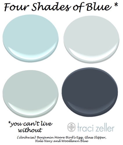
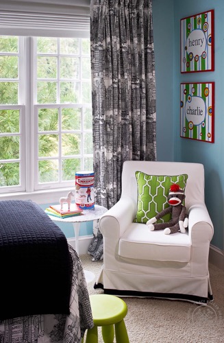
My favorite Benjamin Moore blues are Woodlawn Blue, Hale Navy and Glass Slipper. My twin boys’ room (below) is a variation of Bird’s Egg. I may flirt with other favorites, but I always come back to blue.

Never let painters come to your house the day after significant eye surgery. Most people would consider that common sense, but oh no, not me. I could barely see straight, and I was under doctor’s orders to rest my eyes for at least several days.
Yet there I was, trying to decide if my ceiling color was too light. I called my studio partner Lisa Mende for a second opinion, and we ended up back at the paint store. For the record, it’s also not easy to select paint colors when you are hiding behind sunglasses!
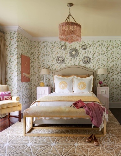
For the second coat, I went one shade darker (shown below). What do you think? I say, all’s well that ends well.

I cannot count the number of times I’ve launched into a “three undertones of beige” lesson with clients. Most people who dislike beige are referring to yellow-beige or pink-beige, but they don’t have the language to explain that. Fortunately, I do!

Navy blue is trendy now, which I adore. White and off-white are timeless. I pray peach doesn’t become popular, because I’m not sure I can go there again. It reminds me too much of Esprit sheets and Caboodle makeup organizers!
With pink or coral, I’m all in, as evidenced by this bold bedroom for a precious little girl (below). But peach? It’s a “no can do.”

I think printed paint chips only exist to make people believe they are making an educated decision on color. Please, please, please, do not rely on the paint chip! Painting a large sample will save you so much heartache. Lucky for you, Maria’s already explained the best way to use those samples! That’s the process I walk through with every client.
Which part of participating in Specify Color with Confidence created the biggest breakthrough/aha moment/insight for your business, and how did it help you move forward?
Because of Maria’s Specify Color with Confidence course, I am more confident in my color selections. I also have the tools to explain clearly why I’ve chosen a certain color – which, in turn, gives my clients more confidence in me. It’s a win-win! Truly, I can’t imagine how different my business would be if I hadn’t signed up for Maria’s course five years ago.
I appreciate Maria having me here today! I hope she’s having a great time in Italy … even if I’m a teensy bit jealous. I’ll be around in the comments to chat with all of you, so let me know if you have any questions. Oh, and I also have a gift for everyone! Click here to grab a copy of my free guide, Can’t Keep Up? 5 Ways to Simplify Your Home.
Which blue is your favourite?
If you’d like to become the next True Colour Expert™ in your area register here.
Related posts:
What Everyone Should Know About Beige


Such a great posting and those photos are all yummy! I too love blue and I’m especially digging turquoise with white!
Thanks so much, Jil! That’s a big compliment coming from you, and YES to turquoise and white!
I just painted my front door BM Woodland green – it is a soft aqua blue – I just love it.
My younger boys’ room is BM Palladian Blue – I love how it is a soft grayed down blue – classic!
Love! Palladian Blue is definitely another favorite of mine; it’s just a bit more green than Woodlawn Blue. I haven’t used Woodland Green before, but I will definitely check it out. Thanks for commenting, Pink Camellias!
Great post,Tracie- I just painted my master bedroom, BM’s Breath of Fresh Air, with white and navy accents in the room and Ralph Lauren blue and White flowered lamps-You can’t ever go wrong with using blues! It makes me happy every morning when I wake up!
I adore blue and white!! Your room sounds beautiful, Kathi!
I have 2 of your favorite blues in my home! Blue has been a favorite of mine for years. Great post, beautiful interiors! Looking forward to checking out your guide to simplifying my home. 🙂
Thanks so much for commenting, Kimberly! I hope you enjoy my guide; I love to simplify and streamline!
Wonderful post Tracie. Blue is also a favourite colour of mine and presently I am playing with formulas to obtain a perfect shade of Indigo to use on an accent wall. As for the colour of peach; once-upon-a-time my daughter’s room was decorated in it (with soft blue ‘n beige) and because ‘she’ loved it, it was only until she left the nest that the colour palette changed. Its location was North-West and she together with the occasional house guest (when we had an overflow to accommodate) all claimed; it felt both calming and serene. -Brenda-
Same color scheme for my daughter, 20 some years ago. It looked beautiful at the time. Her room was the first time I ever had a vision for a decorated room and carried it out so that I could look around the finished room and say it was exactly what I imagined. The sense of accomplishment was so satisfying.
What a wonderful memory, Kay! It’s a gift to be able to envision a room, and you have it!
Sounds delightful, Brenda! I am sure your daughter absolutely adored it. Don’t get me wrong – I *coveted* those Esprit sheets. Ha!
I am also a blue lover Traci. There are a lot of shades of blue in my house including turquoise. I love your 4 shades but confess it is hard to pin down my favourites – there are probably about 10! Great post!
Oh, Jo, I could have gone on and on. Picking a favorite blue is a little bit like “eeny meeny miny mo,” but these are four I’ve used over and over again. After all, I doubt anyone would want to read my post 50+ Shades of Blue I Can’t Live Without. HA! 🙂 Thanks for commenting!
Traci, What a great post! I am so glad blue is back with a vengence. It was missing for so long. There is nothing so elegant as blue and crisp white. By the way, I have been a fan of yours for a long time! Keep up the good work.
Thank you so much, Lucy! Long live blue and white! 🙂
Great post! I love your blue choices. I understand what you are saying about peach. I had BM peach parfait on the walls in my LR, Dining area and hallways in NYC in the 80’s and 90’s with a forest green sofa. It was great for 10 years, that was it. I was fortunate to be in the Color expert class with you. We learned so much and we are still learning. Thanks again and keep posting, I love your blog.
Yes, we did, Ann! We were a lucky crew!! It’s so delightful to hear from you. Thanks for commenting!
I love the pink room. Can you please share the name of the pink paint. It looks spectacular. I too love all the blues you mentioned. I have used the hale blue in my son’s room. It fabulous.
It’s Benjamin Moore’s “Touch of Pink,” Diane. It’s a really pretty one – a warm slightly-coral pink without being bubblegum!
My favorite blue is periwinkle. “Wedgewinkle” is the name on my chip – I can’t remember who it was from. Never getting tired of it!
What a clever, but funny, name; you can absolutely picture exactly what it looks like. It’s a far cry from so many of the non-descriptive names! I’ll keep my eyes out for it!
What is the lovely yellow paint color you used on your bedroom ceiling?
It’s Richard’s Paint 0867 “Egg Noodle.” Richard’s is a regional, but quickly growing, brand, but hopefully you can find a dealer near you on their website – http://www.richardspaint.com. The slightly too light color was 0866 Apple Sauce.
Great post. I never get the blues over blues.
My thoughts exactly!
Traci, how kind of you to reply to each and every one! Wonderful post and loved that these are BM examples, a paint I can actually access where I live.
I’m glad that you have access to Benjamin Moore, Mairi; I hope this was helpful! Thanks so much for taking the time to comment.
Beautiful photos Traci!I also love navy blue- my favorite and you can tell because it is all over my home! Love the pink room also- gorgeous!
Such a perfect post, Traci! You can tell you are a seasoned blogger. You have all the right elements to intrigue and inform and keep us reading to the very end. And I love your services – designer for a day! I’d hire you in the blink of an eye!!!!
I am so sorry you cannot “do peach” again. I love my peach living room. It is a true southern formal living room with mahogany furniture, satin drapes and…yes…it is peach. It is soothing to me and I love being in that room. It is as soothing to me as my blue seaside family room. They give me different feelings. I would not get rid of peach for anything!!!!
I LOVE blues, too! What neutrals go best with Woodlawn Blue? Is Woodlawn Blue a clean color? Thanks!