
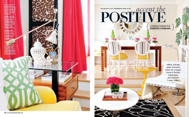
Okay, here’s the rest of the photos inside Style at Home’s colour issue this April! Thanks again to everyone at Style at Home for including me in this issue AND on the cover! Here’s my family room and this post has my kitchen photos.
Here’s what it looks like in the magazine (above).
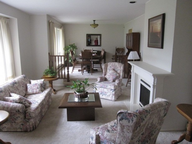
Here’s the REAL ESTATE PHOTO – BEFORE we took possession
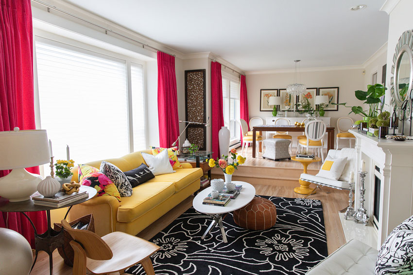
After
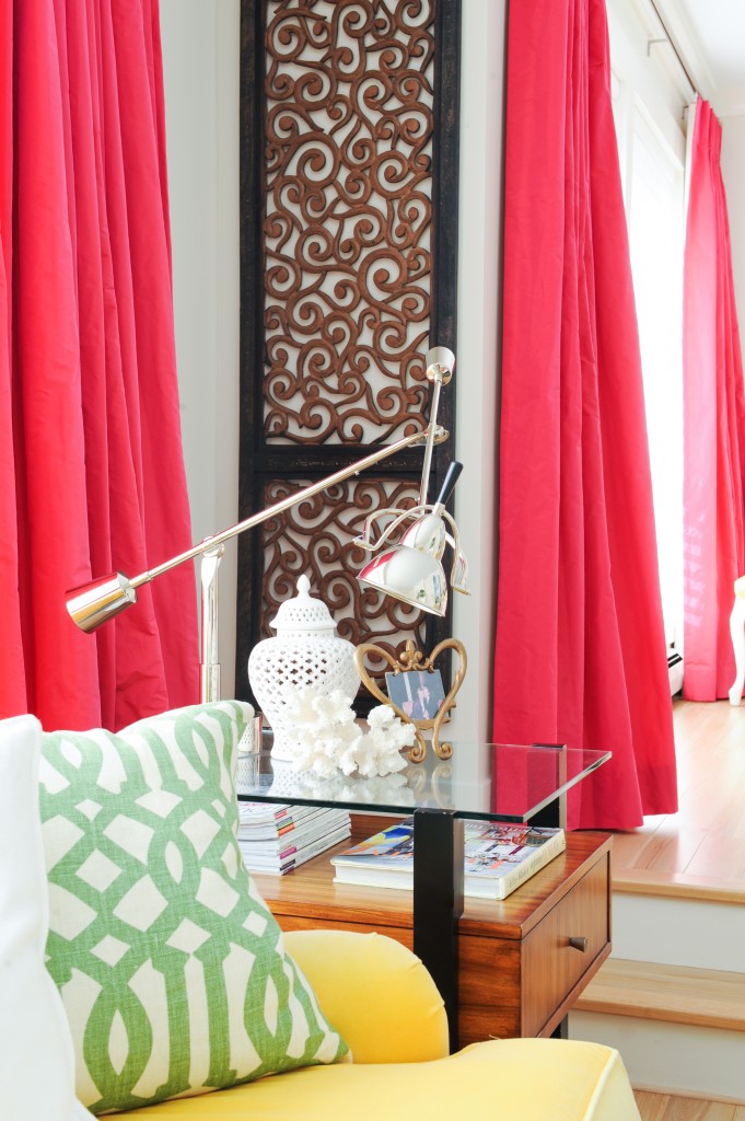
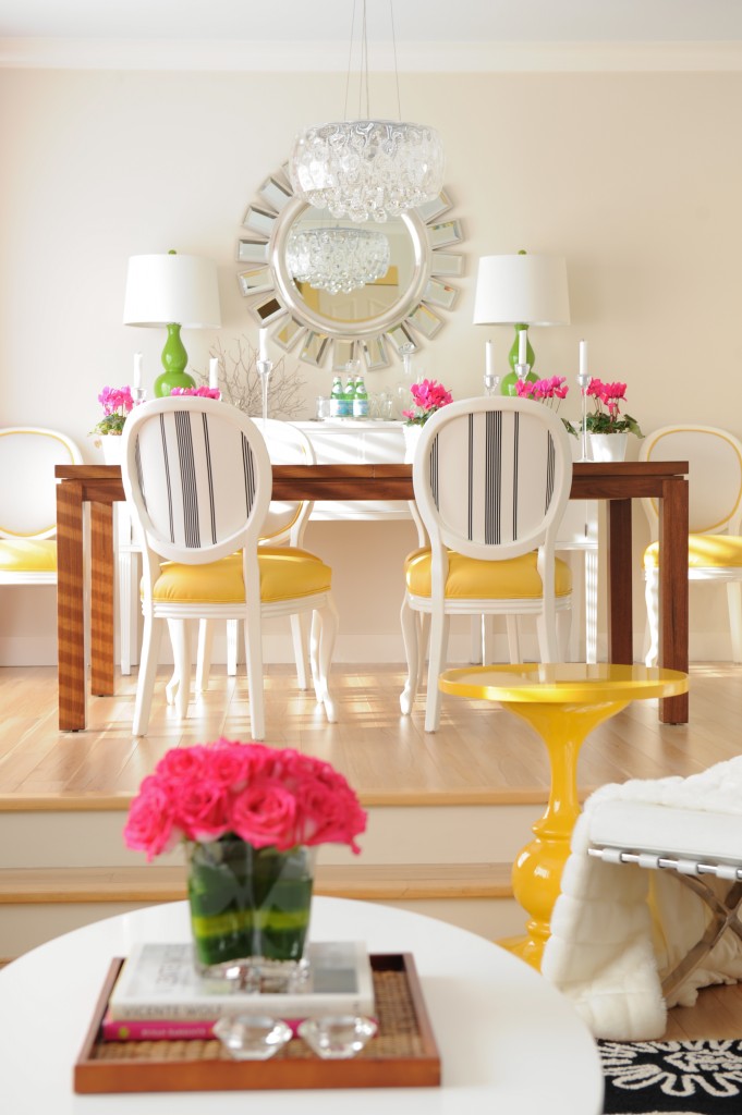
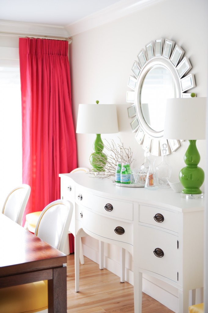
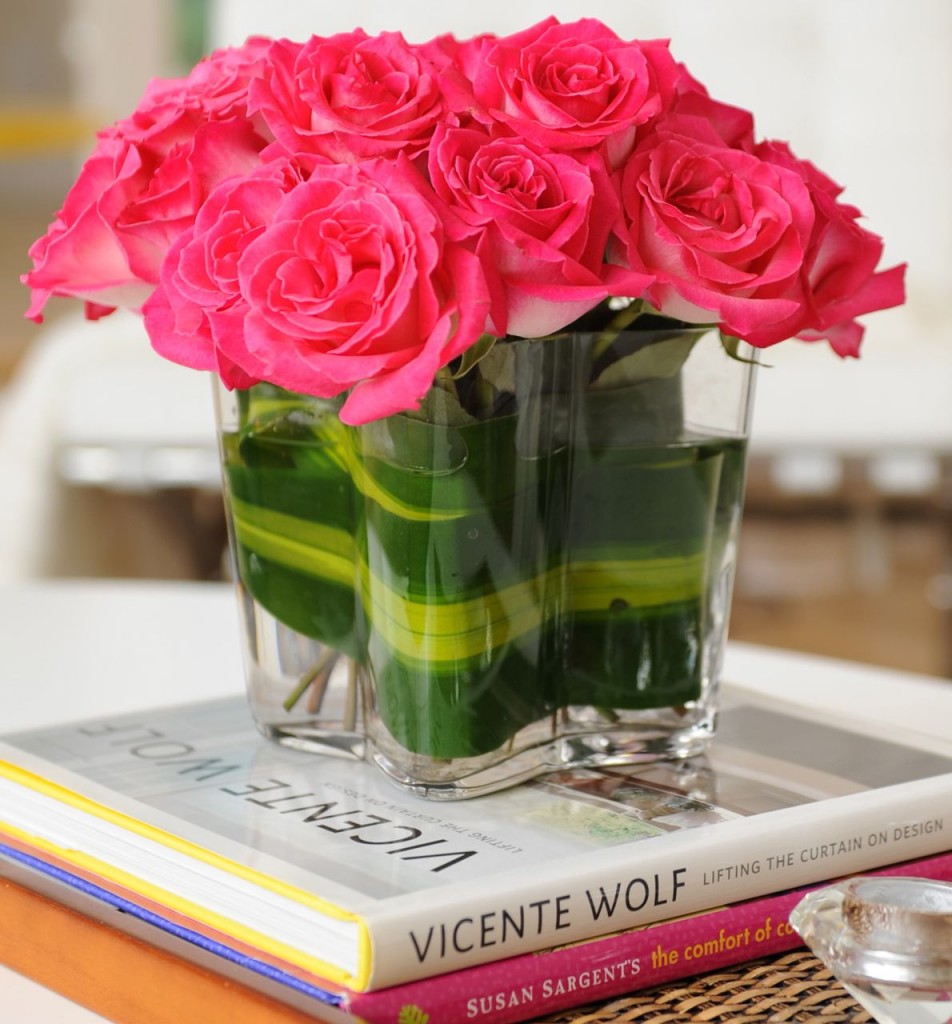
You’ll notice that the raspberry is ONLY repeated in the flowers.
My first choice for drapery would have been green to coordinate with the green in the room. But I couldn’t find the fabric I wanted in the right green so then I thought, white. But that seemed too safe given I’m into colour.
When I decided on the raspberry, I decided to treat it as a colour block and ONLY repeat it in the flowers in the space. So that’s what I did.
Also, because I didn’t have any raspberry in the major pieces of furniture, rug or even artwork, it would not have looked right to only repeat the colour on cushions and accessories.
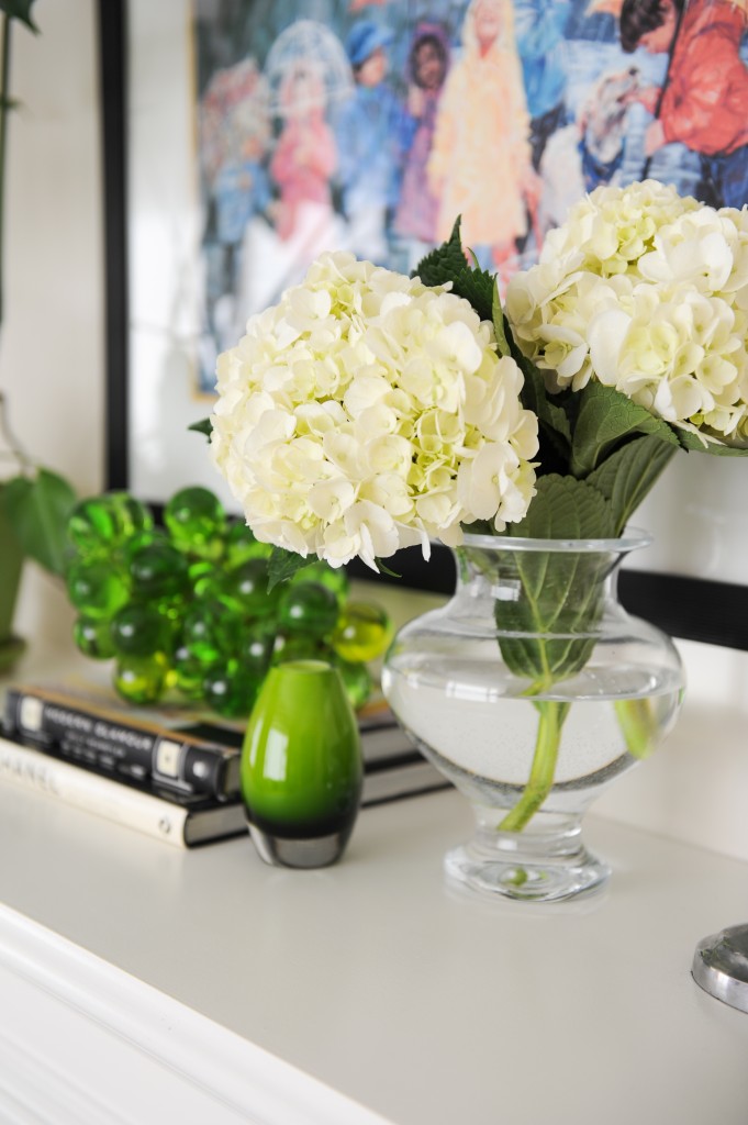
And here are the rest of the pictures:
My tulips are poking their heads out of the ground, Spring is just around the corner, can’t wait! xo Maria
Related posts:
My White Kitchen Inside Style at Home (including the Before’s)
My Family Room Inside Style at Home (including the Before’s)
The 10 Step Maria Killam Colour Confidence Method (#3 is my Favourite)
If you would like your home to fill you with happiness every time you walk in the door, become a client. On-line or In-person.
Download my eBook, How to Choose Paint Colours – It’s All in the Undertones to get my complete step-by-step system on how to get colour to do what you want and to make sure the undertones in your home are right, get some large samples!



Your living room looks great, Maria! Congratulations on the magazine!!!
xo Kristie
Love the light fixture above the dining table. Where is this from? The drapes make the room so beautiful!
The chandelier is from Mint Interiors in Vancouver.
Thanks Mary Anne! x Maria
Love the raspberry drapes/flowers with the yellow and green in the room. Bright and cheerful! Like spring all year round (which we could all use more of).
Hmm, did the magazine choose the pink colored font for the “Style at Home” title to go specifically with your front cover room because of your use of the raspberry pops of color?
It’s so encouraging to look at the before and after and see that anything is possible 🙂 I hope you enjoy the tulips you worked so hard to plant…
Beautiful room! I love the raspberry drapes with the flowers too. You can’t beat a good before and after!
Maria! Where did you get your subway tile? Mfg and color and grout?? I know I need to use subway but there are solo many! Love how your whole house has come together, wow, so bright fun and clean looking. And, not all gray. ; )
Hi Brooke, My subway tile is from Olympia Tile, they carry two colours, white and off-white. Mine is off-white. The grout colour was one of the lightest and it matches.
Subway tile is always installed dead last, when your countertop is in, prop up your samples against the wall as close to the same position as when they’ll be installed. Laying them flat on the counter will not help you choose. When you prop up your finishes as close to the position as possible to duplicate the installation, then you can ‘see’ the colour, and ONLY then.
Hope this helps,
Maria
Thanks, starting over so am lucky to be able to pick everything at once. I may just copy everything you did, how lazy is that? Then I’ll call you so I can add some color some place in the house. We are going on a road trip this summer and will be in Canada, Vancouver. I see a few trips to paint and tile stores in my future… xo
Gosh, why didn’t they show that gorgeous console table behind your dining room table, it’s beautiful. What a truly, truly, perfect room Maria – you rock!
Congrats on getting published, Maria. The room looks great! (tho I would nix the Thai screens which detract from the look and the brown competes with the black rug).
Well it’s kind of like this. When Alexa Hampton’s husband questioned her decorating, she would say “Honey, have I seen your work published somewhere in a magazine?”
So I’ll be keeping my Thai screen : ) : ) the brown relates perfectly to the nearby end table and dining table and the black to my area rug.
And everyone’s entitled to their own aesthetic and opinion.
Thanks for your comment!
Maria
Hmm, that seems a little bitchy, Maria. Wll that be the response from now on when a poster does something other than gush at your brilliance? Great discourse.
Oh no, you didn’t think that was funny? My point was simply to point out that I’m not removing the screen anytime soon. Maria
Of course we got your sense of humor, Marie! You would fit right in with my 3 sisters and I…we are usually laughing the whole time we’re together. Congratulations on getting published! I love reading your helpful blogs, and thank you for answering questions when you can. You are a sweetheart! Blessings!
I disagree with BillP about the brown and the Thai screen. If I just looked at the closeup of the screen, I might criticize it, but in the photo you took, Maria, it’s clear that the screen balances the rest of the room. You don’t have much natural wood furniture in your modern, colorful space, but what you have helps to ground things. I think it’s better to take in the whole of the room–if that works, then it means the details are generally right. IMO, of course!!
I rarely comment on decorating as I am no expert but I have to agree with BILLP – and that is only from how I am looking at it – the screen looks slightly oriental to me and something that would fit more into a balinese type home and its not like the rest of the room. But maybe that is just the way the photo looks and when you are actually in the room it looks different. But you live in the home and if you love it and decorating experts say it ‘relates’ then great, but I do get what BILLP says.
I have to say that I love the Thai screen. I think it adds dimension and defines the rooms more clearly.
The thai screen is necessary to pull the darker wood around the space from the DR table to the wall to the coffee table and the small floor table. By itself it would not fly, but really works in this circumstance. You’ve done the same with all the other colours and it ties both rooms together. I do spy some rasperry/pink in those paintings which further enhance the drapery choice.
I ADORE the raspberry even more than the green. Are they interlined or just lined? Any chance you could post a close-up of the heading and explain your choice? I’m obsessed with headings! :))
This spread is gorgeous and truly an inspiration!
Beautiful room, lovely colours. I was thinking the same… not only that they included your house in the magazine, they even gave you the cover!!!
So fresh and pretty. Loved seeing it all come together. I do tend to agree about the Thai screen though, it just doesn’t work for me, sorry Maria. I love, love, love everything else.
your space is compelling — you are amazing!
The photo’s read: HAPPY! HAPPY! HAPPY!
Love the different levels.
Maria, congratulations! Your room and house are beautiful!
I loved seeing the before and after photos. They really show that you can transform anything into something so alive and welcoming. Great job!
I thought immediately that the Thai screen related to the rug. The positive/negative space on those 2 pieces work perfectly together.
Love the bold use of color! Nailed it!
Love the raspberry drapes Maria, they are an inspired choice. What a lovely room!
If I remember correctly, you painted your laundry room, or was it your powder room(?) raspberry? Great way to keep the flow going through your home. It is so pretty! Style at Home will need to come back to do a feature on your studio space!
So very striking – just beautiful. Who does your flowers?
I arranged them, thanks! Maria
Maria,
I remember when you installed drapes instead of going to Italy–those drapes were worth it!! They are SO beautiful and make the room come alive!
I like the comment that “your room looks like spring” –and after the winter we just had spring look extra wonderful!!
Being published is great. Landing that beautiful cover is AWESOME! Congrats Maria! I love studying how you coordinate color, textures and styles. I wanna be like you when I grow up ;). xxoo L.
It’s lovely, do you ever hang out in there?
What a warm, welcoming room. It must be a delight to come home to.
The Barcelona chairs; the French pleated draperies; that amazing end table! I don’t know where to start…love it all Maria.. Most of all I admire your restraint of well-placed accent objects. What you have accomplished there in a year while managing a busy career astounds me!
I have samples of velveteen upholstery and have been trying to choose one for a settee- a raspberry; a wedgewood blue or a pine green. Like you, I find that if a particular texture is wanted, one can’t assume that the fabric exists. After seeing your draperies and how I wouldn’t need to add more of this colour to the room, I might just go for raspberry upholstery. The main accent colour is mustard…so here goes with colour! (And to think a year ago I was all set to do the white on white everywhere:) -thanks for inspiring us…
Maria, you always make everything look beautiful, fresh and colorful! Love the photos of how you transformed your own home. Congratulations and continued success in your extraordinary journey!
Congratulations! And your home is so beautiful:)
I love the screen! It ‘ Thais’ everything together! And gives some weight or heft …or something. Balance, I suppose. While I don’t have the nerve/confidence to live with that much cheerfulness, I wish I did… and really enjoy seeing it. Congrats, Maria!
Nice Punny 🙂
It is funny, my eye went right to the screen on that narrow wall in between the windows and I thought, genius! Completely relates with your dining table, and pulls the look together. You are a master of mixing colour, texture and creating a happy space that feels like spring. Congratulations on the cover and feature~ inspirational work!
Impressive in every detail. The drapes are magic, love that only the flowers pick up that color again. The close-up of the vase with the leaf filler is wonderful. I miss the black polka dots on the back of your dining room chairs, but I really like PDs. . The scroll screen is beautiful and fills the space and complements the rug pattern in such a pleasing way. Congrats on the mag. spread.
How did you make the space look so much bigger? I love everything you’ve done to your new house.
Love love love your living room- especially the drapes. And the way that you created flow through your rooms with the green, raspberry and yellow. Thanks for sharing it with Maria 🙂
Gorgeous Maria! The raspberry was a gutsy choice but it’s perfect! I love the Thai screen too I also love that you don’t have a rug under the dining table.
A big hug and a pat on the back! So beautiful. Drapes are well worth having nixed the Italy trip. Congratulations!
Total love!! franki
Maria!!! Your home looks fabulous! And the raspberry drapes are like the cherry on top. A good lesson for us all; to add a colour as a colour block and use it sparingly. I would have felt compelled to have raspberry cushions, etc., but your words and photos make perfect sense. The entire aesthetic of your space is serene and at the same time very uplifting! A Bobbi Burgers would look captivating in the space..maybe she’ll approach you!! 🙂 Love the way the flowers are styled. Is it a real leaf under the water?
Absolutely no regrets about Italy, Maria! And talk about eternal Spring and Summer – your cushy, cozy, comfortable winter slippers have probably asked to be put back in the closet even as we speak. The Thai screen is perfect and, though different and unexpected to some, one can easily see the tie-ins to the rooms in your photograph.
Most of all, thanks for the lesson in choosing color beyond paint. I would have wanted green drapes for your room as well, but I can totally understand not being able to find the “right” green. Just because it exists perfectly in your mind doesn’t mean someone somewhere read your mind and produced it. Rather than live with frustration and plain windows, you came up with a gorgeous solution.
Congrats and thanks on every aspect from the sharing of your project with us throughout and all the lessons taught to this display of the beautiful results and this very significant recognition.
What a happy inviting space! You are the queen at combining colors and textures, Maria. I adore the raspberry drapes and pops of apple green against the sunny yellow sofa. Using a black rug never would have occurred to me, but it all blends together gloriously. You have a rare gift!
Great job Maria, I love everything you’ve done with your home. I would not have had the guts to go with the raspberry drapes but find they impressed me the most. Would you mind sharing the source for the end table. LOVE what you’ve done. Congrats on the Magazine spread!
So pretty. I wish I could get inside that head of yours so I can fully understand how you manage to turn a dowdy house into such a beautiful home.
And I must have missed the post on color blocking. I don’t know what that is.
I thought I saw some raspberry in the artwork. The picture of the little wooden stool & the large piece behind it. Doesn’t that floral piece have some raspberry in it?
Did this all start with your beautiful yellow couch? Amazing!!!
This space is definitely a happy place.
My suggestion is to save up some money and consult with Maria. Life is too short for dowdy, and I’m convinced that getting a little pro help can go a long way.
Some of us are engineers, and some of us are artists. You need both to make the world go round. Play to your strengths and hire help for what you aren’t good at.
Maria wrote, “Also, because I didn’t have any raspberry in the major pieces of furniture, rug or even artwork, it would not have looked right to only repeat the colour on cushions and accessories.”
Maria could you explain this a bit more. Why would it have not looked right?
So fresh and Spring-like.
Because it looks too bitty when a strong accent colour like that is only in the accessories and not found anywhere else. I’m sure that rule can be broken, but in this space I felt that it should just be a colour block. Hope that helps, Maria
Absolutely stunning! I may have missed a post, but did you refinish the floors and, if so, did you keep them natural or stain them? This is the wood floor I want!
My flooring post is here! https://mariakillam.com/pravada-floors-how-to-choose-the-right-colour-wood-flooring/ Thanks Patricia.
Fabulous. Absolutely fabulous!!!
love, Love, LOVE IT!!!! The raspberry drapes are THE perfect touch!
Maybe I’m also not remembering a previous post, but now I’m really curious what colour of paint you used in there. Because the realtor photo looks like, well, a griege colour, and your new colour looks the same (i know it’s not, but along the same tone maybe?). What did you use in that room? Also, it’s funny how the light they used in the mag made it look brilliantly WHITE! Fitting since you are the queen of white kitchens I suppose. But I assume it is NOT a white, is it?
I was so pleasantly surprised to be at the airport buying a magazine (I RARELY do that) and there was your home! I knew instantly it was yours, and I knew that you had mentioned you “might be in it”. You were on the cover haha! (I didn’t buy the mag, mainly cuz I read this blog so often! Not sure if that was good or bad!).
Everything in the room is so happy, gorgeous and fun to explore! I’ve been wondering about the paint color as well. Is it a warm cream? An off white? A bright white? Is that why the colors in the fabrics and accessories pop and are so pleasing?
Love love love your style. I’m going to order the magazine today! xoxo
It’s Rice Paper by Cloverdale Paint and I would consider it to be a white/greige. Closest to SW Shoji White. Thanks Lori 🙂
HI Jackie,
You’re right, when I chose the colour for the walls and walked over to hold it up to show Terreeia, it was almost exactly the same colour which was kind of funny because in the context of the old carpeting it looked like a boring apartment beige. It would have been better if the before picture had a bad colour in it for sure. Maria
Where did you get your green lamps? I’m looking for some just like that in a soft blue.
They were from HomeSense. But they have similar ones at Lamps Plus.
Those rooms are so beautiful and cheerful. Raspberry is my favorite color. Love it all. Congrats on getting published. Love the floral print and the wooden stool (table?) in 2nd last pic. Can you please provide a source for both? Also how big is that print (painting?) and where is it located in the room?
Thanks.
The stool was from NOOD. The floral print is from HomeSense, it’s in the dining room on the right side which is why it can’t be seen from the living room pic.
Thanks Maria!
I am so glad that you decdided to NOT pool the drapes on the floor. They are the perfect length-breaking just slightly above the floor- they look perfection. Love the colour too. So many people are “afraid” of colour. I have never quite understood that expression. I know that colour is a very personal thing, however, to fill a home with such happy colour….who wouldn’t want that? I think I would smile everytime I walked in that living room….but then again colour is such a personal thing!
If you don’t mind me asking, where did you get your Barcelona chairs? I would love to get a pair for my office, but can’t buy them locally and would need to purchase online, which makes me nervous since you can’t always determine quality ahead of time. Yours are beautiful and don’t look at all flimsy, so I thought that might be a good place to start if you are willing to share! I love the room 🙂
I got mine in a store in Vancouver that has now been closed. So I didn’t get them on-line, I agree with you!
You can order Barcelona chairs online from many sources. And if you love the look but the original, authentic is out of your price range, you can google search “Barcelona knock offs”. I did this for a client who wanted “the look” but his budget didn’t allow for authentic pieces. Some knock offs are better than others, so be choosy and scrutinize their return policy before ordering 😉
Your home is beautiful!!! I am so inspired by your use of bright, cheerful colors. It is such a happy space. What is the color blue on your ceilings? It is the perfect shade. I am hoping I can find something similar here in the states.
I am so glad I found your blog. I am already a huge fan. Thank you for all the great decorating advise!
Have a wonderful weekend.
Dawn
Maria I love reading your blogs. The white side board behind your dining table I love. Did you refinish it and paint it white? I have one just like it but wood. I would love to get it to look like yours.
I bought it that way from Craigslist of all places. But I would definitely get that kind of piece professionally done. Maria
Maria…I am beyond…your house looks splendid and Tracey did a fabulous job too. So glad Tereeia was also mentioned in the article. About time!
Congratulations on being published in this wonderful Canadian mag! I LOVE the fresh colors and sometimes I think of adding to my mostly white living room too…but not quite yet 😉 Your LR is a wonderful testament of how to use white walls correctly. White walls = unlimited color options = “it all works” IMHO 🙂
I love the way you oriented the dining table with its long side parallel to the wall . In the realty photo I saw the dining area in the pic and the first thing I said was “I’d move the table the other way.” When I move a client’s dining table opposite of how it’s currently placed, they come in and say “Wow! Is that ‘our’ table? The room looks so much better now!” 🙂 Little secrets, big results 🙂
Can I please know where your dining table is from? My dear daughter that works super hard is moving into her new house soon. She needs a table like yours. Thanks in advance. You have done a super fabulous job with your house and studio. Beyond amazing.
This dining table was custom made unfortunately. Maria
Oh My Gosh, this looks beautiful, fresh and happy. Of course, happy! Congratulations. I love the artwork too.
Are your ceilings the older standard of 8′? If so could you tell me what size / height your baseboards and crown molding are? And does room size overall have an impact how big or small they should be? Thanks!
Hi Maria,
Where is your white dining room console from? I am looking for something exactly like this. Thank you!!
I found it from Craigslist already painted white even!
Just wondering what color the white trim is throughout your home?
It’s Artisan White with Cloverdale Paint. Maria
I cannot find your article about choosing hostas. Were they the green and white or the green and yellow ones? I loved them.
Yes here it is: https://mariakillam.com/boringequalstimeless/
Will you divulge the source of the black/white area rug?