Hooray! It’s time to test those colours.
Now that you have my advice for making your home even more beautiful, you need to properly test the colours I recommend. Clear testing instructions are provided on the following pages. If you are uncertain about the colours I suggested after you’ve tested them, please upload images of your testing process to your existing online album and email my eDesign team to let them know. I’ll review them and tweak my recommendations if necessary.
-XO, Maria
Be Sure to Properly Test Your Colours
Always test the colours I recommend as the actual painted board is the ultimate test for accuracy. If it doesn’t look like an accurate match, email me a photo and I will tweak it to make sure the colour is perfect.
It takes a little more work to consult with me this way, but it’s worth it because you’re getting the right colour advice the first time.
To properly test your colours, paint them up on a large board and hold the board vertically against all your hard finishes and furnishings. Isolate the new colour from the old paint colour by placing a white board behind it, so you are not reacting to the combination of old and new colours.
Observe the colours throughout the day to make sure it is perfect. Also look at the colours at night in artificial light but know that light bulbs can be switched to a better light colour.
If you are sending me a photo, take in the middle of the day in natural light. No flash.
Sourcing and Testing Interior Finishes
If you need my help selecting hard finishes, I will be specifying classic finishes and brands that will be widely available at most suppliers. In most cases, I will provide a link to a source, but you may need to source the material from a local supplier. If you would like help choosing a colour for a specific product, you can include a link to the available colours. However, please note, whether it is a product you have chosen, or one I specify, I will ask you to get actual samples of the suggested products and test them according to our instructions since website representations can be inaccurate.
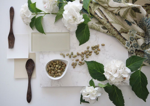
In order to see how the finishes in your kitchen or bathroom relate, they must all be placed in the orientation they will be installed. For example, floor tile and countertop sample flat, paint colour, cabinets and backsplash tiles propped up vertically.
Each element or grouping needs to be surrounded by white. Poster board works well for this.
Please make sure to take the photo in natural daylight (no lights on at all) and no flash.
Testing Hard Finishes
Testing Backsplash with Floor Tile: Place the tiles on white paper in the orientation they will appear and photograph them in natural daylight with no flash.
Testing Countertop with Floor Tile: Place your countertop samples directly on the floor with a white paper underneath it. This way it isolates the undertone visually.
Testing Backsplash Tile: The tiles under consideration need to be placed on the countertop in the orientation they will be installed, with white paper placed behind them.
If you are photographing your counter and/or backsplash tile for me to look at, take the photo in natural light in the middle of the day.
Click here to read the post I wrote about how to properly test backsplash tile.
Testing Cabinet Colours: Always test the colours I recommend. I’m an expert at choosing colour online, but an actual painted colour board is the ultimate test for accuracy. If the colour doesn’t look like an accurate match, email me a picture and I can tweak it once I see your picture and make sure it’s perfect.
It takes a little more work to consult with me this way, but it’s worth it because you’re getting the right colour advice the first time.
To test a colour for cabinets hold a large painted colour board vertically beneath the counter top.
Make sure to place a whiteboard or white paper behind the colour board to isolate the new colour from the old so that you can get a true read on the relationship of the colour to the countertop.
Testing Kitchen and Bathroom Finishes: In order to see how the hard finishes in your kitchen relate to each other, they must all be placed in the orientation they will be installed. For example, floor tile and countertop sample need to be laid flat, while paint colour options, cabinets and backsplash tiles need to be propped vertically.
Each element or grouping must be surrounded by white. Poster board works well for this.
To photograph them for me, please make sure to take the photo in natural daylight (no lights on at all) with no flash.
Testing Carpet Samples: Carpet samples most often come on a big board showing all the colours in the collection.
In order to narrow down which carpet sample is right for your home, paint a large board with the neutral undertone that relates to your hard finishes, and place it, vertically in relation to the carpet samples with a white board behind.
Order larger samples of the one or two carpet options that relate best to your wall and hard finishes colour and check them against your colour board.
It is essential to order larger samples to see the nuances of the carpet colour and undertones accurately. The way to choose the right colour is to compare it to what you need it to relate to.
Sourcing and Testing Exterior Colours
It’s important to properly test the colours I suggest before you paint your exterior.
Get samples of the suggested paint colour and paint it onto a large board that’s at least 11×14”. Hold the board beside any fixed stone or brick you are coordinating with, and isolate them from the current colour by placing a white paper behind the colour board.
Or, if you aren’t dealing with a fixed element on the body of the house, paint an isolated section of your house between a window frame and a corner edge for example to see how the colour will look. Add a white border of paper or white paint to separate the colours. This will help me see them accurately.
Test door colours and trim colours as well.
It takes a little more work to consult with me this way, but it’s worth it because you’re getting the right colour advice the first time.
Sending your photos to the eDesign team
Remember that online photo album you created at the beginning of the eDesign process? Go ahead and add your testing photos to the same album. Just make sure you email the eDesign team at [email protected] to let them know.
In case you’ve forgotten, click here to review those instructions again.
How to upload your photos to an online album.
Taking photos with your phone is the most convenient way to gather the shots we need for your eDesign consultation. However, we will need them to be added to an album on an online photo sharing site that we can access with a public link.
Unfortunately sites like Dropbox have space requirements that prevent us from accepting a shared folder invite. That’s why we recommend using these free sites instead.
All of these solutions work best when you download the corresponding app to your phone first.
Google Photos
- Click here to access Google Photos.
- Click here for instructions on how to upload photos to Google Photos.
- Watch video instructions for adding photos to a Google Photo Album.
- Watch video instructions for sharing a link to your Google Photo Album.