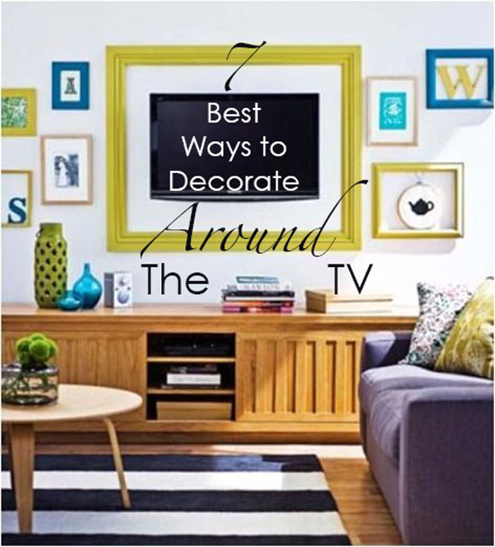
If you’re asking, How do I decorate around my TV? You’re in the right place. I’m sharing the 7 best ways to decorate around the TV in your home. Take your TV from eyesore to chic decor with these helpful tips.
photo via Centsational Girl
How decorate around your TV
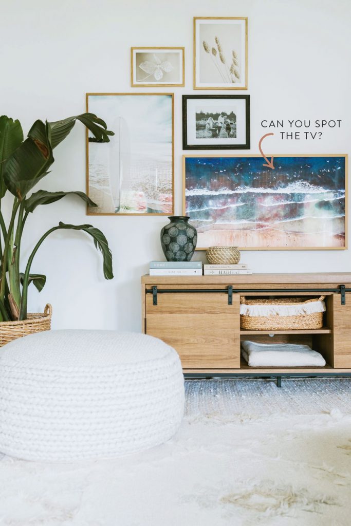
1. The very best way to decorate around a flat screen TV is to mount it.
This way you can really make it look like it belongs up there with the artwork. But if you don’t have a handy husband or wife around to do it, it can be expensive.
The installation of our flat screen TV cost $450!
However, mounting the television and installing art around it makes it feel more like it belongs and less like an eyesore. Does anyone have one of those new Frame TVs (see below). I love how it blends so seamlessly with the artwork.
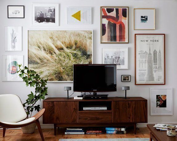
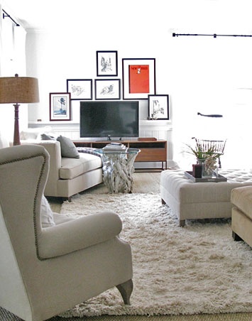
2. Layer art behind it.
This way the attention is way more on the art than on the black object on the console. The best way to do this is to spend some time collecting artwork that you love.
Notice that the frames don’t have to match. You can even add mirrors to fill up some spaces to make it easier to get a collected looking wall faster.
You can search some fun artwork here.
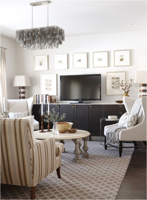
3. Balance the black TV with a black console underneath
Then it will feel more like an accessory. And you can keep the artwork lighter all around it if the black is already repeated by the furniture underneath it.
Repeating something one more time is a great way to get a collected look. It works the same when you want to mix wood stained furniture in your living room so it looks less matchy.
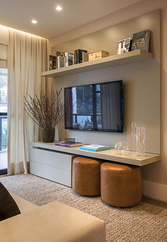
4. This is a good way to make a bigger TV look intentional
And, less like your husband (or wife) won over you 😉
Keep it alone on the wall above the console or shelf and hang another shelf above it.
I love the design of this millwork (above)! I have received many emails from readers wanting to know where it came from. I’m pretty sure it was a custom design!
Notice it’s quite modern, not for every house but works if you have a modern living room.
via pinterest
5. Add black and white artwork to repeat the black of the TV
So many big box stores sell frames and all you have to do is insert artwork or photographs inside them.
You can find them here or here.
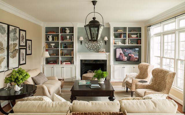
6. Build it right into your millwork, but on the right or left side of the mantle
This way, you won’t get a crick in your neck looking up while you’re watching episodes of Scandal.
I love this millwork design because the focus here is the fireplace and what’s above it rather than the television.
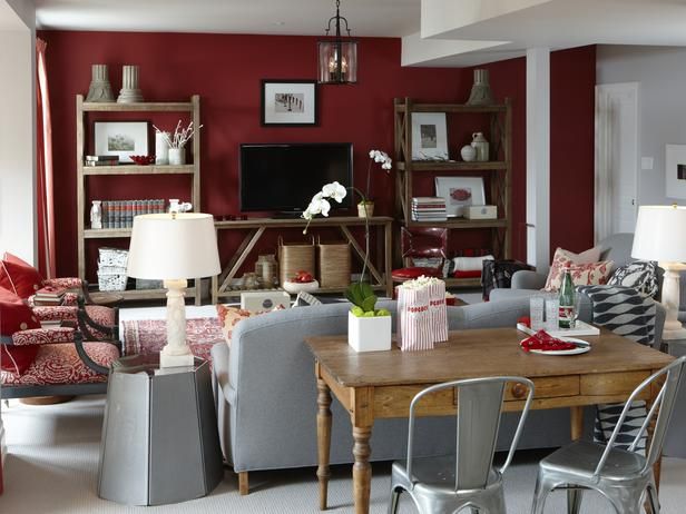
7. On a budget but still want the feeling of millwork?
Open shelving and some styling go a long way to creating that effect. Don’t forget baskets right below the TV to hide cords (below).
If you would like your home to fill you with happiness every time you walk in, contact us! We would love to help you choose colours, select the right combination of hard finishes or create a plan to pull your room together. You can find our fabulous e-design consultation packages here.
Related posts:
How to Hang a Gallery Photo Wall: Before & After
Need an Extra Window Somewhere? Do This Instead
A Shocking Way to Get the Art You Want








Maria, what kind of person does the flatscreen installation? I have a mess in my new bedroom because my contractor just guessed where I would want it, then I had the tv mounted on a swivel bracket, but the outlets are too low and there are cords everywhere. My electrician said it was too late to bury everything because it is an outside wall. I want to scream.
Throughout the US, Geek Squad will install a flatscreen. They charge for labor – you provide the cables and mounting bracket. You also can search for “home theatre installation” for a local contractor.
Thanks, Christina. I will check them out.
I didn’t realize it cost so much to mount a flat screen. We have one mounted in the basement, but a friend did the work.
I didn’t want it mounted on the wall, but I was overruled. It’s probably just a personal quirk, but I am bugged by wall-mounted TVs, no matter how great the room looks.
I always imagine them falling off the wall. I feel more secure with a TV resting on a long low console.
thank you for this post — if only to know that other people face the same problem. no matter how beautiful the room…someone (looking at YOU, husbands) will covet a large, black rectangle that sucks up light and is completely useless most of the time (at least in our house). my dearest wish is to find a solution…something that would work in earthquake country. maybe a beautiful cloth cover — treat the tv like a big canary cage! LOL!
It isn’t hard to mount your own tv. After paying for it once and watching the installation, I was kicking myself for not doing it then. Since then I have done it myself. Buy a kit for the back brackets and get good wall anchors and it is that simple. If you happen to install into the studs, it is even easier!
One option is to banish the TV to a room guests don’t see. My husband wants a big flatscreen for watching sports, and we’re going to put it in the basement room as soon as it’s dry walled. Right now it’s painted cement block, so impossible to mount. I just watch the small old fashioned TV, which sits on a low table under a window in the office. Our new living room was designed to be TV free.
But great ideas, Maria.
the only one i like is #4….
surrounding a TV with a myriad of art pieces is just distracting, assuming you um, actually watch tv!
i personally don’t understand the need to ‘hide the TV’ todays flat panels are sleek and attractive, and should be positioned in front of the seats used for viewing (not off in a corner somewhere)…even the one i like has a dried plant positioned to interfere with the screen….whatever happened to form following function.? having a TV in your main sitting room is no vice
I completely agree! If you are going to watch TV then make it the same great experience you would for anything else in your home – the bigger the better, center wall position, lovely woodwork console underneath, comfortable and good looking furniture for viewing pleasure 🙂
Darlene
Absolutely! When we were raising kids, we never watched tv, but now my husband and I look forward to our nightly binge. My apologies to every designer, but when I install the flatscreen in our living room, it will be the focal point, as it will be the reason to be in there.
I couldn’t even FIND it in #6. Love that idea.
PS I think so much of our “what a house SHOULD look like” comes from values and aesthetics that preceded TVs. At least, that’s true in my case. The TV is something we actually use, and most days of the week. My oven isn’t pretty, costly as it was. I didn’t “hide” my microwave…it’s right out there. These are pretty ways to make the TV blend into the environment. But I have let go of my grandmother’s aesthetics in so many other places, I’m thrilled to let go of this “hide the TV” one, too.
I liked Lauren’s installation. (But I love everything she does!). I didn’t even notice the TV when I first saw the picture. But that may be because the TV appears to be on & I wasn’t seeing a black screen.
And since you asked…we are having a wet summer. But I can’t say it’s been hot. just a little humid.
Great post on TV’s, lots of options to make them make work with the decor. Thanks!! Friend lives in central WA. record temperatures, up to 104 degrees. Stay cool.
These are such great ideas! The art behind the TVs is so beautifully composed that I almost did not see the TVs! I love the ‘console’ under the TV that is like a big, floating shelf with poufs underneath! Very cool!! Stay cool!!
xo Leslie
You can hook up your TV to a computer and have a constantly changing slide show of your own photos or others. Amazon Fire Stick has a wonderful set of images it displays as screensavers. Let the TV be art in the room.
I’m going to throw in my two cents here – first time poster and not a professional. Not even a skilled amateur. But I’m going on 25 years without owning a “real” tv (dont worry, our family does watch a lot, we’ve got lots of computers and tablets in the house, just not the big screen). So that may color my perception somewhat.
Big flat screen TVs are bossy, to use one of MK’s words. Really bossy. When I walk into someone’s house, that big black shiny rectangle is usually one of the first things I see and is almost always just about impossible to ignore. It’s like having a shiny black countertop in the room. The spaces I feel most comfortable in are the ones that work with the big black shiny surface rather than trying too hard to distract from it. (In fact, I think one of the factors contributing to the “gray”/ clear color trend is that it works better with glossy black surfaces than the brown trend did.)
Anyway. Shelf above, shelf below usually looks good, something about having those long horizontal lines, and it provides a place to put items repeating the black shiny rectangle (in the picture above, the blook cover does the trick; also could use BW/photos, wide black picture frames, etc.)
A darker wall color behind the TV usually works wonders too, especially if you are having to stick with a dirtier color pallette. To my eye, a black tv on a white wall just looks heavier too, like it isn’t supported as well, regardless of physical reality. However, in the red wall picture above, the little (by comparison to the tv) white-matted picture looks wrong to my eye, even though yes I see a triangle composition there. A better choice I think would be a wider-than-the-tv horizontal shelf, or maybe to mount the picture off to one side so it doesn’t look like a snow-capped mountain peak.
Basically, balancing the size and shape of the tv is as important as working with the color. Top-heavy and bottom-heavy arrangements never seem quite right. But I do like the deep red color in that room.
One other choice I’ve seen that can work really great in the right room is to just go whole-hog with the “home theater” concept with curtain behind and to the sides of the TV. One friend of mine several years ago converted her mostly windowless too-small anyway dining room into a home theater, using a ceiling mounted projecter and a pull down screen and gorgeous silk curtains that hid an entire wall of wall-mounted wire storage shelving, providing closet space her older house desparately needed. And no one ever could guess what was behind the curtain- paper towels, camping gear, file boxes, Christmas ornaments!
The one thing that never works is putting the tv above the fireplace. I get a crick in my neck just thinking about my in-laws’ living room (sorry!).
We used to have our TV in a separate catch-all room and it was great. I’m not a big TV watcher and I liked that it wasn’t a focus of our small living space. Since the former TV room needs to become a kid’s room, it’s time to move the TV into the living room. Because of other focal points nearby, I don’t thing the gallery wall is going to work for us and I am leaning towards just letting it be there without “disguising” it. Though I am working on how to cover it with something attractive when not in use! Some kind of curtain, or woven piece, or art…
Maria – What about hiding it in a decorative armoire? My neighbor did that, and I kind of liked the idea, except not sure I can find one big enough for our 50″+ TV. So far I like your idea #3 best, black TV on black console. We’ve tried the wall mount idea. The kind we got made the TV stick out from the wall (so that you could angle it), and it drew even more attention to the TV. Anyway, can you comment on the armoire idea? Thank you.
Maria, Good post! My pet peave is a big TV over the fireplace where most people hang it. Nothing attractive to see what normally would be a focal point in the room, and look a black hole. I have seen them framed like a picture and also a remote canvass that roles down in front of it which would be my option if I had the money to do it. Otherwise you could leave it on all day with a travel scene on the TV. Omg how we are in love with the big black box!
I’m on the don’t-disguise-it bandwagon, but these are all attractive options. Hinged artwork, shutters or doors also work. Another way to hide it is behind a wall cabinet — Horchow has two designs, artwork and mirrored -http://www.horchow.com/search.jsp?N=0&Ntt=tv+wall+cabinet&_requestid=21754
Yes, those big black screens can be something else. Can’t tell you how many kitchens I’ve re done so people can see the TV from the kitchen.
I’m working on finishing the rest of house of a single guy whose kitchen I did in 2011. He has a TV in the living room and doesn’t use it. He uses his computer to watch things. But I also did a kitchen and baths for a couple where the husband was a retired electrical engineer and he had a 60+ inch tv that seemed to take up the entire room. Huuuuge.
Practical post and I pretty much like 6 of the 7. #6 with the formal seating arrangement and the TV stuck in the corner is appealing at all. Can’t think of a single seat that would be comfortable to view the TV. #7 is great because there are more mix-n-match components available now that are not only budget-friendly but can be “customized” for your space. The most embarrassing thing about #2 (Apartment Therapy’s shot) is the sloppy mass of cords hanging down behind the TV – absolutely no excuse for that.
I have a 35″ flat black “thing” sitting on the media cabinet in my bedroom. Recently I found a print I love that coordinates perfectly with my bedroom and that’s a perfect size to cover the TV during the day. For me, this post was a reminder to get with it and order the mounted print and, better yet, it’s 30% off if I do it today. So it’s not only inspirational following your blog, Maria; it’s economical too.
While I love design, I value function even more. I have a beautiful French style cabinet that I bought on auction. It fits my tv and provides a beautiful, unique focal point in my room. When we are done watching tv, we just shut the doors! It seems like this used to be a popular solution, but I don’t see it done as much any more.
Great ideas. Saw a documentary on a NY penthouse built by a wife of now deceased TV mogul (so needed a TV in every room). Her bed had a lift built underneath that raised a 60″-er from under the foot of the bed! An engineering miracle! LOL!
Geek Squad only charges $100.00 to install my flat screen in Las Vegas. That included hooking it up to the Blue Ray, speakers and my sound system $450 is outrageous. They may charge a little more in other cities, but not $450.00.
When we bought our 55″ TV at Best Buy a few years ago, that’s what it cost then too — but we did it ourselves.
Clearly I live in the wrong part of the country! That is so great! Maria
Its starting to get hot here in Austin Texas. Been in the 90’s
but the heat index is 100. If your coming to Houston Maria
you should come in the winter……the weather is waaay better than the summer heat here!!
Love the wall unit in Number 4 I’m wondering if that is
from Ikea?? Its gorgeous and yet so simple with drawers to
hide all your stuff.
Glad you posted this article the TV is always a problem
area. Thanks!
Long explanation (sorry) — with an old house there is no family room or alternate place for a big flat screen so it had to be in the living room, but the way it was configured there was no wall space that would accommodate the TV and be within reasonable sight lines of seating. Hanging it over the FP was a non-starter — it’s way too high for comfortable viewing and I hate the way it looks.
Across from the fireplace was a 64″ opening with double french doors. So our solution was to close this off and build a wall, then cut into the existing wall at the end of the room to create a new doorway (narrower at 48″, still with double french doors). This also gave us more wall space in our entry hall (other side of the new wall where TV now hangs in the LR) so we built a shallow floor to ceiling bookcase there.
Building a new wall where the original doorway had been allowed us to design a recessed area for the flat screen. Since a flat screen ordinarily protrudes a few inches from the wall, this modification allowed us to have the surface of the TV almost flush with the wall. It’s surrounded by pictures and the whole effect is quite harmonious. A loveseat and sofa face one another and you look in one direction at the fireplace and the other direction at the TV. These changes also required a big reconfiguration of speakers for the home theater set up. We eliminated wall hung effects speakers and added some in the ceiling.
We are very pleased with how it came out. And I’m not ashamed to say we like to watch TV, though in the summer we mostly stay outside well into the evening and viewing goes way down.
I chose to repeat the black and rectangular shape with black pillows on thesofa and a huge blackboard (for my son to play -win win) in the opposite side of the room. It kind of makes everything intentional and the black screen doesn’t bother me that much
The nicest installation I ever saw was in a showhome in Arizona. The (very large) wall was framed out on both sides and above to give it some depth. The “frame” was perhaps eight inches in span and maybe six inches deep. The designer then mounted lattice work (big squares) within the fram and installed the tv in front of that but all of it was stil slightly recessed within the frame. Below the tv there was a large (much wider than the TV) floating sideboard. The style was mid-century modern. I think what maked the wall mount really work is recessing it within the frame. It was actually quite stunning. Wish I had a picture to share.
Elisabet’s comment re: black flat screen driving the trend to gray and clean color–away from brown–is an interesting idea. We used suggestion #3, black console, and it does work! Just never thought about “why”. I pinned #4 as an idea for another TV (thanks!)… Yes, multi-media home.
Enough about the TV. I don’t find it the problem. The problem is the components! The PVR, the receiver, the DVD player etc! The photos look good but only half a picture. All these components need to be controlled by remote, so they can’t be hidden. This is not a realistic post.
I love, love, love the #4 photo. What a smart idea to even include extra seating. What kind of wall is the tv mounted to? Also, is the console below custom built?
I assume the entire unit is custom millwork yes. Hope that helps, Maria
Put it in a cabinet where it pops up to watch and down to disappear. Or what is getting more popular here is to have it drop into the level below.
I’m surprised you didn’t mention the top advice I always here, to mount it on a dark background. I’m thinking navy blue grasscloth for mine. I like the modern example above but I have my heart set on a mid-century tv stand below it.