The look of 2014 is fresh, polished and happy.
{Click on images for source}
1. Oversize Pendants over Kitchen Islands
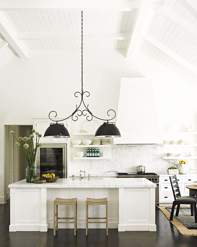
This kitchen by Jeffrey Alan Marks inspired this entire post, I fell madly in love with these pendants. If anyone knows where to find this light fixture, please include the link in the comments.
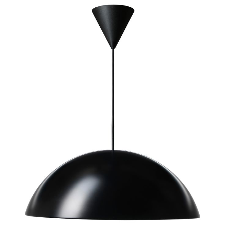
Here’s a less expensive version (well not exactly the same) from IKEA. It also comes in white.
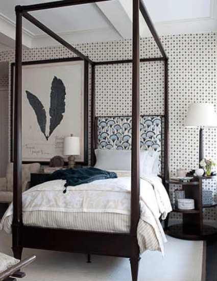
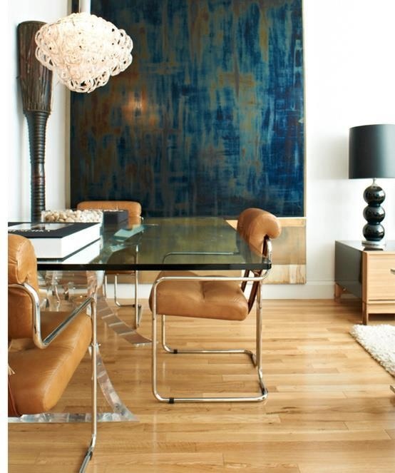
2. Navy Blue.
This colour is hot, hot, hot. I’m seeing it everywhere, I’m specifying it all over the place these days and I especially love it with camel tones. It’s crisp so it looks good with grey but it’s just a little softer than black.
3. Chevron.
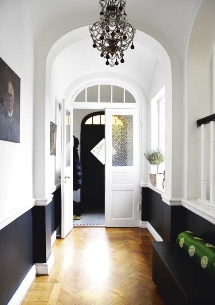
Haha, just kidding, you can’t throw a stone without hitting something in a chevron print these days. However, as much as we all like to scream ‘IT’S OUT’, it’s not going anywhere anytime soon. I love in hardwood floors and it’s almost a replacement for a stripe. Okay it’s herringbone in this floor but they are pretty close.
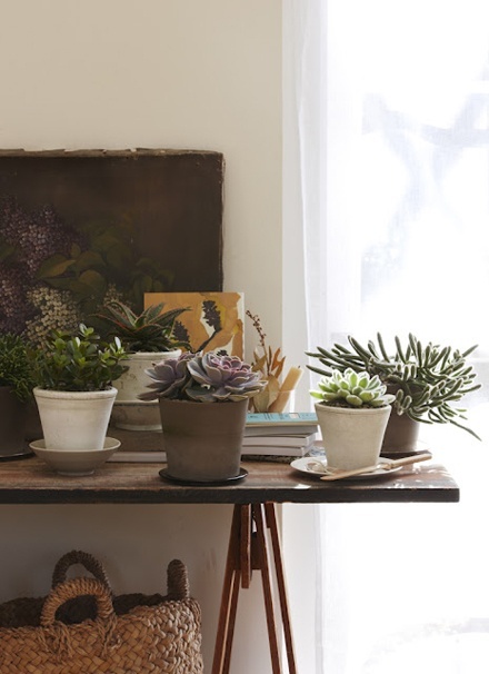
4. Houseplants
Trendy you ask? Yes.
And don’t say you don’t have a green thumb, as I read in this fun book which inspired me to run out and buy even more for my house:
“Plants are like pets, if you don’t water/feed them, they will die”.
Green on your coffee table, island in your kitchen or sitting next to the bathtub in your master bedroom is as imperative as the air you breathe. And now that Christmas is over and all the sparkly lights are gone, we need green more than ever.
5. The 4-Hour Workweek
This so-awesome-book that I am only halfway through, is a must-read for anyone that wants to break out of working 9-5.
My favourite quote so far and how I want my business model to go is this one:
‘The factory of the future will only have two employees, a man and a dog. The man will be there to feed the dog. The dog will be there to keep the man from touching the equipment.’ Warren G. Bennis, University of SC, Professor of Business Administration; advisor to Ronald Reagan and John F. Kennedy.
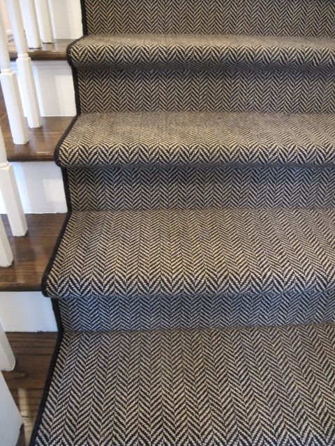
6. Staircase carpet that coordinates with the entry not the beige-on-beige carpet in the rest of the house.
Does it not make sense to pick something that the kids won’t trash in 5 minutes like this one (below)?
The rest of the carpet upstairs can be something lighter and neutral because after all, it needs to work with countless bedrooms, perhaps an office, or maybe even a playroom, but consider stepping outside of the box and choose something darker and patterned that will really make your entry sing. Since that’s where the stairs usually are.
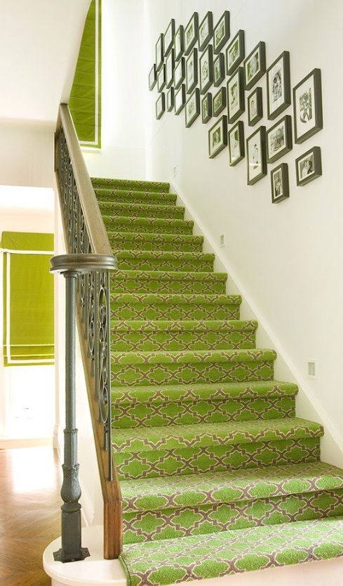
Here’s another one that I thought was so great:
Does it need to look like this for the rest of the upstairs? No. But it sure looks great downstairs.
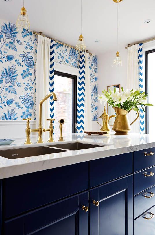
7. Gold.
Faucets, lighting, frames, accessories. . . the list continues.
It’s back, but of course it looks nothing like the shiny brass of the 80’s, just in case you were under the mistaken impression that you could leave those doorknobs and 80’s faucets as they are now. NOT.
And notice, we have a chevron print here, navy blue cabinets and gold. Three trends all together in one space. Beautiful. Sarah Richardson does it again.
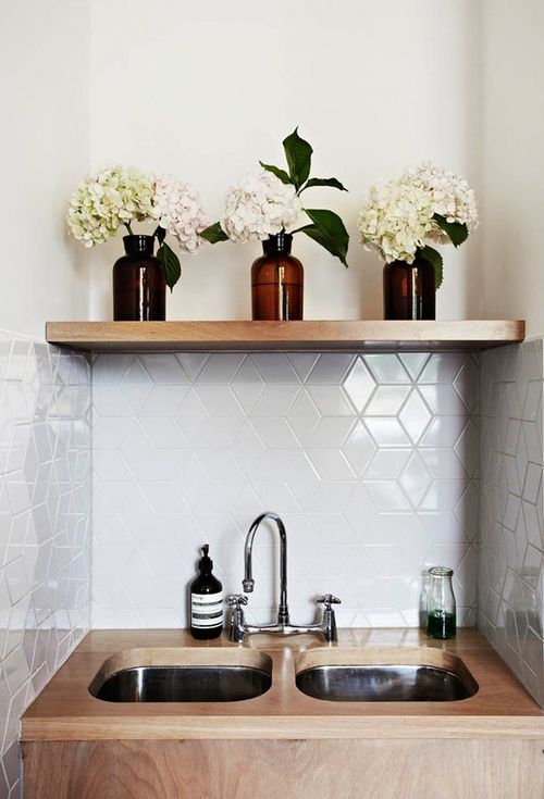
8. Geometric backsplash tile.
It’s the latest and trendiest, but my advice would still be to keep it white, cream or at least a solid colour (below). Patterns like this or this, I’m afraid will be OUT, OUT, OUT before you know it.
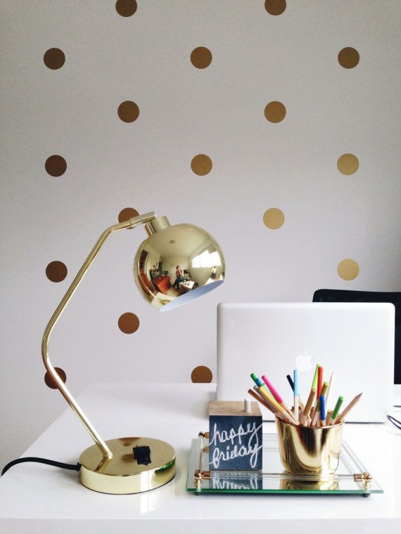
9. Vinyl Wall Art Stickers
Such a fun and easy way to transform any space!
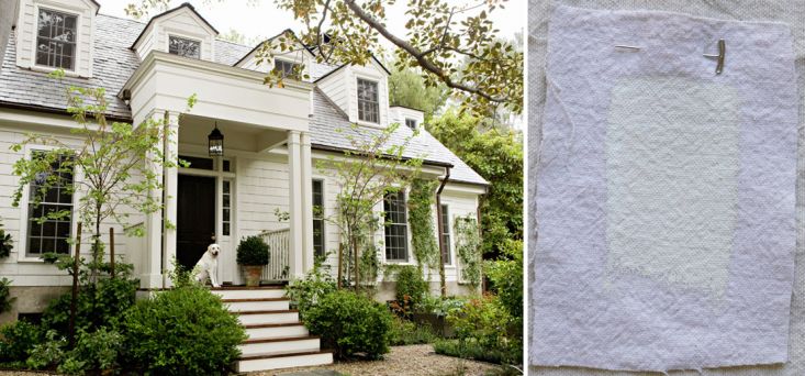
10. Creamy Exteriors.
I have never specified more light and pale exteriors than this last year and I’m sure that trend is here to stay.
Which one is your favourite?
Related posts:
The Hottest Trend Colours in 2013 from Palm Springs
I Don’t Follow the Trends. Is this You?
Trend Alert: Gray is Getting Cooler, Yay or Nay?
If you would like your home to fill you with happiness every time you walk up to the front door, become a client. On-line or In-person.
Download my eBook, How to Choose Paint Colours – It’s All in the Undertones to get my complete step-by-step system on how to get colour to do what you want and to make sure the undertones in your home are right, get some large samples!
If you would like to learn how to choose colour with confidence, become a True Colour Expert.




Maria, you are so on with everything! Always love reading your latest posts, you have inspired me so much to make my house a nicer place to look at inside (after all I am in it all the time as a stay at home mom!) I only wish I had started reading you when we first bought it! (But next one I think I will have to consult you from the start so I will be truly happy with it!) By the way one of the December covers of HGTV magazine with the Christmas tree on it- it looks like they seriously copied your tree style on the cover!! You always know and post the best stuff before anyone else. But thank you for being so inspiring and always telling it like it is!
I am in no way a designer (not blessed with the creative gene) but love design and consume a lot of blogs and I have to say this feels spot on to me!
what?? no radiant orchid??? !!! Joking.. phew!
LOVING your forecast!!!
Ivy
I love your forecast! I am about to put navy toile wallpaper in my powder room and I love how Miles Redd stains chevron wood floors in alternating dark and light, though my hardwood is just plain straight lines.
Loving navy/indigos with whites! Not a fan of chevron, BUT in flooring. I had it in the apartment we rented in Paris and the patina of the wood and the pattern were stunning. Would love it down my very long hallway! Fun post Maria! Happy New Year to YOU!
I think that is technically a herringbone floor, not chevron. Chevron would have mitered boards that meet.
Haha, I live like they are the same. Maria
I am sure that all these trends you “made-up”, Maria, will prove to be the right ones… I love navy blue (I just color-blocked a portion of a wall behind a sofa), love the new gold (incorporating it as we speak in my own house), and as for chevron… let’s just say that I am probably the only person on the planet that still loves it. I continue to incorporate it in my designs, because I think it’s a classic. We abused it lately, it is true – but look at that beautiful floor! I am happy that it is on yours and Sarah Richrdson’s list 🙂
Oh, I love navy blue and that creamy exterior!
Hi Maria. I have blue cabinets (starry nights beauti-tone), but after 3 years they still bug me…something is wrong. I think the blue may be too clean of a color as it seems to fight with colors in an adjacent space (open floor plan) that has an orange brick fireplace, BM jute walls, a open stairwell that has one wall painted BM northern fire ( red paint extends from 1st floor to 3rd floor of my split level home). The blue is clean while jute and northern fire seem dirty.
Is there such a thing as a BM navy that would play well with dirty colors? I think a slight adjustment is needed for my kitchen cabinets ( counter is a light grey marbled laminate). Can navy be dirty without looking drab and dull?
I would also like to know the answer to this question.
BM Hale Navy is not a ‘clean’ navy but here are lots in the Preview that would read as bright and clean instead of muted for sure which is probably what you experienced with the Beuti-tone blue. Maria
I was going to use BM Van Deusen in my kithen, but at the last minute knew that Hale Navy was better. I love it and you’re right that it is definitely a murky colour. It goes great with the warm greys but I also used Simply White for the wainscotting and trim and accents in the room just to brighten it up and match my white cabinets, and no issues. I did use the Van Deusen eventually in my boy’s room and find it too “blue”, not navy. I can’t wait to add something in his room like thick stripes in a warm grey or something to mute it. I love Hale Navy and ended up putting it on accent walls in my room and the guest room. Didn’t go great with Cloud White because too much of a contrast from wall-to-wall. I’ll need a darker colour in there to make it work. Wainscotting in the kitchen didn’t have that problem.
Hi Nicola,
I have BM Flint in my house paired with dirty colours. It’s quite dark, almost more charcoal than blue, but it is one of my favourite colours. It’s in the Aura paint deck. Your home sounds lovely!
I have seen Van Deusen Blue in some pretty rooms on the Benjamin Moore website. I have only used it on a front door, though, not inside yet. Have you seen pictures of Miles Redd’s dark blue cabinet kitchens? He uses a Farrow and Ball colour but I think Van Deusen Blue is close.
I posted above this about Van Deusen/Hale Navy. I don’t like VD as I find it to not be navy, but dark/royal blue. Definitely go with Hale Navy for true navy. I know F&B well and would say they are close to Hale Navy but they have a lot more green in their version.
I agree with you with navy! Love it and want to use more in my house. And I have bought a few houseplants this past month – i am a step ahead I guess. I kind of jumped on that chevron bandwagon and now am so tired of it. I am craving more classic chintz and oversized florals! Looking forward to seeing what trends reveal themselves this year!
Lots of good stuff ahead! Just a point about the hardwood floor pictured-easily confused, but that is actually a herringbone pattern (not chevron) 🙂
Maria, these are all lovely. I recently disposed of my boring beige (not pink beige ha!) stair runner and added a gray and tan runner in a chevron print. Also, last year I added a chevron wood floor in my den. It is the best looking room in my whole house. As for houseplants, I will to find some that I cannot water to death! I think the really light colored exteriors are a little boring, but to each his own.
My new navy velvet sectional is gorgeous in front of my Revere Pewter walls. Maria’s suggestions during my consult we’re followed to the letter, and it al works beautifully together. I just put up my gold framed pictures on the wall behind the couch, and they look great with the navy sofa, too. So happy with the transformation of the room!
Tamara, I’m building a home and have chosen Revere Pewter as my “main” color and love navy and was wondering how to incorporate it in the LR. Navy velvet sounds so tempting!!! And here I was just thinking accessories with the blue and your post just might give me courage!!! Thanks!
The one and only goal I have on my list for 2014 is to paint our dining room chairs navy to match the banker’s chair I painted in navy in our adjacent family room (http://gracie-senseandsimplicity.blogspot.ca/2013/09/hello-blue-chair-hello-white-bench.html). I’m just so ahead of the curve! Great list and much more likely than the purple Colour of the Year nonsense.
I have been waiting several years for navy to make a resurgence. I have been wearing navy for 4 years or so. I agree; it is the softer neutral. So happy! As for plants, I just looked at my dining room table yesterday and thought ” I need to buy a plant for that table”. It isn’t a table we eat at often so I think I will get something over-sized and very green! Love your blog!
The fun is seeing “validation.” I do this, too, with design material…”ah, ha, that’s just what I did two months ago!” 🙂 The b/w carpeting on the steps is just what I used in our son’s room ten years ago…”ah, ha, I still luv it!!” franki
I would still stand by your classic choices Maria! I love all your picks but the carpeting on the stairway. I spent 10 years trying to alternate where I would walk up the steps so the wear would be even. Just plain wood steps is the way to go. Maybe the trend could be decorative risers. I painted contact paper and stuck it on each riser so if I tire of it I can just peel it off!
Wonderful Post Maria.
I love your predictions and they ring true
with me.
Michelle
I moved into a new home in August. It had wall-to-wall forest green carpet and shades of brown paint in every room – even on the ceiling! I bought a navy/cream stripe area rug for my new wood floors; bought antiqued gold cabinet hardware and put splashes of green throughout the house by using plants as accessories. I feel so validated by your post, Maria. The days worrying that my plan for house wasn’t going to come together are long gone. 2014 is going to be a great year for design.
I so look forward to your posts and your trend forecast didn’t disappoint. You are awesome, Maria.
Sorry Maria but I have to disagree with you about house plants being trendy.
My mother always had them & I have had them since my first apartment in the 70’s. They were in macrame hangers. Now that was trendy! HA!
‘Fraid the two size-of-Texas fluorescents in my kitchens WON’T be replaced with oversized pendants. Admire the navy, and Tamara’s velvet navy sectional sounds WOW, but with 3 white cats, it wouldn’t be navy for long in my LR and doesn’t call my name otherwise. Have always liked chevron and think it really is classic; think when it became “trendy”, it got overdone and now trenders are tired of it. Re whether the floor is actually herringbone, found this post which nicely explains the difference: http://www.remodelista.com/posts/chevron-and-herringbone-spot-the-difference; crave plants but with Mei Mei who loves pet grass, is a jumper and will even try to sample the faux plants, I have to be so very careful. Don’t have stairs but would almost frame and hang the pic of that gorgeous green one. And the finale – that creamy white house with the creamy white dog and all the gorgeous greenery. Can I at least spend the week? Fun post, Maria, and thanks for asking for our favorites – it’s fun to read everyone’s comments as well. Let’s be sure to revisit this one at the end of the year.
Love both carpets on the stairs. I have hardwood floors throughout the house including the second floor bedrooms. I use area rugs and have painted a runner going up my stairs. But those colors and patterns are gorgeous. Ah, so many choices and so many ways to decorate. I would redecorate yearly if that were feasible.
I have been using “houseplants” for the longest of time because to me they add life to a room. Unfortunately, for me though (and I will probably get more than a slap on the wrist for this) I have to use the “everlasting” (not plastic) variety in beautiful containers
because of our 3 cats.
Love the “new” gold, navy, chevron, patterned carpets, etc. I’m with you all the way.
xo
Yippee! I’m on trend 🙂 I deliberated and deliberated, but finally bought a replacement slipcover for an old PB sofa in their new navy!
A favourite? How could I pick just one of these 2014 trends! I love navy…just blogged about it…so if I could be cornered into choosing navy as my fav; however, I love creamy exteriors, chevron pattern, and the stair carpet idea is brilliant. I’ve pinned the houseplant book, and after browsing through Thomas Hobbs in Kerrisdale recently, want to create some beautiful living art with plants and pottery. Have a great day!
I have always loved herringbone wood floors. They will never go out of style for me – sort of remind me of Paris.
Do you have a source for that herringbone stair runner? I need that in my life!
So fabulous! I have been madly in love with so many of these things for a long time. I especially love oversized lighting, navy and herringbone/chevron floors and on fireplace walls–classic and timeless. Thanks, Maria!
Woot woot! My navy and camel from the mid nineties is still a GO! I had already deleted the bright shiny brass fixtures, though I may or may not still have a few of those pesky doorknobs around (on the list to delete for 2014 though). Maria, what are your thoughts on toile these days?
If you watch Netflix’s ‘House of Cards’ you will see all of the next trends that are so classic. I include fashion as well as decor. The sets are fabulous.. Washington townhouses and a NYC loft (urban industrial). But the palettes are muted blues, navy, grey, charcoal, black, cream, mixing black with navy AND just try to take your eyes off of Robin Wright’s character, Claire.. her palette and style are going to dictate what’s coming in homes and closets, especially after the new season starting in February. I just binge watched the whole first season.. OMG!
Linda I enjoyed the set decor as well, lol. I would watch with my husband only to be entertained by the fashion and home decor.
Loved what Sarah Richardson did in #7. She ALWAYS knows what she’s doing.
Just replaced our front door with one in navy, inside and out. Picks up the navy in the birds on the Thibaut wallpaper in the tiny entry and looks fabulous. I have some bare surfaces to decorate and ordinarily avoid plants because of my black thumb (pets ask for food and water, but plants don’t–until you notice them drooping and it’s too late). They would look wonderful though, so maybe I’ll spring for some. Thanks, Maria!!
The quote is by far my favorite!
On the decorting side, the like the stairs the best. Seems like an overlooked area that can be a WOW. I have a staircase that goes up and another that goes down immediately off a small landing at my front door. I have considered doing something with the stairs up to the living room for a while now…a project for 2014.
Hi Maria, happy New Year-I was trying to do some research on those fabulous pendants for you and came across this in Jeffrey Alan Marks book, The white on white story is brought to life by the dramatic light fixture,which is a conglomeration of found objects, so I am guessing its custom and not sold anywhere!
All of these are great. I still don’t think I’ll specify the gold faucets. They look lovely, but I don’t think they’re a trend that is going to hold up to the test of time. I also didn’t think the oil rubbed bronze faucets would last either. However, you never see the chrome or brushed nickle losing favor in the trends. But I can completely see the gold working for cabinet hardware if you really want the warmth of the aged gold look.
I prefer Chrome for durability. Always cleans easily compared to other faucet finishes….
Yay! for cheerful stairs (carpet or patint)! Love when people paint them different colors too!
oops, that’s PAINT, not Patint
Can you tell me where to find the cute vinyl wall stickers? Thanks! Debby
Just click on the image and it’ll take you there.
Glad to see that gold is back. It never went ‘out’ for me. I love antique brass lighting, faucets, accessories, etc. It brings such warmth and depth to a room. I think all of your predictions are right on target!
Oh boy I laughed Maria when you mentioned houseplants sitting next to the bathtub. Way back in the 80’s when houseplants were a “hot trend” I perched a lovely fern on the edge of our bath. It was doing really well in the humid environment & my DH was just tolerating it until one night he decided to have a soak after a hard days sailing. All was quiet until suddenly the house was filled with yelling and cursing. Fearing the worst I ran into the bathroom & found DH sitting in the tub (eyes blinded by shampoo) with the fern, broken pot & what looked like half a ton of potting mix floating all around him in the water.
I don’t think we’ll be doing the “houseplant in the bathroom” trend again!
For our 10th anniversary (back in 2001!) Hubby and I stayed a night at a bed & breakfast called Tara’s in western PA. We were in Rhett’s room (yes, as in Gone with the Wind), which was very masculine with dark mahogany woods and navy and deep plums. It was a beautiful, rich, relaxing space. Blue is not normally a color i gravitate towards, as i prefer greens and warm oranges and yellows, but i have always thought that someday i’d like to do a room with those navy and plums – maybe a den or library space! Much more inviting than blacks.
Does anyone know when Sarah’s House on HGTV is returning?
They have a very similar light fixture at http://www.lookintheattic.com.
I really like some of the vinyl decals; but I always wonder if other people think they are tacky or too pedestrian. Not many comments on the vinyl -positive or negative. Just wondering what everyone thinks.
I used some “beachy” vinyl decals to cheer up some ugly backsplash tile I have in my kitchen until I have a chance to change it. Now I see the starfish/shells, etc and smile instead of noticing my ugly tile. For renters decals are easy because it’s not permanent. I think it’s all a matter of personal taste….
Question: Under chevron you show the herringbone floors, but on your pinterest trendy not timeless page you show herringbone floor tile. We were thinking of laying tile flooring in herringbone. Yes or not?
Haha, now that I know the difference between herringbone and chevron, I would avoid chevron but lay it in a herringbone pattern yes.
Maria, On carpeting stairs, would you continue the stair carpet onto the landing at the top? Or change the carpeting choice at the top stair so the landing carpet matches what’s in the bedrooms?
I love that you included Tim Ferriss’ 4 hour work week in your list! How unexpected (but awesome) in a list about home decor trends. The world has changed a bit in terms of how to implement such a strategy, but more than 5 years on, the ‘why’ that the book proposes is still relevant. There are some great podcasts out there which are great follow-ons from the book. I recommend The Fizzle Show and The Foolish Adventure.
Oh, and the rest of your list is pretty spot-on too! Per your suggestion, I’m going to try to not get too carried away with geometrics this year 🙂
I am LOVING the gold fixtures in the kitchen…but, what color would appliances need to be? I’m guessing not stainless steel?