Perfect.
I’m on board.
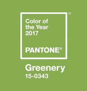
This green evokes the first green of Spring. It’s about regenerate, refresh, revitalize, renew. That’s the news from Pantone.
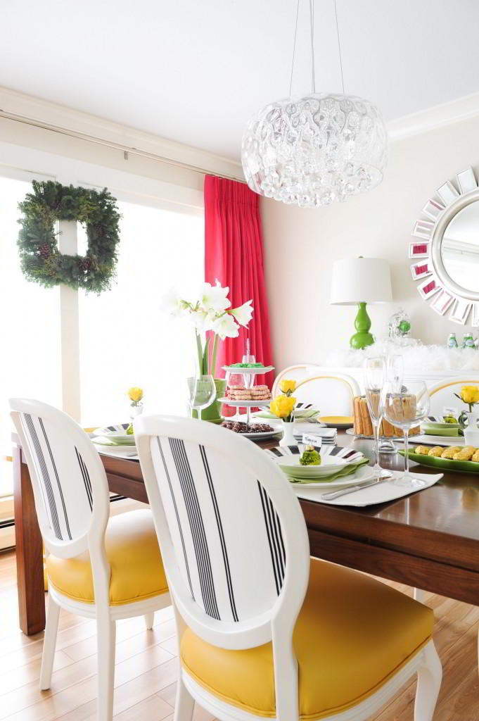
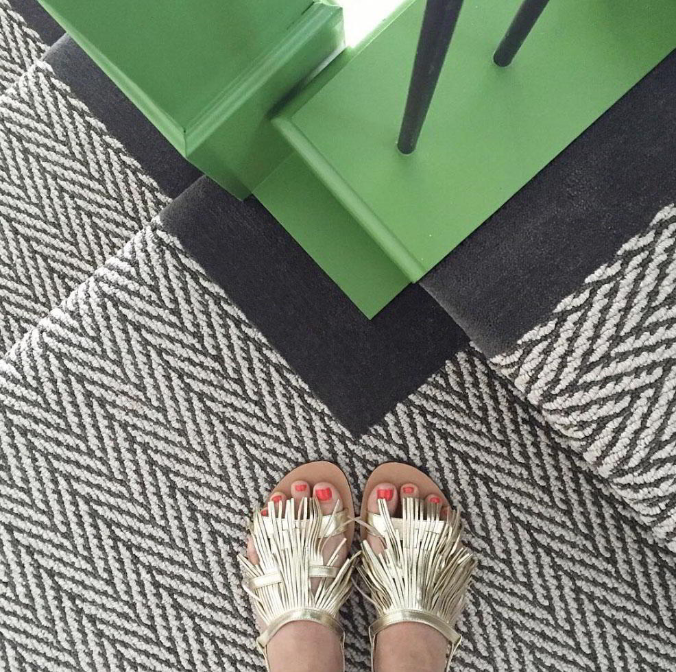
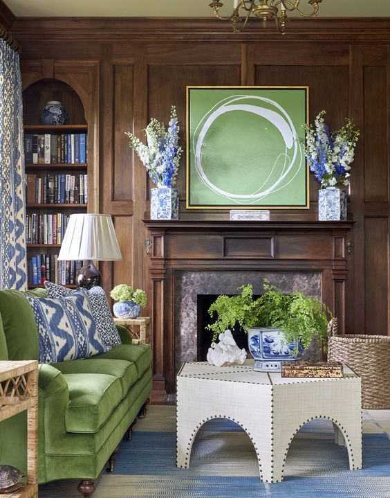
It’s the shade of green in my living room and dining room (above) and very close to the shade of the bannisters I recently had painted in a clients home (below).
My shoes in the summertime! Pic from Instagram
I was talking about green in one of my workshops this Fall. About how all shades of greens seem to still be on trend.
Anything from yellow-greens all the way to emeralds blues. None of them feel dated yet and I’ve been specifying yellow-greens for over 15 years.
Many forecasters feel this is because of the green movement.
All greens go together {source}
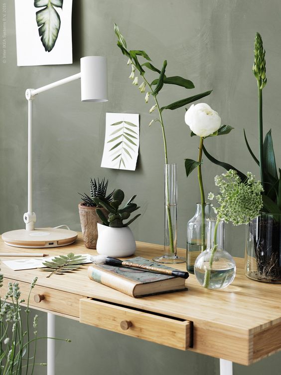
The only green that currently feels dated to most people is sage green. It’s pretty in this photo combined with white and a some flowers styled perfectly, but it’s not a colour I’ve specified for many years.
If I walk into a house where someone has a sage green sofa, I know they’ve had it since the 90’s when that colour was big.
There is nothing wrong with sage green if it’s in your home, it’s just not on trend at the moment.
via {Pinterest}
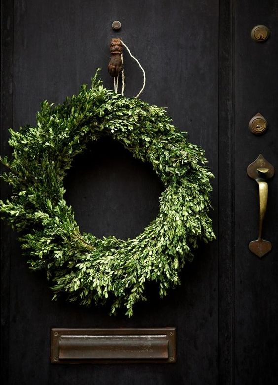
Given that Greenery is the colour of the year, perhaps it’s timely that the decorating trend this Christmas is the natural look.
via {pinterest}
What do you think of the colour of the year? Love to hear your opinion below!
Related posts:
Here’s How Colour Trend Forecasting Works
My Take on Pantone’s 2016 Colour of the Year: Serenity & Rose Quartz
My Take on Pantone’s 2015 colour of the year: Marsala
My Take on Pantone’s 2014 Colour of the Year: Radiant Orchid





I had accents of your green about 5 years ago. It was easy to find things in that color. Then I tired of it & got rid of all my green things.
Now I actually prefer sage green. Go figure!
Haha…the first thing I thought when I read the post was that I thought sage green is coming back. At least I wish I would. I agree that a couch in sage green screams 90s (my brother had a tired looking one up to a couple years ago), but I am seeing sage greens like the picture of above on Pinterest and the trend seems to be to do it with blacks and whites. Better Homes and Gardens featured a room with Valspar Green Tea Leaves that had white trim, black accents and some fushia and I cut the picture out. I miss that color!! I am not a big fan of super fresh yellowy greens, grass green in houses. Maybe a clothing accessory in spring (isn’t Pantone coming from that world?), but in a house, unless you live in a warm climate, or just love the crispness of it, it can make things feel cool. I just don’t see that color around, except for die hards and sure, classic looks like the pics from Maria’s house and House Beautiful. Real people seem to be into the gray greens (and green grays) and blue-greens.
I mean “real people” as opposed to designers. Pantone is annoying to me, I just think their picks do not track trends in houses the way Ben Moore and other paint companies do. On a different note, in spite of all the blogs opinions about Poised Taupe (SW), I had 2 people recently (who have absolutely no connection whatsoever) tell me they chose the color for a master bedroom recently, based on it being color of the year. I thought that was interesting b/c I have never ever known anyone to mention a Color of the Year to me as a choice they actually picked. I don’t not live in a trendy area, and that made the revelations all the more intriguing to me.
Pantone wouldn’t track trends in homes the way Benjamin Moore does because the color of the year is not meant solely for use in homes. That’s not the only industry they’re using for inspiration.
That’s right, thanks for reminding us Melissa!
x
maria
I know, that’s why I think they should probably be ignored…haha 🙂
My island and a few other accents are Benjamin Moore dill pickle in my white kitchen. Is this a similar colour? I love touch of green in my kitchen!
I love it! Which Benjamin Moore Colour do you think is close? Now maybe we will find more fabrics with this shade of green. My sofa, kitchen chairs, and many other things in my house are this colour so I am happy.
I only prefer it as an accent color. A pop here and there. It’s the color of nature but would freak if I was surrounded with it on the walls lol
Love it! It seems both Benjamin Moore & Sherwin Williams have taken a different approach this year and it all seemed so dark or gloomy. I’m excited to see Pantone went in a more cheery, natural direction!!
I totally agree!! My favorite color is green, then coral and white
It’s very easy for me to go overboard with green – it’s my favorite color, and there are so many great variations. Like Mary, I am leaning toward sage again. The Pantone hue is a bit too much chroma for me to use in my home, but I love to see it as the color of the year.
About 20 years ago walked into a client’s home and the formal foyer was this color.
Total magic with her surrounding acreage of woodlands.
Note-to-self, magic combo.
Using similar green for my exterior color trinity, green-brown-white. Green for shed-house-coop doors, chairs, and a few odd ball green items.
It ages well.
Garden & Be Well, XOT
I love this color – I have a rug with a white lattice pattern in my bedroom that is great with my natural wood furniture and white bedding. It’s also great in my accent pillows on my sofa with soft greys and tans for spring and summer, as well as oranges for fall. It’s very versatile and soothing to me. Also easy to incorporate ferns and other plants and flowers to bring in more accents. Funny that all my green things this color are 5-10 years old.
I am not a fan of green in my personal environment. I do however, enjoy what you did for your client’s home. Your sandals are pretty cute too.
I am so excited about this because it is my all time favorite color. My logo is even a bright spring green! I’d love to see more of that bannister! Looks beautiful.
We had a dark green canvas type fabric sofa in our family room when I was growing up in the 50’s. My mother hated it. I loved it, and I carted its seat cushions with me to college. They faded the way denim does, and they went from home to home with me for years! Now yellow greens are everywhere in my house- Benjamin Moore Timothy Straw, and variations thereof. I find it to be the most comforting of colors. Regardless of the trends, I think green will be a big part of my decor forever!
I’m so excited about “greenery”. I fall asleep viewing many bloggers’ house tours these days – I’m so bored with everything blue or blue and white – they all look the same. And Scandi minimalist with stark whites and cold greys seems soulless and chills me to the bone. Green is my favorite color but with a touch more yellow than Pantone’s pick. After all, it was the view of the greenbelt and a wonderful grapefruit tree out the large 8′-wide window of the living room that sold me on my home here in the desert of Arizona. I smiled the minute I walked in the front door and, with a similar view out a similar window in the master bedroom, all that greenery is what makes me smile every morning that I wake up and open the curtains and every time I walk through my little house. And every time I look at pics of white kitchens, I remember, Maria, your remark that a white kitchen will never come alive without a touch of green – just a plant or a bowl of limes or even a bowl of happy lemons (yellow has become a second favorite). I’m very happy.
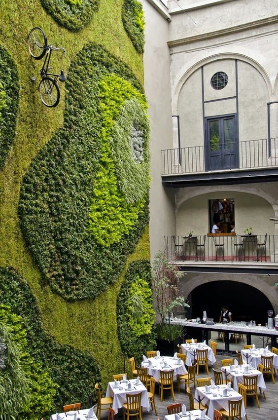
P.S. That stunning greenery display up the wall of the restaurant is an inspiration for the day when we may need to ditch a lot of the grass and trees in our desert HOA because of the water shortage. I’m on the landscaping committee and I don’t believe in rock.
Love it! I am always searching for green accents in this color, so I’m excited.
So happy to see this, Maria. I have been using green to freshen my blue/white for years, and his “Greenery” gives me the perfect shade to work with. With the exception of a navy dining room (SW Hale Navy) my walls and furniture are various shades of greige/white. Lately I have been looking for fabric (velvet) to bring some life into the space in the way of pillows and maybe benches or footstools. This gives me confirmation that I’m on the right track. Thank you.
Green is my favorite color so it’s no surprise I’m happy with the trend. My house already has a good dose of green in it – mid greens a touch on the yellow side for the most part. There’s a painted dresser in my living room, cream and green cushions on my gray sofa, and landscape art. The kitchen/dining room has a green and white awning over the sink (yes, indoors) and the French doors have green and white curtains. There’s always some sort of fern on the dining table. I live in California where it is too dry for my tastes, so instead of a yard full of grass I have to make my green happen with fabric and paint.
Love love love green! It’s my favorite color and it’s in every room in my house. I even like sage green and have a lot of it. Very exciting!
Totally disagree with your assessment of sage green. I’m seeing it more and more lately. It works as neutral background for many other colors, and adds warmth that we’ve been lacking lately with all the gray and white rooms. I also do love brighter green accents, though…always looks like spring!!
Seeing it everywhere and having a client ask for that colour are two different things. And as I said in the post, there is nothing wrong with sage green. I specify colour all over North America and when clients start asking me for a colour, that’s when I know it’s trendy. Just like the trend forecasters. No one is sitting in a hotel meeting room just choosing which colour the consumer will buy next. It’s the consumer that decides.
Thanks for your comment!
Maria
I’m seeing and liking sage green too. It goes well with grey, black, white and natural un-stained wood. I think we can not say certain colors are “out”. What we perceive as “out” is not a color for its own sake, but is always a certain siluette in a color that is combined with other particular colors and silhouetes that were in fashion at the time. It’s not the color… We see the color with fresh eyes again as soon as it is in a different silhouette and paired with different colors.
I love that moss wall with the “paths” and a bicycle. So creative!
I don’t follow the various “colour of the year” picks. Why should some stranger pick for you? Choose what you like in your home. Having said that, it is a very refreshing colour and looks fantastic in your home, Maria.
To me green has always been a staple. As I walk through some of the fabric showrooms green in different shades are displayed everywhere. I remember a beautiful home in Newport Beach that I helped to remodel. It had a 2 story foyer with a green lattice wallpaper. I thought it was the most gorgeous house I had ever seen. The winding staircase railings were painted black. There were two wing back chairs on each side of the fireplace with a print on the front side and the back was a beautiful shade of emerald green. I just loved that house! Unfortunately they wanted all of it to be torn out and wanted golds and browns. It never looked as pretty in my estimation. So I am happy to see the greens back in style. I guess what goes around comes around!
Thank you for the post Maria. If Pantone Greenery is a crisp color, could it be a bridge color, tying in crisp colors with earthy ones? I’m thinking it would go with both the gray trend, and the muted colors that go with creamy whites, like BM White Down?
I love this green. Many of my nature photos taken in the spring have it. I might add it as an accent.
Now maybe my green tub and matching green square tiles will be back in vogue!! I’m re-doing my bathroom around them!
Love it! After a couple of what I thought were very bad choices, I am very happy with this years selection!
I love a lot of green in a house, partly for the freshness and partly because it can tie other colors together.
Feeling super trendy, lol. My 1938 bathroom has original tile this color, and I carried it through to other rooms to tie everything together. I love seeing how you’ve worked with it.
“cold milk and warm cookies are good for you”. so is green, in every shade of it. forests and meadows and rolling hills an jungles and even just a plant on the windowsill-all are a part, a bit of a promise..the ancient promise that the land is near and the life is to continue to be.
Pantone has finally got a winner! I love Greenery! What a fresh, LIVE color! It reminds me of the first trips to the garden nursery in spring! Colors in nature are to me always going to be on trend.
Nice post Maria! Your knowledge and advice on color is always so on point.
xo,
Ivy
Spring green was my great-grandmother’s favorite color. I have a set of her dishes in the lovely, fresh color which I have displayed in my kitchen. Love it with birch cabinets and white tile back splash!
Green (apple) is my all time favorite color. It works in almost every color combination and looks fresh, clean and happy. I was thrilled that Pantone chose Greenery as the color of the year! In my opinion, it’s a useful, sophisticated and timeless color.
Reply
It’s all so subjective anyway. Like art.
I like certain greens (sage and some very, dark ones) but Pantone’s choice does not resonate for me, nor do I believe it will be around long. It may be too trendy. But, if one wants to use trends in their decor, (I know Maria is on board with this) just apply it in small hits, like decor pillows and/or in this case, a live plant or two. I never seem to agree with Pantone anyway, but I am always hopeful it may happen one year.. just not this one.
decOracle