Before you begin painting your exterior, read this roundup of my best colour advice so you can choose the right colour for your home improvements this season!
Today I’ve curated some of my best colour advice on painting your exterior posts. After all, my blog is almost 10 years old so there’s a lot of content to consume.
In our eDesign department, we consult with clients all around the world on exterior colour. However, since most of them are consultations for the DIY client, we rarely receive after photos.
It’s surprisingly difficult to get a good photo of an exterior. The lighting, landscaping and angles need to be really good to produce a presentable image, so photos that aren’t professional are rarely high enough quality to post.
BTW – If anyone has any before and after photos, we would love to see them.
For those of you looking to paint your exterior this season, here are some of my favorite blog posts about exterior colour:
10 Tips To Transform Your Exterior
There are some good lessons in this post about exterior colour, check it out here.
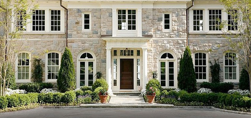
5 Steps to Designing a Classic Stone Exterior
Always and I mean ALWAYS question your elevations. Don’t just assume that because they have been designed by an architect they are beautiful.
I have saved countless homeowners from installing WAY TOO MUCH stone on their exterior.
And sometimes there are not even enough windows on the front of the house!!?? It actually upsets me when I see that because by the time I’m consulting on the colour, it’s too late to do anything about that. The front of your house is where all the curb appeal is. It’s just as important as the back of the house where you spend all your time in the summer.
Tudor Style Home Ideas: Exterior Colour Before and After
We generally don’t recommend combining brick and stone because there are so few combinations that actually look good TOGETHER. However, there are a lot of neighbourhoods that require a combination of both so we consult with MANY homeowners to get their colours right.
If you are in the middle of trying to decide which combination works, you are most likely driving around looking at what your neighbours have done and you’ve probably noticed, it isn’t pretty.
I am hard pressed to come to a screeching halt in front of an attractive combination of brick and stone because it’s so rare.
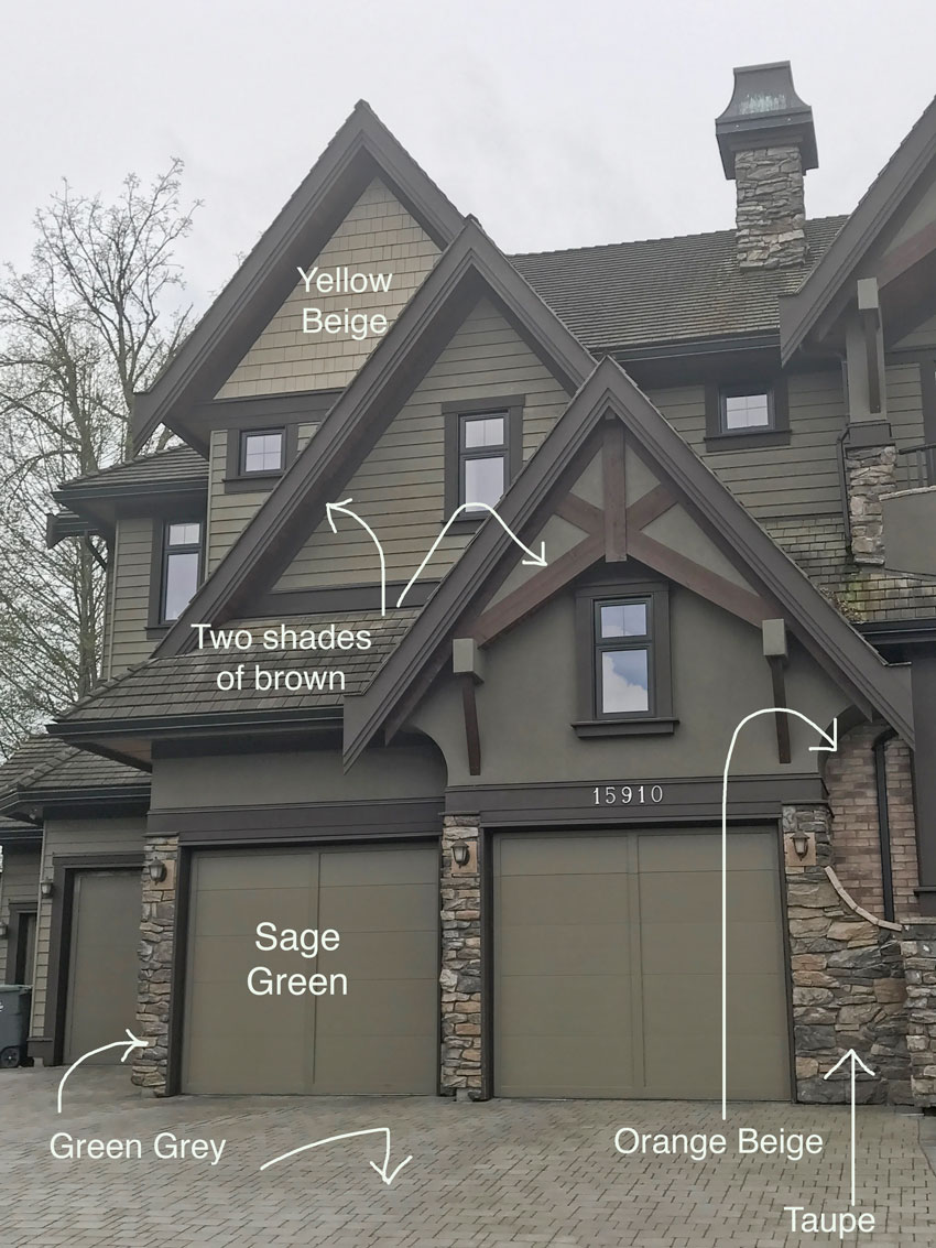
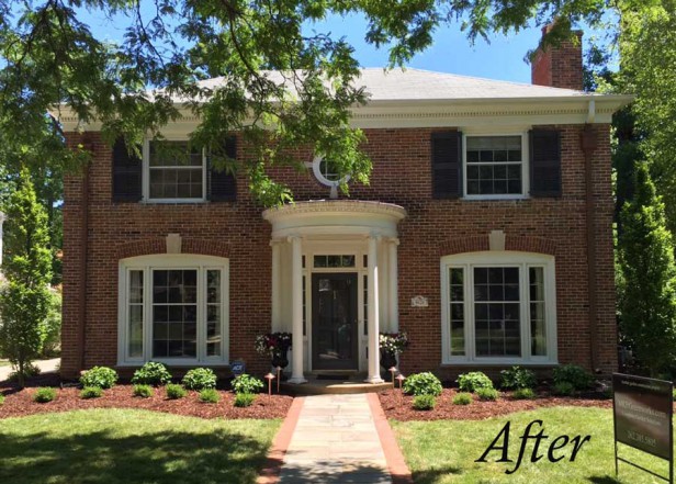
Here’s a good before and after, make sure you read the entire post here, because it dissects the undertones of the ‘before’ pic.
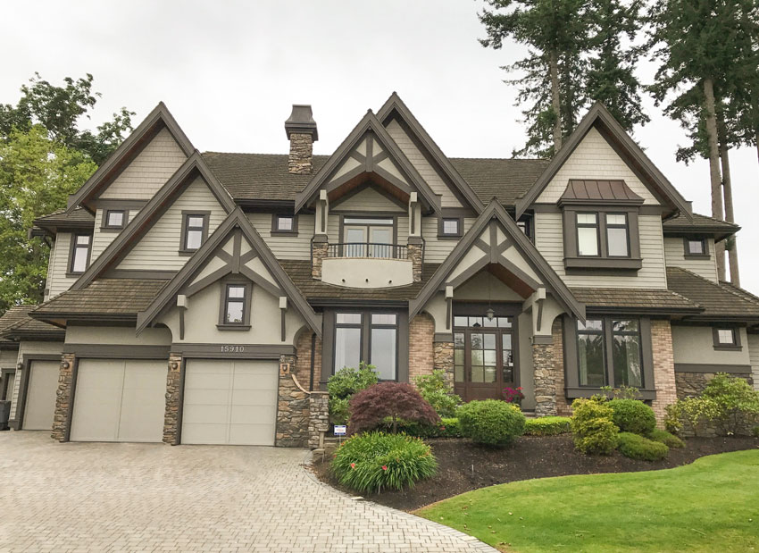
After

Here was the breakdown in undertones:
The Shortcut to Testing Exterior Colour; Before & After
This exterior transformation eDesign was photographed by a blogger who sent me some pretty pics! I also talk about testing colours, and this post will show you why testing exterior colour is so important and how it changed our original recommendations.


Before
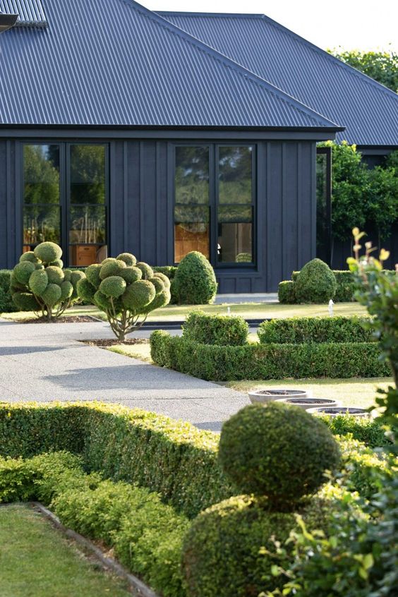
Trend Alert: All White and All Black Exteriors
The black and white trend is still going strong! But it doesn’t work for all exteriors. Read all about it here.
Can Grey be Dirty? Yellow Exterior (Before & After)
This is a local bakery and coffee shop in the tiny town I live in that looked much better after my intervention. See the full post here.
One of the biggest mistakes designers and homeowners make is when combining clean and dirty colours. It’s a big piece of the colour training in my Specify Colour with Confidence workshops.

Exterior Accent Colours Change Everything: Before & After
Sometimes all you need is the right colour trim. If that’s all your house needs, you can buy that eDesign consultation right here.
See the before photos and the full post here.
Ask Maria: What’s Next After the Grey Trend?
Still want to paint your house Grey? Please read this post first.

How to Get the Perfect Creamy Exterior
How do you achieve the perfect cream exterior?
Which white or cream is best for a stone or brick exterior?
What’s the best way to choose the correct stone AND brick for your exterior?
Ever wish you could just refer to a short list of exterior colours to make the best choice for your home or clients?
All the answers to these questions and more are here in my online masterclass, available on demand here.
All ebooks and webinars are available to read or watch indefinitely.
My advice: take advantage of this sale. Instead of looking at every showroom in your area, every magazine, catalog, paint rack, hours on Houzz and Pinterest. Don’t drive yourself nuts. There will always be surprises in renovation, because that happens in construction but don’t make picking weird colors one of them. Like earthy granite plus mint green paint. I’ve seen it in real estate ads. Ugh. Just because each item is ptetty, doesn’t mean they look pretty together.
I agree, and I did! I’m a long time reader and customer who bought a couple online consults. The results are fabulous and classic! People are always in awe of our home and it’s nothing special…The colors are seamless and the atmosphere calm and timeless. I have yet to tire of any choice. It all started with her blog and with over 8 years of renovations, we have tackled every single surface and room. The look is so cohesive. We are selling soon and we expect it to sell quickly. Besides the consulting services, I have read every single blog post which has helped make other choices like furniture and fabric. I also love Darryl Carter, so I’m a big fan of white, antique furniture and editing a room. Thanks Maria!
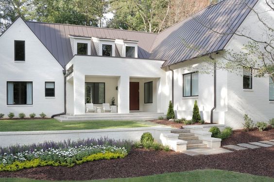
Great post. Shouldn’t th downspouts on that last photo be painted out? That looks bad to me. Who wants to draw attention to those?
I think they are copper, which then becomes a deliberate accent choice.
Can you store a webinar on you iPad?
You receive links to videos to watch so they don’t need to be stored on your IPAD but you can certainly watch them from your IPAD. Maria
[…] Read more: The Best Colour Advice for Painting Your Exterior […]