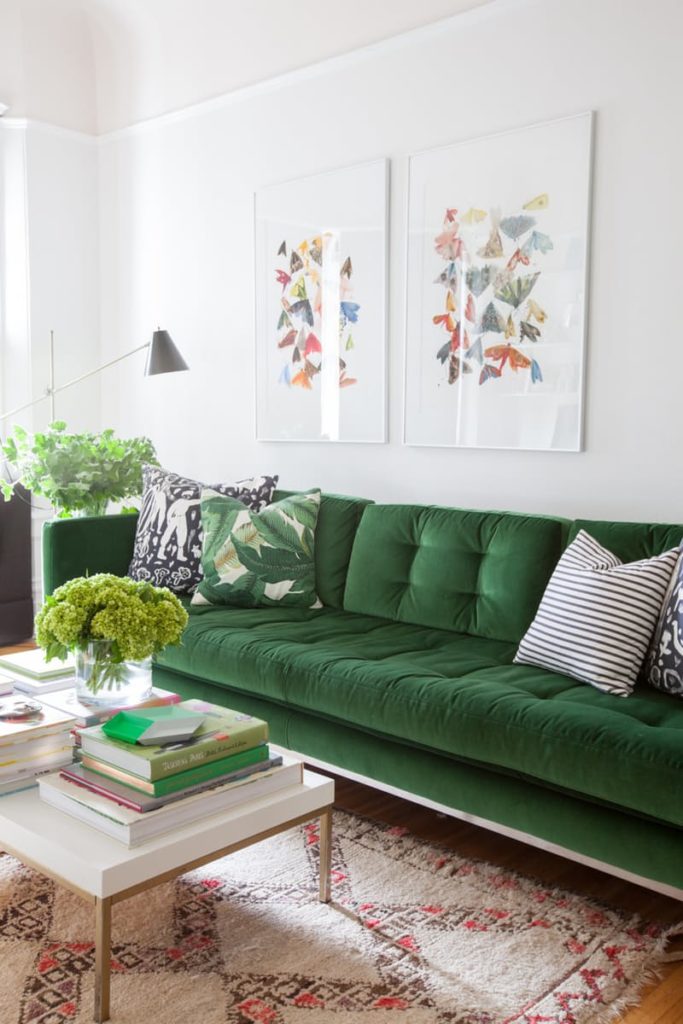
The colour for 2017 is kelly green (hooray, I’ve been waiting for this green for a long time) and the look is refined and generally warming up.
Green reigns supreme in 2017 as the most versatile colour with broad appeal. Greens are getting both richer and warmer, moving away from the beachy, minty hues towards more grounded shades of yellow green spring shoots and deep leafy greens. (In other words, I think Pantone nailed it with Greenery this year).
Move over cool industrial edginess and laid back rustic everything, 2017 is the year we return to warm, cozy and luxurious layering!

image via Cup of Joe

Boxy, grainy, reclaimed wood and bare Edison bulbs have reached their peak and are on the wane in favor of finer textured, lighter warm woods and refined, even glamorous details like fluted glass and scalloped edges with softer silhouettes.
The problem with the ‘bare bulb’ look is that it’s often not a very flattering light.

Via Pinterest
The feel is invested, more traditional and elegant instead of rustic, recycled and DIY.
Rather than making junk look cute, or worse, buying cheap throwaway pieces with faux patina, in 2017 we will decorate mindfully with classic pieces that will last many years to come.
Look at this richly layered room in dramatic lacquered black with some nice traditional furniture pieces.

While mid-century modern pieces are enduring classics, we are long over the campy look of going all out with it. A few pieces mixed with other styles, creates a more current and sophisticated look, like these chairs paired with more contemporary pieces.

Whites and neutrals are getting warmer, but NOT for paint colours. I know Sherwin Williams chose a mid-tone taupe with a purple undertone for their colour of the year, and Benjamin Moore chose a dark, muted purple for theirs (and they might still know something I don’t know), but until my clients all around the country start asking me for those colours, that’s when I will also declare them to be current trend colours.
In my experience, colour trends are set by YOU and no one else. When my clients start asking me for beige or dark taupes, in other words, earth tones for walls or kitchen cabinets, you’ll be the first to know!
White for interiors (ie. paint colours) is still bigger than ever. It’s simply not NEWS which is what this post is about.
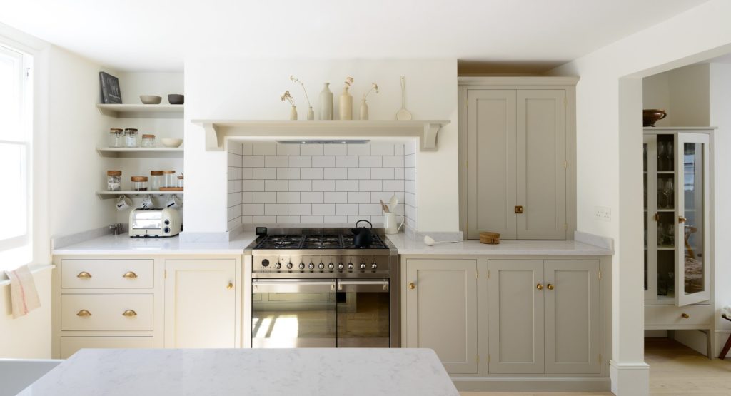
Also, just because I’m repeating that white is trendy, doesn’t mean your interior or your house can handle walls painted plain white! Probably a shade of greige (below) is a better choice which will still give you the look of ‘white and fresh’ if that’s what you’re craving.
Ballet White source
via Devol
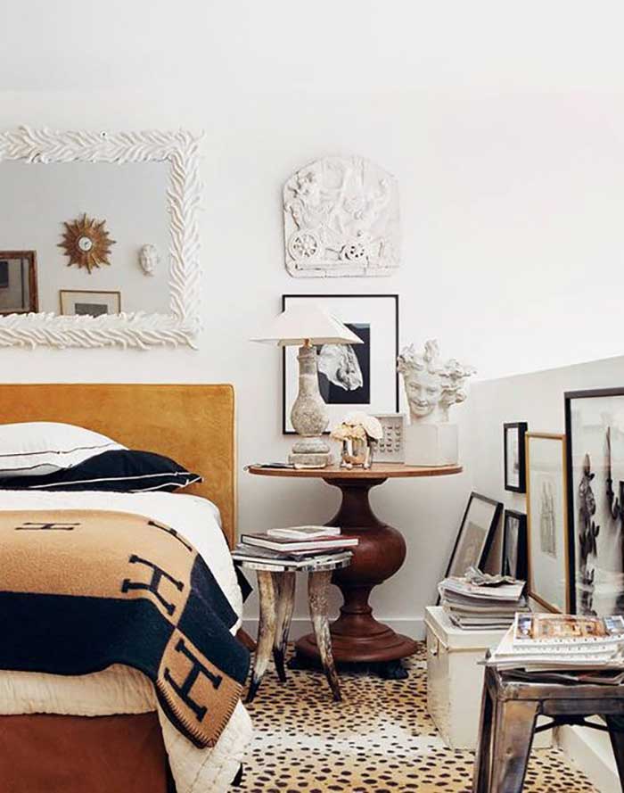
And when I say warm, I’m talking about warmer by a few degrees, more in the realm of terra cotta brick shades and cognac. Not chocolate fondue. Although theres nothing wrong with a hit of chocolate just like black. I’m simply imploring you to not go all out with ANY of these trend colours, that’s when your house will just scream, well. Trendy.
image via Camile Styles
Leopard or other animal prints in the above colours go with lots of bright colours. A great way to work with gold beige sofas or rugs and make that earthy shade from the Tuscan trend look fresh again.
Related post: How to Inject Fresh into Your Earth Toned House
I talked about this floors in these two posts last fall here and here.
via pinterest
We will see warmer whites and greiges as well as more dramatic colours working as backdrops for warm and bold colour in layered and glamorous, yet fresh and unfussy arrangements. The look is a balance of warm and cool, refined elegance and sophisticated coziness.
Related post: Paint your Walls and Trim White (or Cream)

Pattern
The 2017 runways are still full of moody florals and feminine details, so we can expect to see this influence emerge in interiors this year. Bold pattern mixing and delicate flowing shapes create a richly layered look. Prints are getting generally finer and richer in detail. A nice foil to all the finery is a clean linear pattern such as a grid, stripe or check.
Note the black background in her dress? Black is the new grey. Just don’t go overboard on it like I already said.
Brown or grey or black take turns being the trendy neutral of the decade, but this does not mean ‘If all else fails and you don’t know what to do, choose BLACK (or grey or brown).’ It means a little of each is a good thing and a lot of any of it, is simply too much!
Danger: How You Know You’ve Fallen for a Trend

From Marchesa Notte Pre Fall 2017 Vogue Runway
Colours
I would add olive green to the list of hot greens, because it is classic and versatile and works surprisingly well to warm up the whites and grays we’ve been decorating with. I talked about olive green two years ago in my trends report from High Point.
While pastels still have their place and will persist this year, I think they are on the wane in favor of richer more luxurious hues such as rich greens and jewel tones.
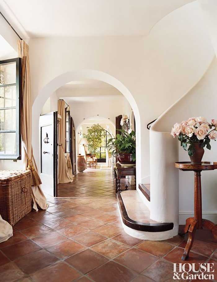
Natural compliments to greens are warm yellows and oranges. Deep golden yellows and warm oranges from mandarin, to persimmon and terracotta will be big this year. We will see lots of orangey cognac browns too along with some blacks and grays that trend toward brown.
Related post: 2015 Trend Alert: Olive Green from High Point

Deep blues will continue to be big, but might be overshadowed by greens and some of the warmer hues that are looking new and fresh.
Whites with a more complex and natural feel will appeal this year over cooler, cleaner whites. They are easier to work with and relate better to warmer materials, colours and textures. Creamy greiges like Ballet White and Soft Chamois are perfect “whites” that look fresh, but natural.

Benjamin Moore Soft Chamois via Pinterest
Black will continue to be big, as I mentioned in my report from Maison & Objet last summer.
We are seeing lots of black windows for exteriors and interiors bringing some crisp contrast to airy rooms and facades.
Tread lightly with black though, getting the weight, placement and proportion right is critical here. Black is glamorous and a nice masculine foil to some of the more feminine details that will be popular this year.

Details
Mixed metals is the order of the day.
While warm metals like brass aren’t going anywhere, it is never a good look to go overboard with one finish (have I said that already?).
Mixing metals is a more sophisticated look that works well with the trend for more complexity and layering.
Try mixing aged brass with oil rubbed bronze, gunmetal or chrome. The trick is to repeat each finish at least once so it looks intentional.
More refined details in drapery and upholstery will come on scene this year too. Tufting will remain big along with pleated skirts and pinch pleat drapes for a more tailored and luxurious feel.

Playing with texture and pattern in tighter colour palettes keeps things looking pulled together with lots of light neutrals to balance out glamorous and dramatic elements.
Greens keep things fresh and if you can’t add green in fabrics or upholstery you can add it with plants and accessories.
So over to you my lovelies, what do you think? Will you be decorating with green and adding a little more luxury to your rooms in 2017?
I’m in Austin this weekend in my quarterly mastermind meeting. We arrived to freezing temperatures and can’t wait to get back to Palm Desert Monday where we’ll be until the end of January! We’re not on vacation anymore, but I’m grateful that we can work anywhere as long as we have our laptops!
I see by my Instagram feed that it’s cold everywhere! Hope you’re keeping warm!
Thanks for all your feedback on my new site! Please keep it coming because I have so much content, it’s been a challenge to get it all working properly so if you see anything amiss, please post a comment below.
Related posts:
I am excited about green too. I have an antique glass bottle that is huge, and its green. I am building a new home and wondered how I would use this piece. My mom had it made into a lamp. I planned on using it before this post, but now I am even more excited to see it as a pop of color in my new space!
Maria,
The new website looks fantastic..but the type is hard to read because it is so small. I almost didn’t finish your very interesting article because of how hard it was to read–and I’ve read every post you have ever written.
Maggie S,
Adjust your font size, go to tools, zoom.
A quick way to enlarge the page is to press and hold the CTRL key and then press the + key. Press repeatedly until the type is the size you’d like.
To return a page to normal–or to decrease its size–use the control key and the minus(-) sign.
I agree! Web site looks nice but the font style has a low “x” height, which can make it hard to read online, especially for small font sizes. I already have it scaled up on a large monitor and find it harder to read than most. I would set the default a bit higher and or increase the leading (space between lines) or go with a similar sans serif style that is easier to read for the body text. Not all of us have young eyes anymore!
Great report! I agree whole heartedly!! Love your new site too!! Looks great! Stay warm. Go visit my friend Meredith Ellis at James Showroom. She is amazing! You will love her and she you! I am dying to go visit her showroom!
I am starting to warm up to green. The picture with the green tufted sofa brought back fond memories of when I was a child, I use to decorate cardboard boxes as rooms for my doll furniture and had a green tufted sofa just like the one in the picture. I never played with dolls just made rooms. I cut out windows and made drapes and added rug samples for flooring and even wall papered the insides. Guess I knew way back then when where my passion lied.
Love your blog and all your insights!
The new website is beautiful. I have always loved green. I am almost sad that it has become a “thing” – lol.
Great post, thank you, Maria! Loving the new site. Way cool…looks so much more..should I say “elegant”, about the website?
As for the trend forecast-I’m right on spot, and a little bit ahead, lol. I used warm whites(not in finished materials but as one of the painting choices..it has a greenish undertone..have no idea how this color is really called, in proper terms. Would love to give it a name:)I love how ever changing it is though. It’s not a real white, not a real light gray, not a real light green, not exactly bone or off white..). Used a lot of greiges, taupes, greens, and purples which I loved for ages already- in my new home.I do have lots of warm yellow accents like amber and orange and gold ..I did use terracotta..because I have a house that likes terracotta. I started being more daring, last couple years,by using just a tiny amount of black, mostly in art and fabrics. I did mix metal finishes-was very scared to do that, but the result is very natural..I think nobody sees I mixed them-they just see the whole picture. So only I know of my own bravery)).I always was into flowers and patterns, all my life..and yes, i’m into more refined details lately, but I thought it’s the age thing..:)
I’m not sure I feel that great with knowing I’m pretty much on trend..I’d rather not be, but as far as I understand-it too shall pass(c))
I also love plants deeply, mix a lot of old and new, and since I’m nuts about lighting(as I just recently found out) I went with the fixtures of very different eras..surprisingly it works. Or so I think. They’re mostly vintage-I’d say 90% of my lights are vintage. It was the only way I could afford what I loved. It was a pain to fit some of them though. Besides vintage, I love all things handmade(who doesn’t) and I travel-or used to travel before the freaking remodel lol-quite a lot, and it gives you all sorts of wonderful opportunities to fall in love with very different things. I collect art..very slowly of course..so I hope my home will continue to say about me and my family as much if not more as it will about the times.
Love this post and new site
Spot on once again!! I have read several trend reports and I think yours is the best and most concise I have read. Everything you said makes good common and design sense. I use Kelley Green as an accent in the Spring with my black and white and cobalt and white. I like classic, more traditional or transitional pieces so I am one happy girl to see things go back to a more refined look. Tired of the all neutral rooms with the DIY/Farmhouse look, they have been DONE to death. You are a great resource of information that is professional and accurate, thank you for your intelligent insight!
Kathysue
Green is one of my favorite colors, so I’m happy to read this post… and I love all the pictures you chose! My bedroom fabric, chosen over 20 years ago is a green and taupe floral on a white background. I was admiring it last night and appreciating the wall color that you specified some years ago! (And wondering how you got it right, just from a picture!) Happy 2017!
Maria, can you tell me a about your mastermind? Is it always in Austin? How did you learn about it and is there someone who leads it? Thank you,
Barbara
I was decorating my new place last year and uh oh, I’m pretty much on trend for 2017 (greens, oranges, cream) but mixed in with natural wood tones and bits of purple gray. A recent diy project was this coffee table–it appears to be pretty much spot on!
https://www.instagram.com/p/BNw91WLBPjt/?taken-by=langejane
I am happy happy happy with Kelly Green! I have been trying to use shots of it here and there in my house for years but it is difficult to find home accessories in the right colour. Maybe there’s hope now! Kelly Green injects a shot of colour during our long and dreary white winters, when there is no colour outside to look at. I miss green the most in the winter time. The other thing is, Kelly Green goes with a lot of other colours! You mentioned yellow and orange above, Maria, which is gorgeous! I am using it with different shades of grey in my living room, while my bedroom is more preppy with Kelly Green and Navy. Happy Happy Happy! All the best in 2017 Maria! You deserve much success and happiness this year, as you bring it to so many people every day!
Hi Maria,
Is it me or has your site changed since your last post? It’s great!
First, I think the whole DIY, reclaimed, rustic trend came about because of the Recession starting at the end of 2007. Folks couldn’t afford new things for their home.
I also believe that most folks make design decisions based on what’s available at the stores they shop. Until the stores start showing items in the latest color trend, most people aren’t even aware of what’s trending.
Out of my family, friends & aquaintances, I’m the only one that seems to be aware of what’s current. Everybody else doesn’t seem to care. My husband accuses me of living in a bubble. A design bubble.
As for my own home, I did green once several years ago. It lasted for several years until I needed a change. I like changing things up. Right now the only green in my home are the house plants. And those are leaning more brown. (Dying)
So agree about the Recession and its influence. Styles -and whole schools of thoughts, in general-are born as a result of many, many things happening in the world and different places, cultures and people living in them in certain times. Take any style and explore it-and you’ll see the story behind it. The story of times and places, thoughts and feelings. just told in visuals rather than in words.
Love it all Maria, was doubtful at first re green (having used it a lot over the years) but seeing it and the uses here, just loved it and will definitely be trying it again, just here and there!
I pretty much love most of this. It is a breath of fresh air.
I love classic lines in furniture, but in lighter finishes with a few dark pieces mixed in.
Green has been on my radar for a long time. Even if you think green isn’t for you, it can be a great background to your favorite colors. I love a green sofa and pillows in other favorite colors. Green plays nicely with nearly any color. And it adds the freshness I’m always looking for.
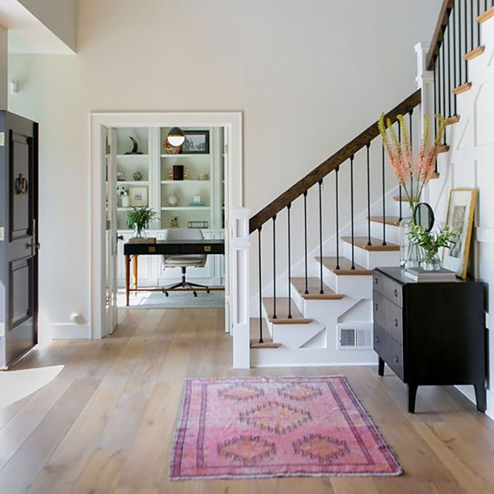
Also, I’m living for that green carpet coming down the stairs!
Love the new website and this article. Thank you
I love your new website, Maria, but I find your name and the colour wheel look just too faded. I would have liked your name with the colour wheel to have been more prominent rather than taking second place to the bright yellow band with the black lettering. That is just my opinion and it seems that I’m the only one to think that. But everything else I love.
As for keeping warm, down here in Australia we have been sweltering in high temperatures this past week with temps. of mid to high 30’sC. which I find unbearable. I’ve just put washing on the line, so should be ready to bring in and put away soon. Stay warm up north.
Maria, A lot of photos are missing from your post, and showed a placeholder box that said “No image found. Oops! We’ll have it soon.” From the comments, it looks like I’m the only one with that problem. I’m on an iPad and never had a problem before. Otherwise it was a very informative post. Thanks!
Green is one of my favorite colors, so I was thrilled when Pantone declared it the color of the year! I love that it’s almost like a neutral in it’s own way. I think your trends are spot on, including the animal prints, pun intended.
I love your blog posts btw and eagerly await your emails announcing a new one. Thank you for bringing beauty and inspiration to my day!
I don’t know what BM and SW were thinking with their color of the year choices, but I think you are right on point. I’m still getting requests for light and fresh. I love this return to classic decorating as well. Great blog post!
Great report on the trends for 2017. I’m super excited green is pantones color of the year, who doesn’t love nature and want to bring into the home? I love the way you broke down all the trends and gave us reason to use a little here and there for balanced design.
Very informative! LOVE
Wow! I am LOVING it!! Really clean, crisp approach. So “adultish” if I may say so lol. I have been super busy these past few months so it was a pleasant surprise to see your new site all at once. I also really like the simplicity of your new logo. It states emphatically and clearly, that YOU, are the color boss. Done deal. Check. Really love it. Greenery may not be my color choice for 2017 but I enjoy the rejuvenation that green in general brings to a room. So I will choose potted greens, and small accessories to freshen up a tired scenario. Always enlightening your posts are. Thank you. Timeless and classic. With a few twists along the way…Nice touch.
I love neutral colours at home which I find relaxing. I also like to add green using plants! Thank you for sharing!
xo Yvonne
http://www.aproposh.com
New site looks GREAT but why so modest? Yours is the blog for “Advice from THE True Color Expert”!!!
And, Two cheers for Kelley Green! It’s my fav color just behind Sunshine Yellow.
Keep nailin’ it and soak up some sun for us trapped in the north 😉
LOVE, LOVE, LOVE your new website!!! You did a great job! And was so happy about the GREEN!! I’ve been adding green to my navy for the last couple years! Have a great time in Palm Desert, don’t work too hard!!
I don’t know if you are right, but I HOPE you are!! Love the idea of returning to classics and moving away somewhat from the sparse spaces of Pinterest with a lot of bare rustic and mid century. My mom historically collected farmhouse motifs and old rustic fans, etc. so they aren’t exactly trendy to me, and I was lucky that when the trend hit, I could just shop in my mother’s basement instead of spending a ton of money for ridiculously heavy tarnished old fans, but I learned through displaying them that a little goes a long way unless you turn over your entire decor to it. And that just seems cold. I like the idea of warmth, classic, cozy, but polished with a mix of metals, etc. I have always loved green, could not get enough of chartreuse when it was in! I admit, a little kelly green goes a long way, but I swear that is often influenced by our own look/style. My friend is blond and blue eyed and looks amazing in navy and kelly green. She rocks the look. I’m darker hair and eyes, and greens moving towards teal and chartreuse look better on me. And I love those more in my decor too! Green is definitely a color people have a strong reaction to and must be a “to each his own” sort of color. Blues seem more universal, I think.
LOVE the new layout and design of your site, Maria! Congrats!! 🙂
You just happened to hit one of the coldest weekends Austin has had in 6 years. Temps are suppose to be in the 70’s
starting Tuesday. Because of our location we can be affected by the arctic fronts but when the wind shifts and starts
blowing from the Gulf, we warm up and in the summer of course it can be unbearably hot.
I like it that you keep us informed of the color trends. A friend of mine has been talking a lot about “greige” lately
like its something new and I just smiled because you have been talking to us for years about it. Its great to know
whats coming so we can make wiser purchases. Thankyou for sharing your knowledge with us.
PS. Do uou think green could almost be a neutral in the right shade to go with what surrounds it? I’m asking
this as it seems like the green in nature goes with everything.
For me, the tufted green sofa colour, YES; but yellow green, like the dining chairs in the picture below, always looks rather strained and sickly to me, definitely not on my list for interiors. 😀 I shall gladly see the overused turquoise greens/blues go out, and also no animal spots for me. My interior style is a mix of french eclectic and beachy (without the sailboats et al.), has been for years, regardless of trends – I assume it reflects my personality very well. Sounds like it will fit right into the scenario for 2017 – hopefully a little longer than that 😉
Regarding neutrals, mine are creamy off-white and warm greys and greiges that sit nicely between “green” and “purple”, i.e. not quite green or purple in undertone. They work well with my pale golden beige and yellow beige. I have both light and darker greys. I don’t do black. I use brown-black (e.g. in a base of a floor lamp) or a dark warm grey instead. I am also mixing the metals.
Reg. the new site: smileys get axed in the replies, I just noticed.
I’m thrilled with the return of green, and especially the yellow greens. If Tanya is right in her comment: “Green is definitely a color people have a strong reaction to and must be a “to each his own” sort of color.”, I’m even happier because that means that my home will reflect me, and no one is going to confuse it with anyone else’s home. Blue may be more “universal”, but again, I’m so bored with seeing blue rooms in every blogger’s house and every designer’s portfolio to the point I don’t notice and certainly don’t remember anything else about the room or the house. What I love about your trend predictions, Maria, is that you give them and you comment on them, with pros and cons, but you don’t you don’t automatically accept them and you certainly don’t push your clients into blindly following them.
Love your new site. So many people react negatively to “white space” on a page (or screen) but limiting how much other “stuff” appears on a page and where it appears (in a column along the right side, for example) enables the eye and the brain to focus on your post and the responses without distraction. Makes it a sort of mini mini class on the subject, yet all the other info is there when you want it. Great job!
I just painted my living room walls BM Cleveland Green and love it. Restful , sophisticated and always changing in the light. And if Bunny Williams likes it then you know it’s a classic!
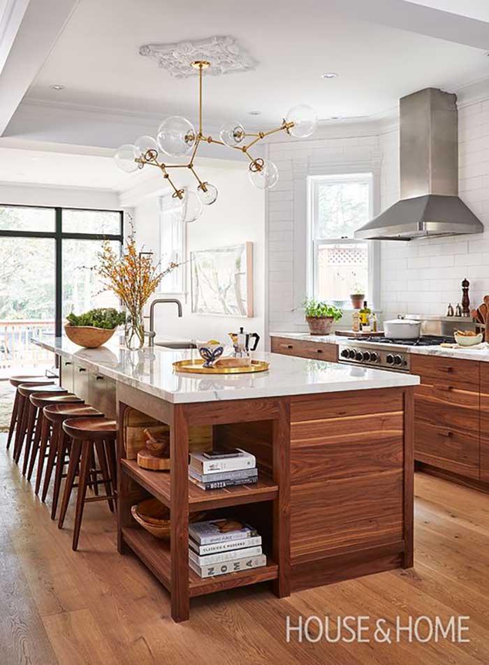
I love the kitchen photo with the wood cabinets but was surprised to see it in your blog since you always do white kitchens. Do you have any special point to make about that photo?
I do love the green!
I’m seeing the black windows everywhere now; don’t you think they are going to date too quickly because they have gotten so trendy? On the one hand I think it’s a cool look, on the other hand it’s not too far from prison bars and I can easily picture saying “what were we thinking?” before too long. And windows are such a big investment!
Hi Cindi, I think that wood stained kitchen is gorgeous! But the average house doesn’t look like that, not sure what those lowers are made of but I guarantee they are not standard with most builders or kitchen cabinet makers.
You couldn’t just ‘specify’ that kitchen in a consultation, it would only look like that if a designer or a creative person who knows something about design was there every step of the way with each decision.
It’s the same with black windows. Those skinny black windows look the best but most people don’t have those either. But they see the inspiration picture and start painting their windows and then it’s not awesome. That’s the problem with most inspiration pictures, if you’re not a designer (or sometimes even if you are, depending on your level of experience) you try to incorporate that into your house and can’t pull it off.
And that’s why most real estate photos are ugly. Because most people do what I’ve just described.
And that’s why I mostly talk about white kitchens.
Maria
Great answer. I understand where you’re coming from. But I’m going to take a contrarian argument based on looking at thousands of designer kitchens on Houzz vs reader kitchens in the comments. When a user paints builder stock dark cabinets white, yes, it always looks better (and it’s something an average person can do for not that much money, so very valuable). But when looking at new white kitchen’s, the good ones always have a ton of extra molding and subtle design features. (Not to mention they don’t have a ton of crap all over the counters like the average household does!) I believe those touches are even more important in a white kitchen, and that’s something an amateur using stock white cabinets isn’t going to do. So stock-cabinet-white- kitchens by amateurs usually look sterile and boring. I have found that as long as you keep away from trendy backsplashes (learned that from you!), and buy nice wood cabinets (not mass production overly detailed wood), in a mid-tone color, the average person can do better with wood cabinets.
I am not opposed to white kitchens, I have had two in recent times. But to me, gorgeous woods are like works of art (walnut or sapele or curly maple with just a clear coat, as examples), and don’t need a lot of embellishment to look great.
Such great advice, I love this comment!! In my area, everyone wants to live in a “new build” and they will pay 3 times as much as they will pay to live in an old house with character. (In their defense, the areas in which many of these homes are located have the better school systems in the area.) If I were forced to live in a new build, I would do everything I could do add character to the house and to give it interest and depth, but people who live in them rarely do that. Last weekend, my mother and I were looking at houses in a development that were selling for over $300.000 and they had all the charm and character of tupperware. In the decorating, it looked like they picked a neutral color (mostly nothing offensive), then added a hodge podge of what they saw on Pinterest. There was no cohesion to the decor, nor was it eye catching or even the least bit interesting, just big vast spaces. I sure wish these people would read your blog!!
Green is my favorite color, and it runs through my entire house — from the foyer to all four bedrooms! I never tire of it. I’m glad to hear that the DIY, rustic, recycled look is on the way out. I don’t see the appeal. I hope shiplap walls go with it. They’re fine in limited doses, but people have gone way overboard with that trend, even installing it in very traditional homes. Looks so out of place. Great post, Maria!
I’m with you on the ship lap, Fran! It is everywhere and I’m tired of seeing it. I have a theory that the more popular something is, the quicker it runs its course, so it should be gone soon.
Also so tired of the bare bulbs hanging on strings, although that look never appealed to me.
Maria, great trend report. I hope you are right!
Love the new site! How wonderful to see Classic and sophisticated is making a comeback. Does trend ever really trump classic? There are many photos of rooms designed decades ago that look as though they could have been done yesterday.
Brilliant, informative post as always: thank you Maria.
The new website is pretty but most of the pictures are missing for me – I’m using Chrome. The design reads as fresh and modern, but I agree that the light grey, small font is not as easily readable as something slightly bigger/darker. your fabulous new logo gets lost with the even thinner font.
I can’t edit the above, but in fact, on further posts the images ALL appeared, except the ‘took a village to create the website’ post, where none of the pictures showed; which makes me wonder if the images which don’t appear are all YOURS or previously used on your blog, i.e. internally linked, but the ones which showed here were externally linked?
PS None of this is complaint! You do so much for us that the least I feel I can do is give you feedback if you ask for it … imagining if this was the first post I’d ever clicked on, I might not come back. And THEN look at what I’d be missing!!!
Black fiberglass windows just arrived at our build site! Very excited about them but not sure about what exterior trim and siding color to use. Leaning towards a navy blue/dark gray siding with white trim. We will coordinate with a natural stone veneer wainscoting and what we think will pop are the Doug Fir king trusses at the front and back entries and covered porch. Too busy???
Hi Heidi,
Navy and black? Not awesome yet. The reason you’re asking is because it doesn’t feel right. If you’d like my help, you can buy it on the shop page in our eDesign packages, I hope you understand, this is what I do for a living. Maria