Everyone wants to know what the most timeless colour is. Here’s what a true colour expert thinks. Hint: it’s not the current, trendy neutral.
I get asked this so often and I have stated this many times on the blog but I think it needs it’s very own post. (updated December 2019)
What is the most timeless colour?
The answer is colour. And, this is good news because colour is happy!
When I was a new decorator my first ‘decorated’ apartment was beige-on-beige. And now that I’ve been in this business for 20 years, I can honestly say this is not a phenomenon exclusive to me. Most decorators use neutrals in the beginning of their career too.
And back then, I also declared that the reason I preferred a room decorated in beige and cream was because I worked with colour all day and preferred to live in a calm and neutral environment (which I have also heard designers say over and over).
But the real reason (and of course I didn’t realize it at the time) was that I had no idea how to decorate using colour.
Neutrals were ‘safe’ and something I could attempt on my own.
When we think about decorating with neutrals, it seems like it wouldn’t be that hard to just make every choice some variation of grey or beige or white and you’ll end up with something lovely.
However, colour will always be more timeless than the current, trendy neutral.
You’ll learn this when you renovate or build your first house and then watch with dismay as the trendy choices you thought were so ‘timeless’, date so quickly. Just like my very first official furniture purchase as a newlywed many years ago.
It’s the same reason most bathrooms currently look like some variation of this one because we’re inside the grey trend:
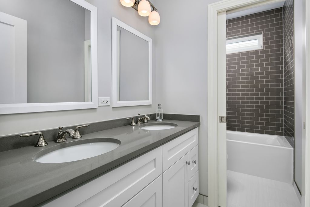
There’s nothing wrong with either of these bathrooms. In both cases, the tile doesn’t appear to clash with the countertop, which is nice. Potentially, you could still paint the vanity any strong, bright colour and paint the walls a colour.
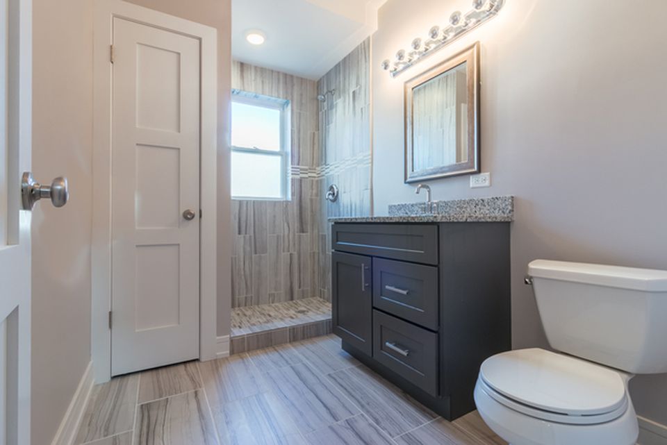
However, whenever a space has TOO MUCH of the current, trendy neutral in it, people stop saying things like, “OMG I love the colour of the vanity? WHAT IS IT, I MUST HAVE IT!”
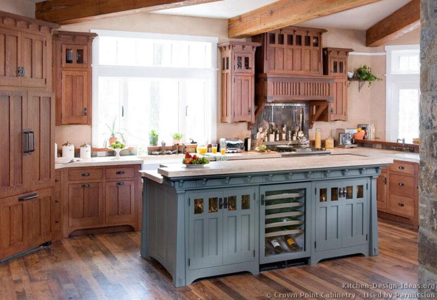
To my point, this wood stained kitchen with the blue-green island makes us pause.
It’s a good balance between the warmth of all the wood, and you can see that the colour also relates to the nearby stone fireplace.
The countertops are white, which is perfect because you won’t be bored of them in 10 minutes.
Hard Finishes Should Be White or Cream
That is why I often say that the hard finishes in kitchens and bathrooms should be primarily white or cream. This way you can change the paint and decor whenever the wind moves you.
For those of you asking for a wood stained kitchen, there it is (picture above).
Choose a Colour for Your Sofa
It’s also why you should choose your favourite colour for your sofa (instead of brown, charcoal or black).
It’s why my yellow sofa (picture below) shows no signs of being dated even though it’s 8 years old.
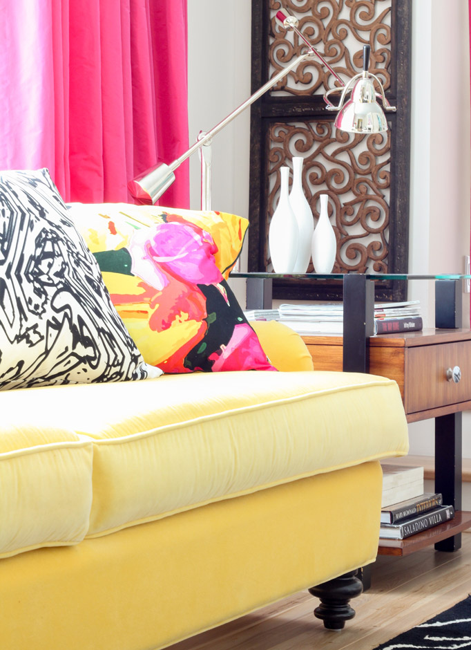
I installed it the year that Pantone declared ‘Mimosa’ to be the ‘colour of the year’. However, that was not accurate. Yellow was no where to be found back then, or in the years to come. It’s been on the periphery of colour trends until this year.
When I suddenly found 3 pairs of shoes in yellow this year, I knew yellow was finally here. And I predicted that it would be in my 2018 trends report here.
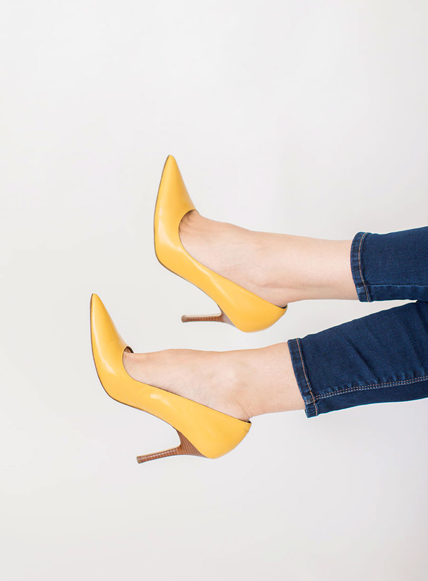
However, if my sofa was brown or charcoal, not only would we instantly be able to give an approximate date as to when it was purchased, we’d probably be bored of it already.
I installed a navy blue sectional in one of my clients living rooms 15 years ago. She recently called me in to help her re-decorate because the sofa was faded from the sun and being moved to their media room.
When I asked her what colour she wanted for the new one, guess what she said?
“Navy. All blues are my favourite. And once you introduce a new accent colour with pillows and accessories, it’ll feel different.”
And, she’s exactly right.
We always tire of the current, trendy neutral more quickly.
I see MANY HOTELS in my travels around the country while leading my workshops, and what saddens me the most is seeing the prolific commitment to the current trendy neutral in all of them.
If they are not already entirely brown, they are all being re-decorated into varying tones of greys and charcoals.
The hotel we are currently holding my Specify Colour with Confidence event in Boca Raton, FL is mostly brown. The guest rooms are brown, the lobby is primarily brown, and the meeting room has brown carpet AND brown drapery.
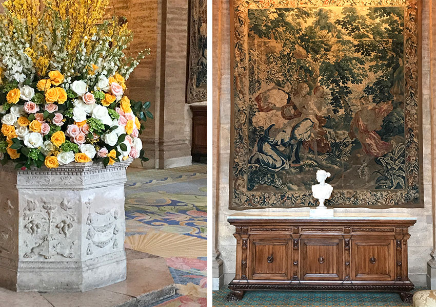
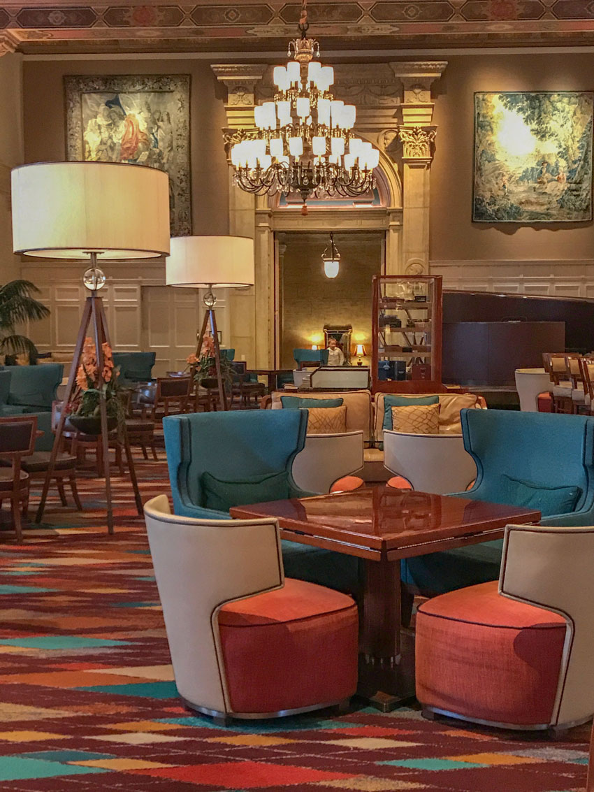
However, we took a drive to West Palm Beach this past weekend and had lunch in the Circle Restaurant at the Breakers Hotel. Here are some photos of the colourful tour.
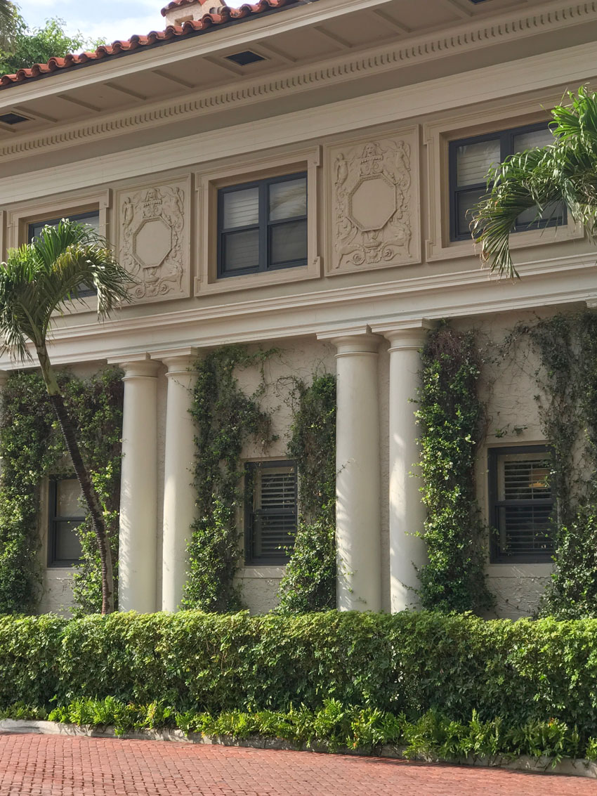
I’ve love to get your thoughts. Tell me at the comments which photo or room looks like it was most recently renovated?
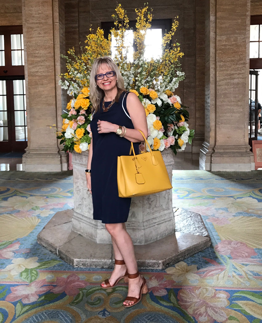
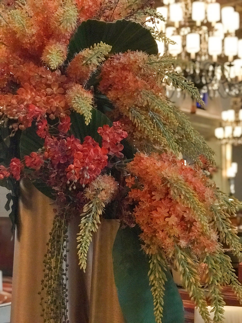
Here I am in the lobby where every single person stopped to snap a photo in front of the flowers!
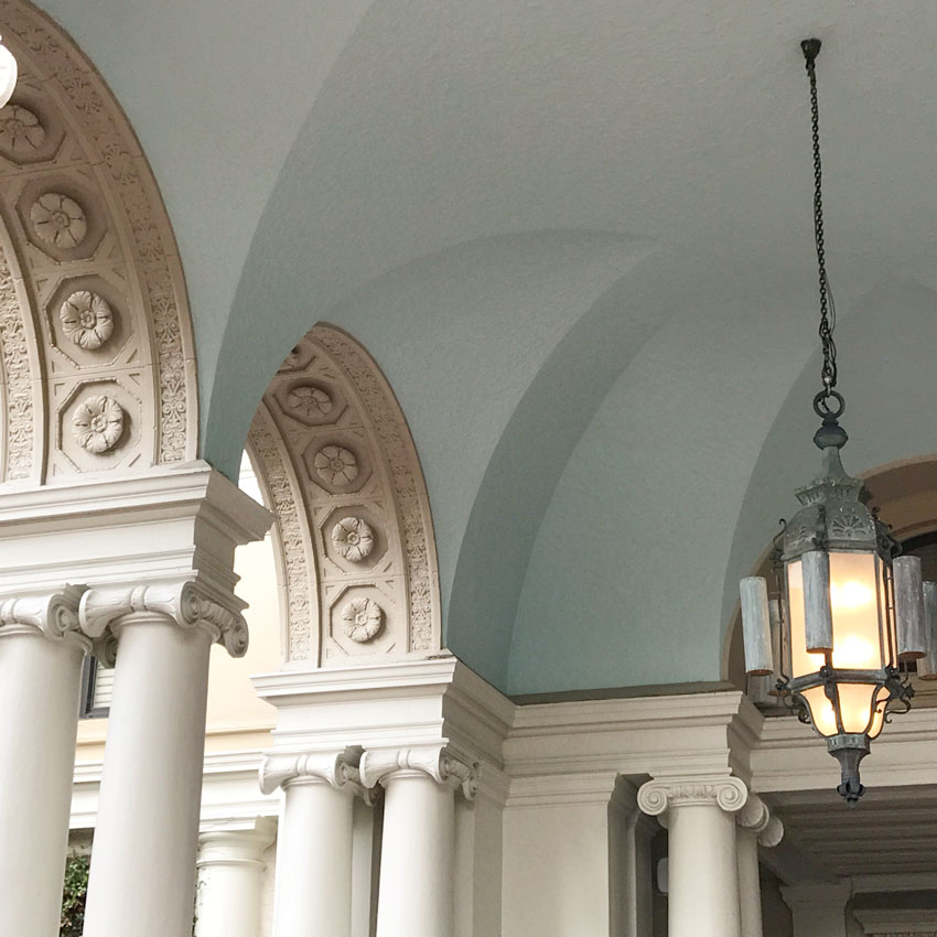
Is this Haint blue? Must be, we are in the South!
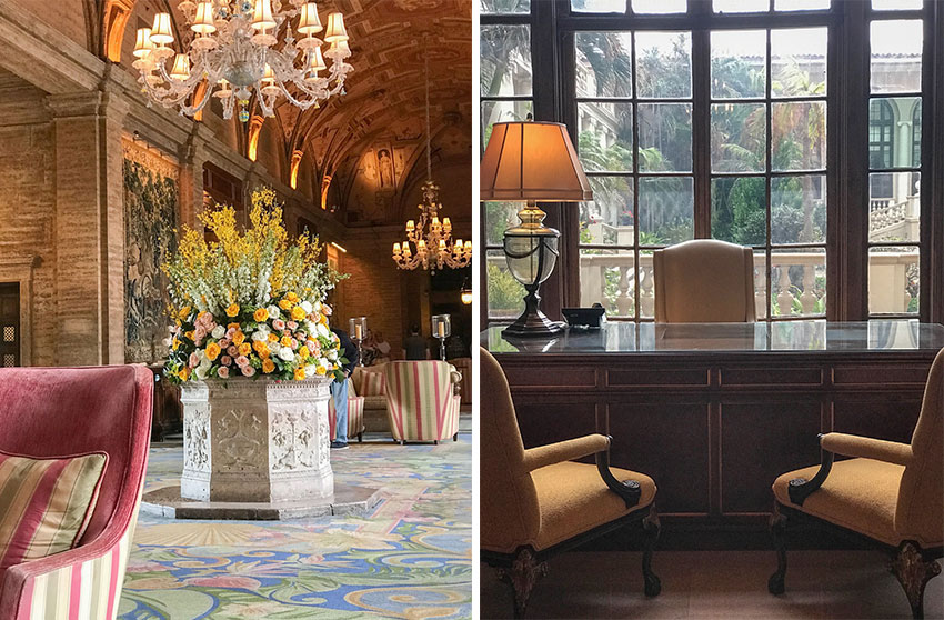
It’s so rare to see such a fabulous floral arrangement in the hotel lobby these days. But, it’s so smart because literally everyone paused to take a photo for their social media account.
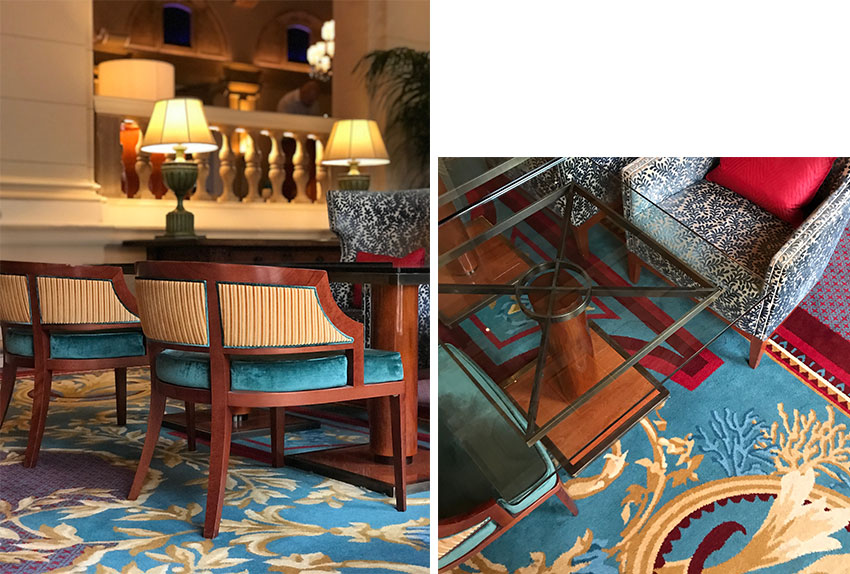
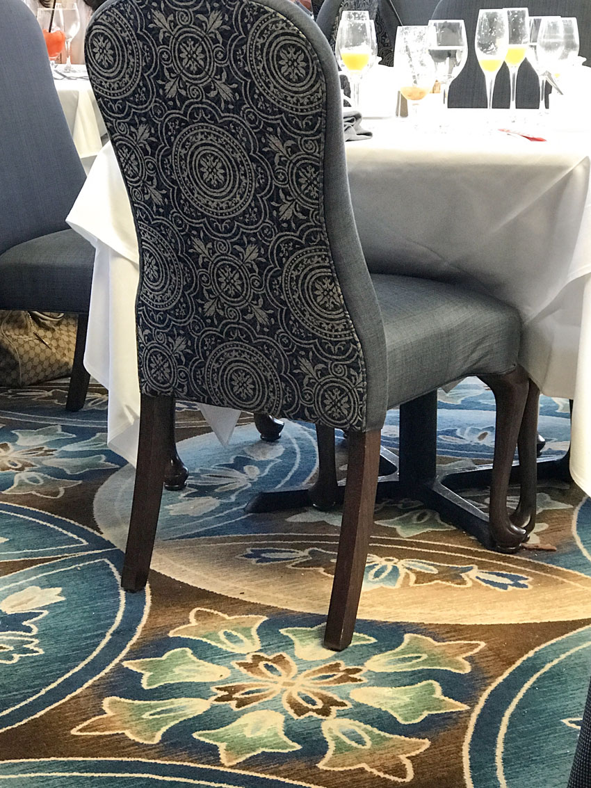
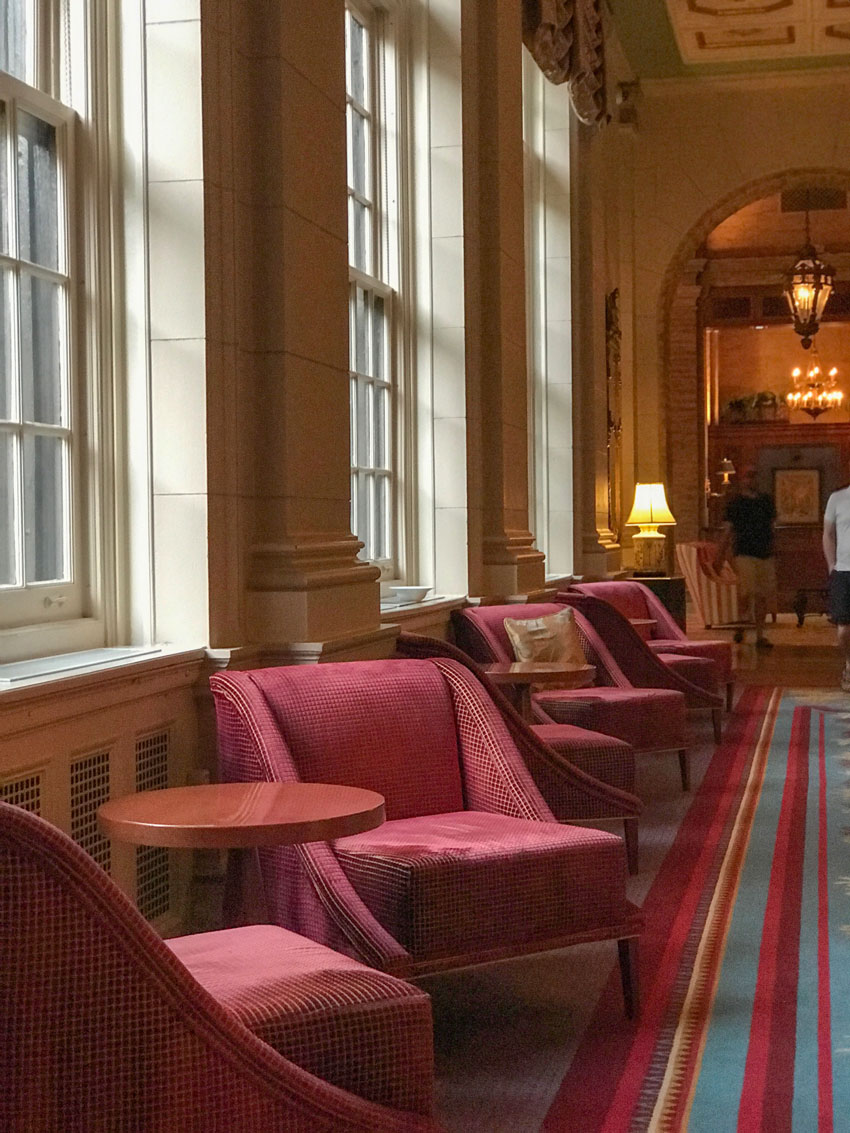
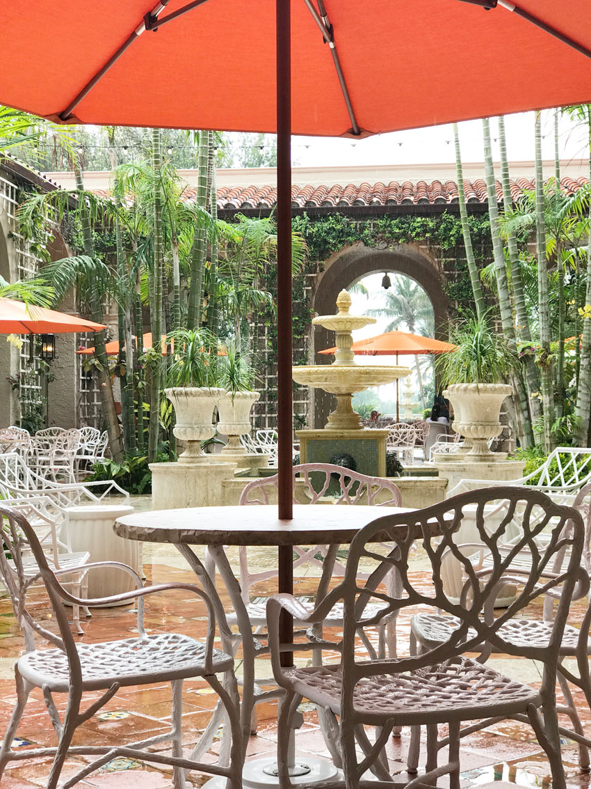
After brunch it rained a bit while we walked around the hotel. I caught a lovely shot of the pretty courtyard with bright orange umbrellas.
A hotel that is decorated with colour only needs to renovate when the furnishings get tired, and not simply because the colours are dated.
Colour is Happy.
And as it turns out, Colour is the most timeless too!
Okay which image looks like it had the most recent update? Post your guess in the comments below!
Related posts:
Grey is OUT (maybe)! The Colour Trend is IN!
Danger: How you Know You’ve Fallen for a Trend
How to Decorate with Black (And how NOT to Decorate with it)
The dining room
I’d say the dining room was most recently renovated. Gray chairs (that don’t really relate to the carpet) are what say it for me. I like the carpet, though. Nice colors.
grey/white chair on blue/brown rug
love the bright colors – need more of them everywhere please…
The teal, red, and gold coral rug with gold and teal chairs. Very fresh colors.
The room with the gray chairs! And from this photo anyway, the upholstery fabric doesn’t relate to anything!
All the other colorful, warm, and inviting rooms look like Boca forever!
Dining chairs have been updated most recently I think. Next guess would be the umbrellas
Gorgeous hotel! I guess the one with the teal and orange carpet, tripod lamps and all the tables is the most recently renovated. Those teal chairs look like something you could find at HomeGoods.
Blue dining room chair photo. I loved all,of the photos. No monotones! I am so tired of seeing that trend and staggers using it.
Maria
I would say the gray dinning room chair.
Not sure why the chairs on that rug were updated though .
I see no realation between the chairs and the rug.
The dining room chairs look like a recent update.
Though I would do with different lobby wall to wall carpet. Too matchy matchy with the chairs.
Love the color throughout. And the burst of floral color.
Thanks!
Gray chairs. They work with the carpet, but if it’s in the same hotel, I wouldn’t say they relate to the other public spaces. Lovely, but disjointed.
The Dining Room
I would say that the chairs in the dining room were added as the most recent update to take focus off the brown and blue carpeting, which was probably the most recent update before that. All the other images are of rooms that are colorful and truly classic (your case in point)!
I would say its the Haint Blue ceiling with the beige trim. Looks fresh and new to me.
Excellent post. I’m soon due for new furniture and my sofa will be blue! I absolutely see and agree about picking a color over neutral and I think just about everything looks great with blue.
I hazard to say that some might just prefer beige & creams together, not because it’s a safe choice. I love to come home to my neutral home. I find it very relaxing after all the colour and busyness of one’s day. And…as you know, there are undertones even in neutral colours. So to get it right, you must identify those while picking your furniture, wall colour and decor. I add colour in small doses keeping the overall feeling of an oasis of calm.
Is your yellow sofa timeless & gorgeous – absolutely. Would I tire of it – yes. It suits your personality as an extrovert. I linger over your home every time it is pictured. Beautifully decorated!
Those tripod floor lamps are definitely a recent trend and the turquoise and coral carpet & chairs have made a comeback too. But those grey, two fabric chairs on the brown & blue carpet scream reno. I really don’t know!
Such a great post and I love seeing those colourful hotels. So much nicer than grey or brown. Love that yellow sofa too!
A question for you Maria – when it comes to colour being more timeless than the latest trendy neutral (I agree by the way), do you have any thoughts about some colours being more timeless than others? I’m thinking of the not-so-timeless avocado greens and oranges of the 70s, the pastels of the 80s, the warm dirtier colours of the 90s and then the brighter cleaner colours. Nobody wanted orange in the 80s but there was plenty of apricot, and then it changed to rust… now its ok again. I can see how navy is a lot more classic and timeless.
I’d like to know this too. Clearly there are colors we totally associate with being dated. We also seem to oscillate between clean and dirty colors.
As to the person who asked about burgundy and hunter green… I suspect color combinations may date faster than specific colors? So maybe you could keep the hunter green or the burgundy and just change the other. (Such as keep a hunter green couch but change the burgundy wall color to something else.)
OK no beige…..but for as many years as I can remember, I have gravitated to shades and textures of white. I have tried my best to go to color….there was a Heriz rug period using those colors that are gorgeous for sure, and then my celadon green period and then…..well, you know what happened! I actually have a guest room in peaceful shades of aqua and so far I have not tired of it as it is a guest room!
Yep gray chairs
I still and will always love neutrals. They sing to me. That grey patterned chair with the slender brown legs makes me happy lol. Yes. Happy. So bright colors are very pretty but I could not live with them on a day to day basis. I would tire of that. It’s all what makes you feel alive. I mix texture etc in and just love it. I do think the grey chair pic is the most recent update wink wink. Fun post!
The sitting room with the tripod lamps. I do love everything about this hotel. It truly has that timeless feel.
The haunt blue ceiling
The room with tripod lamps and the trendy wing chairs.
I’m probably wrong as I’m not an ID.
After such a great post, I hesitate to say it, but someone has to…! THOSE SHOES! I LOVE THOSE SHOES! And the bag isn’t too bad either!
The row of red chairs along the windows because sunlight bleaches fabrics and the red fabric looks new (vice worn or faded).
I love that kitchen!
The dining room?
The cocktail lounge-seating area. The blue, white and orange chairs have the new cut out back that seems to be everywhere right now. Also, the tripod lights are very trendy right now.
The dining area with the grey chairs? I’m drooling so it’s hard to focus on what looks newish.
The dining room with the grey chair and grey and blue carpet. I love it, but it is definitely the current trend.
I agree. Which is it, Maria?
I love your posts. I purchased my gray sofa when we built our home in 2006, while drooling over cobalt blue and emerald green. It was the safe, sensible choice. I hope I have the guts to get a color I love next time. Navy blue would be beautiful, too.
I have no clue. Too much colour for me – it all looks very ‘old’ European. I do love the ceiling that appears to be a F&B – my best guess. So, what’s the answer, Maria?
I am guessing # 4 from the bottom, plus the one with the tripod/oversized lampshade lamps.
Love the pic with the Haint blue and the beautiful columns. Have a great trip(s) 🙂
All of them look fresh and updated though most may be Re-iterations of prior color schemes.
The dining room!
The dining room. The chair covering is gray.
My guess would be the picture of the blue dining chairs. Not because of the color but because I imagine dining chairs would need to be replaced most often.
But you’re so right!
Which brings up a question. What about dark red or cranberry & hunter green? I had those colors years ago & if I saw them now I would think it looked dated. Is it because I used them years ago? Would anyone think they’re dated?
I was thinking the same thing. I remember the hunter green fad, and also the country blue and mauve (from the 1980s). It seems style is cyclical.
I’m eager to see Maria’s answer on this. I love learning from her! I recently fell in love with a pair of “hunter green” chairs for our den. They were called something else but I remember that color! They look “clean”, not “dirty” and would be in our den with two Audubon prints (both of which have elements that relate to the green), but feature beautiful pink and navy colors as well. I think it’s what you pair individual colors and how it relates to the feature elements in a room that makes the difference. If it is THE feature color or is paired with a color that was trendy, that date sit completely.
Good question! I still love the red wallpaper in my dining room that was put up 15 years ago. Getting ready to sell the house I hear it makes the house look dated, but it brings me joy every day.
I completely agree that YOUR favorite colors never go out of style. I painted my lower cabinets green (F&B Lichen) after choosing a marble counter with green veining. At first, I thought it was a risk, but then I realized I have loved green since I was 3 and 32 years later, nothing has changed. I personally find grey & beige a bit depressing, so I’ve stuck to creams & whites for my neutrals after reading your books. We have moved, but I’ve been collecting/rearranging the same furniture & accessories since 2010. I only buy things if I love them, regardless of trends, so I’m still super happy with my house. And at the end of the day, my family is the only client that matters 🙂 Thanks for writing this blog and your books…they have given me a lot of confidence in my decisions!
Love The Breakers! Glad you do too.
I’ve been following The Breakers on Instagram because I love their photos and it’s somewhere I want to visit. I recognized the bold floral arrangement right away and you’re a lovely addition! I love coastal decor and crave living warm/coastal someday. Some of my favorite coastal interiors use the dreaded pink beige but do it SO well. Geography probably has more influence than we think when it comes to color selection. Have you considered visiting The Greenbrier? Dorothy Draper would have never followed a trend. That place is a feast for the eyes.
Best post ever Maria. Congratulations on actually liking a wood stained kitchen with beige walls (with the blue island for color), instead of everything all white! All the hotel colours look great, and they are mostly combined with earthy neutrals, not white or grey. A good example that you can add colour to any neutral. You can’t tell which was the most recent renovation, and why bother guessing when all the colors look good.
My best guess as others have stated is the gray dining chairs because they wanted to be in the gray trend. That hotel is spectacular and all of the rooms are just lovely! The “haint” blue or gray ceiling is fun.
Most of all I love the floral arrangement in the lobby and you look so chic standing next to it! Love your purse too!
The grey upholstered dining chairs were added to go with the current trend. I think to appeal to a younger generation who have no appreciation for timeless architecture and design and who are afraid of color. I bet a person under age 40 selected the grey chairs, an in-house decision and they did not hire a professional seasoned designer to specify that the new chairs to related to the glamourous and high end interiors of adjacent areas. .
I don’t know which room was most recently updated, but I do know which are my favorites. I’m loving that long lobby or bar area with the raspberry chairs and red and blue rug, along with the space where the ceiling is painted “haint blue”. I love the amazing architecture of this place!!!
Dining room—gray upholstered chairs.
Hope I’m allowed 2 posts ?. I read Mary-Illinois post and have to agree – there are a lot of colors that become “dated”. Along the the hunter green and cranberry how about seafoam, mauve (which seems to have made its way back, unfortunately ) “harvest gold “ , etc. I’m pretty sure if you had purchased a hunter green sofa you would have been looking to replace it after a few years. I believe you should use a color or neutral only if you really love it and it works in you space, but how do you differentiate between trendy color and classic color? I think that’s why most of us choose a neutral for large expensive pieces like a sofa and then change out pillows, accessories, etc to reflect our current tastes.
Hunter green WAS the trendy neutral of the 80’s, just like Charcoal grey is the current trendy neutral. Maria
My first thought was the gray dining room chairs but since gray has been “in” for a while, who knows! Second thought was the rose-coloured chairs along the windows or the chairs with blue! After all that, I would love to know a BM colour that would be a good “yellow beige” example for a sofa and also a comparable BM chip for the beautiful yellow that is your sofa..love it! And that blue island….what colour would that be? Thanks Maria, great post, as always!
I think it overall has a 1920s grand hotel atmosphere with some nods to 1940s and 50s. I agree the dining room looks the most recent change, although the oversized lamps and mid-century modern type chairs with the argle carpeting . Th.and the twig backed chairs on the patio could be recent. It all works well with the architecture.
I agree, you need to go to Greenbrier if you haven’t already. You have already channeled her in your home office, so would be nice to see the originals. It is so rare for décor to be that well preserved. I love that her book was titled, “Decorating is Fun.” I should order a copy.
Dining room with grey and navy?
My choices (more than one) for recently updated are:
Photo 8 and 11. Teal seems to be the color they chose on their furnishings to recently update the look. The pattern backing on the dining room chairs also updates their look.
The dinning room area thats seen all in grey!
Have fun in Boca! I love love love your bright yellow bag! 🙂
The dining room
I’m guessing #4 from the bottom because there’s a lot of grey.
As different shades of blue are consistent in all the carpeting plus upholstered furnishings colorfully co-ordinate, my guess is the gray chairs in the dining area have been recently updated with them being such a neutral. -Brenda-
P.S.: Not particularly crazy about them, however I do love the fabric in the back of them and would love to make Roman Shades (if suitable in weight and blend) for one of my spare bedrooms though … :).
I think the dining room with the grey is the latest room decorated although they were consistent to include blue which is seen throughout the hotel.
Oh, and I forgot to mention that countertop in the kitchen is beige not white as you stated.
Well it’s greige, because that’s what a lot of the marble looking quartz is, but I am totally guessing here, I could be wrong. Maria
I am probably wrong but I say the lounge area with the blue and orange chairs. The tripod lamps are a newer design trend so I am doing with the lounge rather than the dining room.
I too think that your yellow handbag is glorious. Colored handbags make the woman, imho.
Cant really tell whats redecorated because of the style of furniture room etc and all the color
going on…..Is that the point? Timeless style and lots of soothing colors and you’ll never be
able to tell whats new and what isn’t?
I love this post. I want to tell you how much I appreciate and have learned from your posts and E-books. Two months ago, my husband and I were in the market for a new construction home. Now, I’ve realized that what I thought I wanted was trendy, and it would be outdated in a few years.
I’ve come to realize that I actually do love our home, and that it just needs updating from tuscan brown to classic. I’m so excited! I’m no longer worried about the inconvenience of home renovations, b/c It’s end it will be beautiful, and much more cost effective.
Thank you for all you and your team do!
I have no clue what was recently updated, but the photo with the lovely red chairs under the big windows look so inviting, I want to sit there!
So glad you got to visit Palm Beach, Maria, and you certainly found the color at The Breakers! You’d love it at Christmastime. Thank you for a great three days of Specifying Colour with Confidence which I will always remember and hold dear. It was such a pleasure meeting you, Tereeria and all my fellow color seekers. I look forward to my new career as a True Colour Expert!
The dining room with the gray-blue chairs.
I have a beautiful green velvet sofa but we are now purchasing another for another ‘room’ in the open concept. I think one coloured sofa is the maximum. What do you think?
But why would you want to buy a sofa in a trend colour that would date faster? Unless it’s a white (or cream) sofa. Hope that helps, Maria
Hi Maria,
That is exactly what I am thinking. I love the cover of House Beautiful with one green sofa and one turquoise sectional but do worry about turquoise looking dated down the road. I am thinking of cream or white for sure. Thank you and I hope this question helps others.
In the sofa store yesterday, 90% of the fabrics were grey. There wasn’t really enough choice in whites and creams, so blue it is!
I say it’s the gold brown chairs in front of the desk.
I believe it’s the lounge with the blue and orange chairs and mid-century modern flair 🙂
Mid-century is a big theme right now and the carpet in the room seems to hint that was the inspiration.
Great post! Always very informative.
Thanks, Maria!
BTW-I have two rooms painted a deep, lovely gold by Benjamin Moore. Glad to hear it’s coming back!
My guess is the room with orange and teal.
I think the dining room has been recently remodeled! I love the navy chairs! I have a fairly new gray sofa. It’s depressing and I wish I had gotten a navy one! I may even have it recovered! Great blog!
By the way, this was a fun post! The navy and gray dining chairs are nice, but they don’t go with the carpet!
My guess for the most recent update is the dining room with the blue/teal chairs, orange/beige chairs and large floor lamps.
My guess is the bar area with bright colors, turquoise, orange/red, and gold. Your snaps of The Breakers were a treat.
The room with the big drum lamp shades, blue chairs and orange seat chairs, diamond patterned carpet. Right? Wrong? Which one was it? Fun and informative post.
I don’t think any of it was ‘wrong’. I thought the colourful rooms were timeless and that was the point of my post 🙂 Thanks for your comment, Maria
To me the most recently renovated picture is with the steel gray blue chair and floral Gray/yellow rug!
Is it the lounge area with the teal, and cream/rust chairs, and tripod floor lamps? The tables don’t seem to mesh with the chairs in any case. Maybe if they were round?
I bookmarked this post when I was halfway through it. Thank you, Maria, as always.