Maria’s Master Ensuite Reveal – Before & After
I know, I know, someone actually thought maybe my contractor had disappeared it’s been so long since I renovated my bathrooms (last summer). But the real reason for the delay in having them photographed was simply that I needed to get the sheers chosen and installed for the windows.
Lame excuse really, but here it finally is.
Before this bathroom was completed, I would bathe only at night, and RARELY in this house in the past six years (since we moved in) because the tub in this bathroom was too large (it was a jacuzzi tub built for two) and I hated the pink beige combined shower and tub insert in the main bathroom, that reveal I recently posted here.
Anyway, now I bathe every morning. In between looking at my phone after I’ve washed my hair, I love to gaze at my row of gold framed botanicals. They just make me happy.
Here was the plan I told you about last year, with a pic of the bathroom when we originally took possession:
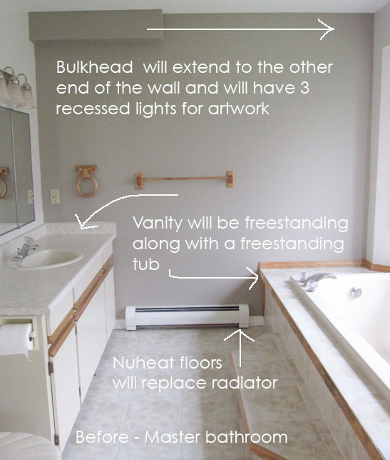
It was my friend and interior designer Jan Romanuk’s brilliant idea to extend the bulkhead and add puck lights to make it look intentional. She also designed the new millwork.
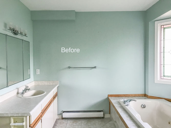
When we moved in, I replaced the previous homeowners taupe ‘accent wall’ with Palladian Blue which was the same as the master bedroom. I also replaced the bar light and towel bar but that was it.
I was so happy when we ripped it all out! Including the radiator, we added in-floor heat instead.
And here’s the after:
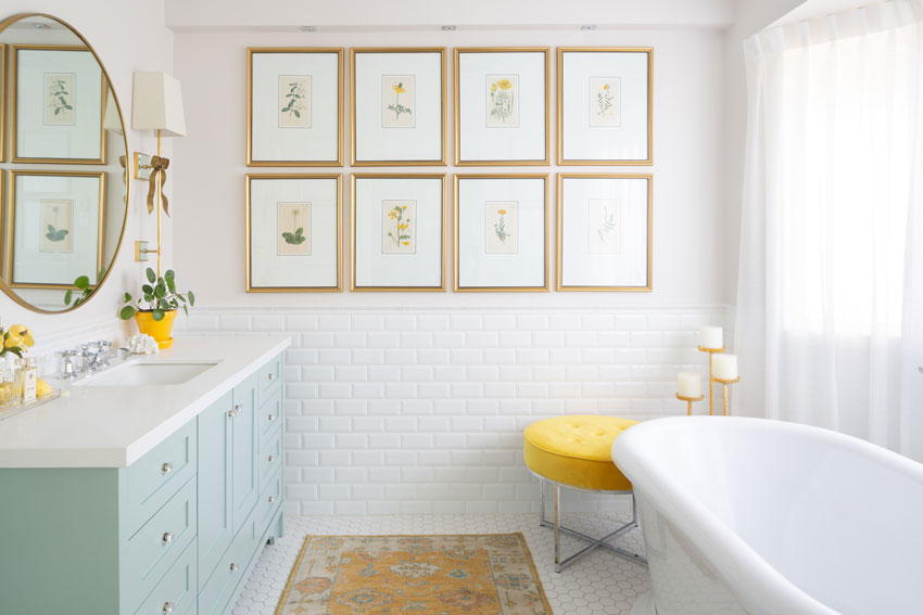
I chose a 2″ off-white hex tile and medium toned green grey grout for the floor. And the tile wainscotting is a true white 3″ x 6″ beveled subway tile with a matching cap moulding for the top.
Read all about whites and how to choose them in my White is Complicated ebook available here.
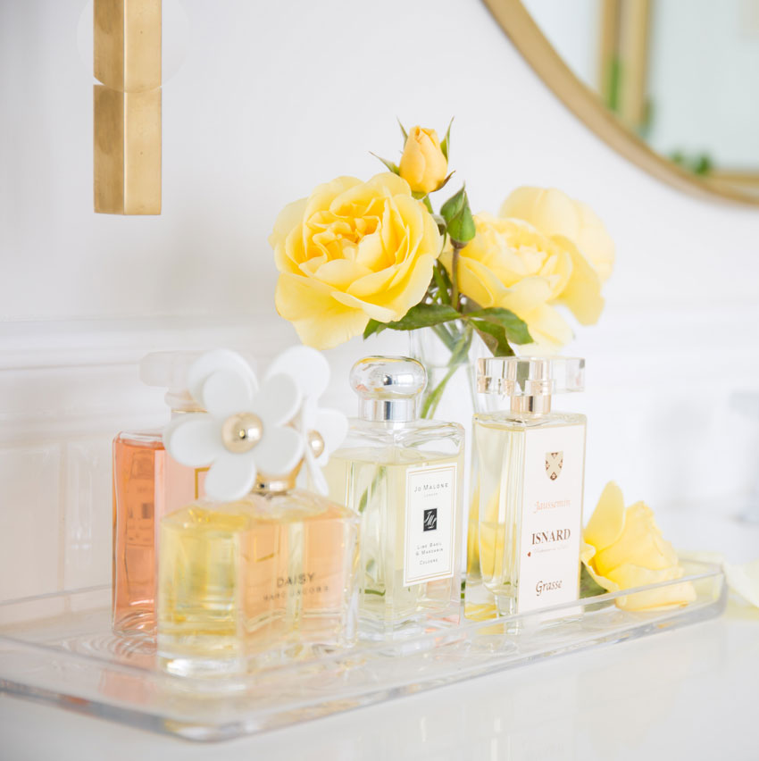
Yellow roses from my garden
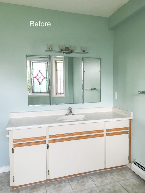
Before
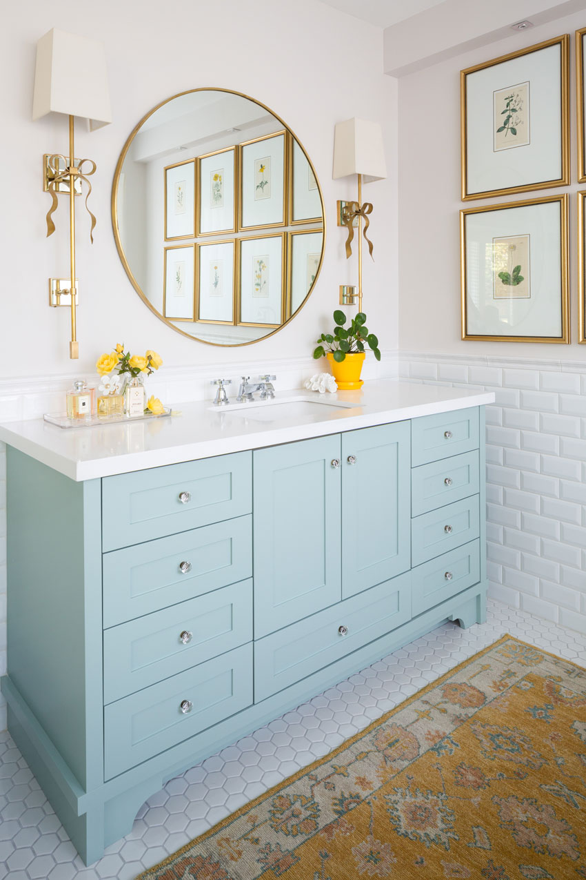
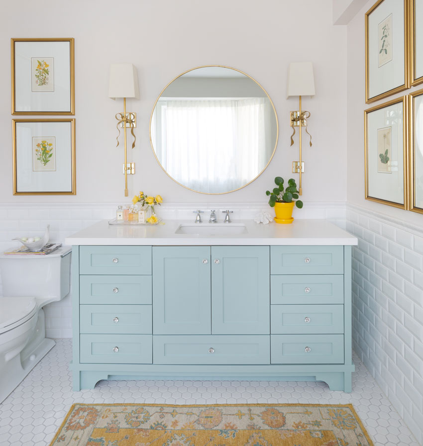
Vanity BM Wythe Blue | Walls are SW Incredible White | Mirror | Sconces Kate Spade | Knobs
You can see that I chose chrome faucets for the tub and vanity, I repeated the chrome in the towel bars (shown below) and the brass is repeated in the mirror, lighting , knobs and framed botanicals.
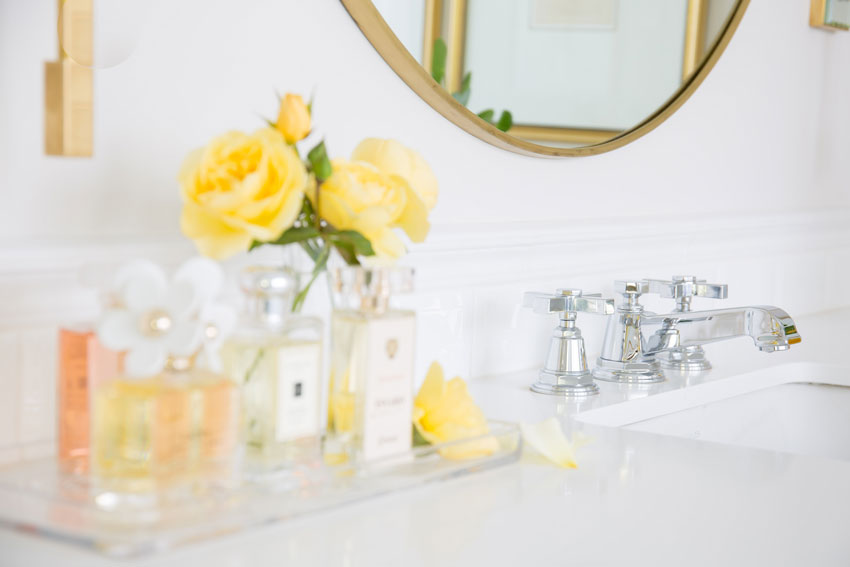
Faucet | Photography by Barry Calhoun
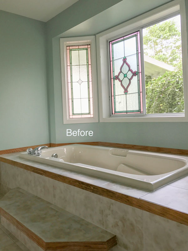
Before
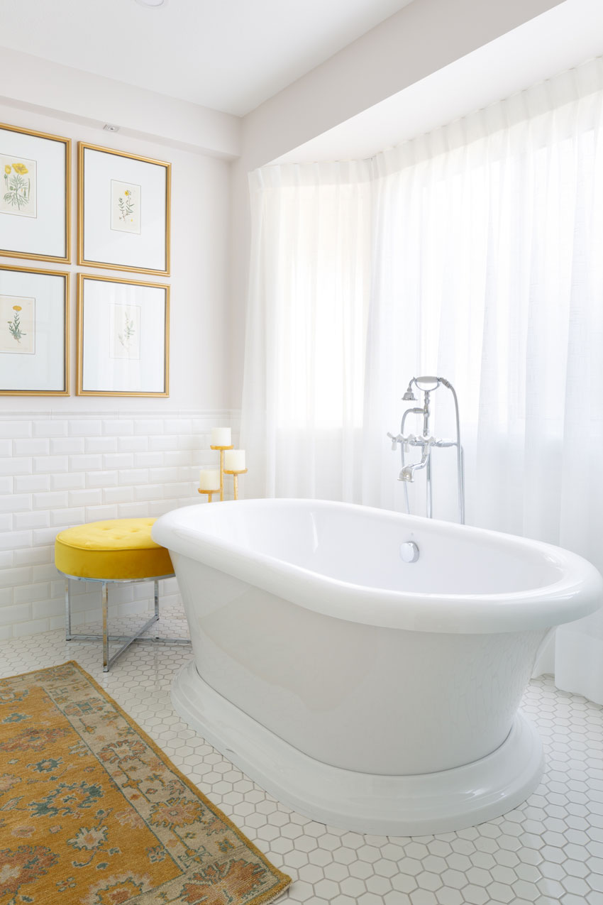
After | Ottoman and candlesticks is from HomeSense | Area rug no longer available
I designed custom sheers to distract the eye from the underwhelming generic windows. I did the same thing–but it’s more dramatic–for my lovely client Crystal’s ensuite here.
A few years ago, I bought 10 botanicals at High Point Market, I planned to hang them in my living room.
Then I had this statement art painted so I was left without a room for them until this renovation.
We completed the renovation in August last year and then when I went to High Point again in the Spring so I bought 4 more botanicals because I wanted them to wrap all the way around this room.
Here you can see them looking into the master bedroom (below):
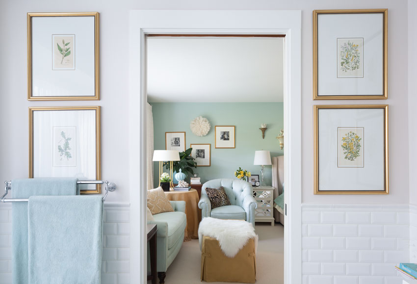
Here is the real estate photo of the master bedroom before we moved in:
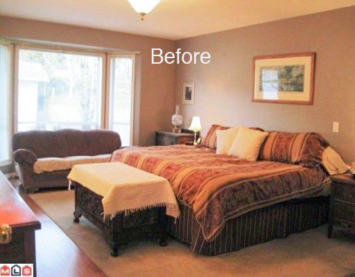
Before
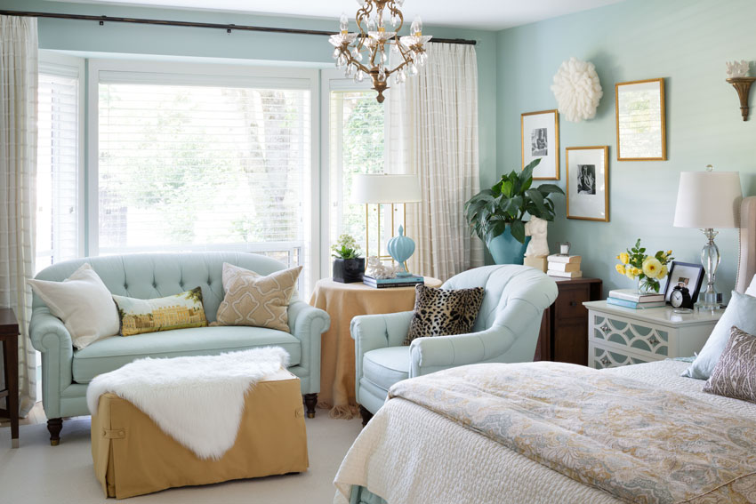
And here’s the after (see more pics of my Master Bedroom here)
Here is the bathroom again:

Before
Notice, there’s nothing boring about this bathroom but if you were looking at plain subway tile and hex tile along with the moulding cap BEFORE it was installed, you’d be thinking THIS IS TOO BORING.
However, boring equals timeless as I’ve said many times on this blog for those in the know!
Just like when you start a new build, you should technically have your decorating plan finalized even BEFORE you choose colours for a single item, it’s the same thing with a renovation.
In my main bathroom, I knew I was hanging the black and white framed artwork back into the room with a couple of additions, that inspired the black and white finishes.
In this bathroom, I already had the botanicals and they where what inspired this room. I think Barbara Sallick would approve.
I also installed the same faucet (but in different finishes) in both bathrooms. I learned my lesson when I chose two different faucets for my Mom’s Carriage house.
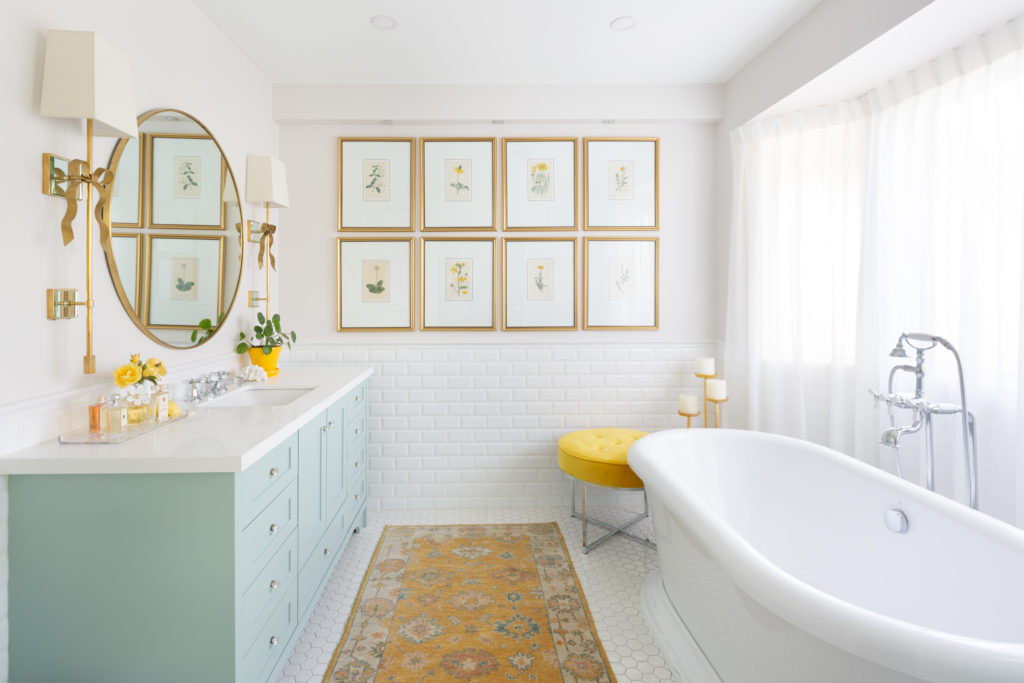
After
I cannot tell you how much I love this bathroom. It’s now my favourite room in my house! I feel blessed!
We just finished our Dallas workshop and it was fabulous! I met so many amazing women (and sometimes men attend too) and I saw lots of great networking happening too!
Terreeia and I are exploring Charleston this weekend, our True Colour Expert Training here starts Tuesday, we have 2 seats left, so there’s still time to register here.
Related posts:
Maria’s Bathroom Renovation Plans; Lighting and Vanity Design
Oh my goodness, Maria, your bathroom is so lovely! The colors flow so well from your master bedroom into this bathroom. My favorite thing might actually be that yellow rug! Beautiful job and I hope you enjoy it for years to come.
The combination of aqua and yellow is one of my favorites, so I LOVE this. I also love botanical art. I WANT that yellow stool.
Maria! This bathroom is gorgeous. And as you say, timeliness! Congratulations and enjoy. Thank you for sharing it <3.
*timeless
Wow, beautiful. Just finished reading White is Complicated for a second time since I’m working on a couple bathroom renovations. I like how you mixed off white and true white here. Im assuming that was to repeat the true white of the freestanding tub?
Yes, that’s right. Maria
Worth the wait! Beautiful Maria!
Lovely! Just curious Maria if u fully tiled behind the vanity or
just framed it with tile.?
No in this case because I only wanted one row of subway tile along with the cap on the backsplash the vanity was installed first and then the tile guys arrived. Maria
Maria:
Your new master bathroom is just gorgeous! I love what you’ve done and the bright touch of lemon yellow, my own favorite color! And….the before and after shots of your master bedroom? Hello to what a designer is capable of achieving!
Have a great time in Charleston this weekend, and thank you for inspiring us with your beautiful home!
The bath is gorgeous.
What is the blue on the BR wall? Also gorgeous!
It’s BM Palladian Blue! Thanks Cate! x Maria
I’m suffering from an acute case of tub envy.
Love the new master bath. Beautiful.
Absolutely stunning!
Absolutely stunning, one of the prettiest rooms I’ve ever seen, soooo very creative. Well done!
Love this room…especially the color of the cabinet!
It’s at once classic and timeless. Beautiful! You mentioned that you use the bath, after you wash your hair, but where do you wash your hair? (Visions of Mom leaning us over the bathtub or the sink, with a washcloth to keep shampoo out of our eyes. Lol.) We are currently having this discussion in our household. (Also, love the two grout colors. When I formerly specified just that, I was told it just isn’t done. As I was busy fighting the “no fake shutters battle, I let the builder win that one. Darn.)
Well I could use the shower head but the reality is I just dunk my entire head in the water. . . simple 🙂 Maria
Maria, this looks great! I learn so much from your rooms since you always explain HOW and WHY you made design choices. I really like how you’ve repeated silver and gold metals in the space. I’ve been struggling with how to incorporate brass/gold so this is a great example.
In the pictures it looks like there are different grout colors on the walls and floor. It looks fabulous! I’m curious how you came to that decision. To my eye the grey grout adds dimension mimicking the shadow lines from the beveled tiles. Was that the intent or did you have other things in mind?
The reason I chose grey grout for the floor tile was simply because it gets dirty. I have chosen many green beige colours for white bathrooms with white tile and dirty grout because it truly was the most prominent colour in the room. Maria
Wow, Maria, this is so inspirational! OK, I’m ready to do mine! Thanks for sharing!!!
This is simply beautiful, and a lovely inspiration for all of us. thank you so much for bringing us into your home!
I just love this clean look with the brass!
Love the update…love that you took your time to update. People can make so many mistakes if they rush into an update. It’s timeless and gorgeous! You hit it out of the ball park! (as usual)
Beautiful job on your bathroom. I read and re-read your White is Complicated e-book when I started to do our bathroom. We ripped everything out and started over. I went with the hex tile with silver gray grout. We loved it right away. I used bevelled subway tile (with white grout) around my new claw-foot tub. I kept the large double sink vanity white with a quartz top that was white marbled with some gray. The wall paint was BM Beach Glass. Without your book and advice, I know it wouldn’t have been such a success. Every decision I made was thought about 10 times over. But I can say that my bathroom is definitely timeless. I’m still working on the small details that make it come together. Most importantly, I feel happy everytime I walk into that room.
Thanks, Maria.
This is hands down the loveliest bathroom I have ever seen. You rock Maria! Want to share what your choice in perfumes are:)
Your house looks like it breathed a sigh of relief when it saw your re-do. Wonderful.
Wondering what is so generic and underwhelming about stained glass windows?
Nothing. I just didn’t like them in my bathroom. And the windows themselves should have been longer to really be a feature that would look good with my tub. Maria
It’s truelly beautiful! Even though it’s colorful, it looks serene.
When I first looked at your new wall color, I thought it looked pinkish. Does it have a pink undertone?
And can you explain why you went with Whythe blue for the vanity instead of the Palladian blue from your bedroom?
Mary, I like your questions!
Good question, I went one shade darker with the turquoise because an accent colour should usually be darker. Which is why it doesn’t work to paint your kitchen island white (for example) if the rest of the kitchen is a wood stain.
Yes the walls do have the slightest hint of pink! Maria
Beautiful! So happy! You’re happy!
Question – with that size of a vanity, most people would insist on double sinks. I always think it’s silly given it leaves you with zero counter space and often less storage. I think T uses the other bathroom, so was one enough?
What were your thoughts as you designed it?
It just wasn’t big enough for double sinks and as you correctly assumed, T uses the main bathroom! She loves the walk in shower, it was designed that way upon her request! Thanks for your comment Glenda! xo
Gorgeous gorgeous gorgeous! I love the color of the vanity and the classic lines of the tub and the sconces and the botannicals and…well, everything! Kindred spirit here – I also have a Palladian Blue bedroom and it makes me happy every day!
Must say, I am in complete awe, I keep looking at the before and after pics, and sure enough, it is the same space, but looks so much bigger! Your buddy, Jan is also a genius! The botanicals really make it special! Great work!
Lovely, just lovely! It is so spa like! No wonder you like to bathe every morning. All that you would need is one of the trays that fits across the tub for your morning coffee and your shampoo etc. The colors are soothing. Also love the sconces that you finally chose. They are just perfect! Awesome! Fabulous job!
Lucy, I ordered one from Anthropologie and didn’t even THINK to measure it, assuming it would be adjustable. It wasn’t. So back it went. And the photoshoot went on without one boo hoo. Thanks for your comment, as always! xo
It is indeed timeless and classic Maria, and your heart must smile secretly every time you enter the space. I love the gold accessories, and you have unknowingly answered a question of mine, can you mix metallics? Yes you can. Softly feminine and elegant, you do have a great eye Maria. The wait was well worth it.
Adelaide, you are so sweet thank you! xo
Maria, I just discovered your blog and it’s so very helpful! Take a look at my bathrooms. Right next to each other! Ugh. I want to do the same black and white floor in the peach bath which we’re gutting. And maybe even the beadboard but with a black vanity. I hate that they look so totally different and that you see them at the same time. So now I think they may end up too similar when I’m finished! Oops, I can’t attach a pic but It’s classic white tile with small black squares and white beadboard …
I love your beautiful bathroom, you have done a wonderful job on it, Maria. Just looking at it’s colours lifts my spirit. I can understand why you bathe there everyday, as it would make me feel happy too and I just love that freestanding tub, it looks great. Also extending the bulkhead and adding lights to it makes such a difference. A great job, enjoy!
Absolutely lovely Maria! The bathroom is beautiful and I love the way the bedroom beyond co-ordinates with it so well. The whole thing is restful, feminine and elegant. Love it!
Oh Maria, your bathroom is just fabulous! It makes me happy just seeing the pictures online. Thanks for explaining how and why you arrived at your choices.
Gorgeous, Maria! And I love the little details you selected, like the bowtie sconces!
I also am relieved to see a “dirty” rug work so well with all of the cleaner yellows and whites. I’ve been struggling and putting off rug purchases for just that reason. It’s nearly impossible to find a rug that doesn’t lean more toward the “dirty” color spectrum. And the ones that don’t, are absolutely blinding! I have a lot of white in my house now (thanks to you), so seeing this really helps show me that it will work!
So thrilled to finally view your finished master bathroom! It’s gorgeous as always is everything you touch. I was waiting to see your timeless classic style before I start remodeling our bathrooms. Thanks for always creating beautiful and timeless spaces.
I know some love to go with every trend that comes along. But many of us love updating with accessories, not with whole house remodels. Timeless and classic is the way I love to go too. Love! Love! Love!
Love your pretty bathroom, Maria! What an amazing transformation. Enjoy your time in Charleston. My favorite city! So many wonderful places to dine and shop!
Gorgeous Maria! We are renovating our bathroom in the spring and I’m feeling even more inspired now. Cheers!
It’s absolutely GORGEOUS, Maria!!!!! ?????????
Hi Maria! Your bathrooms look beautiful and elegant! Can you PLEASE share the grout color used for the wall tile?? I used white grout with 4×8 white matte subway in our master and now am on the fence about using white again or an extremely light gray in our main bath… However, after reading what you just wrote, I’m thinking you would say “stick to the white because it’s already in the second bath.” Glad to read that I made the right choice about duplicating the same faucets, thought I was being too matchy matchy didn’t know until now but I bought the same ones that you chose for your mom ?
The grout colour was the lightest one, I don’t remember what the name of it was. . . if you have contrasting grout on the floor tile then your wall grout should be the same as the tile. Hope that helps, Maria
I love love love this bathroom! I just put an area rug in my master bath and thought everyone would think i was crazy. If Maria did it , it must be cool : )
I love the aqua and gold with the white. Just lovely.
Lovely and feminine
Every inch is perfectly lovely!
Looks beautiful and so you! Love those floral prints. Great job! Enjoy to the fullest. And I just recently took a pic of those sconces 🙂 adorable choice!
I have a couple of questions Maria – it looks like your freestanding tub is anchored to the floor. During our last remodel a plumber told me that a freestanding tub is never really anchored – only by the plumbing – and could easily shift on the floor. He also said that they are “just for looks” and people don’t really like to bathe in them. So I didn’t do a freestanding tub. Since you take a bath everyday, like I do, what are the pros and cons of a freestanding vs a standard tub?
Hmmm. . . my plumber did not say that although it took 2 plumbers to get this tub installed. The first plumber pretended that this tub did not come with the right parts and delayed the job while waiting for these ‘said parts’. Then another 2 weeks passed and he came over and blankly stared at all of it and then ‘vomited’ in my other bathroom saying he was exhausted (and it was 5:00 pm when he arrived). We fired him.
The second plumber did a beautiful job, that tub certainly cannot be moved and it is divine.
I’m guessing your plumber did not know how to install a free standing tub.
Hope that helps,
Maria
Fabulous job, Maria! My husband loves it, too–I thought he’d think it was too “feminine,” with the sconces, but he loves it all. We’re about to gut our my Hall and Master Baths. I’m following your advice, carefully, as any project you’ve done looks gorgeous to me. I love the pale aqua on your vanity but have been squeamish about using anything but a white or creamy white for my vanities. I’m glad to see you do this in your own home and how it relates well to your Master Bedroom (I have BM Homestead Green in my Master.).
I realize paint can be changed, later, and since that’s the only semi-fixed color in your bathroom, do you feel it’s okay to paint the vanity in a color (I see navy and blues a lot, still.) or use a wood stain as long as other elements are simple and white? Considering a color or stained wood for our (grown) kids’/guest Hall Bath.
A wood stained vanity is fabulous in a white bathroom AND colour is way more timeless than the current trendy neutral which is why I did not hesitate to paint my vanity a colour! Hope that helps, Maria
Your master bathroom is stunning! Love the vanity and those gorgeous lights!
Yay!! I had been anxiously awaiting this bathroom reveal :-0 Many of us should be inspired with this once builder grade 80’s to gorgeous bath! Jan I am sure was invaluable (that vanity looks custom all the way and the apron in front of the toekick is genius). I love the plumbing in chrome and crosshatch knobs as I view those another classic touch. Thank you for sharing the solutions to issues- the soffit is extended and now useful with lighting (I know removing was not an option) and heated floors replaced baseboard heating. Touches that really move the bath to the next level too are 1. Gone is the boring glued on mirror / medicine cabinet. I am one that insists on taking down those and putting a real mirror in place. 2. A non “bath” rug (handmade? wool it looks like- yum) that coordinates your secondary colors. Who ever thought the cotton throw or shaggy pile were ideal? 3. Full length real curtains! I am curious if you have a handtowel near the sink… Thanks Maria!
Hi I am renovating my master which is 11’6″ x 10’…curious what the size and company of you lovely vanity. Did you custom paint it? What a delight now truly a WONDERFUL renovation!!!
Lovely bathroom. It is great to see a realistic size bathroom and how beautiful it can look. Since so many bathrooms use hooks for towel instead of bars, I wonder what your thoughts were as you selected a towel bar. Where does the vanity towel reside? Thanks for sharing your outstanding space!
I don’t have a vanity towel, having the towel right beside the door on the way out works great! Thanks Barb! Maria
Your bathroom is stunning and very relaxing! I would love a free standing tub now!
We are in the planning stages of our bathroom update. I was considering a square sink but didn’t know if it was classic or more modern. I thought…I wonder what Maria put in her bathroom? Then I saw this post! I see you choose a square sink. Would you mind sharing why? I always love hearing your explanations. I assume that a square sink is classic when the rest of your bathroom is classic? Thanks!
I chose a square sink because I wanted something different from an oval sink. In the world of classic vs. timeless, the sink is probably not the first place in a bathroom that someone will scream “OMG it’s so 2018!” Hope that helps, Maria
In the world of classic design the thing to keep in mind is colour and pattern. Will the pattern date? Is it trendy? IN most cases the answer is yes, so introduce it in wallpaper or a rug, much easier to change out than tile. Will the colour date? Is it trendy? A little brown, a little charcoal, a little black goes a long way, when the entire bathroom is any of those neutrals, it starts to scream TRENDY. Hope that is clearer. Maria
Maria – It really turned out beautifully. I laughed when I saw your sconces in the bathroom. I’ve had those in my Amazon wishlist for a while and I think I saw them on one of your posts originally.
Beautiful bathroom! Just 2 questions; what is the size of the room and do you have any other lighting besides the scones?
Hi Maria,
I love your new bathroom vanity (in your new master bath). Would you mind sharing your source? Did you buy it (already made) and have it custom painted?
Thank you,
Laurel
Yes it was custom made by Quality Cabinets in North Vancouver. Maria
Your bathroom is beautiful! There is so much I love about it – the botanical prints, the ribbon sconces, the blue turquoise vanity.
I was curious – that is the paint color on the wall? In some picture is look basically white and in others it looks like a very pale pink.
Thanks!
Yes it is SW Incredible White which, in this bathroom looks pale pink! Maria
Oh I hope you’re still responding to comments Maria! Did you say that the wall grout should be the same as the wall tile if contrasting grout is used on the floor? So then the grout on your wall is white?
Yes. Maria
Hi Maria, your bathroom is just gorgeous! Where did you find your rug? Do you know the brand?
I don’t and it’s no longer available sorry! Maria
Maria – gorgeous bathroom! Are the hex tiles gloss finish? I just placed an order for gloss hex tiles but wondering if I should look for matte finish instead. Thank you!
Yes they have a sheen but I don’t think it matters. Maria
This is a gorgeous bathroom. I was wondering if the tile on the floor is glossy or matte. Also, it looks like the grout on the wall blends with the tile. Is that correct? Great job!!
They were glossy and the grout on the wall tile is the same yes. Maria
Wow, aside from the extended bulkhead, adding the wall tile, and removing the radiator–this is awful.
Maria can you tell me what your countertop is made of? I am guessing quartz but do you remember which one/style? I am trying having a tricky time finding one that is as plain as can be and not full of grain. I love the mix of white and off white finishes!
It’s Pure White from Caesarstone. I chose it because I used it also in the powder room and the 4″ backsplash which became part of a frame around the mirror in the main bathroom as well 🙂 Maria
Absolutely beautiful! Would you mind sharing the specific grout color you used?
[…] via […]
Beautiful bathroom. What color of grout did you use for the floor?
Maria, we are building a new home and I was wondering if you remember the make and model of your tub? It looks so sturdy. Has it held up to your expectations so far? Any other soaker tub shopping advice? There is such a choice out there, and I want something on the low side to be able to take advantage of a water view. I read somewhere that in Europe historically they called them ‘garden tubs’, when the tub was located to strategically take advantage of a lovely garden view! Sounds good to me, lol. Thanks…
This Bathroom I just came across and is stunning! It is very similar to a bathroom remodel I am currently doing at our beach home! Is your vanity custom? I am doing the same color pre bought, but I prefer the white countertop!! Can you share your source please?? Thanks ❤️
Hi Maria
I am new to your platform and so happy to be here!! We will be remodelling our existing bathroom and have been looking for a vanity. I absolutely love the one you have featured in your own bathroom remodel of 2018. Can you tell me where you purchased it? Thanks so much!💖