Sometimes small changes can make a big impact on your home’s exterior. Here’s an excellent design trick to make your brick accents and columns look timeless.
My client Deborah moved into this house with brick accents along with brick columns (below).
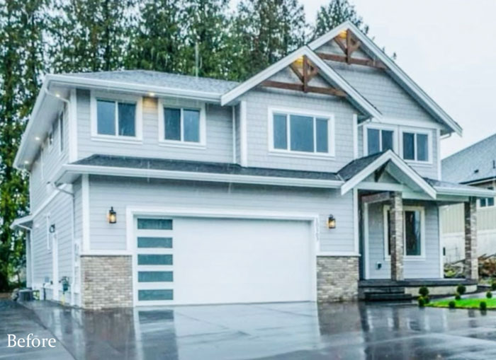
She immediately dry brushed the siding paint colour on top of the brick to make it look authentic.
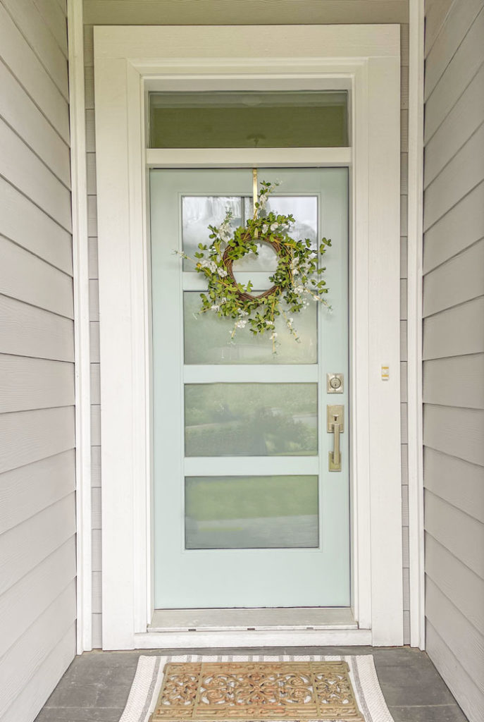
Here’s a better photo of the brick painted (left) and what it looked like before (right).
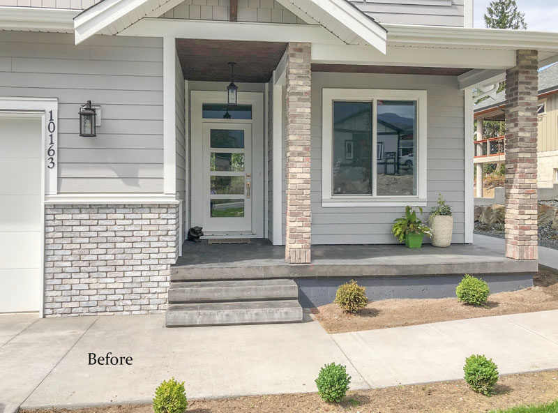
These are the columns, that weren’t beautiful yet. So she had them covered up and added trim to each base.
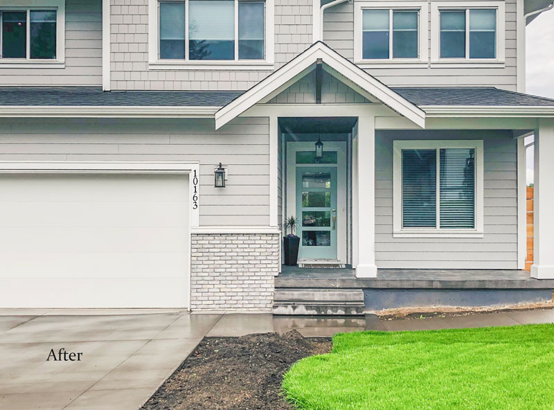
Then came the landscaping, but let’s see the before again shall we?

Sometimes the little things make a big difference!
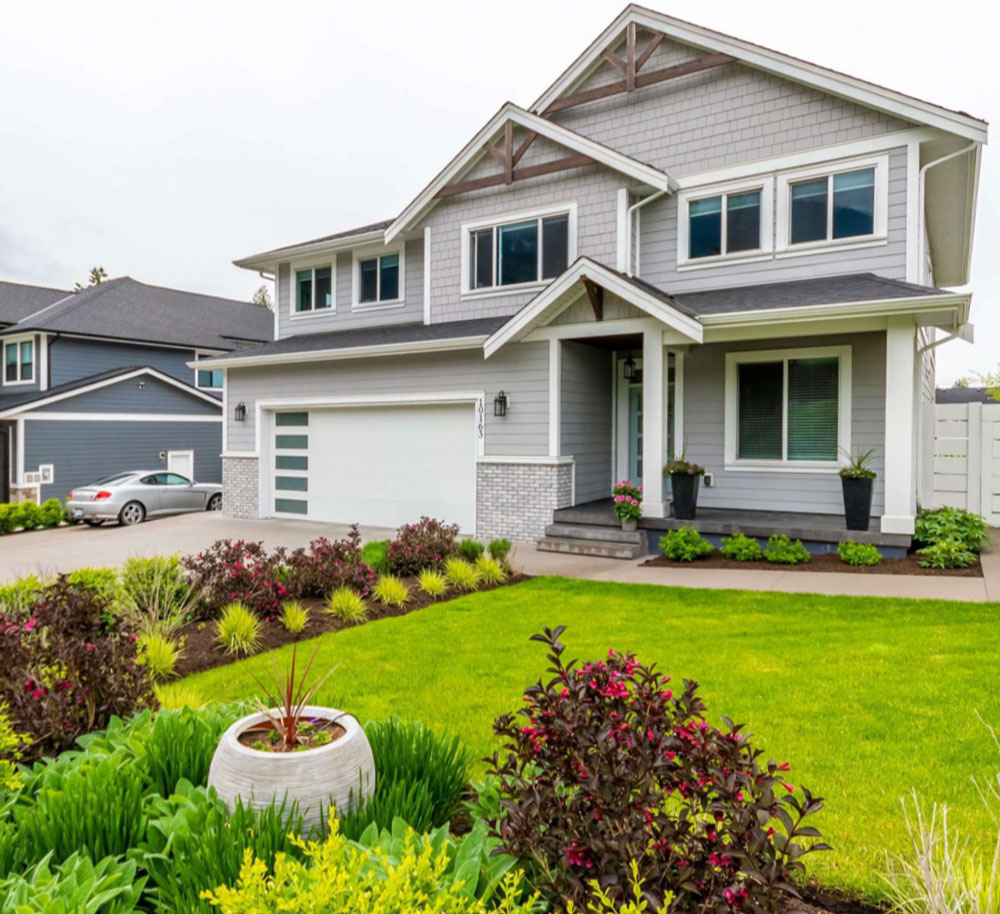
After
Photos speak a thousand words don’t they? See the inside of this now, much prettier house here.
I’ve seen many brick columns throughout my career and VERY FEW that I think should have stayed on the home.
If you have brick columns that work on your house or an Ask Maria question, send me your photos here. Please note, questions without photos CANNOT be considered.
If you’d like to learn how to choose the right colour for you exterior, purchase my Masterclass for Exterior Colour Selection here.
If you’d like custom advice on your exterior colours, see our exterior packages here.
PS. Here’s my latest coat purchase because we’re still wearing them here in the West Coast. #worstsummerever

Related posts:
What Colours are Trending on Commercial Exteriors?
Stone Placement; Is Stone Necessary on Your Exterior?
How to Choose the Right Windows for your Brick Exterior; Before & After
Good example of proportion, repetition ,
and LANDSCAPING.
All elements of good exterior design.
mwhitedesign
SO much better in the After pic! I’ve never seen a brick column that looks right but perhaps even worse are wrought iron columns. Those look too spindly to hold up a roof.
I think brick columns can work on a craftsman type house but only if they are large, tapered columns and the house can carry them. I agree with the white farmhouses with black windows . . . Not timeless at all to me. Especially the “severe looking” ones. And I think they look odd in the midst of other styles of houses in a neighbourhood.🤷🏼♀️ That being said, I have seen photos of white farmhouses (with white windows) that looked as if they had been there for generations. Those were timeless.
I know what you mean about the white farmhouses standing out in a neighborhood but I don’t always think it’s the farmhouse that’s the problem. A white house is a classic look and sometimes the rest of the neighborhood just looks as if they are trying to be mini mansions or they were just that particular developer‘s favorite style. Totally agree that all white is a more classic look than the trendy white with black windows.
Great examples and photos. What does “dry brushing” mean? Is that just a very light coat?
Well it means you’re not painting ALL the brick just the parts of it that are the wrong colour, leaving the mortar the same colour, etc. Maria
A great post Maria!
A minor trim question: in the last photo (re top right) there is a white horizontal trim board separating the accent shingles from the clapboard. Is it always necessary to transition in this way? Or could they connect to each other directly for a more minimalist look?
Brick anything doesn’t look good added on to a house that isn’t brick. Our 1964 house has a full flight of brick stairs up to the front door, with solid brick on both sides, left next to the driveway and right on rising ground with landscaping. It was an eyesore. First we had limestone slabs added to cover the steps and landings, and then we had the brick whitewashed. Those changes made the whole pile so much less noticeable. The siding is yellow, trim white, and roof grey, with a similar stone patio in the back, so everything goes together now.
White houses are classic. Black trim on white houses is trendy.
That is an interesting observation I had not considered. Thanks Kay! Maria
Wow! Great before and after on the house with the wobbly, spindly looking brick pillars. Landscaping also made a huge difference. Love.
At the same time, the absolute first thing I would have done would have been to knock down those faux support beams under the eaves. They look ridiculous to me. I see they are still there, just stuck onto the edges of the house — why?!
My “why” sounds rhetorical. I was serious — is there a reason for these faux support beams? They look like something a window washer would install — temporarily — and then take down after. Or like a temporary site for a piano mover’s ropes and pulleys? I don’t get it.
I agree! I think they spoil the final hugely improved look of the exterior. As a design element, they don’t relate to the new contemporary design of the front door and the garage door. It’s like the house has a split personality! At the very least they should have been painted the same white the rest of the trim.
There are a lot of homes in subdivisions where the builder adds random beams like that to make one house different from the next. I think the garage door is too modern as well to suit the traditional style of this home, however the homeowner has the house up for sale now so the next homeowner can worry about those details! Good eye ladies! Maria
Great post and before and after example. The street view is fantastic. Love the landscaping!
Pretty color of yellow for your jacket.
Reminds me of when I suggested a client dry brush her fireplace, she did and it completely changed the look & feel of the room.
Such a low cost way to update things!
I agree that painting the brick made the house more harmonious, more coordinated, more uniform, more aesthetically pleasing, in short better–but could you explain why you call it “more authentic”? To me “authentic” implies meeting a standard of correctness based on a historical style precedent, which doesn’t exist for a house like this.
I didn’t call it authentic but I do think it’s a more timeless look since most columns should be white to match the trim and NOT brick. Maria
Brick columns do work depending on the style of the house and specially when used with warmer colors complementing the color of the bricks.
Personally I do not see many homes with street appeal including million dollar homes. There is paint, bricks, siding, stack stone without any looking good. Have no idea who is making these decisions but it does not include street appeal. Maria good for you to teach and have your design team help people with this huge, costly decision.
Sooo much better. I ditto this sentiment for “stone” columns at home entrances. Never seen one that wasn’t cringe worthy.
Much improved with the white columns, but they appear to have been clad with wood rather than painted out. They are smooth rather than textured as a painted brick would be. Could just be my phone, but I did open the image and zoom in.
The landscaping is spectacular, and the mulch colour related nicely to the decorative beams under the gables. To my mind, wooden planters on the veranda would have helped tie it all together.
They were definitely clad, the second image just showed the difference between the brick after she painted it vs. what it was. Maria
I think white houses with black trim have been around for quite a while–especially ever since cheap premixed bright white and black paint became widely available in the 1930s at your local hardware store. Of course, white houses have been around for at least two centuries. But before the 1950s, it was more common to have the trim white and the sashes painted black or green. A dark black/green was even more popular than pure black in the 1800s.
Brick columns can look OK if they are massive enough to look like they are actually holding up something and have a base and capital. Back in day they were actually load-bearing and round ones were made of specially-shaped brick. Nowadays, brick (and stone)is a thin veneer often placed with little regard of actual structural placement and proportion, and so looks slapped on and weak.
The after looks so much better to minimize the brick and its somewhat random placement. These brick columns also go all the way up to the roof, rather than to under the top lintel, where it would have ended if they were actually structural. At least there is a lintel, which is often not visible in modern porches, but it does not line up with the one above the steps. When trim is treated as decorative, rather than symbolic of the underlying structure, it often looks wrong.
I actually like the gable ornaments, and that is historic placement, although the design is a bit more contemporary. At least the house doesn’t suffer from excessive shallow gables, as is often seen on neo-traditional houses.
Great call on her part, it certainly felt out of place with the house. It looked so much better painted, and now it looks extra lush with her landscaping! What a beauty.