Today I want to explore the enduring appeal of Nancy Meyers’ kitchen designs, as seen in iconic films like “Something’s Gotta Give” and “It’s Complicated.” These movies feature classic black and white kitchens that remain stylish and relevant over two decades later.
And that, my friends is the very definition of TIMELESS.
Back in 2010 I wrote a post that compared the beautiful and utterly timeless Nancy Meyers white and black kitchen in Something’s Gotta Give that my client had copied.
And it seems that lately everyone is talking about Nancy Meyers’ classic movies’ timeless decorating style.
Simple, versatile finishes and subtle styling that transcend trends–isn’t that everyone’s goal for their kitchen design?

Nancy Meyers at home via Elle Decor
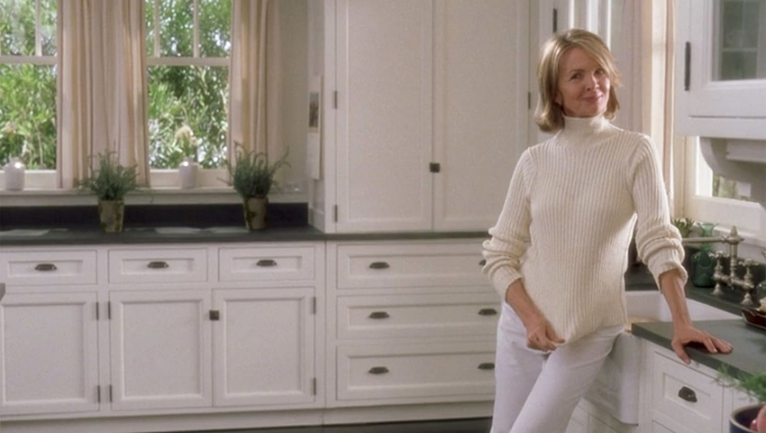
Diane Keaton in Something’s Gotta Give – Universal Pictures
Is timeless trending?
I would say timeless has become a hot topic. But I see people calling all kinds of things timeless. Most people think the overdone black and white they’re installing all over the place is also timeless.
However I take timeless seriously. Because, do you want to know what the real test of timeless is?
Timeless is when you can’t tell if it was installed decades ago or today.
It means keeping it simple and not installing a bunch of trendy “look at me” finishes that are easy to associate with a specific trend era.
Just like the famous Nancy Meyers kitchen in ‘Something’s Gotta Give’ starring Diane Keaton. This movie came out in December of 2003.
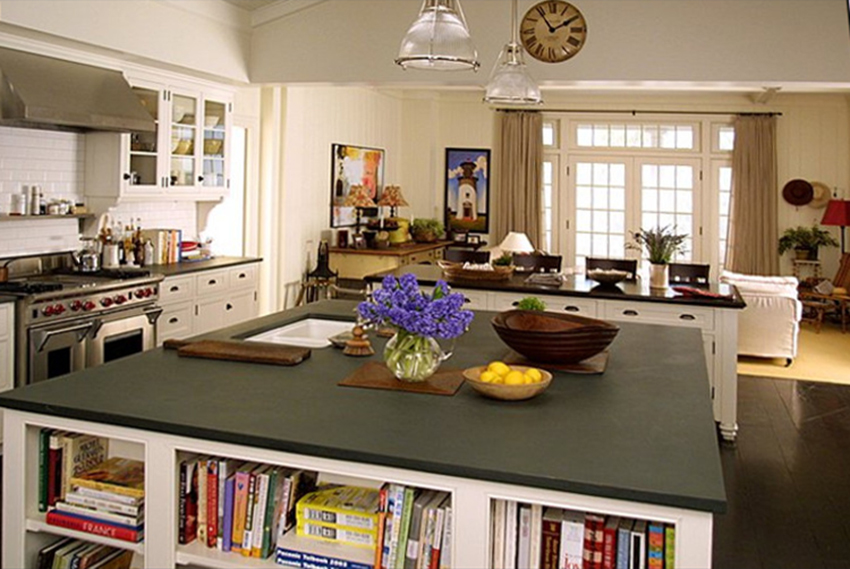
Something’s Gotta Give – Universal Pictures
And 20+ years later, this kitchen still looks great – because she only repeated black once, in the hardware.
Despite trend driven designers declaring the white kitchen out.
Despite the appeal of the new warm neutral kitchen trend.
The Nancy Meyers kitchen is still in the timeless category, as I have been staying for 16 years on this blog.
That’s why I’m STILL saying subway tile. That’s why white or cream cabinets are STILL a great choice.
It’s why a little black can STILL be a good idea – as long as it’s not overdone.
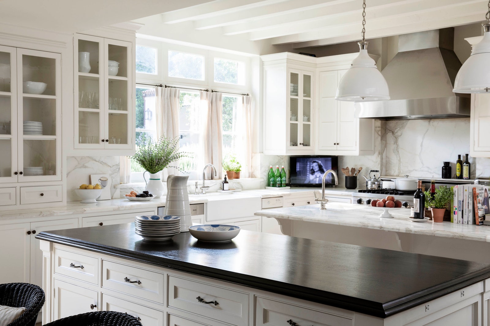
Nancy Meyers worked with star designer Mark Sikes to create her current real life kitchen (below) and it looks a whole lot like the ‘Something’s Gotta Give’ kitchen.
Nancy Meyers Kitchen designed by Mark Sikes via Architectural Digest
“Boring now equals timeless later” ~Maria Killam
So go ahead and be boring. And you can sit back and enjoy your kitchen for decades to come. Because, -pssssst- the other skill that makes Nancy Meyers’ movie sets so famous and endearing is excellent STYLING.
Here’s another famous Nancy Meyers movie kitchen below from ‘It’s Complicated’ starring Meryl Streep (below). Notice how essentially simple it is with white countertops and open shelving. Would you guess this kitchen is from a movie that came out in 2009???
Read more: First Rule of Design; Boring now equals timeless later
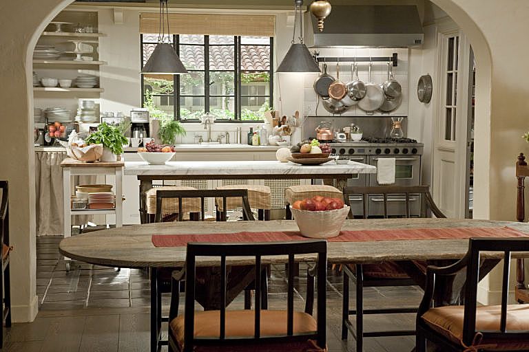
It’s Complicated – Universal Pictures
Why we love Nancy Meyers’ kitchens
She knows that how to create charm with lived in layers that tell a story of real life. The story of a character we can relate to. The story of abundance and comfort.
The simple, versatile finishes in the ‘It’s Complicated’ kitchen, like in the ‘Something’s Gotta Give kitchen’, are the perfect backdrop for endless styling options. Look how lived in and inviting these kitchens look.
And when you know you know. That’s where the magic is.
And that’s why you want a timeless kitchen. So you have the perfect backdrop for expressing yourself through your changing needs and interests through the endlessly shifting phases of life.
Learn how to create a timeless Nancy Meyers worthy kitchen
Learn how to create a timeless kitchen you’ll love forever in my two-day course for homeowners: Create Your Dream Home virtual training.
Or, get my help planning your timeless new build or renovation with one of my eDesign packages here.
Related Posts
3 Design Details for a Timeless Black and White Kitchen
What IKEA Knows About Black Kitchens (That You Don’t)
16 Expert Styling Tips for Any Budget
I have a question that just occurred to me: Maria, do you think that *colored* kitchens can ever be timeless? Or natural wood kitchens? I’m thinking of a relative’s custom (designed by an architect as part of a high end gut reno) cherry wood kitchen that they installed 20 years ago which still looks beautiful and coordinated today since all of the finishes were chosen with the dark wood cabinets in mind. Or for a more recent example that has online photos, Emily Henderson’s Portland House kitchen (https://stylebyemilyhenderson.com/blog/portland-project-the-kitchen-remodel-reveal) which has green cabinets, green-veined marble, and a simple white subway tile backsplash. It reads pretty timeless to me, while being more interesting to me than an all-white kitchen (admittedly I am not shy about color and don’t want an all-any-other-neutral kitchen either).
Yes I’ve written a few posts about this! Keep the hard finishes timeless, after 10-15 years a kitchen needs a repaint anyway no matter what colour it is. Maria
Maria,
This message inspired me 15 years ago to build a white kitchen with black granite counters instead of spotty granite or something else. To this day I love my kitchen still.
Thank you!!!
I think the real appeal of these kitchens is how lived-in and homey they look. And that’s b/c of the styling, as you said. Imagine each of these kitchens without all the stuff on the counters and shelves and you realize they’re just boring kitchens. Classic, timeless…and boring. There are no pops of this or that, no trends, nothing to draw the eye. Which is a good thing!
I hate to be different but I think the last photo is a little cluttered. I do not like open shelves either. Take a bunch of that stuff off the counter and move some of the extra carts, etc someplace else and you will discover how pretty it is. But in my opinion there’s just too much “stuff” in that kitchen. You can be “homey” and still be cluttered. There is gobs of stuff all over the counters. It’s actually hiding the nice kitchen it could be. Sorry but this is my personal opinion. The dining room table seems very mis matched for the kitchen also.
But that’s exactly the point! Styling can be super personal. Enjoy clutter? Layer away. Hate clutter? Remove it all. People with vastly different styles/preferences can put their own spin on a timeless kitchen.
Clutter is NEVER timeless! Sure you can do what you want of course but why spoil a good thing? Underneath all that is a pretty kitchen but who can see it? It has been proven that clutter messes with your brain and makes you unproductive. My opinion only. It is not mine to worry with and if they like it so be it.
Movie set photos are never taken well because they are screen shots from the movie. But if we’re talking about the styling of the counters, ya’ll are missing the point of my point 🙂 xo
The subplot of “It’s Complicated” is planning the renovation of that kitchen — Meryl Streep’s character is thrilled that she’s finally getting “a real kitchen,” which boggles my mind. But there is not much cabinetry in the kitchen, so I guess that could make sense. I have a house with lots of warm wood and literally have photographed my TV screen to save images of that kitchen for future inspiration. 😁
*note one of the pictures is mislabeled. Diane Keaton was not in “It’s Complicated” and neither was that white kitchen.
Another commonality to the pictures you posted: high end stainless steel ranges. Which contribute to the timeless designs of these kitchens.
I have designed kitchens for 25+years. White has always been a constant. Stain trends and paint colors have come and gone. But white doors in a traditional style are always in style. Now, I think the white shaker doors will be seen as the 2020’s style of the day, which is a shame because they are lovely.
My dream kitchen is soft white with black soapstone counters. I waver on the flooring material. Someday….
I’m guessing I know the answer, but I’m curious on whether the new black and white finishes of appliances will be considered trendy. It reminds me of the old ones we used to have. I’ll be doing a renovation in my historic home that will include panel ready dishwasher and fridge, but have been eyeing the white finishes in some of the ovens.
Is Craftsman style becoming “dated”, since the Craftsman “revival” started about, what, 20 years ago now? I have a Tiffany (not original!) chandelier which is the only thing that introduces a little color into my neutral-heavy living-dining-kitchen space. Is Tiffany stuff considered a little gimmicky now, or only if **everything** is over-the-top Craftsman-y, like you’re designing a period movie set?
As a serious cook ( my career was spent in professional kitchens) I look at ‘trendy’ kitchen spaces with a critical eye. Pot fillers come to mind as the most useless money waster of all. Honestly I know four people who had them installed during a reno and the dang things are never used! They are pointless, yes it saves you filling the pot of cold water at the sink but you have to carry the pot of boiling water back to the sink to strain. Over large ranges installed in tiny kitchens that cause dangerous pinch points when the large oven door is open, do you really need to spend 60,000.00 for a le Cornu? But mostly I hate breakfast bars especially when a table is four feet away! No, no no! That’s wasted real estate in a small kitchen and if it has a riser ( ostensibly to hide the kitchen mess) ugh!) I love an island that’s big and clean ( no sink, no cook top) creating this with lowers and uppers back to back gives storage and space. One kitchen done in 2002 still gets rave reviews natural birch,shaker doors, dark quartz counters, stainless appliances brushed nickel library pulls and knobs, minimal uppers. Repeated in the kitchen of our summer home only with white cabs, white quartz but because it’s smaller and hosts a lot of kids and dogs went with a darker lower in blue grey. It’s on the ocean so blue grey always looks good in small doses.
Personally I love a lived in kitchen styled by the aesthetic of those who work in it. Not everyone wants or needs a gazillion cook books ( I do) or pieces of art (me!) or the kitchen aide mixer sittin pretty on the counter ( me again) or a raft of lovely and sharp knives handy in the wall, liquor cabinet ( not drinking wines though) in the kitchen.
Maria, it’s like you are in my head! I always read your blogs and when I saw the title of this one, I jumped right in! I just love these two movies and I have always especially loved, and paid close attention, to the KITCHENS! Both are just dreamy, as are the houses! Timeless and cozy. On that note, going to watch Something’s Gotta Give for the 100th time haha!
Maria, I love how right you are with your timeless advice!
In 2013, we installed a white kitchen. Years later (2019), we renovated our house, and what got the first compliment? The kitchen that we had NOT touched. People who had not previously been in our house were always surprised to learn that the kitchen was not new with the renovation.
This past fall, we renovated the kitchen. My husband wanted to stick with the white cabinets again. I was nervous about bucking the trend because all you see right now is the English Countryside kitchens. However, I thought, “Maria always teaches a white kitchen is timeless, and also what relates to your house is timeless.” In fact, a white kitchen with gold hardware (following the trend a bit) relates perfectly to our house’s style, the white and gold wallpaper in the adjacent dining room, and the white and gold color and finishes in our other two rooms that open to the kitchen. An English Countryside kitchen would have looked out of place in our house. In my friend’s house down the street, she will lean into the English Countryside kitchen and will look and fit in great; our house, nope.
One of our friends walked in to see the kitchen finished and said something like, ” The kitchen is perfect for this house. It looks like it belongs here and has always been here.” While I can’t remember her exact wording, I just thought, you can’t get a better compliment to timeless than that.
You’re always spot-on with your advice and teachings, and I really appreciate it! Thank you!
I love the look of these kitchens. I remember in the 1990s walking down Park Avenue and seeing through a window into a white kitchen with subway tile and a French pot rack and thinking how wonderful and historic it looked. It was SO different from anything in my 50s/60s-era apartment building (which had pink tile bathrooms), or from anything I’d grown up with in the 80s. The white subway tile said “Gilded Age/Downton Abbey” era. I had never seen subway tile in anyone’s home — just in Merchant Ivory movies. To me, it very much dated to a specific decade, but that was part of its charm. I like historic things.
I now think subway tile kitchens are “timeless” in that they will always look nice, but I do think the tile will date kitchens to a specific decade, just like other supposedly timeless choices like oak cabinets and granite. But it has the advantage of being inexpensive, so it may stick around for a while longer.
In terms of set design…The subway tile in the Nancy Myers movies was a subtle way of indicating that the owner of said kitchen had spent time in France, where subway tile has been more commonly used for decades. It is mentioned in both It’s Complicated and Something’s Got to Give that the characters speak fluent French.