If you have a stunning view, it makes sense to maximize it when laying out the room. This week we look at some specific challenges when decorating a room with a view.

This weeks makeover is for my good friend Gail and her husband Casey. They built their lakeside retirement home in Cultus Lake with this spectacular view. After she purchased new sofas for the living room, she got stuck on how to finish and decorate the room.

How to decorate a room with a view
Here’s how it looked when they moved in.
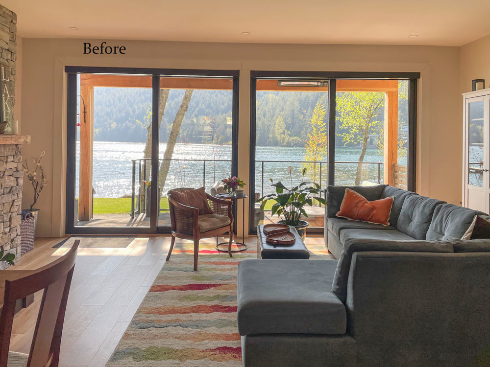
And here are her new sofas (below). The reason Gail chose two sofas (instead of a sofa and two chairs) was because she wanted to block the view of the patio furniture located directly outside the windows.
She specifically expressed that she didn’t want drapery because she didn’t want to block the view in any way. However they have roller shades for privacy in the evenings.
The other thing that bothered her was how heavy this side of the room felt.
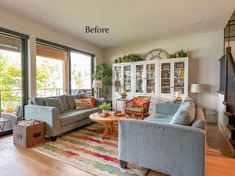
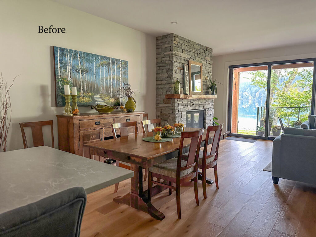
She worried that the fireplace should have been positioned on the right of the room instead of the left (see below) because it didn’t feel like it was part of the living room.
And she didn’t know what to do with the bowling alley size walkway to their back patio.
Here’s a sneak peek.
I know you might be wondering why she agreed to have art installed in between the two windows (since she didn’t want drapery to block the view) but you’ll have to watch the video to find out how and why it all went down like it did.
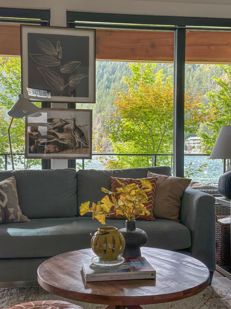
This entire space was transformed in a weekend. We shopped on Saturday afternoon, and it took a couple hours on Sunday to install everything.
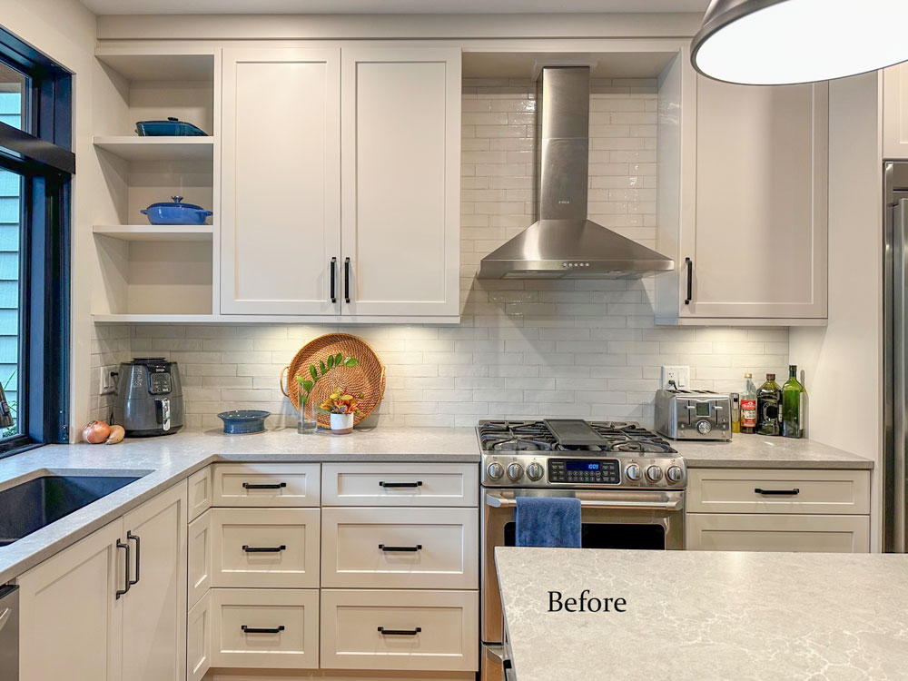
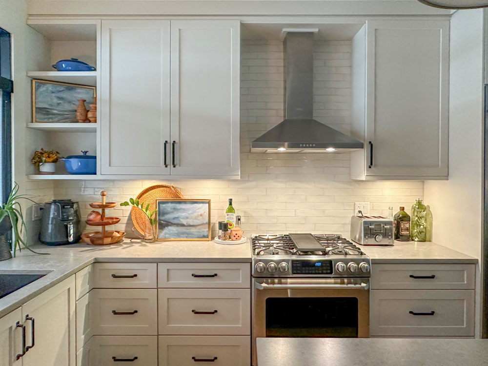
Mini Kitchen Styling
PS. I also styled the kitchen before I left. Here’s a look at the before:
And, here’s the after:
Colour Rescue: Lake Inspired Living Room Magic
This is a great episode demonstrating how to tackle some of the specific decorating challenges of styling a room with a stunning view and multiple focal points.
And you guys! For a VERY limited time, I’m offering my popular Get me Started decorating eDesign package! It’s like having me in YOUR living room.
You’ll get two done-for-you mood boards with decor and source links personalized for your specific room. Plus, the first 5 who sign up will SAVE almost $500! Get started here.
Related posts:
5 Kitchen Design Details that Matter; Before & After
Fall Nesting: Warm Colour and Cozy Styling
How to Mix Dining Chairs and Tables (Pass the Pretty Test)
Gorgeous makeover! Love the placement of the art (and I wasn’t sure about it at first). Beautiful job, as always!
Nicer, cozier, warmer. Great improvement.
I do wish you resisted the urge to have 2 spelled out signs prominently displayed: LAKE and LAKE HOUSE. Is anyone in doubt with that gorgeous view where they are?
I normally don’t like word art but she had them and I don’t mind lake house or lake, perhaps two of them was unnecessary. But let the record show, anyone with word are like live, laugh, love should let them go, haha. Maria
As long as we’re talking “decorating”, signs with words are way past their smell test–especially words that stand for something obvious. In this case, what would have made more sense (if a word sign was a must) was “Thankful”. Thankful to have such a lovely place and share it with someone you love.
But after it’s all said and done, people should do whatever makes them happy including a wall-full of signs if that’s what they like.
I feel like everyone with a beach house or a lake house has a sign that says so. It’s a big deal. Not everyone in this world gets to live in a waterfront home. That and Love I think are exceptions to the word art rule but that’s just my opinion doesn’t mean it’s right. Thanks for your comment, Maria
What a wonderful couple they are! Such a pleasure to meet them virtually and to see the transformation of their rooms. I laughed a little that you are apparently owning your “bossy and charming” personality. Hahaha.
Love the idea of the smaller table and the 2 chairs look great on each side of the cabinet behind the table. The larger rug pulled everything together, especially with the chair and plant by the fireplace. I was smiling at Gail’s reaction to hanging two pictures in the middle of the view – I was saying ‘NO’ in my mind, but in the end it added to the room. Lovely couple!
Well that was fun! I felt like everyone had fun, not just the viewer here 🙂
It’s ten thousand times more inviting. I didn’t feel drawn to sit in the “before”, but I’d love to sit in the “after”. It’s more of a conversational grouping. Love the window art.
Another beautiful transformation! What delightful friends and family you have. Getting to know them is as much fun as seeing the makeovers!
Changing the couches to an L arrangement was the best change of all because it opened up the space and invited people in. The previous arrangement created a wall that emphasized the “bowling alley feeling.” While you made the rectangular dining table work, I still prefer your idea of getting a round one.
I think I’ve come around to art over windows! I bet it’s even better in person.
OMG my friend Gail and Casey…Beautiful work…Maria – you will be hearing from me soon…Not sure what I don’t exactly like in my room – but I know it needs help.
Lynn