I still laugh when I think about the fact that I blogged for an entire year before I figured out exactly what ‘my design aesthetic’ was. I started my blog in October 2008 and even wrote a post about it in March 2009 but it wasn’t until months later that I figured it out.
When I did, it was so obvious. I was amazed it took me so long to see it. And since then… I’ve come up with my rules of design.
First Rule of Design: Boring Now, Equals Timeless Later
Second Rule of Design: Waiting Now, Equals Beautiful Later
Third Rule of Design: Expensive Does Not Equal Timeless
As for my aesthetic… I love contrast, colour, solids over lots of patterns, classic and comfortable interiors, which is obvious by the interiors I design.
So, I loved this Editor’s Letter by Suzanne Dimma in House and Home Magazine:
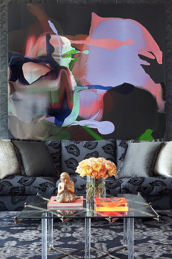
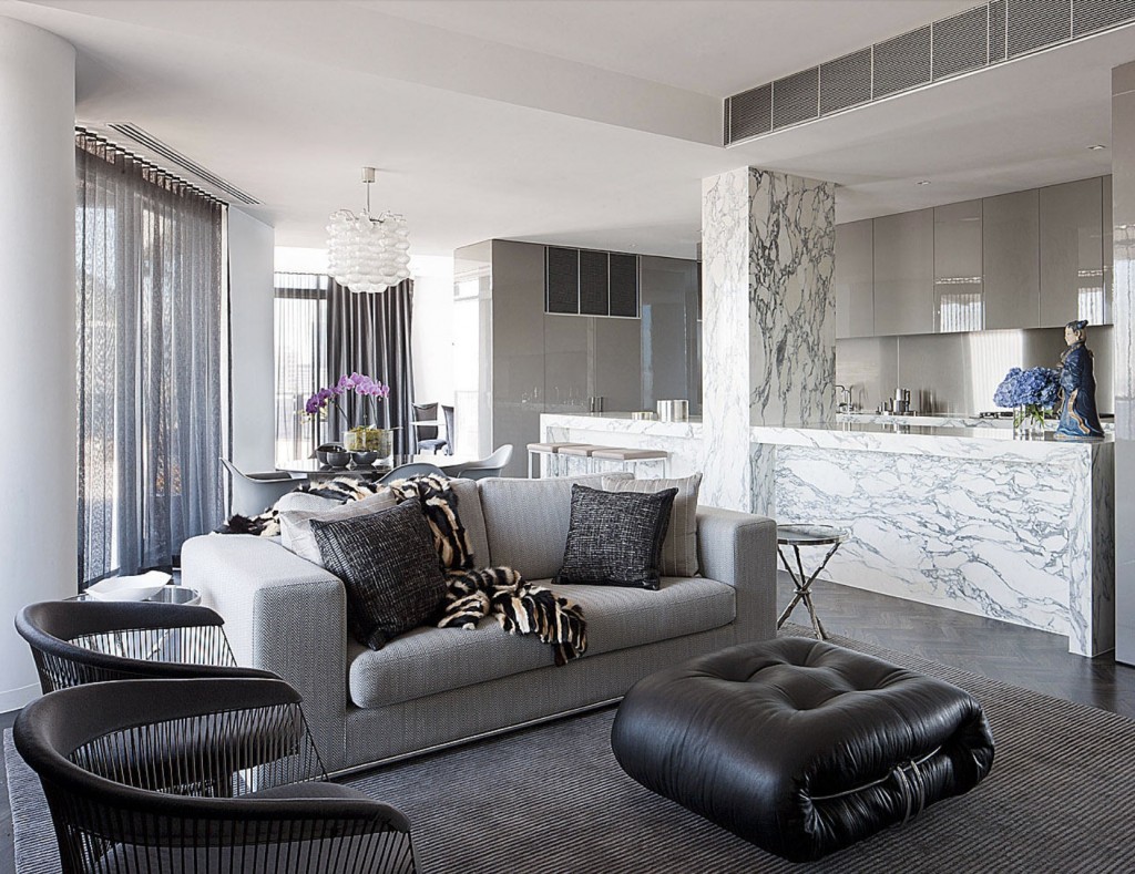
“I’ve always felt that the key to great design is contrast. Whether it’s through texture, colour, or light versus dark, differences are what stimulate the eye and make a room memorable.
Look at the work of some of the most celebrated designers and you’ll find that contrast is often at the core of their aesthetic.
Take Washington D.C.-based designer Darryl Carter, for example. He’s known for layering a white-painted shell with standout antiques in black, gold and wood. It’s a classic look because our eyes never tire of it! In a totally different style direction, there’s David Hicks, who was famous for his graphic carpets and vibrant, often clashing, colours.
It’s not an easy thing to master, though. A contrast can easily become a clash–and not in a good way.”
The Key to Great Design: Contrast
Recently I received this question from a reader regarding her kitchen finishes:
I have made so many mistakes over the years I feel like I am a bit paralyzed in making any decisions at all. We have chosen our design, cabinets ( which is the only thing I am sure of), and our appliances. Our contractor is ready to install the insulation, then dry wall, cabinets and then on to the floor, countertops and backsplash. That is where I start hyperventilating. I am stymied. Please help.
I think I like the absolute black brushed as I know I don’t care for glitzy , shiny or speckled. I am thinking of a gray and taupe floor to blend in with the taupe cabinets although I am afraid that they might be too dark. Then there is the problem of the backsplash. I am thinking of a lighter beige, taupe, a little black porcelain tile. … Big tiles as I don’t care for the small busy patterns. I’m worried that it’s boring and wondering if you have any better ideas for me.
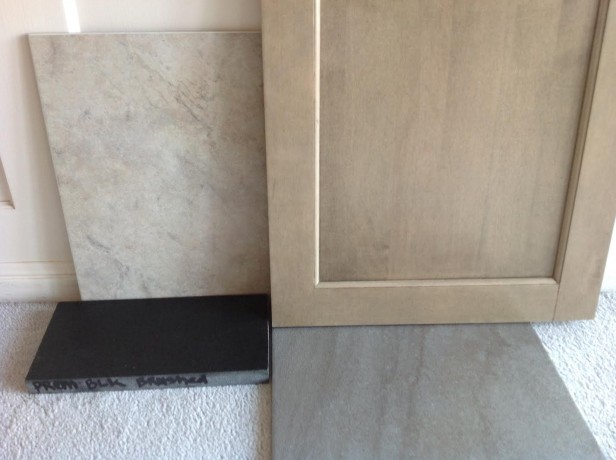
My response was that there’s not enough contrast and the black countertops don’t relate to anything. Plus, installing 12″ x 12″ tile on the backsplash will simply look like your floor tile continues on the wall.
What should we choose instead? This training is inside my Expert Colour & Design workshops.
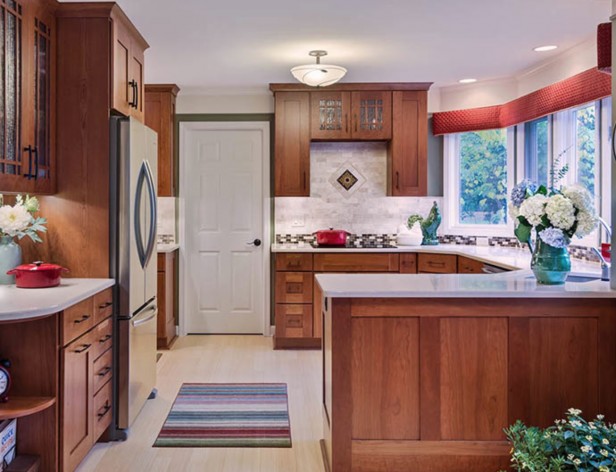
Another reader asked the same question about how to lighten cherry cabinets.
Except for the accent tile which I would (of course) eliminate, the white countertops and basically white backsplash are beautiful here. This kitchen still looks fresh even though the cabinets are cherry. Of course the expanse of windows above the sink certainly adds to the fresh feel of this kitchen.
Which rooms in your house need contrast?
Related posts:
Ask Maria: Help! I Don’t Want the Same Kitchen as Everyone Else
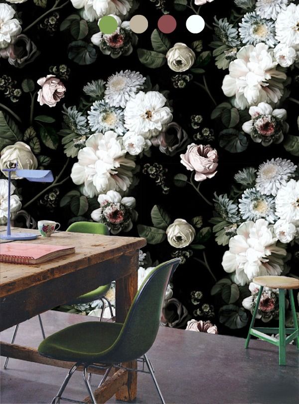
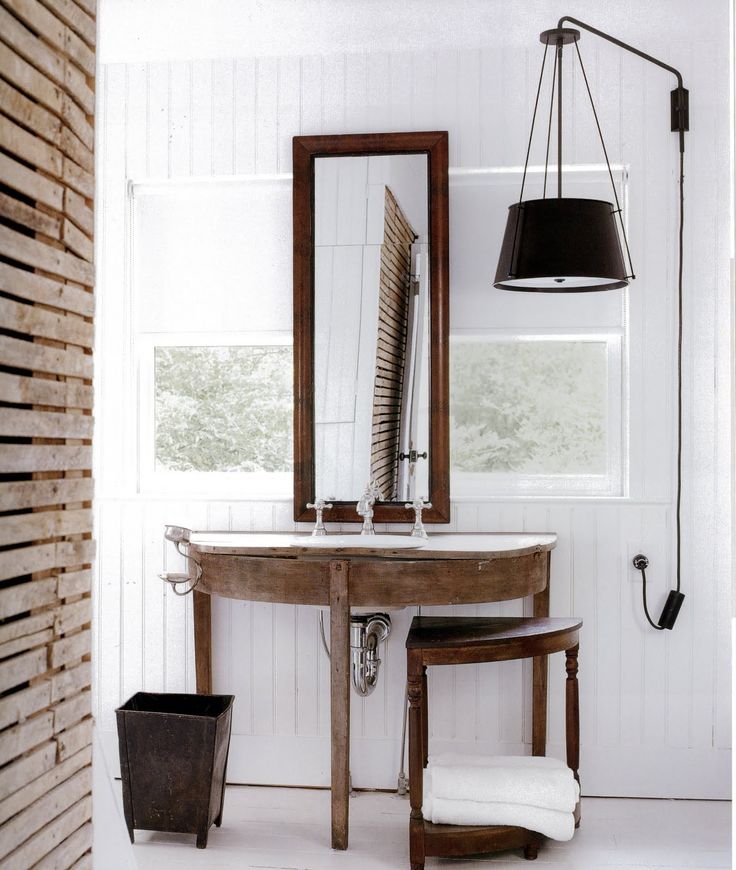
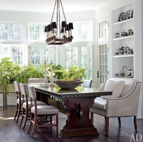
Same in a garden, all about CONTRAST.
And, repetition.
An irony, yes?
Garden & Be Well, XO Tara
LOL MY first thought, too, was about gardens!! Yes, contrast and tonality, are key.
A big YEA to Maria’s post and Tara’s comment on garden design. I’d define my interior and exterior styles as high-contrast — and I’m also a lover of patterns with solids. Now when it comes to kitchens, I’m also in agreement with Maria that too much contrast (e.g competing textures and colors such as using multicolored mosaic tile backsplashes — hope that trend is dead) is not a good thing. Redoing our kitchen remains a formidable future challenge; otherwise there’s no absence of contrast in my surroundings which I find comforting — bland houses and gardens bore me.
Thanks for bringing this up.
I went with a contrast finish on my island vs the wall cabinets and although I was nervous about it two years later I walk into my kitchen everyday and smile. I need to think about it for the rest of my home. I have loved the play of black and white all my life so this makes sense for me but may not be for everyone.
Maria, I’d add “connection” to your style – that all spaces connect, at least on the main floor. It may be so automatic to you that you don’t think about it, but you stress it and do it. (It’s a bit different than what some might call flow, which is kind of an insipid word anyway.)
I have had different ideas about contrast when it comes to color. I always thought lack of contrast was good when it comes to small spaces. A monochromatic room let’s your eye travel around a room & can be calming.
You can still have contrast in a monochromatic room with texture. And contrast with your style. Example…modern with antiques.
I agree. I like similar tones as long as there is a lot of contrast in textures.
Great post, Thank you!!
Maria,
Fantastic post and photos.
Fantastic post Maria! Good examples to back up your post!
Couldn’t agree more. Contrast is the key. Along with knowing when to stop.
Sometimes I feel like I’m from another planet in the design world. Although I get your point about contrast, I personally like less of it. I don’t like sharp lines or bright colors. I find them stressful, they “hurt my eyes” so to speak. As always, I think we should be true to our individual preferences.
I esp. like the first picture with the big floral wallpaper
and the 4th picture of the David Hicks living room. Contrast is my style too tho in my house its in softer
colors but I gravitate toward colored walls with white
woodwork and furniture etc against them. Always seems
fresh and inviting. Never thought of it as a style choice.
Great post!
I feel confused because first you say there is not enough contrast and then you take away the dark (granite?) countertop which seems to be the only thing providing much contrast, replacing it with another pale finish, off-white countertops. I know you seem to prefer the off white quartz in your designs and really dislike granite.
Hi Becky,
That’s a great question. There’s nothing wrong with black granite but in this case it didn’t relate to the chosen finishes.
Also, creating contrast does not automatically mean one must introduce black and white or even bright colours into a space.
It’s about balancing patterns with solids, as well as colours and neutrals.
Maria
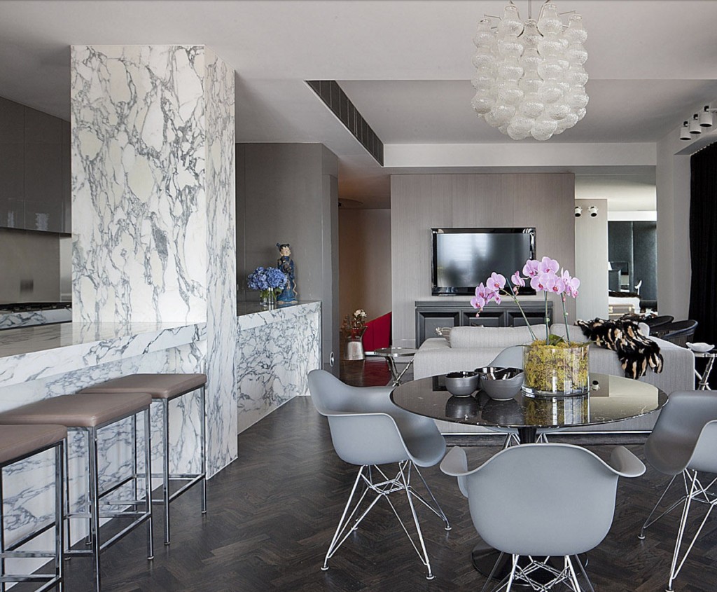
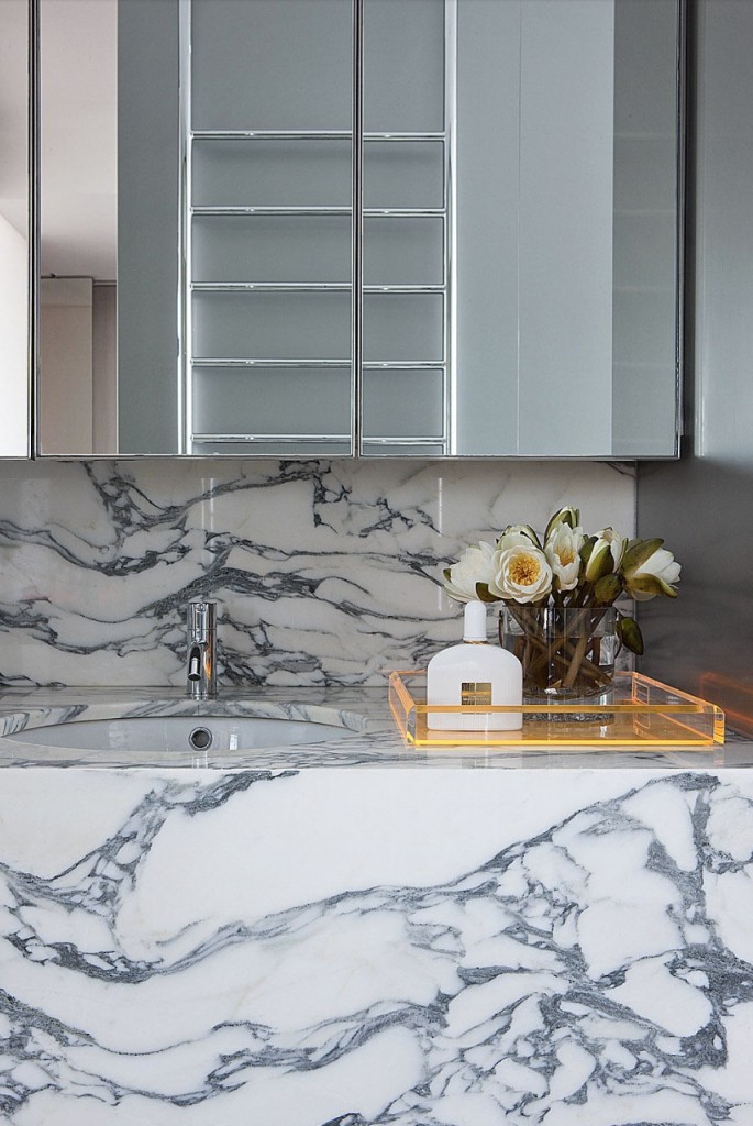
The only photos I liked wer the first two, especeially the one with the floral wall paper. And it was this one which, I thought (but I’m not designer!), best exemplified your thinking. The marble walls and bluey-grey interiors provoked in me a feeling of sadness at such coldness in a domestic environment. It’s easy to forget too that the various inhabitants of these spaces can also lend contrast with their presence. I enjoyr your posts immensely though Maria and have found your ideas very helpful. Even in most of the above cases where the aesthetic is not really in line with my own.
Seeing those big marble walls helped me decide not to do them in my home.
I lived in NYC for nearly a decade and saw many book-matched marble lobbies and love natural stone. My granite installer has done this cladding of walls in a number of homes, but unless it’s a really nice Calcutta d’Oro, which ran maybe $40-$80 per square foot for the material alone from the stone yard, I’m thinking no. It’s like the example of “What would you rather have, the $1000 stereo or the $700 one, plus $300 of music?”
Great post Maria! I find the same thing in home staging…..a Mongolian lambswool pillow on a leather sofa….a metal and glass coffee table in a (!) pine paneled room, and your favorite- leafy green soft herbs on the hard quartz countertop. You are so right- contrast is what creates interest and beauty. Thanks!
Thanks for the cherry cabinet post. 🙂
My husband wants to do something other than wood kitchen flooring would you suggest tile on floors that match the white countertops and back splash or too much white? I do looooove contrast.
Thanks Maria great post!
I would not do stark white floors because that will look too contemporary but something related yes. Maria
I had a white tile floor with black 1×1 accents in a rental. What a pain to keep it clean!
Then I moved to another which was black and white 1ft square vinyl checkerboard. The washer in the adjacent laundry room overflowed on my first use so the kitchen floor was really clean. Once. LOL!
Terrific post. I am gonna throw in that contrast alone does not capture what is needed. CONTROLLED Contrast is the key.
You can Control Contrast to what ever effect you want.
You can contrast greatly, or contrast subtly.
You can contrast in saturation or texture.
You can contrast to produce calm or excitement.
You can contrast to control the eye, control movement, invite, beckon, recede, omit, and fool the mind.
Thanks for this, Maria! And great comments by all.
I think my question is sort of related to this contrast post. My upstairs guest bathroom has pickled maple cabinet (pink and gray and sometimes a little yellow coming through). I don’t plan to update this bath and paint the cabinet for a year or two but would like to paint the walls a color that will make the cabinets look better until then. The floor is a yellow beige with green-gray marble-like swirls. Do I blend the walls with the cabinets or contrast/complement them? Is there a color that would reduce the pink tone and still work with the floor? Thanks Maria!
Maria, I used to scroll quickly by photos that were not my personal taste without stopping to see what I could learn from them. Though I may not ever want marble walls or some other design choice I might encounter, I now scroll much much slower and see what is there for me to learn, much thanks to you for your great insights and talents. I’m not a pro, just an amateur building the last home of her life perhaps, in the USA, and more excited than ever after my “home study” of decorating and colour with great pros like you and your guests!