The other day a reader emailed me a question about orange beige.
She had an existing orange beige stone fireplace and wondered what the rules were about choosing a neutral to coordinate with it. Which ones worked, which ones didn’t.

The System for Specifying Colour™
My answer was that all of the other 8 undertones can live with orange beige. And to clarify, I explained the fundamental guideline to use when choosing neutrals.
So I thought I’d share it with you as well.
The reason why I don’t spend a lot of time (well zero actually) talking about colour theory in my Specify Colour with Confidence workshops is because when you are learning colour theory, you’re looking at the primary colour wheel.
Which is not that useful.
I have never walked into a house and thought to myself “I think I’ll introduce a split complementary triad here”.
Also, the basic lesson in colour theory is that you look to the colour wheel to help you when coordinating colours.
And the reason this is not that useful is most people use the colour wheel wrong. I have seen this over and over again with colour enthusiasts and designers everywhere.
This is how a novice will generally use the wheel:
Okay I have cherry cabinets in my kitchen so that means I’m dealing with a red undertone, right?
What’s the complement of red?
Green.
And then you go out, choose a green shade of paint for your kitchen and now you’re cranky. You can see that it’s not awesome with your countertops but you might not understand why.
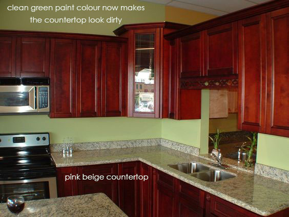
Not only does this green paint colour in no way relate to the two tone pink beige (and what appears to be green grey) countertops, it also makes the countertop look dirty because it’s too clean.
So there is also a clean and dirty problem here.
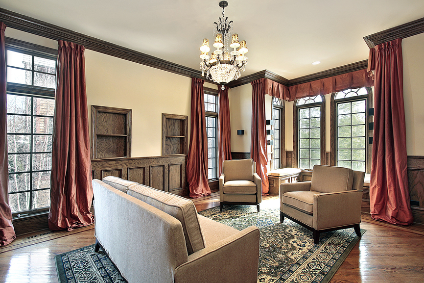
Here’s another ‘complementary’ red and green colour combination with a green carpet and red drapery (below). Except now the ‘neutrals’ here are pink beige upholstery and yellow beige paint.
As yellow beige makes pink beige look dirty, that’s exactly what’s happening here. The furniture looks old and dirty because of the colours in this room.
Related post: 3 Surprising Reasons Your Colour Scheme Looks Dirty
The first and foremost guideline to choosing the correct neutral (if that’s what you’re trying to do) is this:
Step 1
Identify the neutral/s in the room
The wall colour you choose should be chosen to pull the room together. So look at the biggest pieces in the room.
In the above photo since we probably aren’t going to paint the walls green or red, pink beige is really the only option to fix the clean and dirty problem.
Because no one wants beige right now, I would probably choose a cream that didn’t go yellow. Something like OC-1 Natural Wicker.
Step 2
Determine how bossy it is. Can you ignore it?
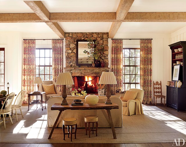
Going back to the question at the beginning of this post, let’s look at a couple rooms with orange beige stone.
Here, Suzanne Kasler did not ignore the stone. In fact, she chose a medallion patterned drapery to coordinate with the stone.
If you look closely, you can see that the fireplace also has pink beige undertones in it, which also relates to the pink beige area rug and slipcovered sofa and chairs.
Here’s another fireplace with earthy rusty/orange tones in it. The orange pillows on the chairs are cleaner than the orange stone but I think it works here.
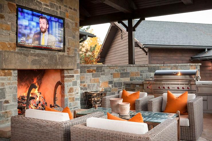
Generally, fireplace stone is pretty bossy. Which is why I prefer millwork and a simple surround over stone for the most timeless look and feel. I think stone belongs in a ski chalet or a country house.
Step 3
Limit your neutral undertones to TWO at the most. Sometimes just one is best.
Here’s what this means.
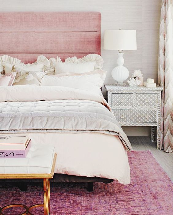
This bedroom is pink and primarily green grey.
It would not work to add a second neutral here, like painting the walls a blue grey for example. That would look like you’d just moved in and hadn’t painted yet.
So in this case, one neutral (besides the cream) is all that’s necessary which the grasscloth picks up nicely. Even the end table is the same neutral tones in this bedroom.
This living room (below) has two neutrals maybe three. You could call the drapes yellow because they look very yellow in this room because there are no other yellow tones here.
In another space, they might simply read yellow beige.
Context is everything.
Then we have the pink beige furniture and the paint colour which appears to be a green grey (it’s definitely not pink).
So in this case, again, we have two unnecessary undertones here, AGAIN.
Related post: What Everyone Should Know about Grey
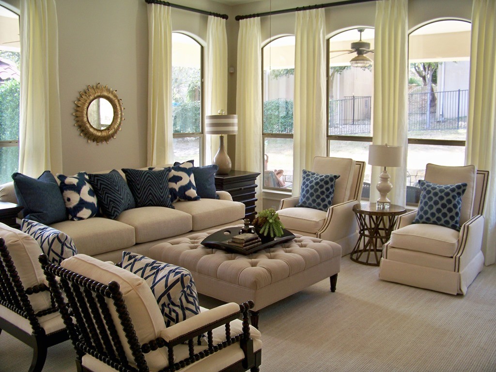
Again, the basic guideline for choosing a wall colour is choose the colour that pulls the room together.
Could this room have been painted navy? Yes it could have been.
Or it could be a pale pink beige to relate to the furniture.
Then the drapes could have been a pink beige linen to coordinate with the furniture with some navy banding or to make it feel fresher, white and navy.
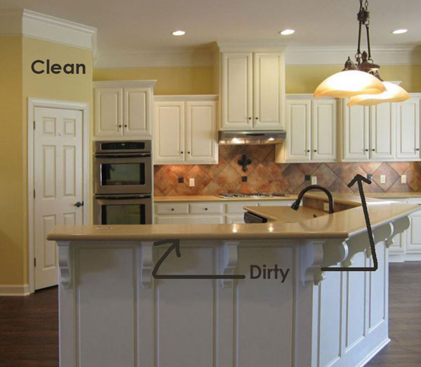
Here we have a very interesting (at the time I guess) dated backsplash that is pink beige, orange and blackish.
In this case the pink beige countertops do relate to the backsplash.
However, the yellow paint colour does not relate at all and is too clean which, in comparison makes the finishes look dirty.
Also the cabinet colour is too white. Given there is no white in the existing countertop and backsplash, the best colour for the cabinets would be a creamier colour like SW Dover White.
The colours in this living room are basically blue grey, gold beige and indigo blue. So two neutrals plus the strong blue shade. Can you spot the third neutral that technically looks slightly out of place?
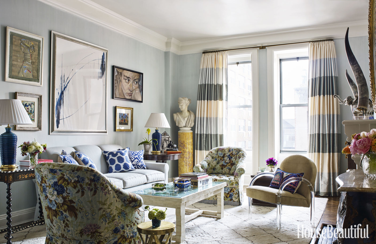
The yellow beige stripe in the drapery. And it could have simply photographed this way because colours always look darker against a window wall. However, three undertones is usually too many.
And here’s the thing, working with undertones obviously comes naturally to many designers out there because there’s a lot beautiful rooms in this world that work.
Something else to think about, if you have too many questions about which undertones go with which colours, perhaps it’s a sign that you need to attend my Specify Colour with Confidence workshop or simply hire a designer to help you.
That’s the best way to get a look and a feel that will make you happy every time you walk in the door!
I’m on my way to Boca Raton tomorrow morning super early, it’s the first city in our three week trip! Follow me on Instagram and on my stories to catch all the fun!
PS. The only way to receive one of my Understanding Undertones colour wheels this Spring is to attend one of my workshops.
Related posts:
The Very Best Way to Choose Your Main Neutral
4 Ways to Work with Colour over Neutrals
Which Stone Colour is Best for Your Fireplace Surround?
Thank you for tips 🙂
One of your best and most informative and helpful posts. This is why I follow your blog. Please keep the practical posts with examples like this coming. Thank you, Maria!
These posts truly are helpful to test our knowledge and untangle the mysteries of undertones.
Thanks Maria!
Have fun at the class. I know you will.
Deb
I love reading these posts and trying to identify the colours you point out.
I’m changing up my guest room fabrics to white for a clean, fresh spring look. The only problem is that now the flax/ beige in the chairs look dirty. I plan to paint too. Is there a simple way to keep the white and marry it with the dirty colours? Thank you for any tips you can give me.
Three weeks on the road must be tiring but also energizing as the group of ladies “get” your system. Have fun!
I loved this post, but I have to say that the blue room is done brilliantly, and I don’t think it has too many neutrals. But I understand that most folks would not be able to pull that off, so a rule of two neutrals at most is a good guideline.
Photo 7: I am asking about painting walls and wood the same color (different finish of pain) because I remember reading that makes a room look bigger. In the kitchen with the orange and black backsplash, what if you painted the walls the exact color of the cabinetry? However, my reading of the article is that those cabinets will never look good until they change color.
Your posts are so special! What a wonderful review of undertones and a good reminder. I will flag this post and review it often lest I forget! Thank you Maria for all that you do. You are changing the world one by one to see color correctly!
Have a fun three weeks on your busy schedule and the bonus trip at the end!!!
This post came at the right time. My mother’s house flooded during hurricane Harvey and she also has an orange beige stone fire place is trying to find a good paint color. I would love to be able to pass along the name of the paint color or a similar paint color that’s in the Suzanne Kasper photo. Thanks!
I can identify with the kitchen picture as I have natural cherry cabinets and brown/beige countertops and moss green paint on my walls. I’m looking to lighten my walls and brighten this area (windows in this room are south facing). Can you suggest a paint color that would pull this room together. Some of the gray/greige paint samples I’ve tried have blue/purple undertones, which I don’t care for.
Hi Karen, without photos it’s impossible for me to give accurate advice! I recommend taking advantage of one of our eDesign packages to help you get the best colour for your kitchen!
you can review them here: https://mariakillam.com/shop-landing-page/#interior-solutions
Thanks for your comment! Maria
Thank you for discussing stone hearths (among other good topics) because I design in country towns of New Jersey with many colonial homes and clients that love traditional and country design. I appreciated the connection to my most common working style.
In that final photo, I think the bright blue and white pillows look out of place with the more muted hues. The mustard yellow stand, the yellow flowers, the mustard yellow in the chairs seem darker shade of the yellow cream curtain stripe.
For some reason I am loving beige right now! Maybe its because I used to have crazy colours on the wall. Anyway, I found a wonderful beige for my hallways & kitchen (Dhurrie beige Shirwin Williams) and I was so surprised after painting my hallway beige, that my bedroom just off the hallway now looked pink beige! It looks soft & feminine, so I’m fine with it, but I could not see the pink undertone at all previously, I should have taken your color course!