When we stopped by Kelly’s home in Tsawwassen this past Monday (on the way home from our weekend in Sooke) I couldn’t get over how beautiful her yard was, and immediately took photos to show you!
Then when she showed me all her before photos, taken the day they took possession, I declared it looked like Grey Gardens (remember that movie from years ago)? Joni from Cote de Texas wrote a very detailed–get a coffee–post about it here.
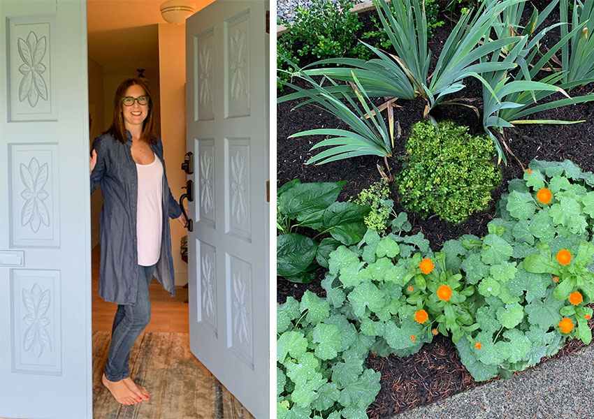
My amazing Design Assistant Kelly Parkinson with her adorable baby bump
Kelly and her husband Mike bought the scariest house on the street in March 2017 (so smart). It was a double lot and they were able to snap it up before a developer did.
The landscaping was like my house. It ALL needed to be removed. However, they had a small problem. The city only allows each household, one permit to remove one mature tree to be removed every two years, unless it’s considered a danger to the house!
MaryAnne White, my landscape designer from New York who designed everything in my yard via long-distance, came to the rescue!
How to incorporate the old with the new
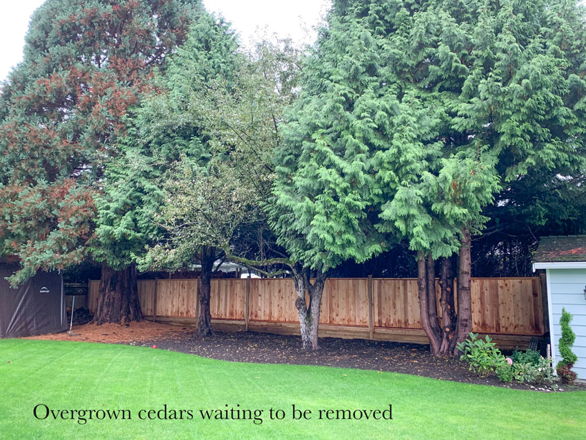
She brilliantly designed a bed that incorporated the two massive overgrown cedars in the front yard in the meantime. Kelly confided that now they don’t bother her as much as the ones in the backyard (keep scrolling). So with their next permit they will focus on removing the evergreen trees in the backyard first!
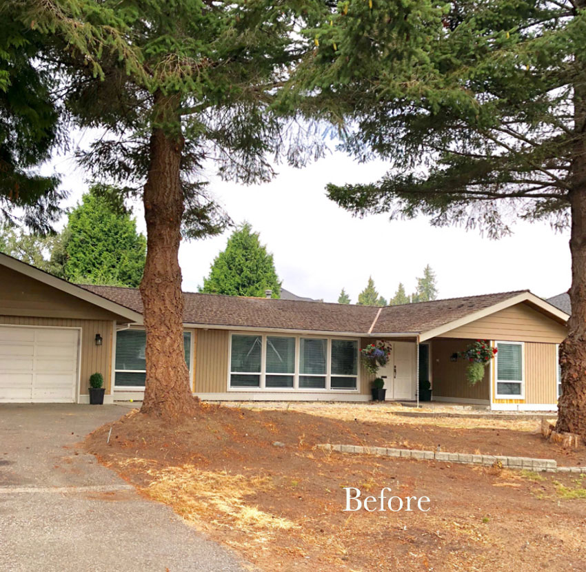
Before
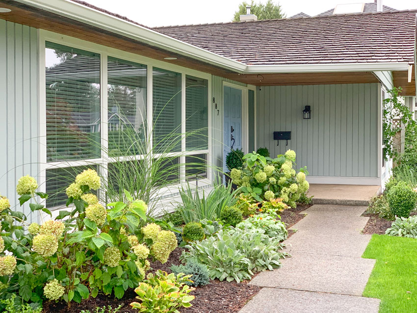
Here’s the after:
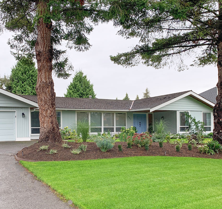
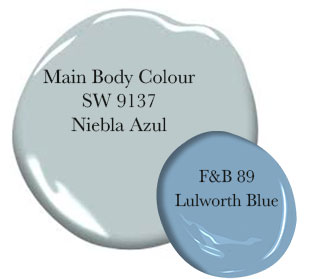
After (Exterior house Colours by Maria Killam – the rest of this beauty, MaryAnne White)
Kelly has decorated the interior so beautifully (and it’ll be so much fun to show the before’s) those photos are coming soon!
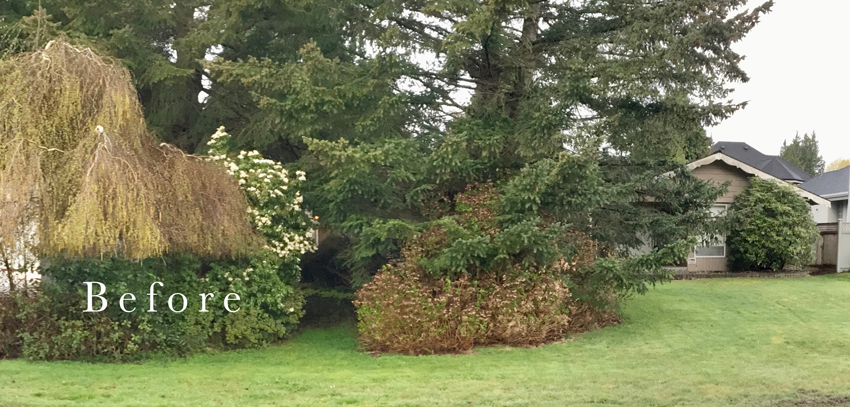
There’s the before with all the huge, overgrown (never maintained) shrubs and trees (above).
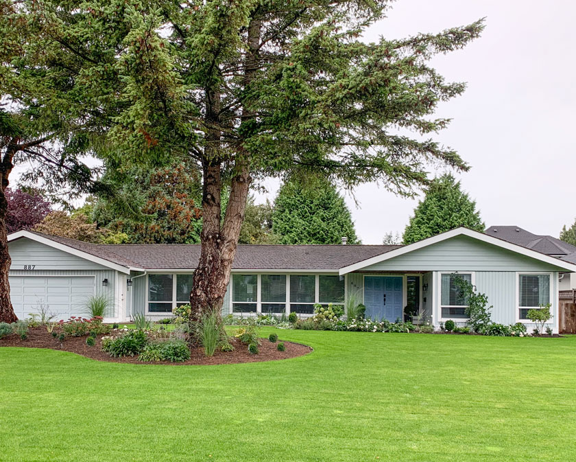
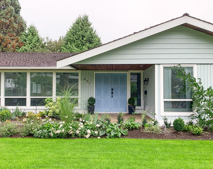
After
You can always tell when a designer has been involved with landscaping. The beds are generous and curvy and I love all the huge windows on this house that are low to the ground, they create lovely atmosphere inside!
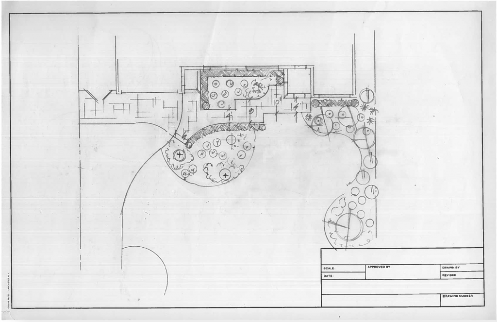
This was MaryAnne’s first drawing for the front yard
Mike and Kelly loved her plan right away, that’s how you know you’re working with the right person when you can’t imagine it any other way!
Here’s the front entrance before:
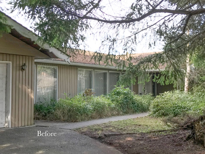
Before
After
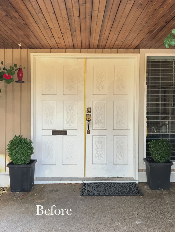
I loved the 70s front doors and suggested this fabulous blue!
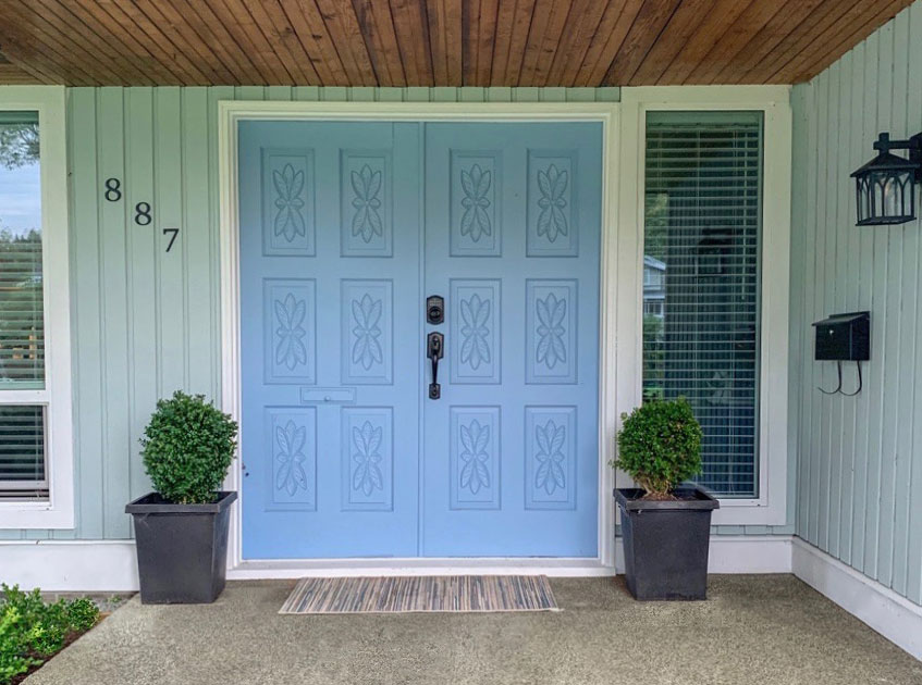
After
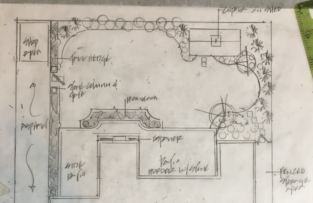
Here’s MaryAnne’s drawing for the backyard:
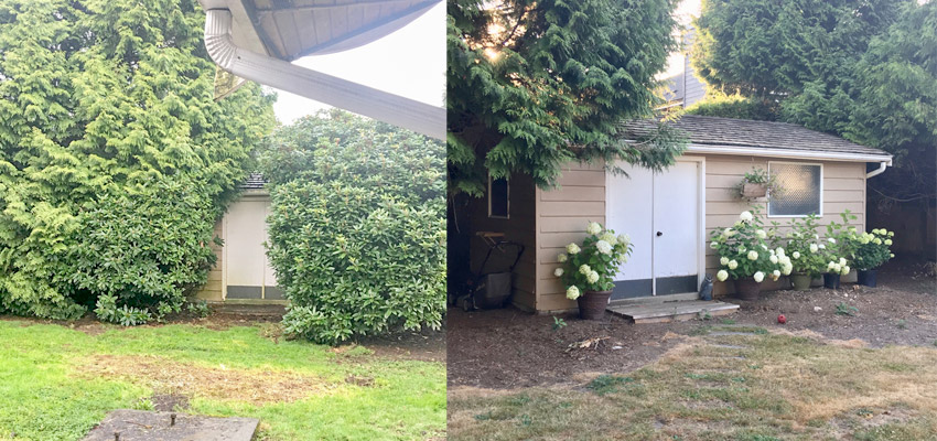
The shed the day they took possession | The shed before the plant material arrived
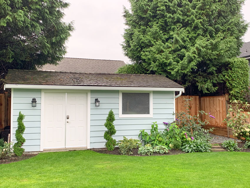
The two curly cedars were gifted by Kelly’s Father-in-law (above). They might technically belong beside more formal doors, but they flank the current double shed doors nicely!
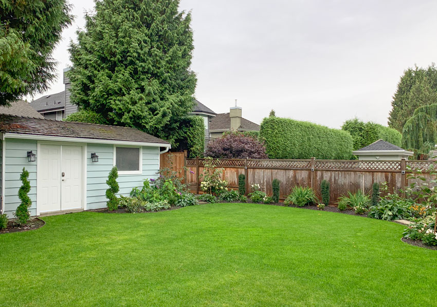
After
Here’s the before pic of the master bedroom windows. This is what really looks like Grey Gardens, haha:
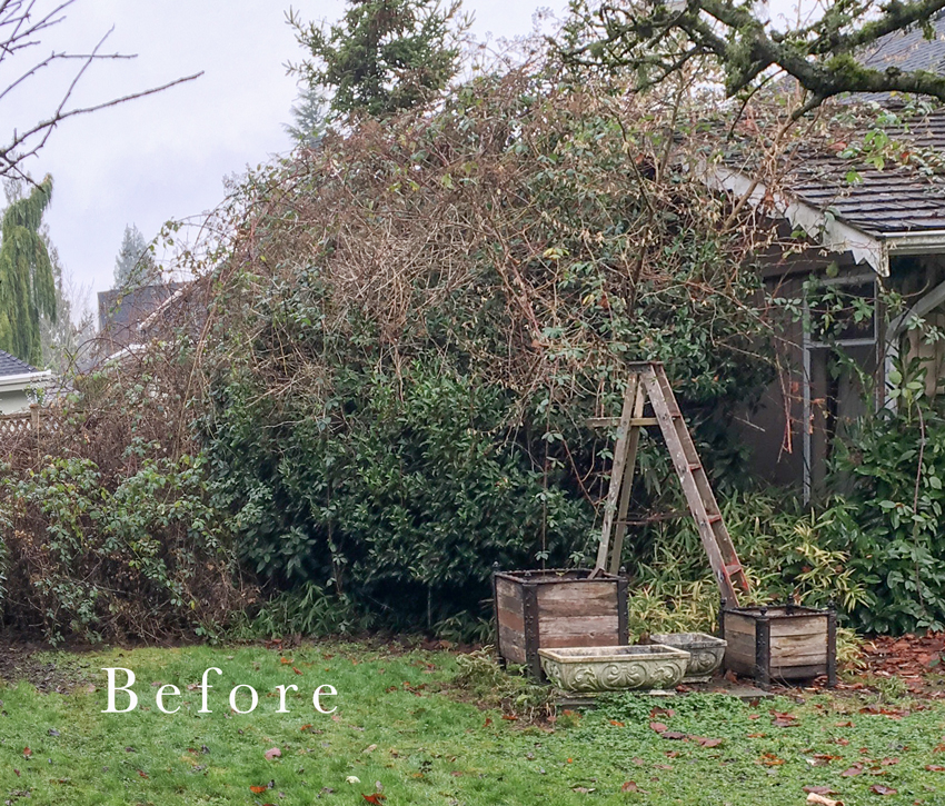
Wow, so much better (below)!
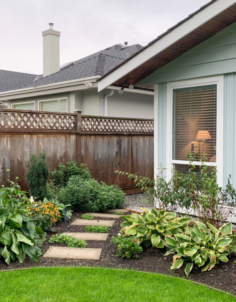
This is now the view from the kitchen windows (above). And this is the current state of the left side of the house with the cedars waiting to be removed (below).
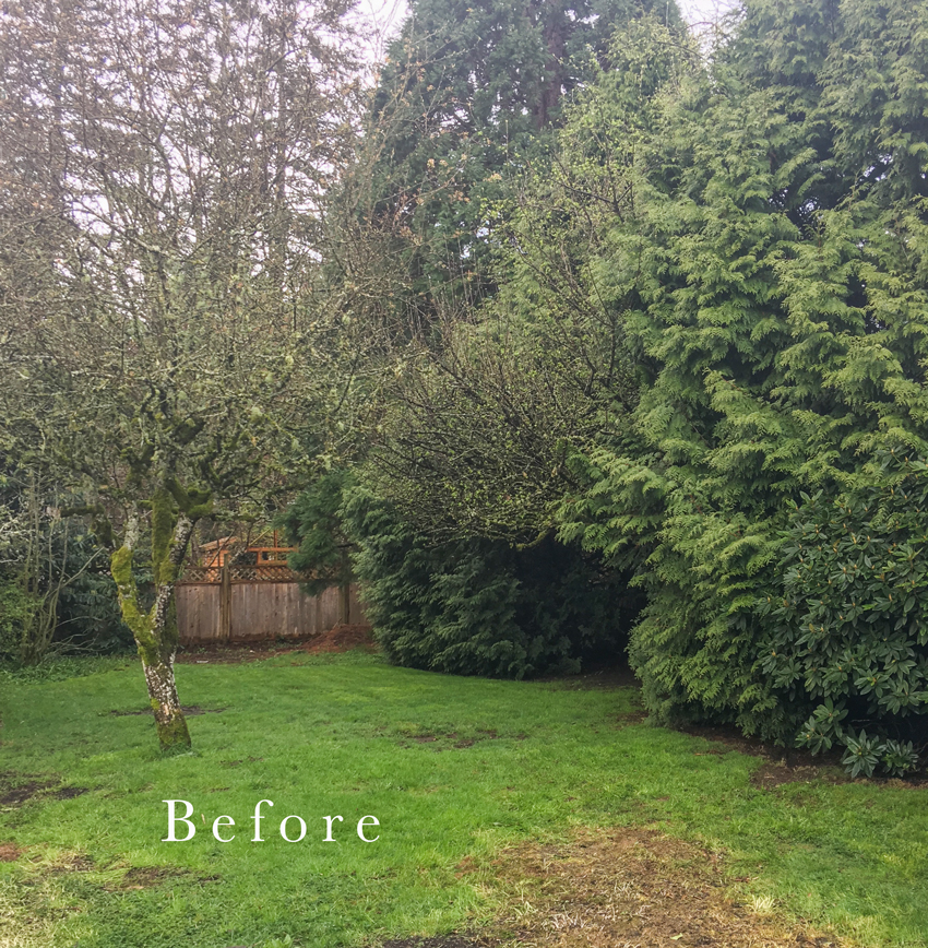
Here’s what they looked like before they were trimmed (below):
All you need is a professional with the skills to turn your vision into reality!
This is not a sponsored post. I always recommend Maryanne White to my readers because she did such a beautiful job on my landscaping and her aesthetic is very similar to mine, which a lot of people are looking for!
Here’s the before and after again:


After
My darling Design Assistant Kelly, is 4 1/2 months pregnant! While we are thrilled for her, we are so sad to lose her and will be looking for her maternity leave replacement soon!

Has this post inspired you to paint your house a colour over white or black? I hope so, colour is timeless after all!
Don’t forget my extensive 12 Module Masterclass for Exterior Colour Selection is included as a BONUS FREE upon registration, there’s 4 spaces left in Chicago, and seats still available in Boston and Orlando, register here.
I’ll be in Calgary this weekend with my Mom visiting my nephew and helping him transform his new pad, follow along on my stories here.
Related posts:
Your Yard May be Scaring off Potential Homebuyers (Kelly’s inspiration pics for the yard)
The Problem with Wide Angled Photos; Before & After (Kelly’s last home renovation)
My stone and brick Texas house ? has black shutters and I am waiting to paint them a soft gray green to relate better to the stone and look lighter and more integrated. Hopefully the HOA will approve. I never would have thought to do anything like this without you and your master color expert training. ❤️❤️❤️
Looks beautiful! I bet the neighbors are thrilled too!
Maria – WOW , WOW WOW!!!!!!!!
Simply lovely!! What wonderful transformation! 🙂
This house has been transformed into a beauty! It looks fantastic. I love the exterior color and front door. Looks very inviting and peaceful!
Lovely…….Kelly’s house reminds me of yours!
I would not have thought to put the softer green with the pop of blue, but it is lovely!
Fabulous transformation! The soft color you chose for her house and door is just perfect! My husband and I did a similar transformation to our very first house. He is gone now but this brings back so many memories! There are a lot of similarities between your house and Kelly’s. Nice job well done!
Holy moly, this place looks FABULOUS! Great landscape design and I love the home’s exterior colors. That front door is amazing! Our house is currently blue but whenever we can afford to change the exterior, I plan to do your exterior consult.
Yowza!
Who knew what treasure was hiding in that jungle! Luckily your friend did. Amazing what some paint and a machete will do!
The front doors are cool, really pop in that color. Love it.
Will there be some inside transformations we’ll be let in on?
Thanks for sharing Maria.
What a makeover…beautiful! I did like the cedars though.
Much overgrown landscaping does need to be removed–but people often remove it all without taking the extra time and effort to figure out how some of it can be pruned and incorporated. Two of the cedars in back look beautiful and in good health. I think the tree rule is brilliant. It gives owners time to come to appreciate the value assets they have in mature plantings.
Absolutely stunning. It’s so similar to your own home. I would change the placement and style of the house numbers as well.
I say I love the colour of the house & door. Both are just gorgeous. That, and the fact no one has painted that cedar strip ceiling over the entrance white.
Absolutely Beautiful!
Wow!!!
Amazing landscape transformation, I also love the colors you selected for the home’s exterior!
Hi Maria,
The fact that Kelly & her husband were able to see past all the “before” is amazing. I wouldn’t have even pulled into the driveway with the realtor to view it.
What a makeover for the neighborhood!
Beautiful. I don’t know… even those overgrown trees look good now!
Congratulations on the baby too, Kelly! You guys are going to have some fabulous family times in that gorgeous back yard!
Awe! Congratulations Kelly! I’m so happy for you! And your house looks great too. 😉 I love the mid-century appeal and that landscape is pretty sweet.