Which trim colour is right for my house? Getting your white trim colour right on the exterior and interior of your house is critical to the style of your home. If your exterior is blue or red, the trim colour you choose can mean the difference between your house looking nautical or heritage.
White trim looks nautical

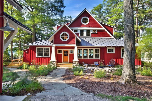
Notice how nautical the above house looks and of course it helps that there’s a porthole looking window above the front door.
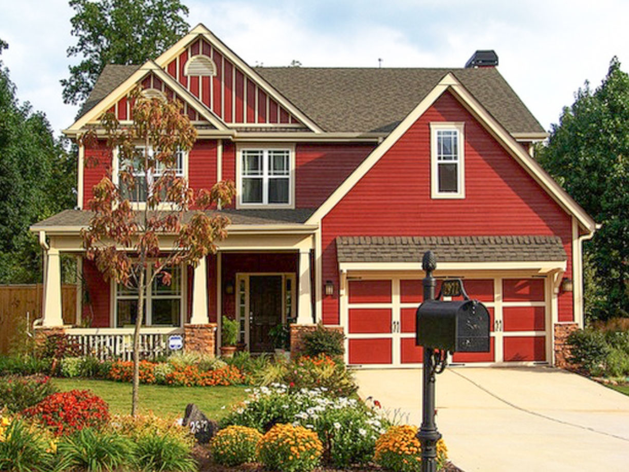
However white trim with a red house is definitely looking more nautical than yellowish cream and red (see below):

If the homeowner above wanted their house to look more nautical, then white trim would have been a better choice.
Yellow or cream trim looks heritage
Heritage style homes typically pay tribute to their historic architectural details and craftsmanship. And in this case, creamy or yellow trim colour is more enduring to its historic design roots than bright white trim. That’s why it’s so important to consider your home’s architectural style before choosing exterior colour.
You can learn a lot more about how to choose body and trim colour for your home in my Exterior Colour Selection Masterclass.
Read more: The best exterior trim colour for brick homes.

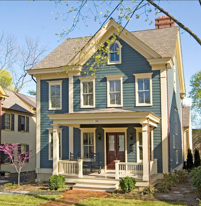
And below is a navy blue house with white trim, which makes this home look more nautical than the home above, doesn’t it? That’s the power of the right trim colour.
Read more: Two Timeless Blue Exterior Designs
That’s my trim colour tip of the day! Off to enjoy my weekend, have a great one!
xo, Maria
Related posts:
5 Best Ways to Choose your Roof Colour
Gray for Commercial Buildings: Yay or Nay

Delightful!
How fun! 🙂
How accurate!
Haha, never thought of it that way – but it makes perfect sense! Thanks for the tip!
How do you pick a white for trim (interior or exterior) for a ‘dirty’ color? Ex. Natural Cream Thank you.
If your walls are Natural Cream then you need a light trim colour like Chantilly Lace or Simply White. If that is your exterior colour then keep the trim white, white – Chantilly Lace. Maria
Maria, you always make me think of color in a new way! thanx for the tip,didn’t even know I needed it and i sure did!
Thanks for the visuals, Maria! Seeing your pictures of the white and yellow makes put it into perspective for me and makes perfect sense!
This is great! It is like profiling colors: orange with black = Halloween, orange with pink = happy; red with green = Christmas, red with blue = nautical; etc.
After looking at your home and a Pinterest search of orange + pink I think I am going to choose all pink and orange flowers for my garden this year (a bonus if they have yellow centers!)
Hello Maria, Great blog post…thank you. I am hoping that you can tell me the color of the two story grey/blue/green house you have shown above? I really like that color. Thanks for your help. Kind Regards,
I always thought that some colors look better with a more creamy or yellowish trim color. It will look much more elegant and less stark. I painted my house a bold golden yellow and went for a lighter beige trim and looks really well together. With bright white trim, it doesn’t look the same.