This post is written by Tricia Firmaniuk, my Senior Colour Designer who is also an artist, as you can tell by even the before photo of her recently re-done bathroom! It’s bold and colourful! Read on:
I’m so excited to share my latest project with you because I am so pleased with how it turned out!
My husband Kelly, daughter Vera, and I live in a very cozy 1950’s bungalow (950 square feet). It has only one tiny bathroom that needs to do everything.
I recently painted it a pale neutral (similar to BM Feather Down OC 6) because we were thinking of putting the house on the market and looking for something with just a bit more space. But since the neighbors and location are so amazing, we decided to stay put for awhile.
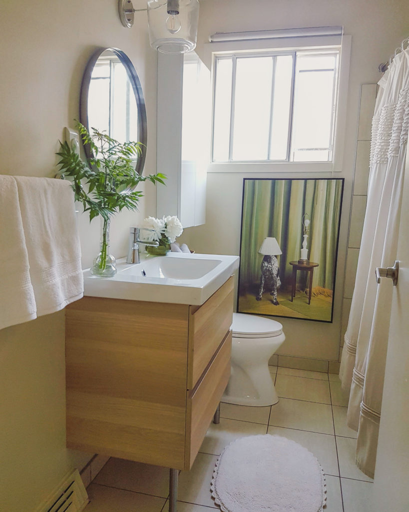
Tricia’s Bathroom Before BM Feather Down OC 6 (what were we thinking to install that roller blind like that haha)
SO, I wanted to have a bit of fun with this little bathroom since it is the closest thing I have to a powder room.
It’s been painted dramatic colours before, I’ve painted it often in the decade we’ve lived here to suit whatever I was doing with the decor. This time, to really change things up, I wanted to try wallpaper!
I spent no less than 3 days combing through the options on Murals Wallpaper‘s amazing site. There were SO many fun options.
Want to see the shortlist?
When I’m trying to visualize a design project, I often just create a Power Point file and paste the options I’m considering onto slides (with links back to the source) to see how they work with with main fixed elements and colours. It’s a great way to eliminate less viable options quickly and have your shortlist (or longlist) of favorites all in one place to flip through.
I made a general slide with my Ikea vanity and a block of colour that represents my green beige floor tile and had a great time pasting in pattern after pattern (who needs sleep?)
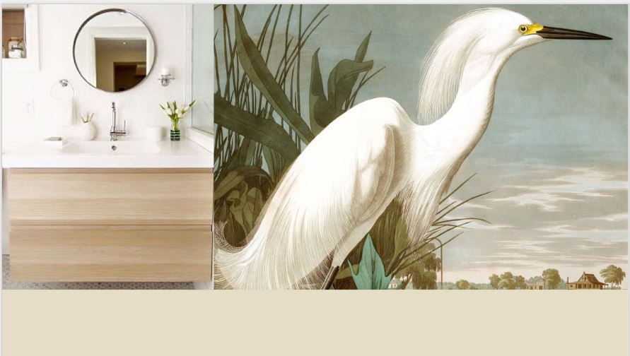
I absolutely love the look of vintage bird prints. And I thought the colour of this one was really pretty with my green beige tile. Vera is an animal lover, and this was her favorite pick. But it really is a mural, and it would not work well to wrap as a wallpaper in a tiny room. Sigh, moving along.
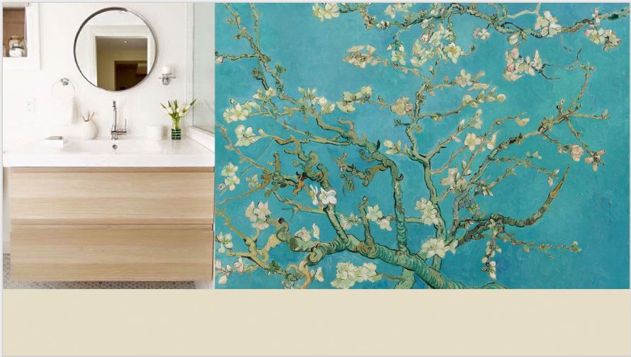
Murals Wallpaper Almond Branches by Van Gogh
I also loved this mural of Van Gogh’s famous painting “Almond Blossom”. I thought it would be a better image to wrap a room in. Kelly really loved this one too (romantic soul ;).
I looked at several patterns that would work more like a traditional wallpaper, like these pretty roses below.
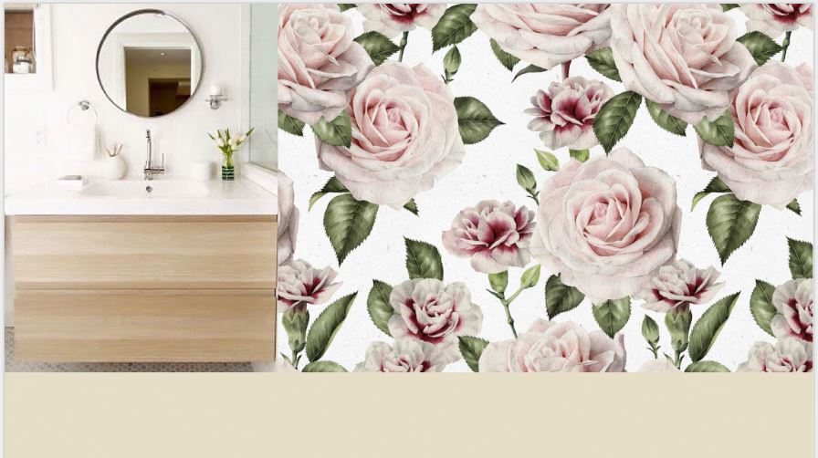
Murals Wallpaper Vintage Carnations Wallpaper
And this preppy over sized gingham.
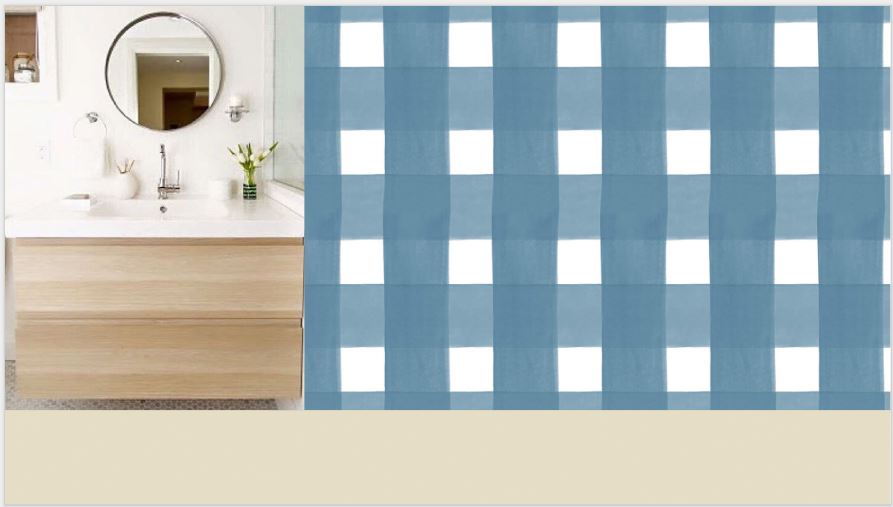
And this pretty watercolour brushstroke.
Full disclosure: I had over 90 slides in the file! And I drove my family nuts getting excited about this option and that haha.
So what did I choose?
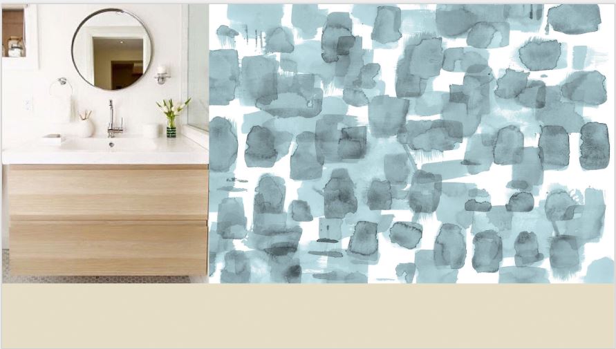
They had some lovely Japanese Shibori prints that I got really excited about. And considering that my house is basically mid century modern in design, you can’t go wrong with a clean Japanese aesthetic. I liked this hand painted cross hatch best.
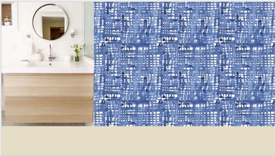
Indigo blue is really so pretty and current. But in my heart, I knew, if I was to paste something to the wall that I could not change on a whim, it needed to be my favorite colour, the one that always exists in my decor, green.
Lucky for me, they do custom colours! I requested this pattern in a leafy green, and sent in a CMYK value for the approximate colour I was looking for. They promptly sent me a proof that was just a bit too clean, Kelly Green rather than Leaf. So we tweaked it and the second proof was just perfect.
Are you ready to see? Ta Da!
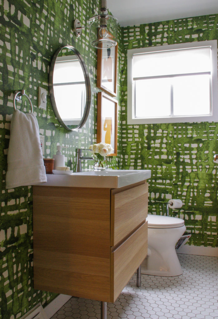
Tricia’s Bathroom After
So fun right?
And notice anything else? Funny thing, the new wallpaper snowballed into a partial bathroom renovation haha. When our dear contractor friend, Brian Geckotile, removed the strip of tile around the molded acrylic tile surround, we decided to just keep going and replace the tired and leaky tub, surround, and (why not while we’re at it?) the floor.
It was a big job, but we are so very happy with it!
You can see part of the newly tiled shower surround in this image below. We used a simple 4 inch square true white tile which I think suits the era of the house well. And a white hex floor with green gray grout. Since I didn’t want more tile on the walls to maximize the wallpapered area, we did true white PVC baseboards which won’t swell and crack when they get wet (Kelly installed these, and after a bit of trial and error I think he was pleased ;).
He also did an amazing job of taking these photos for me.
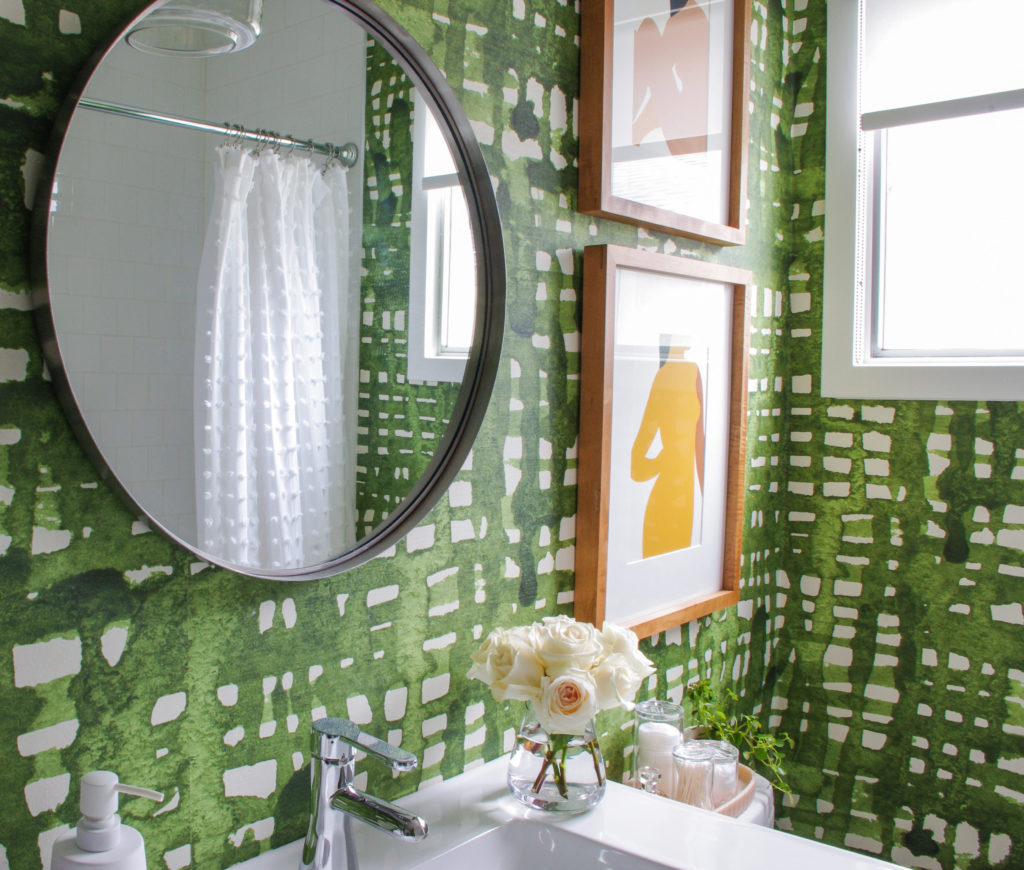
Tricia’s Bathroom After
We were so grateful for Brian’s excellent work on the tile, tub and plumbing. It would have taken us until Christmas I’m sure, to do what he did in a few days. And thank goodness because remember, it’s our only bathroom in the house.
The one thing I would do differently is have a professional install the wallpaper. It was my first time and while the installation instructions were simple and clear, being a newbie, I was in a little over my head. However, it is a very organic and forgiving pattern and I think it turned out alright 🙂
Oh, and in case you’re wondering about wallpaper in a full bath, the wallpaper company recommended a decorator’s varnish to protect it from moisture here. So far so good.
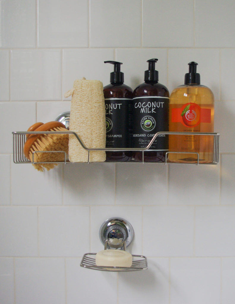
And speaking of first times, I ordered this shower caddy set with suction cups because I didn’t have the heart to drill into the new tile. I had it sitting in the bathroom in a box and Vera (who is barely 9) decided to install it during her bath because she needed somewhere to put the shampoo. I was impressed. Straight and everything, just as you see it here. Handy kid!
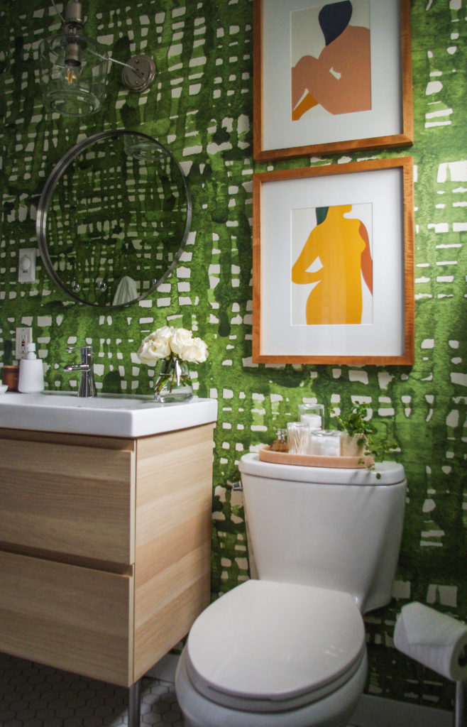
Prints by Stephanie Cheng from Pretty Grit
Because the wallpaper is so painterly, I needed something graphic for the artwork. I found these gorgeous prints on our family vacation visiting friends in Hamilton where they have lots of cute little shops.
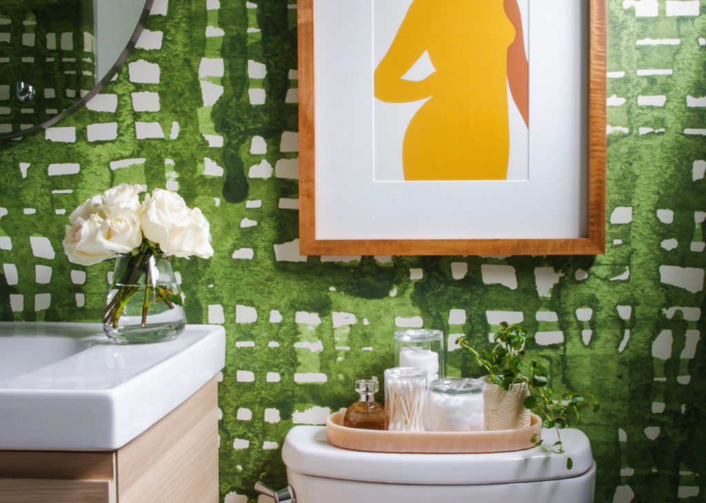
And you may remember my recent master bedroom transformation. I really like the way the bathroom holds up to the drama of that room when seen together coming down the hall now.
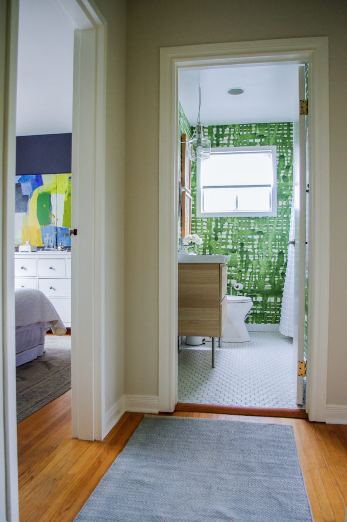
Tricia’s Bedroom and Bathroom
Here again is an image of our new bedroom.
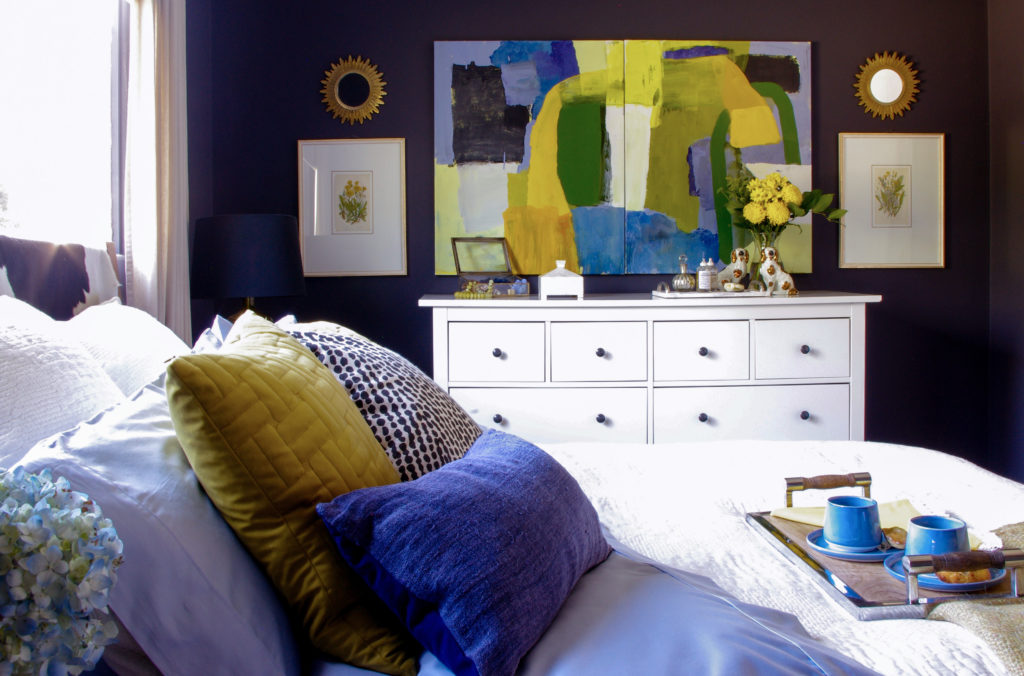
Tricia’s Black Bedroom
Across the hall, Vera painted her room a fresh blue, BM Serenata which also looks lovely (but her room is mostly a mess of artwork, books and toys, so no photos sorry 😉 Here she is rolling her sleeves up again, handy kid.
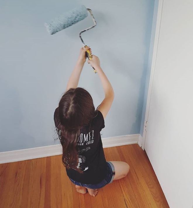
BM Serenata AF 535
Once again here is the before.

Before
And the after.

After
Next up I’m going to work these fresh greens, blues and golds into our main living space! Which is really kind of backwards. Usually, you would decorate your great room and spin your other rooms off of that which is what we help you do with our Get Me Started package here.
But if a bathroom reno is your emergency, we can help you with that here.
I’m curious about your experiences with choosing and installing wallpaper. Did you struggle with committing to a pattern? Or did you just go for it?
Thanks Tricia!
I’m in Vegas this week in a Business course with Tony Robbins! To move your business forward if you don’t literally go back to school, you need to participate in seminars and learn from the best!
The best colour course in the world is almost sold out in Vancouver this September, we have two seats left, and I’ll also be in Dallas and Charleston this Fall, register here.
*Wallpaper sponsored by Murals Wallpaper.
Related posts:
That is a gorgeous makeover. I absolutely LOVE that wallpaper!!! But the artwork of the dog with the lampshade on his head? THAT IS EVERYTHING!!!!! I hope it found a spot somewhere else!
We went through a Similar process. We painted our powder room a neutral thinking we were going to sell. Our daughter saw it and proclaimed that it was too boring and didn’t belong in our house. She was really upset!
So we wallpapered. It is turquoise and gold and we’ve accessorize it in a Moroccan theme. We get so many compliments! We even brought a realtor in who loved it and said this was great because buyers are looking for character and style. And yes my daughter loves it too.
Here’s where the old saying applies: Different strokes for different folks!
I enjoyed reading about and applaud her journey to get to the the look she loves..and it’s great..but I would find it very hard to live with.
After all the (very pricey) wallpaper I had in the ’90’s, I’m never doing it again..grass cloth, perhaps, or bead board since my townhouse is Georgian.. 🙁
I must redo all my sad, sad ’70’s baths, for possible resale…Don’t know where, how or with whom to start.
“I’ll think about that tomorrow.”
PS..Kudos to her sweet daughter for being such a great help!
I used the 4″x4″ white tile in my shower, set the same way, and I love it! and have the white hex on the floor
I adore wallpaper instead of a plain painted wall. I usually have it in the bathrooms, kitchen, dining room and bedrooms; but so far never in the living room. I think that is because of the size of the room and some lingering fear of choosing the wrong pattern for such a large space. I tend toward toile, florals and stripes. We are starting a downstairs powder room and the first thing I purchased was “country life” style toile in a dark shade of Wedgwood blue between royal and navy on a barely there warm cream background. At first I thought I would paper only the area above the chair rail but now that I have the paper I love it and will paper the walls from floor to ceiling. https://www.pinterest.com/pin/334462709818607808/
I looked at many different patterns but knew that this was the perfect one for our 1920s Dutch Colonial house. We don’t try to keep our old house period perfect but we do like to keep it looking “happy” with the old architecture and feel of the house but not look like it belongs in a museum. My husband and I are both sensitive to color and I did not want a drastic departure from colors used in other parts of the house, so the blue color is good for us. These are the things I keep in mind when shopping for wallpaper: has to have some history to it, has to play nice with the colors and styles in other parts of the house, and the pattern has to “say” something to me.
Stunning makeover! LOVE that green wallpaper. I think it would make me smile every time I walked into this room.
I love the wallpaper I chose for my powder room. However, I am having trouble deciding on artwork to hang over the toilet. Should I use black/white, beige? Or can I add a splash of color? My favorite is green, also! The wallpaper pattern is so busy, I’m wondering what type of image to use.
Oh, and by the way….. I LOVE what you did! I love it so much, I’m hoping you can give me some of your expert advice!
I’m sorry I couldn’t add the photos….. it looks like layers of earth, the layers moving horizontally in shades of gray, white, beige. All the fixtures in the powder room are white, toilet, sink, with chrome fixtures and silver light fixture. I really feel like I need a splash of color!
I love your natural wood vanity with the square sink and the round mirror above. While the beige paint could be taken as boring, your wallpaper is definitely not.
I have been considering wallpaper for my main bath. Perhaps, a modern flower print.
Stunning!
It’s fantastic! First-time poster here. I am considering using a similar green, blue, and yellow color scheme for our main living space in our lakeside condo here in the Colorado Rockies. Thanks for sharing such inspiring photos today.
Nicely done! I wasn’t really crazy about the wallpaper until viewing the shot from the hall, then I loved it! Why did you decide to keep the plain roller blind? I’m thinking a solid dark mustard (or whatever color the dark yellow is on the print) in a flat roman shade would be nice but I’m not a Decorator, just a color enthusiast!
I like the way it filters the light without casting any colour in white, it’s a very hot South facing window. And it’s simple to let the wallpaper be the star 🙂
Is that a TV cover I see in your bedroom? If so would you share how you did it?
Hi Susan, it’s not, but I wish it was 😉
I can see that wallpaper with a 5 foot white board and batten wainscot.
love everything about this bathroom! drool worthy indeed…green is the only way to go in my book!
Love the new wallpaper and the color. The IKEA cabinet’s perfect in the space. The new IKEA catalog shows lots of Grey’s and a bit of Blush with blonde woods. Good job on the update Tricia and family.
Looks beautiful! I would love to know the source of your shower caddy set. I really would love to add that to my shower!
Hi Millicent, there’s a link below the photo 🙂
Amazing…love, love the colors. It makes my eyes sing, if that is possible. Would you share the maker of the tile floor you used. I am considering using a hex from Daltile Uptown . It is glass. Does anyone know anything about such a product?
I love it – nice fresh painterly, organic and fun.
Tricia I certainly see that you are an artist. Thanks for taking us on your bathroom journey! I loved your trial and journey of choosing just the right wallpaper that makes you all happy. The paper, tile and cabinet just makes the whole space look fresh and current. Love it! Also your daughter will probably follow your footsteps. The only wallpaper that I personally installed was a vinyl grasscloth which of course doesn’t have a pattern match.
Thanks for sharing your article.
just gorgeous
LOVE it!!!!!!
I enjoyed reading about your bathroom renovation. Your wallpaper really is lovely, although for my somewhat less colorful tastes, I would have put the wallpaper on one wall only. I too have a mid-mod home and your modern take on the classic 4×4 tile by offsetting it – rather than the typical grid -is a really nice touch.
I LOVE the wallpaper. I hated the blue pattern just above it so I was so relieved to see the green. And I love that you replaced the floor. So much more modern and clean. The bathroom looks great and is making me think of wallpaper….hmmm
So fresh and pretty! Enjoy!
Just ADORABLE bathroom – LOVE the paper, esp next to that blue bedroom! Great job, Tricia!
Fabulous bathroom and choices! I fell in love with the blue paper, but after seeing the green, I love it, too. My last house had lots of greens, so when I moved, it felt more fresh to start over with blues. To be honest, I could go either way, now.
I really love the wallpaper and the whole bathroom makeover! I have a green floral wallpaper from Farrow and Ball in my tiny hall “powder” room. (What an old fashioned word!) I spent many years ordering wallpaper samples and looking in magazines (this may have been before I knew of pinterest.) Reading all Maria’s blogs helped me narrow the colours down to the colour of my living room sofa and the look and feel I wanted for my house, which, after reading your recent blog, I know is called New Traditional (Miles Redd is my patron saint) but in a cottage -y way because my house is small. Serenata is one of my favourite colours. I recently painted my daughter’s room Porcelain Glaze CSP, which is similar. I love your guest blogs.
love everything. thank you for sharing you wonderful transformation with us, Tricia!
as for wallpaper-I grew up with it, so i love the concept
when I was looking for it several years ago-took me a long time to find what I wanted(it had to go with existing finishes, quite challenging-a bathroom too). I found it. It was 300 plus dollars a square foot
It’d be putting lipstick on a pig, in this particular case
I sighed and went with paint
(and a nice shower curtain and a rug)
I don’t like to compromise when it comes to pattern. I need to love it. Either I love it and commit to it-or I wait/go without.
With fabrics, it’s much easier to stiil have most of what you want, just so. okay so won’t be a chair or a rug of your dreams-but you’ll have it in throw pillows and bedding, for example
Wallpapers and murals and tiles..I fall for some hard, and I never forget them, and it’s hard to afford them most of the times because I tend to fall in love with very pricey things, somehow. So. I have a wonderful Pinterest board lol. Where I can collect them and look at them-and if I win a lottery, I can trace it all back:)
PS and I’d never be able to put things up straight so kudos to both Tricia and Vera:)
Love the wallpaper! Didn’t realize it was such a large print until it was installed.
My mother put up wallpaper professionally for a while, and even could deliberately mismatch patterns for clients who did not order enough to match properly. It can be tricky. She installed a lovely blue huge gingham check in my bedroom that looked like strips of torn tissue paper, with furniture painted in bright yellow, green and blue to match, and a off-white vinyl floor (my choice so I could do as many art projects as I wanted).
I loved it, but haven’t had the courage to install wallpaper myself, except for my son’s baby room. Maybe your example will inspire me to go for it!
Tricia, I laughed so hard at your 100 pages, and love your outcome!!!
We just finished our powder room, and hired a local designer, because the room was getting a custom vanity to house our cat litter box (long story), and she wanted wallpaper (GULP at the commitment). Even then I obsessed over her selections, but am very happy we did paper—it’s so glamorous and unexpected.
I have a 150 year old distressed frame for the mirror, that I bought in Florence, Italy, which served as the inspiration for the room. She made it relevant and modern for us. We repeated Maria’s kitchen cabinet design in the cabinetry. Thank you Tricia, and all designers!
Great job, Tricia! I’m re-wallpapering my laundry room soon. The area next to the sink is hit with water whenever my husband uses it. I’ll definitely be looking into the poly you recommended. Can it be rolled on like paint?
Hi Mary, it didn’t say on the bottle and it was prone to bubbling, so I put it on with a low nap roller and brushed over it 🙂
Also, do you know if dead flat varnish is necessary in a powder room? I have put it in a few small spots but wonder if I should do all four walls.
I’m really not sure, best to ask the wallpaper company 🙂
Love the paper you chose and your finished room! Congrats! I adore wallpaper and have it in my rather large foyer and also the main floor powder room. It makes a statement when you first walk in our home (apple green strié) and then another story when you step in the loo (Thibaut botanical with many insects)…wish I knew HOW to wallpaper, I’d do more!
Your bathroom renovation looks amazing ! I love the boldness of the colors both in your bedroom and bathroom. Congratulations on another successful project.
I love the bathroom. The paper is perfect and makes it very easy to see your bathroom as a powder room. I love the scale. It is a professionally decorated room for sure!
Looks like you had fun! Kind of miss the dog art 😉 I like actual greenery with the humidity – it seems natural to me.
I thought the dog art was fun, but in a funny place. I like what you did Tricia…green is my favorite color, too! And the green wallpaper plus the green in the art in your bedroom looks like an artist was there (wink). Nice job!
Beautiful upgrade Tricia! Re your question; I am a self-confessed wall paper junkie however have given up the habit in recent years ….. ha …. but never had a problem with choosing nor working with it. (Suppose I did enough not to be intimidated?) That stated; worse part IMO was always stripping it until I came across a fabulous product called ‘Safe & Simple’ (wallpaper removal solution/Pasadena Cal.) that is environmental friendly and works like a charm. Its what many professionals use and can be ordered online.
-Brenda-
P.S.: FTR I am not affiliated with said product in any shape or form.
Wish I had known this years back! I had a tough time in our last house. And after stripping I realized one real good reason for wallpaper. To cover plaster wall cracks.
love this bathroom, the wallpaper is gorgeous! I actually love everything about this bathroom and the rest of your home too!
now I’m wondering when we will see Maria’s remodeled bathrooms!?
I would love to experiment with wallpaper but all of my walls are textured except for the bathroom. I suppose they would have to be sanded before adding wallpaper. I LOVE your bathroom wallpaper though. It turned out fabulous and I would buy that wallpaper if I saw it somewhere! Congratulations on a beautiful new bathroom.
My response, WOW. What a great transformation. Gutsy. I ‘d sing every time I entered that bathroom. But yet, for me in my house, I’d be afraid to go there. I still need to stay in the safe zone. Sad, because I’m missing out. Feelings are being pulled in two different directions. This was just an aha moment.
Congrats on the “new” bathroom! So fresh & fun! I paid close attention to your choices since we are planning a master bath remodel and are now lost in the World of Tile. Maybe Maria has already answered a couple of questions I have and I could not locate her answers: Medium brown hardwood floors are like blue jeans & go with everything, right? Is that also true of porcelain tile that looks like (medium brown) hardwood? In a blog post about the best baths are white/cream, Maria mentioned her NY hotel had timeless marble. I noticed the photo showed marble with characteristic veining; so not plain white. Will porcelain tile that has a marble look also work as “timeless”? I sometimes wonder if a porcelain tile that is faux wood or marble will date–kinda like my current tile which is faux (pale) traveratine. I worry that a faux marble tile will just look blotchy & bad over time. Confession: I have fallen hard for a blue-gray “marble” tile (12×24) but my inner voice is yelling–Maria says “no way”! If I have these questions, thinking others do to! Thanks for any help!
Ahhh that’s so great. It has lots of character. And I love hearing about your process…I work the same way 🙂
Beautiful space, the colours are so unique ! I especially love the floor !
Keep up with the great work ! 🙂
Sara
http://www.thefrenchcountryliving.com