My favourite place for blue is Master Bedrooms. So many people use white bedding and blue is so pretty with white.
And, blue can be a tricky colour to choose. If you don’t gray it down enough, it ends up baby blue on the walls and–unless you pair it with lots of white or a bright colour to warm it up—a gray/blue that’s too dark can end up looking too much like ‘teenage boys room’ or a ‘man cave’.
So when House Beautiful sent me their little book called Blue to review, I learned something new about blue. And here’s what it was:
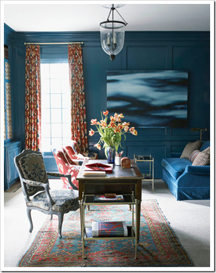
 Interior Design by Carlton Varney
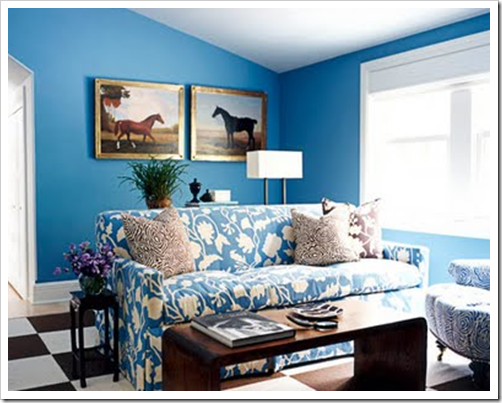
If you keep it a happy, clear blue and you go darker, it works. Just like this wonderful blue above, Farrow & Ball Cook’s Blue 237. I’ve been specifying gray blues for so long, I never thought much about it. The only time I would pick a bright blue like the one above is if I was for a kids bedroom.
 (BM Bermuda Turquoise) House Beautiful
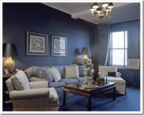
 Interior Design by Joe Nahem (source)
Blue is the world’s most favourite colour, so if it’s yours, this stunning little book with one beautiful room after another (and all with colour names) is for you! Click here to order your copy.
Do you have a blue room in your house?
If you would like your home to fill you with happiness every time you walk in, contact me.
Related posts:
Dreamy Blue Bedroom
Bright Colour needs a Healthy Dose of White
What Everyone Should Know about Gray
New to this Blog? Click here ; Follow me on Facebook and Twitter; Become a True Colour Expert in Vancouver & Toronto


The coastal blues are still very popular here in Charlotte. I grew up on Long Island so I'm partial to 'Sea Salt' and 'Rainwashed' which remind me of beach glass. (Sherwin Williams) A close runner up here is 'November Skies' by Benjamin Moore.
I did see a clients bonus room in a color similar to Cook's Blue and it was just so very bright! Other than that, dark blues are not too popular here, only in occasional accent colors.
Are coastal colors popular by you Maria?
My kitchen is going to be blue with white cabinets. I chose a grey blue similar to BM winter lake. Will also likely paint the basement bedroom a dark blue, because as you've taught me a light colour won't lighten a dark space. Not to mention it will take fewer coats to cover the previous owner's daughter's colour choices of BM hot lips and BM lime green.
I used BM Silver Mink in my Master Bedroom in my old house and again in this one, until I changed it to my current love, BM Antique Parchment. My leftover Silver Mink is now in my small powder room and it looks great there, too! I find it a bit sophisticated. It seems to me that the clear, clean colors that are in vogue now will get more tiring on the walls of the rooms we're seeing now than the more muted, less in-you-face colors that have so much white in them. I just think muted colors (and I'm not necessarily talking earth tones) are easier and calmer to live with. What's your opinion? I don't think the average color-tolerant person could live with that Carlton Varney room for very long. What's your take on that?
I love House Beautiful's books on colour. I'm doing my daughter's room in blue…but I'll wait till after the class with you in May to make the final decision…the F&B blues I like look closer to green which throws me off.
The living room by Joe Nahem is excellent!
I think paint is the most wonderful way to express yourself. If you go for the brighter blues it is so easy in a couple of years to change it…and keeps us in business 😉
Carol, I agree I think someone would really have to love blue to go that strong on the walls!
It's great for show though!
Maria
I am redoing my beach house (the one you consulted me on) in blues, grays, greens and white. I can't wait! I will certainly send you pics. it's such a departure for me since my primary home is all beiges, orange, browns, and creams.
Also – that pic of the wall color you normally would choose for a kids room reminded me of Carrie Bradshaw's apt makeover from SATC movie:
http://www.casasugar.com/Casa-Interview-Sex-Citys-Jeremy-Conway-1675967
to add: the brilliant, lovely ocean blue on Carrie's walls is very close to Benjamin Moore's Electric Blue
I love, love blue! I have painted my bedroom blue in different apartments at least 5 times. It all started in the mid 80's when I saw a light blue bedroom with white eyelet bedding on the cover of a magazine with a country style. I had the shelves with the heart cut-out and blue candles hanging over the knobs. Then I moved to Florida and had pastel bedding ("Monte's Lilies") with the blue walls. I eventually changed to off-white with black and green accents. I can't wait to go back to blue and white!
Maria,
Gray-blues and gray-greens are sooo huge here in the south. I've got about 7 go-to gray-blues right now that I recommend again and again. The darker blues I often pare with the lighter gray-blues include Del-Mar Blue, Stratton Blue (I swear, they are the SAME color), Stillwater, Phillipsburg Blue, and Hemlock Blue.
I am working on picking out colors for the interior of my home. Here are some color choices that I am going to get little samples of, and put big swatches on my walls, surrounded by white, just like how I learned on this blog to do.
I am looking at BM "stingray," "azores," "monroe bisque," and "hawthorne yellow."
I am one of those few people, I guess, who, like Maria, loves yellow. The Hawthorne Yellow looks lovely. And we have a lot of light in our home.
I just loooove blue!! I love it's cooling down effect when used properly in a room! I have a grey, blue, white and scandinavian wood combo in the master bedroom and a turqoise blue, lime green, dark brown living room! I hope you approve it, since you are our colour guru!! 🙂
I could probably be happy with every room in my house being blue. My living room is Behr's Embellished Blue, a bright and clear medium blue.
Asking me if I have blue is like asking if I have hair on my head..lol. I LOVE blue and find it in all its many beautiful shades to be soothing, elegant, warm and cozy. I love it in a master bedroom too combined with creamy colors and throughout the house as well. Interesting little tidbits of info above..thanks!
I did a client's office in a "strong" blue, SherwinWilliams Major Blue, similar to F&B's Cook's Blue in the Carlton Varney room but far less gray. She loves it! White desk and big white lamps for contrast make it work.
Hi Maria, I have noticed this trend too. I just tried BM Galapagos Turqoise for a local design showcase and loved it. It made the yellow in the paintings and textiles sing! I also paired it with a gorgeous pink lacquer coffee table and heavy doses of white furniture.
Blue is such a wonderful accent colour too. In my last house it was the colour that pulled everything together. A warm cream sitting with pale maple furniture looked really vibrant with blue accessories.
I've also found blue and green glass accessories work well in a pale teal bedroom, as they picked out both the blue and the green tones in the paint. I also used rich royal blue bedlinen in an aubergine bedroom – the effect was far more dramatic than matching bedlinen would have been.
Blue in a room needs a little zest! Recalling Marc Chagall's famous color wheel quote: "All colors are the friends of their neighbors and the lovers of their opposites." My bedroom is a gray/blue, soothing, serene on the walls. Blue/green duvet, turquoise rug, white accessories and I'm adding some zest — might cover a lampshade with Chiang Mau Aquamarine fabric, add a couple red/orange accents, here and there, subtle pops that keep things friendly, serene yet energy flows and keeps things interesting!
By far, I find with my clients, that blue is the most popular color and yet when I go find fabrics blue is incredibly difficult to find. It's not a lack of resources, I am a designer in New York City. I'm talking about true blues, not green-blues, not grey-blues. I see the trends come and go, purple, orange, beige, but blue is always popular and I can't figure out why it is so hard to find.
I wonder if bright, clear colors are coming into poularity because of the recession. They feel more happy and we could all use more of that! I have devoted a whole chapter on color and its meanings in the book I am currently working on, Sassy Decorating Secrets: A Diva's Guide to interior Design amd Feng Shui. What colors mean and how to use them to change attitude and mood is very interesting.
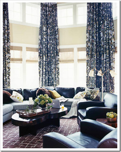
I love this post! ALL my clients want at least half of their house in blue, green and grey. I have to struggle to get non-blue rooms in my portfolio. But Blue Sells. However, I am so excited about the newer shades of blue popping up. You don't happen to know the paint color in the third photo?
Oh I'd love blue and yellow together in my house! 😀 Strange that no one else does it, it seems like such a natural pairing!
Relatable Style
Timely post as I'm trying to decide what color blue to paint our sunroom. I guess I'm in the minority but I love blue and yellow.
I have many blue rooms in my home and am currently looking for the perfect dark blue for a couple of projects.
what perfect timing this post is,just finished whole downstairs update,totally switched gears from doing tuscany look to a more zen look and could not be happier-I painted ms rainwater in the kitchen,ms spring melt in living room,dining room, ms bakery box white in foyer,hallways, and ms toasted marshmallow in game room-I fell in love with my house all over again after being here 18 years-if I would have known about this blog, i would have hired Maria to help me with the colors, I spent a gazillion hours thinking about this project, put over 30 paint samples up and agonized over every step-it was pure torture, this is why we need experts, they are trained to see the big picture-when we buy a second home in charleston,s.c. I am calling her-it was a million times harder than I thought it would be, no wonder I had the builders navajo white still on in every room-lol
i have three blue rooms…two offices and one bedroom.
My guest bedroom is BM Raindance with BM Bleeker Beige and it's definitely calming. One office is BM Gray Wisp and the other office is very bold and I don't know the name of it but it looks like the bright blue roof tops found in Greece.
Maria, when you mention blue and yellow, I can't help but think of Monet's house in Giverney, where his dining room is pure, sunshine yellow (chosen evidently in part to set off the blue & white china displayed in the cupboards) and the adjoining kitchen several shades of blue, with gleaming copper pots in a row. Just for fun, take a peek– a unique artist's choices in his own home: http://giverny.org/monet/home/
I'm so loving blue right now! Almost every room will have blue in it. MAster & bath are a light aqua, living room will be a richer aqua for accent, boy's room & bath will be stronger blues. We may not be done for 20yrs and I may be tired of it by then, but for now, I love dreaming about my vision!
My favorite blue is BM Quiet Moments. It looks a bit green on the swatch but when it goes up it is a wonderful soft blue gray.
love the finish on the lakehouse bed. Would you mind telling me the finish and the upholstery fabric used on the bed?
I appreciate the recommendation about large paint samples. I just had my study painted Sherwin Williams 7661 Reflection which I thought was light gray. It has a definite blue tint which was a real surprise. But it is the most beautiful and soothing color and all who come into the room love it. Until this, I was not a blue person. I like it so much, I am taking the same color into my bedroom and master bath.
My master is a serene moderate blue with purple/grey undertone with white trim, as is the bedding. THe furniture is a deep tobacco brown and the accents are brushed nickle. And i love this room, it is my haven and retreat. I chose it a year ago after reading your blog for over a year and listening to you say pick what you love! Thank you Maria!
My favorite color is blue and my home reflects that. I am amazed that although most people like blue, you don’t find much at the retail level. I just ordered a new chair and found the fabric options very limited.
I have painted my boys’ room BM Smoke for the 3rd time. It is an absolutely perfect color, suited to any age! My bedroom, office, and back door are all BM Hale Navy, truly a classic, sharp navy. I imagine these colors would translate beautifully into any space and home!
[…] What Everyone Should Know About Blue […]