


Transform your home with confidence! Discover how our eDesign services turn inspiration into stunning, personalized results. See the incredible before and afters from real clients who trusted me to bring their vision to life.
Happy eDesign clients!
We absolutely LOVE to hear from our happy clients. It’s so rewarding to help transform how people feel about their homes. And we LOVE great before and afters!
We recently received this note from Valerie. She has completed several eDesign consultations over the last few years and is delighted with the transformation.
“This is wonderful, thank you so much! My home was photographed recently. I’ve attached some of the pictures here, because I wanted to share how your wonderful advice has transformed my home over the years. I am so very grateful.”
Before I share her stunning before and afters with you I want to say that we are SO grateful Valerie for your taking the time to share these with us!
It’s actually pretty rare that we get to see the finished result of our eDesign projects. By the time the last piece is installed and the dust has settled, most clients are just ready to get on with life—and I totally get it! Getting good photos is a lot of work when the dust and disruption has only just settled 💛. Still, I always feel so lucky when we do get to see the transformation—it’s such a rewarding part of the process!”
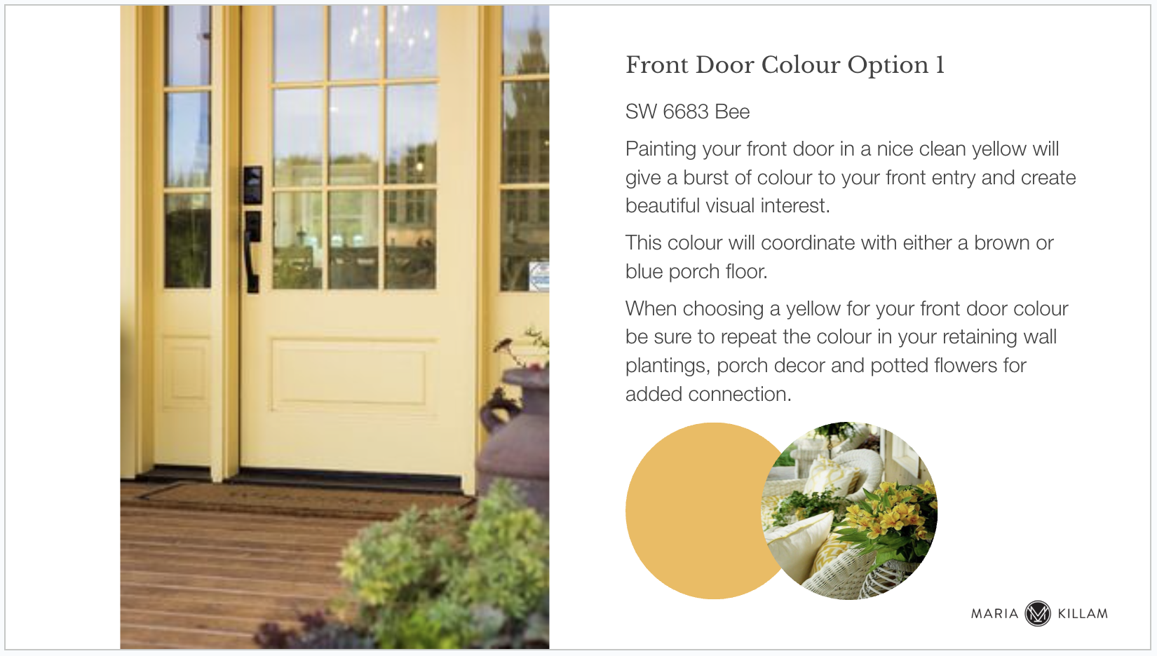
Exterior eDesign Colour Package
Valerie has a lovely house a top a slope that needed a new metal roof colour and a fresher body and front door colour. She consulted first on those and came back to us when it was time to also update the siding with our Essential Exterior Palette eDesign consultation.
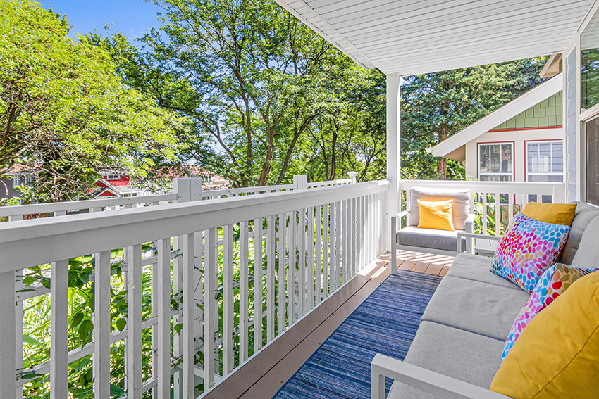
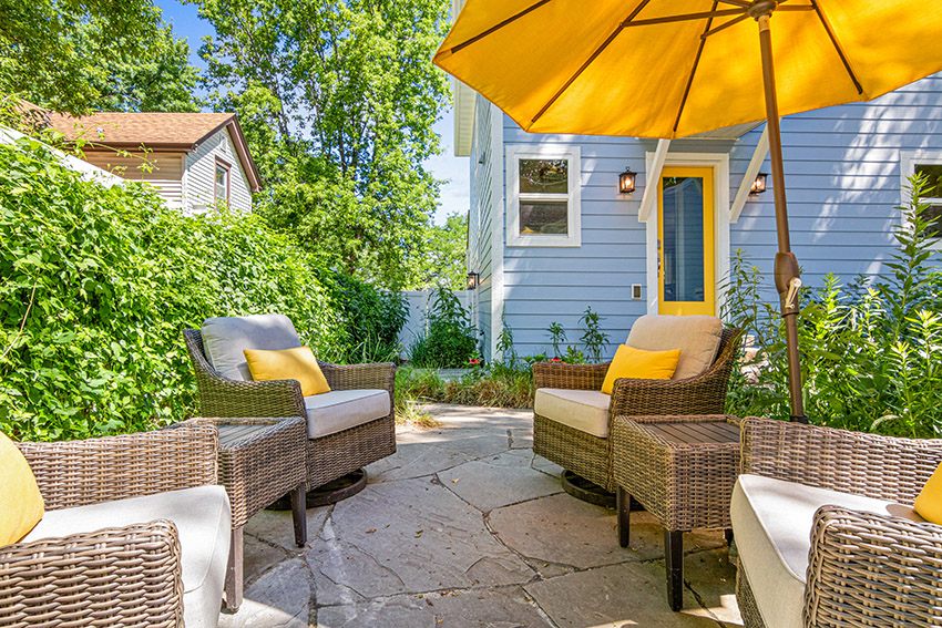
Here’s how her house looks now with all of it done!
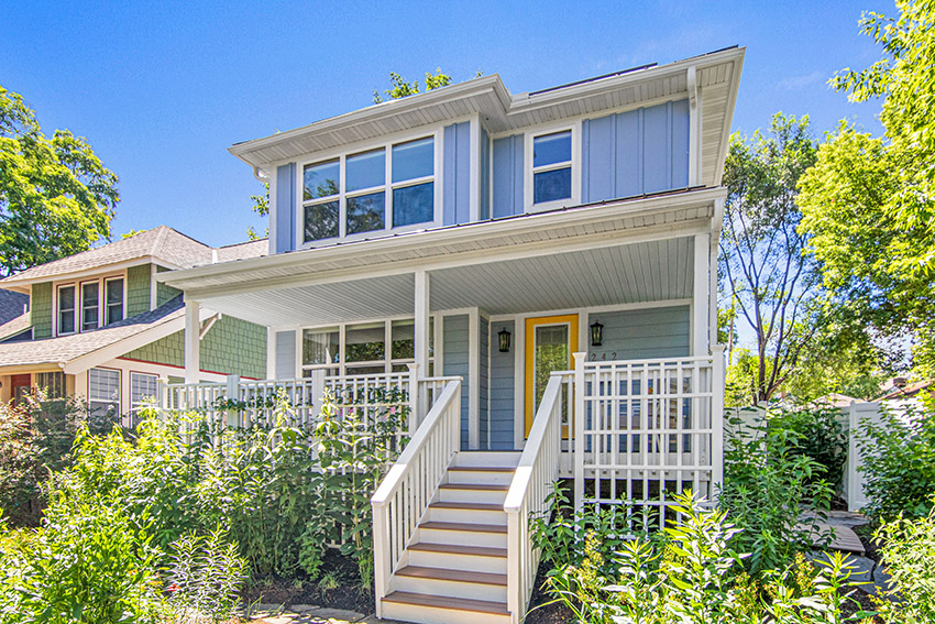
SW 6241 Aleutian & SW 6683 Bee
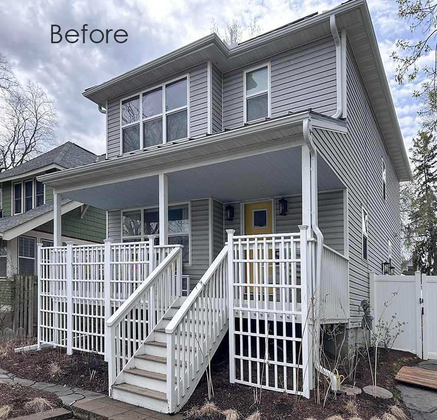
Here’s the before (with the new yellow front door brightening up the grey.
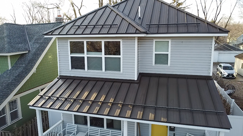
And the interim with just the new bronze roof and sunny yellow door.
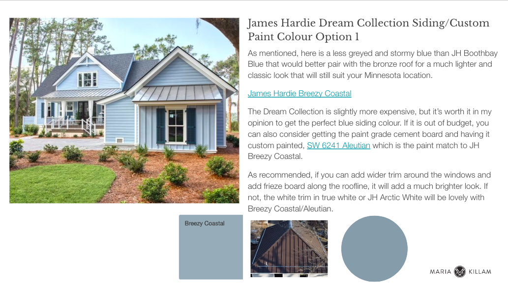
Her neutral grey siding wasn’t terrible, but she really loves colour. After considering the standard James Hardie blue options, which are either too dark and heavy, or too muted for the look she wanted, we nudged her to go with a custom colour from the Hardie Dream collection to get a fresher blue.
Here is the previous advice for the happy yellow door which works beautifully to the new blue siding as well.
She did a lovely job of repeating the yellow in porch and garden decor 💛
How fabulous!
Interior eDesign Colour Package
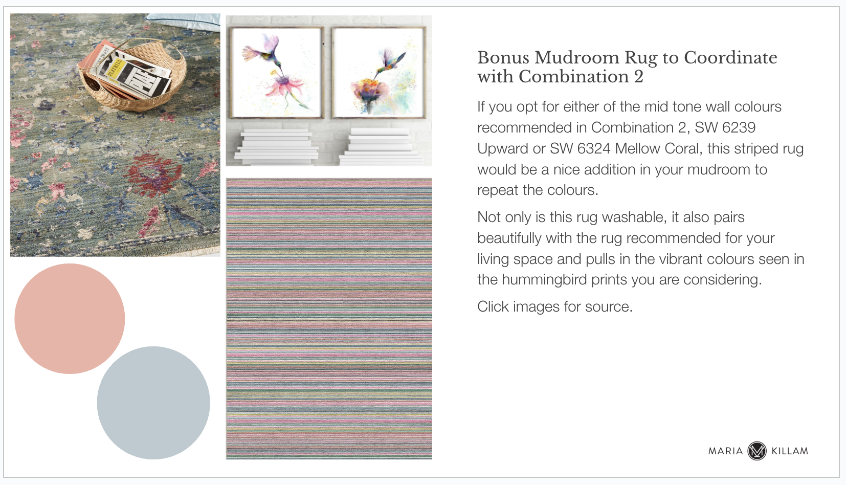
She also consulted on her new design for her mudroom. We suggested a pretty blue and white scheme both to flow with the exterior and blue with pink accents to relate to the new living room area rug she purchased.
Such a welcoming entry!
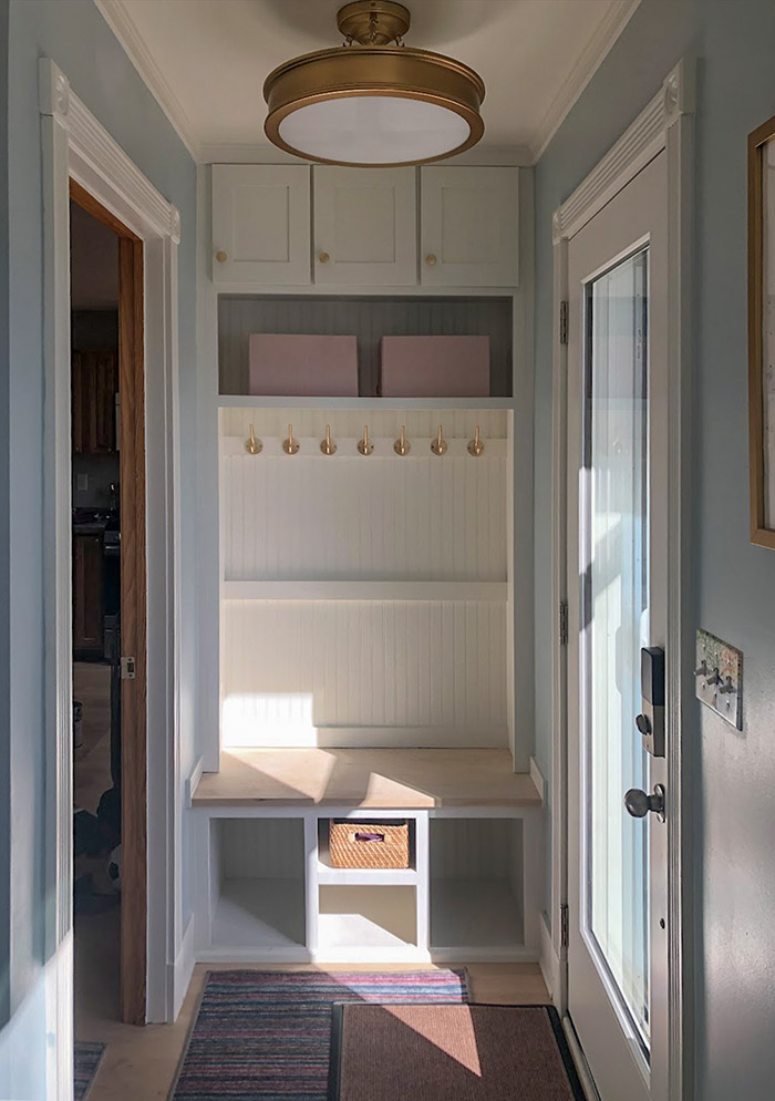
Here’s the option she went with:
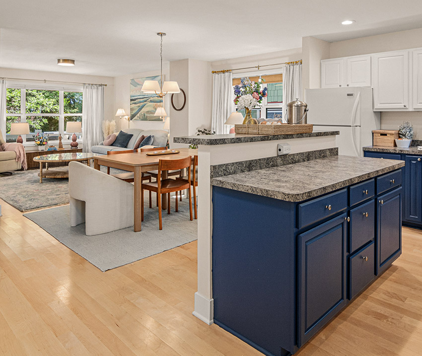
A ‘now and later’ plan for the kitchen project
She used our Create a Timeless Kitchen package to get advice for making some cosmetic updates in the short term as well as advice on a more extensive kitchen renovation in time.
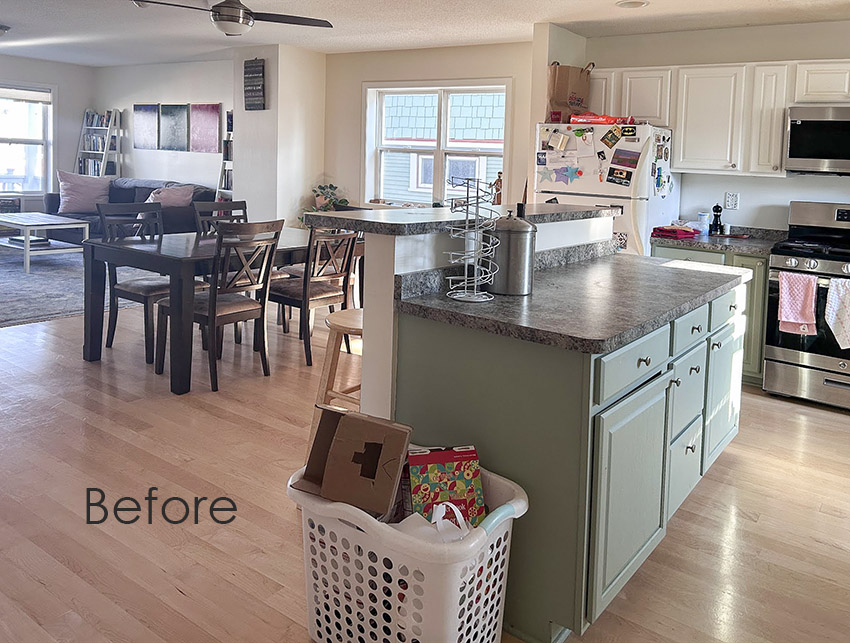
New Paint on the cabinets (SW 7602 Indigo Batik and SW 7551 Greek Villa also on the trim) created connection to her new living room decor in blues and pinks (below).
The walls were already SW 7571 Casa Blanca, an orange beige complex cream, from a previous Open Layout Colour consultation. She used the Get Me Started decorating package for advice on new furniture and accessories for her living room to work with her blue and pink area rug.
And if you’re a homeowner that wants to have more confidence with your home projects, sign up for my FREE webinar here!
Get Me Started eDesign Decorating Package
In the living room the dark sofa was swapped out for a softer timeless blue one. And we advised that she move her deep jewel toned triptych to create a softer feel with the new sofa.
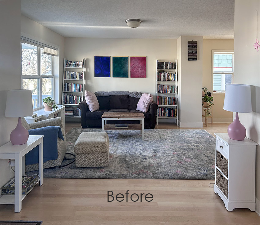
Here is the option from our presentation that she went with.
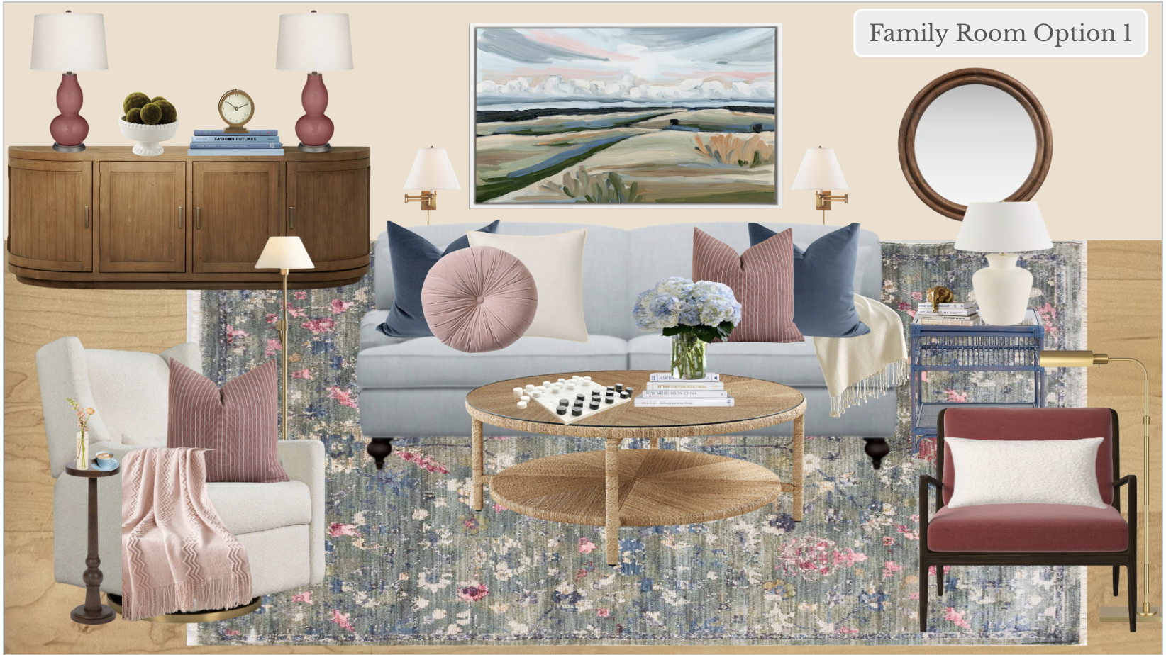
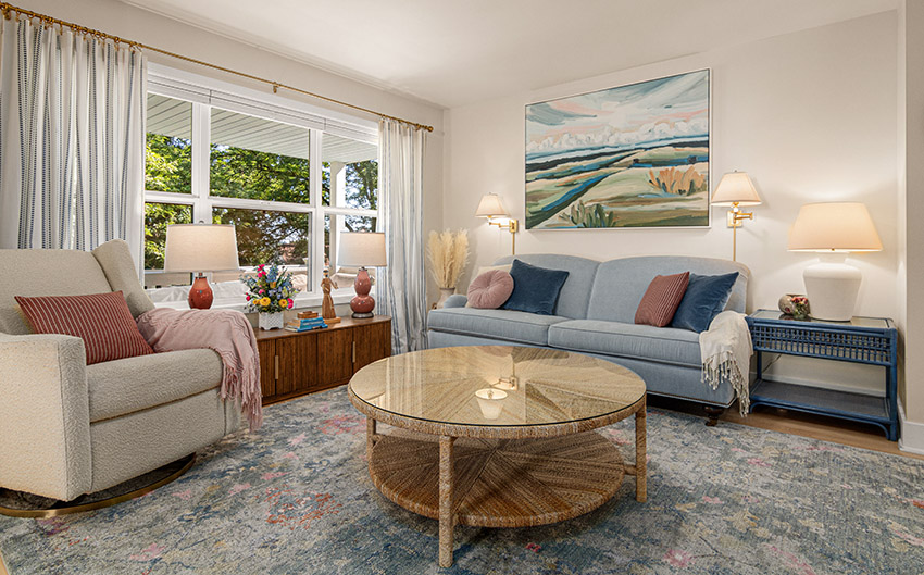
And here’s the living room after!
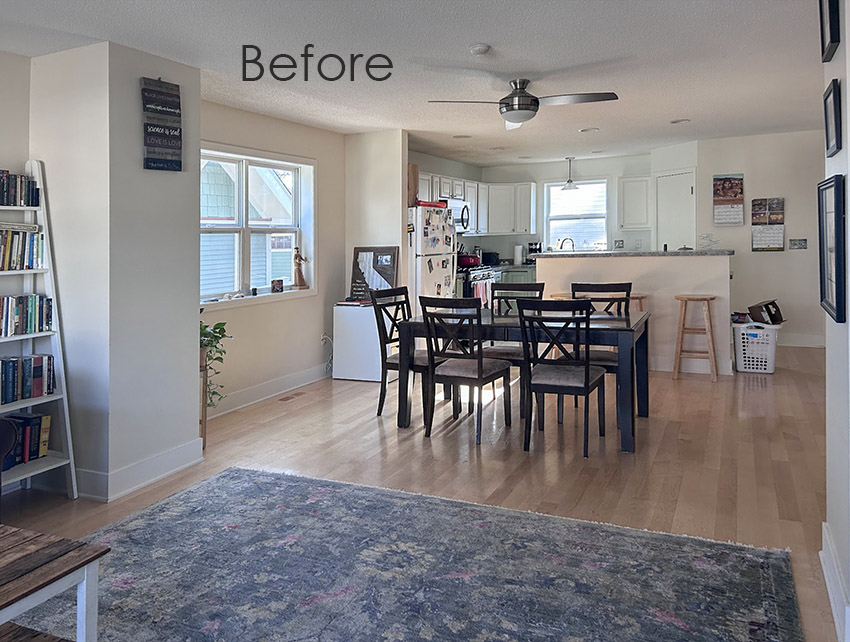
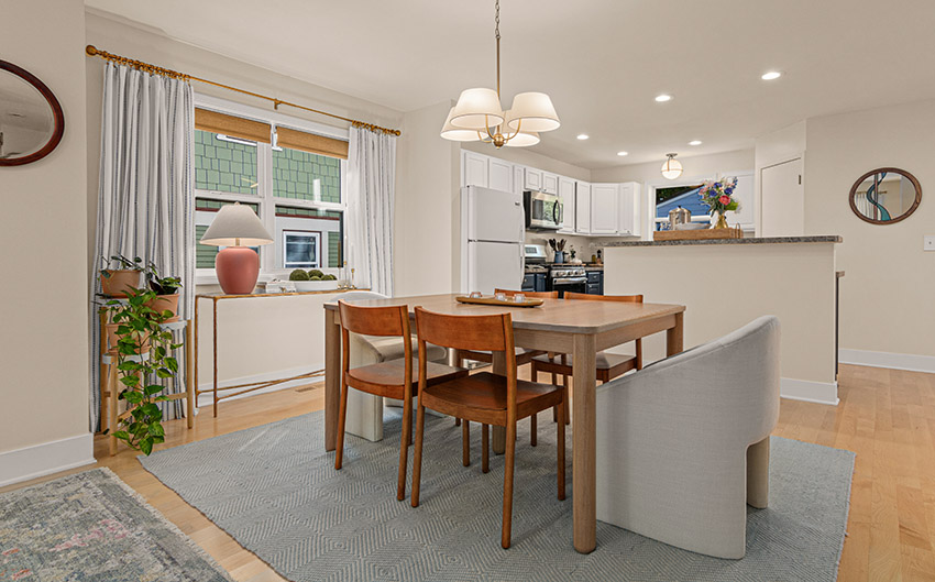
In an open concept layout, you have to coordinate the kitchen, living room and dining room so they all look harmonious and connected by colour and style. Here’s Valeries dining area viewed from the living room before.
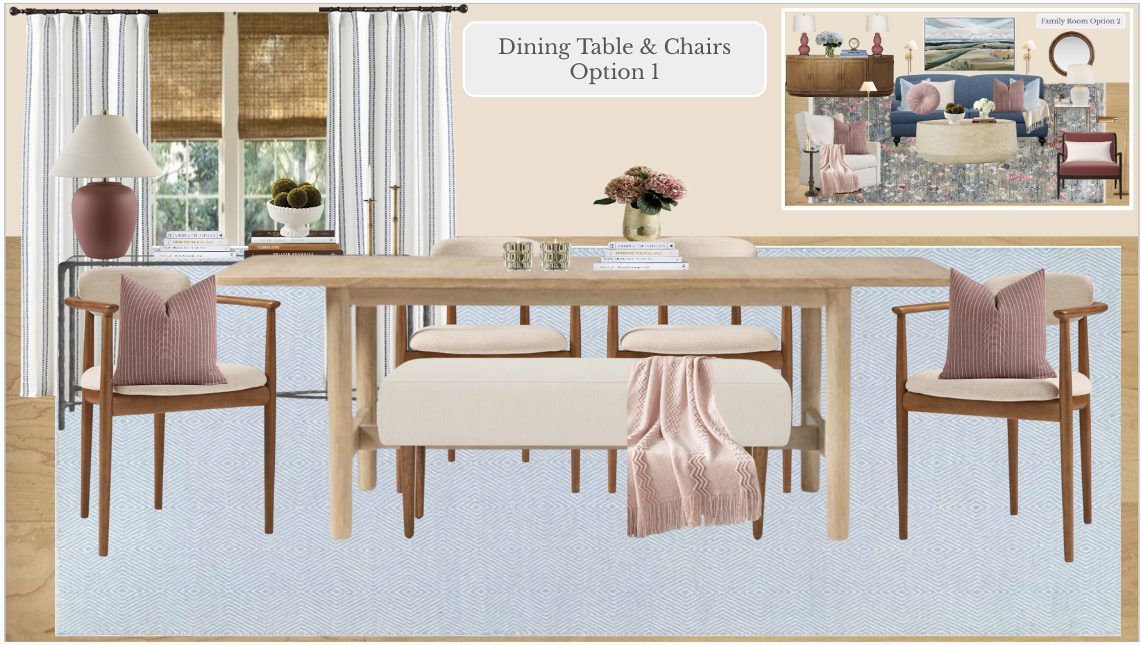
And here are our suggestions for her dining room.
And here’s how it came together! It’s amazing the difference pretty lighting and drapes make.
Thank you again Valerie for sharing your beautiful home with us!
I hope you enjoyed this post and found some inspiration. We would love to help you create that transformation in your home! Whether you want to tackle a full makeover, a new build or simply a small paint project, we’ve got you!
You can browse our eDesign packages here.
If you are the friend everyone calls for decorating advice, maybe there’s a new career waiting for you? My first colour designer masterclass is happening tomorrow at 9:00 AM PST (12 Noon EST). In one hour I will teach you how to make your first $2000, it’s easier than you think! Sign up here.
Related Posts
A Timeless Kitchen Refresh with Travertine: Before and After
The Easiest Way to get a Designer Living Room: Before & After
2023 Front Door Paint Colours (that aren’t black)


Wow, stunning transformation inside and out!
Absolutely love this — I find it cheerful, uplifting, harmonious, comfortable, welcoming. Just beautiful!
Beautiful transformations! Where are her table and chairs from? They really make the space.
These are wonderful! So glad she got the pictures for all of us to enjoy.
Beautiful! I’m loving the bronze roof, where did you source that from? Thanks Maria!
Very lovely!! Pretty, and so livable! A very nice color scheme inside and out!!!
Valerie, thank you so much for sharing your lovely home with us. You did a great job implementing all the inside and out using Maria’s suggestions. Your home looks so welcoming!
Wow, these are indeed stunning!
It truly is a stunning change, both inside and out – the lighting did make a huge difference as well. The house looks welcoming and cheerful. Personally, I’m not a fan of carpet under a dining room table, but love the carpet she selected for the living room. It pulls all the colors throughout together. Congratulations!
Could I ask what the Benjamin Moore equivalent is for the exterior house colour? SW 6241 Aleutian.
Thanks so much!
The before-and-after photos are stunning! You have really captured how colour can completely shift the feel of a home. It’s so satisfying to see how thoughtful design choices can breathe new life into a space. What stood out most to me in this post is the way you balanced creativity with practicality. Valerie’s transformation feels both elegant and lived-in, which is something not every designer achieves. The attention to detail in both the colour palette and the overall harmony of the home is truly inspiring.
I actually came across similar work recently while helping a friend look for general contractors in Vancouver for his home renovation. One of the companies that stood out was Ailo Contracting, their attention to detail and transformation work reminded me a lot of what you’ve shared here.