Have you ever wondered exactly how I discovered my system of Understanding Undertones™ that I teach to designers, decorators, architects, home stagers and colour enthusiasts from around the world?
I didn’t see the subtle undertones in neutrals myself until I started using large colour boards. So really, they are a huge contribution to the existence of my entire system.
There are way too many colour choices that are just plain wrong made daily by professionals and homeowners alike.
If you would like your confidence in specifying colour to go from 0-60 in one minute, you need your own private collection of large sample boards.
I have had so many requests for another collection of large samples that designers or homeowners can use to make accurate colour choices and they are finally here!
My new collection of large samples includes the best greens, blues, some more pale greige neutrals a few yellows, (they are hard to choose, sometimes you end up with a caution sign) pinks (this way you don’t end up with baby pinks) and darks. The best brown, black, charcoal, navy and a few in between. There are no duplicates between my Core Collection and this new VIP Collection.
Where can you use your large samples?
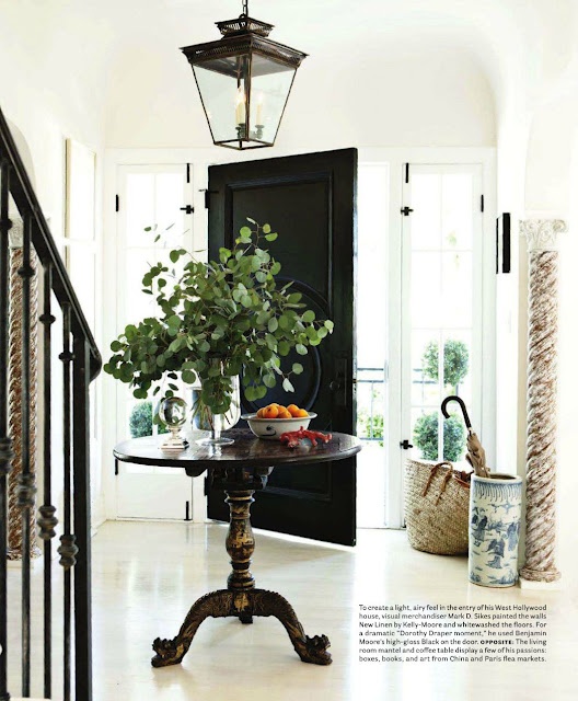
To decide that a black painted interior door is really a good idea. . . or not.
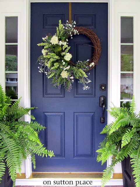
How about a Navy Blue painted front door? Much easier to decide with a big sample propped up in front of the door.
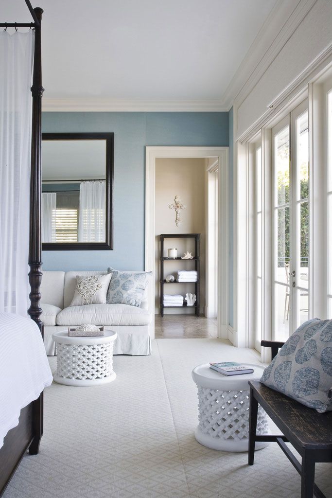
When deciding on a blue bedroom or a green office and you have to paint NOW. And you don’t have any bedding or fabrics picked out? Much easier to choose when you can see a large sample.
All I have to do is pull out a green and/or blue from my stash and really no matter which ones I suddenly wave around, my client happily and confidently says “I like those”.
What about the client whose surround tile is just plain ugly and you know it would look fabulous painted black! Easy to show that this is a great idea!
What about greige. When your client asks for it, how can you show her that she needs one that is a slightly more taupe, vs, green grey vs, violet taupe?
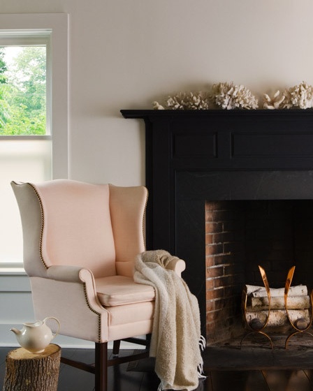
Totally impossible without a large painted sample that is strong enough to be wedged behind a stone fireplace, propped up everywhere and leaned up against the crown moulding beside a tile floor if necessary.
As I’ve said before, if you are in the business of specifying colour you need to be able to pull off the following:
Pull your clients space together using the right colour that seems to work with everything.
Create magic whenever possible.
or and this is the best kind of colour. . .
Take an “OMG we need to rip this kitchen/bathroom out ASAP to WOW I can live with it for another year while I spend money on other more urgent areas of the house you’re a genius thanks!”
You don’t have to buy them from me, (you can also paint them yourself) but I’m telling you right now, you can’t specify colour accurately without them.
If you have them already, please post a comment and tell us what you think!
Related posts:
4 Ways to work with Colour over Neutrals
Rules for Colours
An Open Letter to All Paint Companies
If you would like your home to fill you with happiness every time you walk up to the front door, become a client. On-line or In-person.
Download my eBook, How to Choose Paint Colours – It’s All in the Undertones to get my complete step-by-step system on how to get colour to do what you want.
To make sure the undertones in your home are right, get some large samples!
If you would like to learn how to choose colour with confidence, become a True Colour Expert.

hi Maria! Our new house is coming along, finally! Drywall is just being finished up and my builder called to tell me he’d like my color selections sooner rather than later (for some reason he seems to think the True Color Expert is going to specify LOTS of color changes… ) I went to the new house with my original set and my brand new color set and within about 15 minutes I had a list ready for the painter. I can’t wait to see it all come together. It’s amazing how simple it is to see which color to choose when the samples are big and can easily move from room to room and wall to wall. Thanks for making it so easy! 🙂
Hi Maria,
Of course I am excited to hear about a new set and will purchase tonight, but will you comment on the undertones of each. With the first set I went back to the book and made notes on the back of the cards. This has been so helpful. What kind of tool (or handout) will you include with this new set?
The VIP collection will come with a list that includes the breakdown of undertones just like the first sample set did. Maria
Maria,
What is your favorite way to store these sample boards and take to job sites?
Thanks,
Dawn
I store them in a rectangular shaped flat nylon bag that I always have placed flat in the trunk of my car. This way they always stay flat and easy to move around. Maria
Suggestion….find a source…and offer them for sale WITH the color samples! I know, we all probably CAN do that ourselves, but maybe this will be a little more incentive to go for it!
Yes, please!
Hi Maria- Are the colors in the VIP Collection by Benjamin Moore? I want to be sure the paint colors are available in the US. Thanks!
Years ago I was hired to choose paint and carpeting for a law firm’s offices. First we chose the carpeting. Then I bought large foam boards (the kind used for crafting), 3 small paint samples and painted the boards. Took them to the client and told them to look at them in all the rooms, at all the hours of the day they’d be using the areas. It was easy to pick the right color. Yes, in this case ‘size does matter’ 😉 So in a sense I’ve sorta done your method too! Large samples = better results of color choice 🙂
I did that “method” when people (yes designers too!) were still telling people to paint sample swatches on their walls. Well, in a commercial building where clients are coming in daily, they couldn’t have ‘test spots’ of paint on walls! 😉
You mentioned something about how hard it is to choose yellows. I saw a house painted super bright, bright, bright yellow (with red trim!) because the homeowner thought the existing color was yellow and she wanted to just freshen it up. Actually it was cream but she couldn’t ‘see’ the color properly! 🙁 She picked the paint color in the store and of course regretted that choice as soon as the house was painted.
Another friend sorta freaked out when the builders asked for a paint color. She couldn’t wait for me to help out (I was away for the weekend) so she picked her own interior yellow….for the entire house! On a bright sunny day, ya better have brought your sunglasses, if ya know what I mean 😉
Love your color undertones suggestions! Keep the great info coming 🙂
Are these Sherwin Williams samples or Benjamen Moore?
They are Benjamin Moore.
Maria, once you showed a picture of yourself actually using your large color boards. I think it would be helpful to new readers to see you holding the color boards up against the wall, or against a stone fireplace, etc. It would be a little like a tutorial. Some folks, myself included, who are visual learners, need that sort of visual. Or, even better, you could do a little video of yourself and a client making a decision using the color boards. I think that might help people understand how helpful the boards are. Just my suggestion.
Ditto!
HI Cherie, my blog has many, many examples where I have used my large samples as a demonstration. Here’s one that I linked to above: https://mariakillam.com/2012/01/how-to-mix-yesterday-with-today-in-your-renovation.html/
Very good! Thank you for the reply. : )
maria, i already have your first set of large color samples –how do i obtain the newest set without redundancy?
She mentioned in the article that there are no duplicate colours in the second set.
I work with Benjamin Moore paints. Are these colors from this company?
Would it be possible to list the 50 colors in this new collection? I’m assuming they’re from Benjamin Moore? Thanks! I’m not a designer but I love playing around with color and am not totally happy with the colors I’ve chosen in the past.
Hi Maria, I have the neutral collection and your E Book and it has made me look like a pro in building our new house. Best money I ever spent! I plan to get you color collection ASAP. I will send you pictures of my white kitchen when it is done. Thank you so much for all your educational tools. If I didn’t live in Florida, so far away, I would take your class too. Thank you so much for sharing with all of us.
Maria,
You are so right, painted boards are a must for choosing colours. How would you describe BM’s Ballet White? It’s a colour I love on a painted board, but I would like to be sure it’s not the dreaded pinky beige !! I learned from you to avoid beige with pink undertones. Thank you for your great ideas.
Mariko,
a few posts back Mario said the color in her livingroom/diningroom is close to BM’sBallet White…There are multiple photos in her blog (from about July 16-17th I believe)…It looks beige with yellow to me. It is already on the list over neutrals for our next home!
-Sue
Maria….not Mario! LOL
It’s hard to pin down the really pale greige tones, somtimes it’s beige, sometimes it’s gray, sometimes it’s green and it could look yellow or even pink depending on the light. Pale colours change the most when they are in a room with lots of natural light. Maria
Your website is showing them as a downloadable ebook now.
Hi Maria,
For those of us starting from scratch, I’m wondering if you offer a special bundle price for both collections and/or your eBook …
One of my favorite colors has always been taupe. I’ve seen the term “greige” so much lately and have wondered if they are the same – or what are their differences.
Taupe is beige and gray combined. Still an earth tone, not great with clean, bright colours. I would not consider it a greige. Maria
In my neck of the woods, people – generally of a certain age – use taupe and greige (gray + beige) interchangeably. : )
For those on the fence about the samples, I’ve painted my own 12×18″ and 18×24″ samples on Mighty Boards or similar for years, yet I immediately bought Maria’s boards.
The time and expense of making my own makes it a no brainer. I’m always telling people not to paint samples next to samples on the wall – the human eye can’t see them accurately. (Look up some of Albers’ and other om-line exercises.) Plus you have a movable mini-wall.
Even if I only used half of them, it would still be worth it. I have the first set. They’re very nicely made and lighter weight than the ones I used to make (I recently switched).
Thanks for part 2, Maria.
I’m a decorator just starting out and have only had two clients but am ready for more. Does anyone know if I can purchase these and write them off as a business expense? It’s more money than I’ve brought in so far!
Of course you can, it’s the cost of doing business! You’ll bring in more if you choose the right colour every time 🙂 Maria
I registered for your Toronto conference and bought the VIP boards! I’m so excited and can’t wait to learn more!!
Maria, I too purchased the Ebook which included List1 of neutrals and colors. I plan to mrkt myself as a color consultant but i am not there yet. So can we purchase just a list of the new colors and buy sample boards later. I am interested in your fave navys, yellows and blues
I can not imagine doing a color consult without Maria’s sample boards. The boards make my life easier and have really increased my confidence with color selections. Thank you Maria for the the beautiful 2nd set!
Hi. We are building new and I am wanting an all white interior. Maria, should I purchase the Core collection or both the Core and VIP? I was originally wanting Donald Kaufman paint colors but if your large boards with the more accessible Ben Moore paint colors would work just as good, then I will consider Core or Core and VIP.
The Core collection has the 10 whites that you’ll use most of the time so if you are looking for whites that’s the one you’d want. Hope this helps, Maria
Purchased the VIP collections a couple days ago. Really looking forward to receiving them. We will be building a new home next year and I’m really hoping these paint boards will help me with choosing the right paint colors for our current home (to make it ready for sale) and then again with our new home. I thought our small city didn’t have anyone selling BM paints but low and behold we do!! Now I’m REALLY excited. Thanks Maria!
Would it be possible to see or buy this list of colors that is included.
The list is in my ebook available for purchase in the store.
Frustration overload!!..I am Australian, and am close to starting a new build,so the fear is building as I continually look at our teensy colour samples here,not to mention that we dont have your colour stores,so matching would be a nightmare..I’ve been getting happily lost in your blogs,great photos,colour wheels talk of colour seminars,not to mention your large painted samples!
Just venting- keep up the great work..
Jennifer.