An accent wall makes it easier to commit to a dark colour. Here’s how to inject a little colour by painting a blue accent wall.
When my sister Elizabeth and her husband Bill first took possession of their house she asked if she could paint the walls in her kitchen blue (they were brown at the time). I said unfortunately no, because it would look like she was ignoring her countertops and her backsplash.
At the time we had to go with HC-45 Shaker Beige because it related to her countertops and very busy backsplash (until she replaced it here), but after the painter replaced the brown wall colour with the new one, she was still left with the old connecting colour (something close to Ranchwood) that went all the way up the stairs.
When we were freshening up her family room for her birthday, I said, “Why don’t we paint that wall a blue shade to relate to the painting in the living room, then you’ll get the hit of blue you’ve wanted in your kitchen all this time.”
Well she loved that plan and this morning I arrived with my paint brush and roller.
I said, “How long could this take? I am tired of looking at the patch created by my Mom’s head after she fell while running after one of the kids!” Eeeek, it’s a good thing her head just went through the drywall and did not hit a stud. It’s been patched–below–but has looked like this for a while.
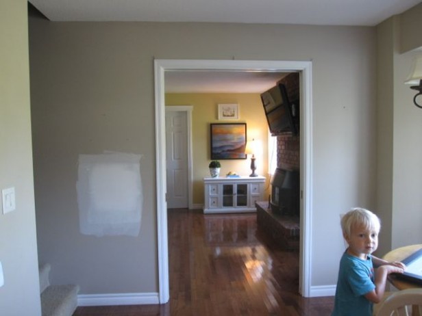
Before

Markus totally got into it. I told him I needed some newspaper to protect the carpet on the stairs while I was painting and he ran out and brought in every single flyer and newspaper in the mailbox!

Painting a Blue Accent Wall
And here is the lovely and fresh result. This took maybe one hour for me to paint. And another 20 minutes for the second coat. The colour, was totally inspired by the art she looks at every day from her kitchen.
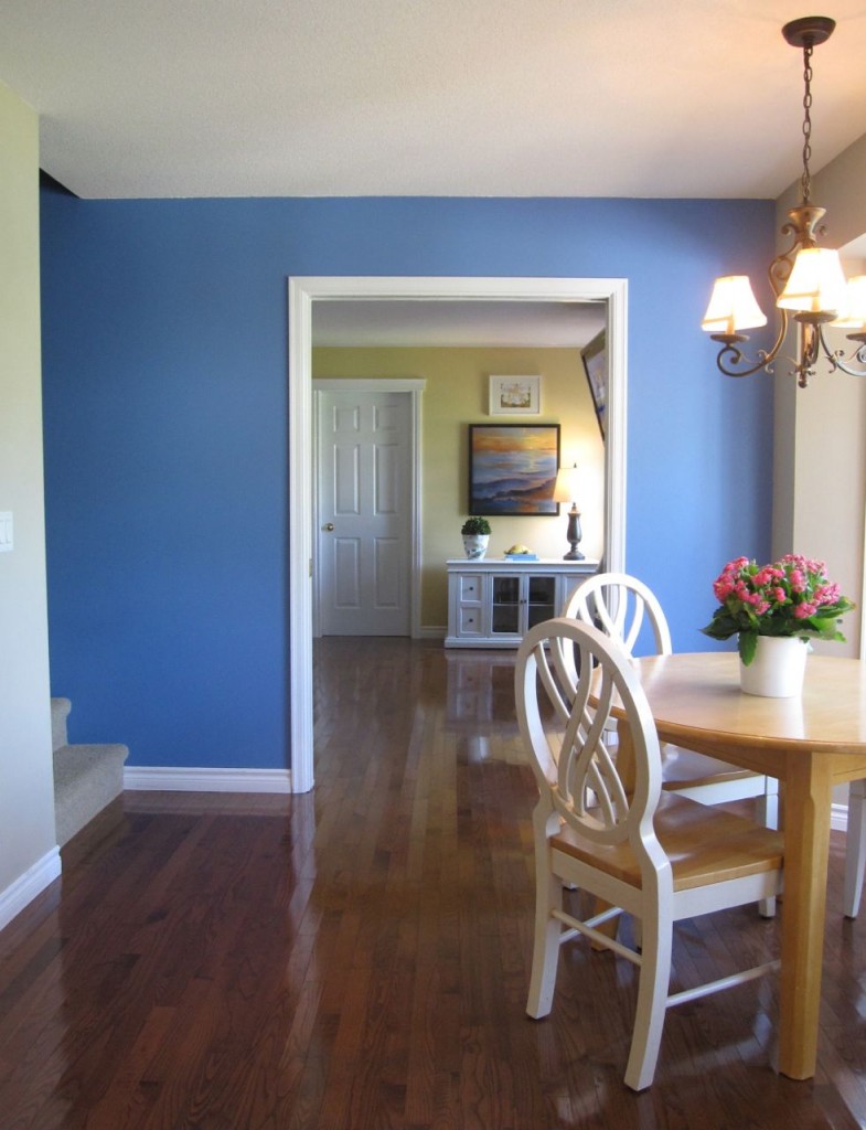
P&L 27-22 Lovebird
The yellow in the adjoining living room is existing, that room needs to be decorated too. It’s currently filled with black leather furniture. Elizabeth uses this room to fold laundry now that her family room has a fresh and happy new colour scheme.
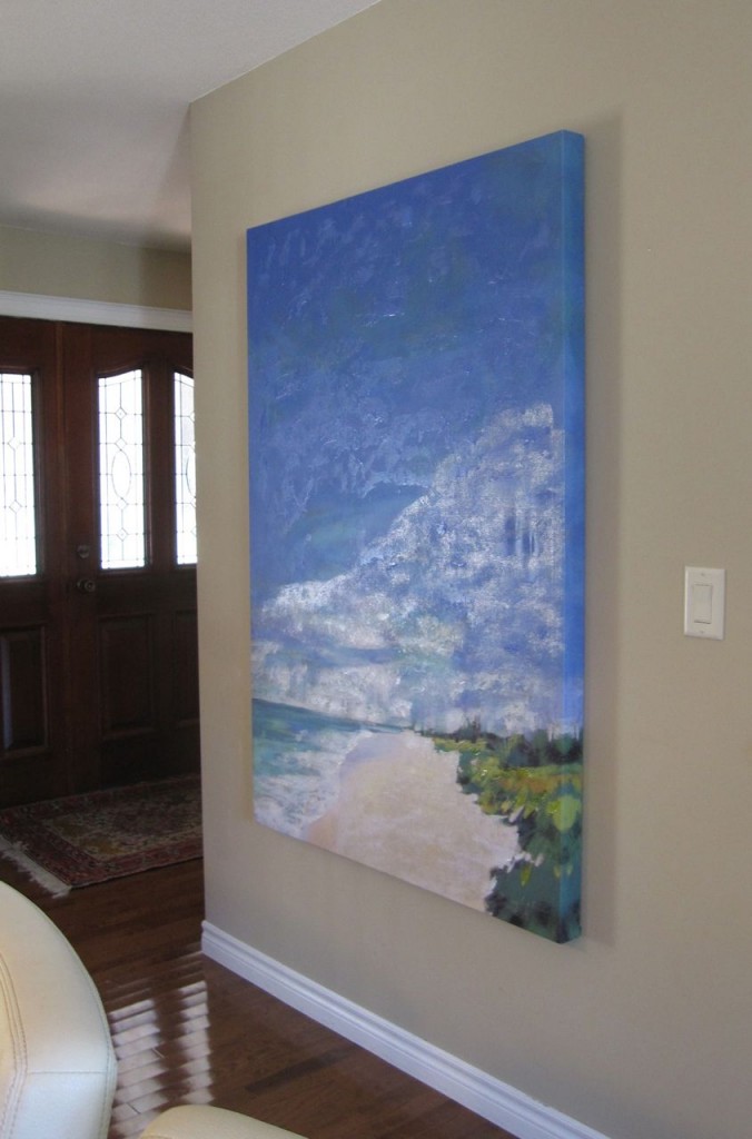
I decided the kitchen needed a new piece of art to complete the colour scheme so I dropped into HomeSense in the afternoon, $119 later, we have a hit of fresh (that also relates to the accent wall) in my sisters kitchen.
I am not a snob about placeholder art. Until your house is decorated and looks the way you want, this is one way to get fresh and fun artwork until you have the budget for real art, after all, there are so many creative ways to fill your walls, I’ve written some posts here, here and here.

Here’s the before again.
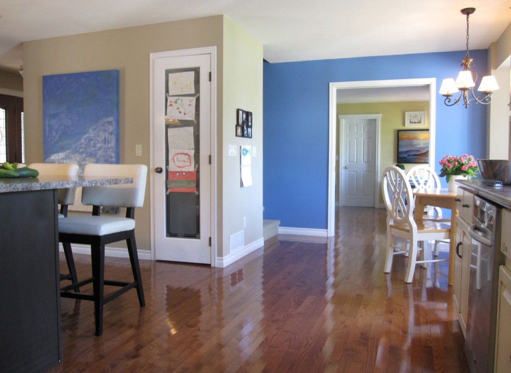
After
My sister inherited hardwood floors that run through her kitchen and family room which are great, it’s unfortunate they are so red! A medium brown would have been perfect. But, as I told her today, hardwood is better than tile any day. If this kitchen had an existing, bossy tile that related to her already bossy countertops, this blue would not have been possible.
Do you have a room you could make happy with a one hour paint job?
Related posts:
My Sister’s Fresh New Backsplash: Before & After
What Everyone Should Know about Blue
When Should you Rip out Perfectly Good Tile?
What is Beauty? Three Ways to Know
If you would like your home to fill you with happiness every time you walk up to the front door, become a client. On-line or In-person.
Download my eBook, How to Choose Paint Colours – It’s All in the Undertones to get my complete step-by-step system on how to get colour to do what you want.
To make sure the undertones in your home are right, get some large samples!
If you would like to learn how to choose colour with confidence, become a True Colour Expert.
Wow, I love a good before and after, and this is a good one! It’s amazing what a little paint and time can do to change a room. I also love the piece of art.
Wow! Maria, the end result is soooo pretty! I love it. Love, love, love it. I think the floors look beautiful with the updating you’ve done. This is such a pleasant view from the kitchen. Double WOW!
that’s wonderful! I love the way the chairs pop with the new color. Your inspiring Maria!!
What an awesome way to give your sister the blue she wanted!
It’s funny you mentioned the floors. I was thinking that I loved them. But when you said it’s too bad they’re so red, I suddenly knew why I loved them. I love mahogany furniture, and our house is full of it!
OH! and before I forget. The art you chose is perfect! I love how it brings the color forward.
Gorgeous colour of blue. I love how it pulls the blue from the art work.
That is a beautiful, stunning transformation! Love love love it. A timely post for me too- we’re moving into our new-build house in a month or so, which is a mid-century meets Northwest contemporary design. Since we’re doing white walls, I have been considering a couple of small bright accent walls here and there to add some color and drama. I think some modern design can look and feel cold, and I certainly want warm and cozy modern! 🙂 Thanks for the post. I always learn a lot from you!
Jill
Beautiful work!
Related topic, since you brought up the floors. What are your thoughts on tile that looks like hardwood (longer tiles, very small grout lines, medium brown tone, etc.)? We have an active household, and my floors take some serious abuse. I love the look of hardwood, but I also want both my boys and myself to live comfortably in our house. We are about to rip out our 13-year-old carpet and want to do the entire house in a hard surface. Thoughts?
I haven’t seen enough of it installed to have a really good opinion. Centsational Girl wrote a great post about it: http://www.centsationalgirl.com/tag/wood-lookalike-tile/
I love my wood-look tiles. They look like weathered wood planks and are perfect for my first floor (small townhouse, so it’s my kitchen and living area.) Lots of people assume they are wood. Mine are Daltile Timber Glen series, Thatch P615. They come in different lengths and widths but very effectively simulate wood planks.
Regarding the tiles, a lot depends upon your location. In Florida, I see a lot of the wood grained tiles, but hardwood floors aren’t as practical in Florida with high humidity and pools. The tiles will be cold in a northern climate and I think are a good option for smaller areas, like a bathroom or kitchen, but less so for large great rooms or hallways. Tiles are harder on your feet and legs than a wood floor. I see the tiles sometimes used as accent pieces, also, around larger slabs of stone. Keep in mind that the tiles can chip or break, so not 100% kid friendly.
One exception to that, Bill, would be a dressy/rustic area such as here in the NC mountains…floor heat is becoming more popular, and doesn’t transmit as well through wood as through tile. With wood look tile, you’d get both. Having seen some of it down, it can really fool you as to it’s true identity!
You rocked it!! franki
The blue makes a perfect transition between the beige and yellow. It really softens the look.
I love the artwork. I am struggling with “old” art. I love the “real” art that I have collected over the years. The problem is some of it has faded, it is very 90s looking, this is my 4th house, the frames and mats are dated ($$ to change) and it just doesn’t always work.
I finally took some of it down (originals and/or signed) and replaced it with store bought stuff from Kohl’s Department Store. I have resisted doing that for years but it looks SO much better. Like your sister’s, it looks clean, coordinated and much more peaceful.
Amy,
I know you can paint the mats and frames with chalk paint (maybe any paint). You can also put something new in the frames –like pages from magazines or other found objects. Look around the web for ideas
You absolutely can spray paint both mats and frames. Just use a good quality one so it goes on nicely (I like Rustoleum).
What you said about old art is so true,I felt quilty replacing my expensive framed Art work, but it was so “tired” looking, plus my taste has changed over the past 20 years,and now I realize I will never buy such expensive art again,I love how colorful and reasonable Home Goods art & Kohls are! my look before was “hunt club” with Robert Bateman animal prints-I am so over it!I would even get tired of a real”Picasso” lol
Love love the blue it looks so fresh and happy. What color blue is that?
It’s Pratt and Lambert and it’s in the post.
I am confused Maria. Is this not mixing clean with muddy colors? The blue seems to be a clean color and I thought the shaker beige and kitchen finishes are more muddy. I have been following your blog for about a year now and this is the first time I have posted a reply. Please help me on this one because I thought I had been learning a lot and suddenly feel like I must not have been getting it after all.
Take both colours and put them beside each other, that’s one way to know if you are going to mix clean and dirty. And if it still looks like a clean and dirty combination, then I’m breaking the rules on this one! Maria
That is one of the differences between a professional and an amateur–the pro know the exception to the rule!
Great transformation! And if that took only an hour to paint, you are a miracle worker, also. A stairwell is always the hardest wall to paint. I guess that the lesson of the day is that an accent wall can provide interest and the punch of color that ties everything together.
Maria-Very, very, very pretty blue! Your sister must be so happy!
Loretta
I had to laugh out loud the way you told the story about your mother’s head but what a scare. I’m glad she’s okay. The only time I ever saw my daddy run was when his grandchild was headed for the road. They’ll do anything for those grandchildren. I love your blog!
Gorgeous blue! After seeing this, I have decided to paint the small walls between windows in my open kitchen dining living room a great blue, the rest is all Powell Buff, looks warm and nice, but there is a break
between living and kitchen, and all told about 8 feet of wall, with a window seat. Have mulled this over for a year, these photos do it for me. I’m with your sister and her love of blue. Great artwork too! Thanks Maria!
This is SUCH a beautiful result. And the artwork that ties together three different walls seen at a glance? That’s what I call the professional touch. I wish I had that $119 Home Sense piece in my house! I love a good landscape. Although come to think of it that much blue might not look great over here.
Wow – looks great. Infact, I want to do the same thing. Now. Immediately. 🙂
I have a basement full of beige walls (BM Sandy Brown). Carpet is a lighter beige colour. Sofa is medium brown “tan”. Other sofa is chocolate brown. wall furniture is all black brown (BM Black Bean Soup). So basically ALL beige/brown/black. What would be the right colour to add to one wall to get the same effect??? I’m torn between a bold blue like you did, or a warm orange, or a warm green, or even a black-brown wall behind the tan couch! How can I get my “beige box” to look better?
Any advice anyone?
Jen
All of those sound like a great idea, it might be easier to find the art first? It was easy to choose the blue because we just used her first piece of art as inspiration. My sisters blue wall would not look quite as fab with the old ‘tuscan inspired’ artwork that was on that wall before we installed the second blue one’. Maria
Thanks — yes I will definitely go art shopping soon. If I can’t find anything quickly, I might even DIY some abstract art so I can tailor-choose an accent colour. I really like the idea of a bold black-brown wall but hesitate because it’s not the punch of colour I’m after. I’m leaning towards blue….maybe a really bright “peacock” blue. Oh so many choices…it’s so hard not to second-guess myself.
Thanks for your reply! Great blog. Great advice.
I put in 20×20 porcelain “travertine” floor tiles 10 years ago throughout the downstairs. We have 4 rescue dogs and 4 rescue cats, 4 grandchildren, and a teenager with lots of friends coming and going. The tile still looks new. The hardwood stairs, not so much. I want to replace the entire upstairs carpet-ugh,hate it. I would prefer hardwood, but it will take a beating. What are your views on floor tile that resembles hardwood? I know it’s not in the same league, but I don’t want to be the floor police all of the time.
Beautifully pulled together, Maria. Painting one wall can make such a huge difference on all the surrounding areas. After living with a beat up brick wall on my back porch for over 25 years, I finally painted it and posted it on my blog. I love it and can’t believe I lived with it for so long the way it was.
It’s amazing what a little paint can do. Great before and after pics.
Glad your mother is okay:)
Interesting question from Cindy re wood-look tiles. I remember I asked you about it a couple of months ago, Maria, and your answer was the same. I read Centsational Girl’s post and it was extremely interesting. However, I’m still not sure. I asked the flooring guy with the company I’m planning to use in the future and when I said I wanted a timeless look for my very open floorplan house (foyer opens to hallway to the right and to the dining room/living room with direct view to the kitchen/laundry room on the left), he said I might end up disappointed with the wood-look tile in that much open space. The other thing that occurs to me, Maria, is that you posted on the best color for a timeless hard wood floor. I’m thinking one would need to consider this for wood-look tile floors as well; otherwise, one ends up with floors that are too dark or too red or too beach-feel in a non-beach house, etc. I’m still quite interested in the product but it’s not so simple.
Cindy, I’d love to hear further about what you decide to do.
Maria, your sister Elizabeth must be smiling from ear to ear every morning as she sits down for coffee at the little breakfast table. Such a lovely, refreshing room (and I’m not really a blue person).
Thanks for all aspects of this post including the comment about place-holder artwork.
What a great way to repeat color from one space into the next. Brilliant!!!
You are brave, Maria, to tackle this job over a carpeted stair—in one hour! Wow. I think the blue will make Elizabeth feel that the kitchen is more clean & orderly…….a good feeling with little guys and toys all around. You two are so pretty in that picture together!
Honestly, I didn’t like it.
I love blue!! That blue is lovely! Love how this pulls all 3 rooms together! Aren’t sisters the best? My sister and I do a house project a month in the winter months! We do her house one month then mine the next. We have a blast and get so much done! And it is so much easier when you have someone to bounce ideas off of! Thank you for your wonderful posts.
Dang, girl! You made it happen, AGAIN.
Lovely transformation! The blue accent wall really pops against the neutral kitchen and beautifully complements the artwork. This is a great example of how a simple paint project can inject personality and color into a space. Thanks for sharing this blog with us.