Thank you to the Washington Post for including this post in your blog watch, September 17, 2009!
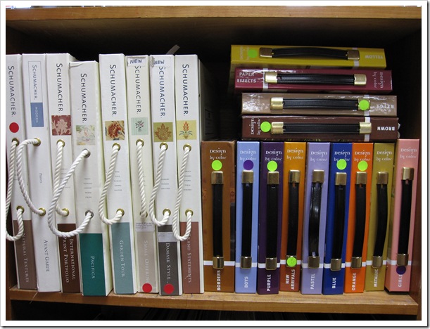
There’s wallpaper that you can buy off-the-shelf in a paint store–rolls of it, pre-selected in bulk quantities—but the choices are slim. To get the best selection, ordering through wallpaper books is the best way to do it. Usually higher end paint stores will have a wall of books to choose from. And of course your designer has access to wallpaper books as well. Then when you find a pattern you like in the book, you can borrow it and take it home to see if it works in your space.

Benjamin Moore in West Vancouver
If you are working with fixed elements in your bathroom, like this beauty [below].
1) Establish what you need to work with.
Here we decided the pink paint was toast (see how it doesn’t even match the toilet? The flowers in the wallpaper match (in another era) but the paint was more orange than the fixture. By the way, it doesn’t make the paint colour peach, it was still [unfortunately] pink, but that’s the comparison.

Before
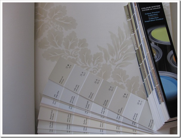
2) When you are looking for the matching paint colour (to your sofa, fabric, bedding, countertop, tile, etc) hold the fan deck on the wall beside the item you are colour matching. (Every homeowner should own a fan deck for this reason)
If you hold the colour chip on top of the countertop, you’ll get close, but to get a more accurate ‘read’ of the colour, it must be on the wall (where the wallpaper or paint is actually going to be installed).

Here none of these are the right one, OC-4 and OC-3 are too pink, and OC-2 is too yellow.
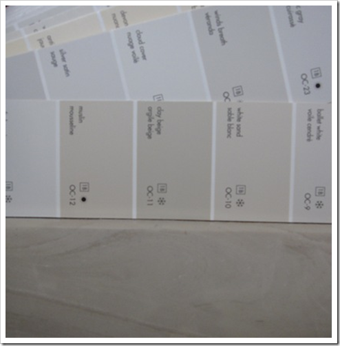
Here OC-11 Clay Beige looks like a pretty good match (considering the countertop is not a solid colour).
3) When you get to the paint store, grab the colour chip and it’ll be much easier to find the right undertone when searching through wallpaper books!

After
4) Determine which elements you will ignore, and which ones will work with the new wallpaper.
Since this bathroom had pink fixtures, a greeny beige countertop/sink, the wallpaper had to work with either one of these fixed elements. If you were to choose paper that had neither colour in it, you would now have 3 colours in the room that don’t relate to each other.
Since your wall covering or paint colour is designed to pull your space together that wouldn’t work. In this case we ignored the pink (because it’s so dated) and worked with the greeny beige. Then I picked the cream that matched the background of the wallpaper and the windowsills and remaining walls and ceiling were painted cream.
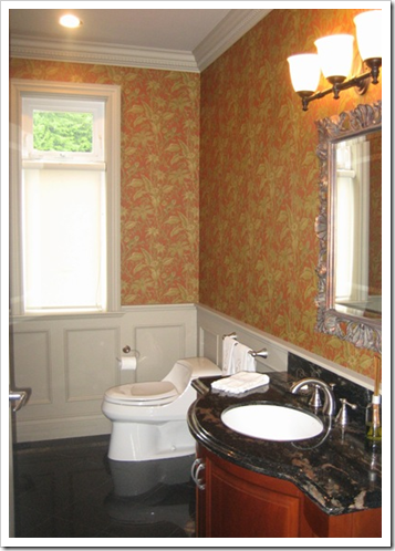
Before
See the paper in this room? It’s orange and green and the wainscotting is [green] gray, with black floors and granite countertop. So here we have the black #1, the gray #2, in addition to the orange and green wallpaper [4 colours now] with zero relationship to the other two colours.
Of course, that is not the only reason this tropical wallpaper did not work in this craftsman style home!
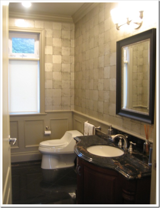
After
I actually tweaked the wainscotting/ceiling/trim colour (although it’s probably hard to tell) and warmed it up to tie in with the taupe shades in the granite.
Then we took that paint chip to find some wallpaper and ended up with a silver/taupe foil look, we also updated the light and had a new mirror custom made for this powder room. (sorry the light is all glaring here again). It still needs art for the walls and an orchid but it’s way more glamorous and sophisticated!
Same idea applies if you are shopping for an area rug. Take your sofa cushion (or match the colour again if this is not possible and paint it up on a large sample) with you, it’s even more painful to schlep carpet after carpet home, only to find that it doesn’t work because it’s too hard to remember the colour in your head when you are already out shopping.
Related posts:
Insider Secrets to Testing & Selecting Paint Colours
New to this Blog? Click here ; Subscribe to my Monthly Newsletter; Become a True Colour Expert
While you’re here, subscribe to this feed so you don’t miss out!




Great tips, Maria and good wallpaper choices! Love the foil in the second room with the other changes you've made. Very dramatic.
Great tips as always. What a difference in the before and afters.
And don't ever throw out extra wallpaper or discontinued sample books ….they make for great gift wrap! I posted on it, but after I had just thrown out a bunch….then I relized-Oops!
Love that taupe transformation Maria!!!
Brava!
you know what I love about this post? it's that when my friends ask me why I don't think they should use that colour or wallpaper in their bathrooms, I can back it up by a pro!
Vitania
Great post, Maria! You do such a good job of breaking things down and making the projects seem much more simple.
wow… that pink bathroom… such a transformation. definitely a change for the better… i don’t think i could have lived with it either. 😉
hey maria… your button needs to be higher up… it’s all the way down down down… 😉
Now you tell me, I've already ordered all mine!!! Hope they work …
Perfect timing – I'm just about to start looking for wallpaper for my kitchen. It's dated beige/peach geometric right now and I'm looking for a William Morris inspired floral to "update" my arts & crafts style house. I'll be using your tips as always. Thanks again.
I love the first wallpaper you selected – it looks fantastic in that bathroom!
Nice explanation! But, I have found that wallpaper in the "workhorse" bathroom of a house ends up being a resting place for mold. No matter how careful I am to ensure no open spots, good seams, it ends up getting mold under it. For a half bath, sure, but older homes often don't have fans in the bathrooms.
Maria,
I really find you an amazing woman and designer. You're really full of energy.
Kisskiss
Great explanation! Your blog is such a great source of information!
Maria,
Wallpaper can be tricky. Done correctly (as you've instructed) is quite stunning in a powder room. Very refreshing.
Bette
Hi RJ,
Not having a fan in an older bathroom is definitely an issue with wallpaper. That's why it's great in a powder room! And I would also highly recommend a professional installer in a bathroom with all the corners and edges around mirrors and cabinetry. Makes a big difference to get it done right!
Maria
Hi Maria,
Wonderful article. I must tell you as an interior designer of 20+ years. One is has been in books…"Top 100 Designers in The World." I can't wait to get to read your blog every morning. I consider this to be my "continual education" in design. You are so very talented. I will certainly use you on my next project…MY home and for clients in the future. In America, we have a wonderful gentleman named Donald Kaufman, who has always been THE person to go to about color. It is so delightful to have find another great colorist!!
I really like the wall paper in the second bathroom it looks like a really nice tiles. Wall papaer has come a long way from what I remember . . the icky velvet, flowery stuff.
perfect explanation & awesome bfore & after- what a difference!!!!
xoxoxo
The transformation in the second room is stunning! And you really didn't have to change much. Beautiful!
I love wallpaper I wish more clients would use it in Nashville. Boo hoo! But these are great examples!
Another great post, Maria!
I wish my client had listened to me when picking her wallpaper. I insisted on one that would have been wonderful (perfect match with the wall colour [would have made it a neutral in the space] with a small design in 1 of the 2 colours I used in the room), but she kept taking us in a different direction. In essence, by chosing the paper that she did, she added a 4th colour (i.e., wall colour [obvious/not neutral now because it doesn't relate], paper colour & my two accent colours). She likes the final result (which is the whole point, I suppose) but I KNOW which paper I should have hung!! I need to develop an "I'm the professional" speech!!
Thanks for dropping by DesignTies… I DON'T have time to blog!!
Victoria
i am thrilled wallpaper is on it's way back!
i love it.
it is just another tool to set the stage of your life.
xx
ahhhh, that's better. i always feel tense when i see mismatched, clashing colors. It's like, i know something is wrong, and i find it unsettling. your updates to both bathrooms were quite lovely
I generally am not a big fan of wallpaper, but I do like it in small spaces like you have shown in this post. I particularly liked the tip on how to look for a match with the fan deck – and the results are great!
Congratulations on the WP blog watch for this post – are you up to 5 or 6? Much deserved!
Woo Hoo, sitting here in my suburb of DC reading the Washington Post Home section tonight- and there you are! Congrats! I love the Post Home section so happy to see one of my blogs in it 🙂
I just love your posts! I feel like I learn something every time I read your blog. That bathroom looks 854334356 gazillion times better 🙂
This is such great advice, Maria! I'm recommending wallpaper a lot these days, and this is helpful to my clients AND me! And congrats. on Blog Watch!
Congratulations on the Washington Post acknowledgement. As always a great post!
Love the transformation of that bathroom, great colour…
Great tips and love the new bathroom. Congrats on the Wash Post mention!
xo,
cristin
II think one thing you should know about wallpaper is that it can be a PAIN to remove, and it will eventually have to come off again. I just finished stripping a small bathroom that had the toughest wallpaper I have ever seen. I have taken a vow to never put any up in my home again! Perhaps I will relent as the memory fades…
Hi Maria
I only just discovered you a couple of weeks ago and look forward to following you and devouring your blog.
I will be undergoing quite a transformation in my home over the next 1-3 years and will be making minor changes such as furniture and paint colors in the present. I read that you suggest hiring a professional and I will be doing just that once I get to the major kitchen and master bathroom renovation.
Right now, changing one thing in the house seems to be creating a domino effect — I have to do this, if I do that.
I am finally getting to my question about wallpaper and paint continuity. : ) Presently, I want to paint the living room and dining room but I am stuck on replacing the wallpaper in my nice open foyer. I don’t want to put the cart before the horse. Shouldn’t I start with the foyer wallpaper and make an impactful statement there and then pick my paint. The present wallpaper is dramatic and I have a beautiful foyer so I am trying to achieve that again. Since the dining room and living room/study flank each side of the foyer – DO the rooms need to be the same color for continuity. Both are north facing rooms and not a lot of light. They also both feed in to the kitchen and great room which is open. Because the house is open (which I do love and not complaining) I can see everything from most angles. I would share a picture of my current foyer but don’t see a place to do so.
I know this post is 10 years old but most of it still rings true I am sure. My problem is I am having trouble finding wallpaper on this tiny island. Are there new fresh sites you can recommend for wallpaper or have you made a more recent wallpaper post. I even thought about mural wallpaper on the top and paint below the nice thick chair molding. I do not have a modern interior but more eclectic with wrought iron doors, chandeliers, thick molding, med. stained hardwood floors. I will also have to repaint every bit of trim and door in the house as I move through this project because it has a yellow dirty undertone to it. So I have a lot going on and ready to start freshening it up.
Last but not least, future post ideas…. have you done any posts about what to do with your overpriced Karastan oriental rugs and Bernhardt dining room chairs that feel out of date today. I know there is a graveyard someplace for all this stuff. If I could just pluck that tiny fleck of gold out of my oriental I would be so happy. I might be over obsessing about getting rid of the gold because the room is painted gold too – maybe once the room color changes and I put my new cream/white velvet sofa in there it will all be better. Another post: Is it a sin to paint the Bernhardt topped buffet?
Thanks Maria for sharing all your knowledge I know I rambled but I am hoping to find that flicker of light in the shadows to get the ball rolling.
Lisa Newton
The pictures have vanished!