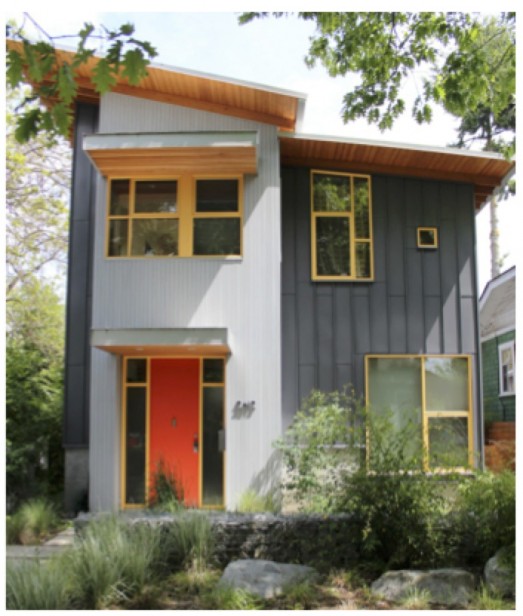
I can’t wait until my How to Choose Exterior Paint Colours with Confidence webinar is here next week! I’ve been rounding up images to whip it into shape and yesterday, I snapped a photo of this house in the middle of a very traditional neighbourhood downtown.
It’s so rare to find such a modern and fun colour scheme, I immediately screeched to a halt so I could take a picture for you!
Orange and yellow. Two of my favourite colours!
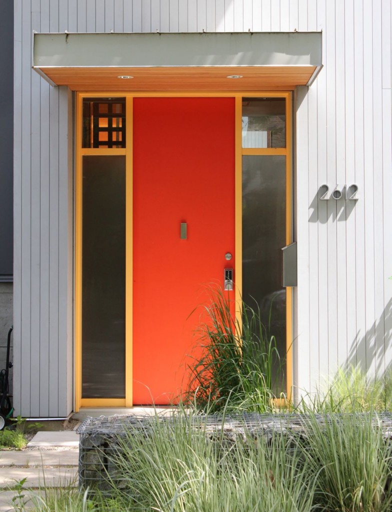
Isn’t this front door awesome? It’s SW 6882 Daredevil.
The rest of the paint colours of this house along with my ALL NEW list of go-to exterior colours divided by undertone will be the BONUS you’ll receive. And here’s everything else you’ll learn.
PS. If I’ve helped you with your exterior colours and you’ve now painted your house, I’d love to have a before and after, especially now that everything is green again! Email me here.
PPS. I’ve decided there’s almost no exceptions to mixing clean and dirty with exteriors (okay here’s one). The only time a cleaner colour works with a more muted/dirty or earthy colour scheme on exterior is sometimes with a fun front door. Agree or disagree? If you disagree, post a photo below! I’d love to be proven wrong, hee, hee.


That you stopped & took a picture…last week, on our neighborhood web page, a neighbor expressed being very upset that someone was taking photos of her house and it upset her children. Others chime in–several saying it was a compliment to her exterior colors 🙂
I am very sympathetic towards this woman, particularly if there is more to the story however I wonder if she realizes that anyone on the World Wide Web can download a photo of her home (vie Screen Shot) if it is on ‘Google Map Street View’. -Brenda-
Well I hope it’s okay in the end. A blogger is kind of like the Paparazzi. If I waited until someone was at home (I did ring the doorbell) then we would not have had this post today 🙁
I’ll have to think of something less scary to wear than white pants and heels next time.
Maria
Maria you’re awesome!!! I will be at another conference for this webinar! I’m sure it’s fab, hate to miss it!!!
Don’t care for it.
I like the colors a lot. Combined with the forms, this entrance really makes a design statement. Without the color and high contrast, the entrance would be boring. Absent the thoughtful use of the strong horizontal element (the porch roof overhang), the door and sidelights could read as too skinny — the vertical siding would accentuate this. It all works well together, and the clear glass panels at the top are also nice. The lattice in the house behind the upper left window is drawing me in . . . .
Well…as much as I like reds and oranges I didn’t
Expect to like this , but I do it’s very crisp and sharp ! Individuality is certainly showing up on everyone’s door ….but mine … Lol..ugh !
Those colors are exactly perfect for many of the ca. 60’s split level ranch homes in metro Atlanta.
Almost always do front doors with a color drawn from interior art that pops with the exterior.
Clients love the color choices for their front door. Oddly, I feel like I’m merely giving them ‘permission’ to use the color of their soul !
Garden & Be Well, XOT
Have to agree, YES it is totally modern and fun BUT what I would love to see is an example of Transitional. In other words a blend of Modern and Traditional that is fun! Please tell me Maria that its possible as so weary of earth tones and blah. ☺ -Brenda-
Such a colorful door and frame in which I would never have the guts to actually paint on my very ugly front entrance. Brenda, I am with you in the weary category-
and living in Seattle with our gray skies and “lodgy” surroundings, it seems to bring out the brown in everyone around here. I think I will draw my colors from our beautiful Mt. Rainier… anyone want to help me?
Re: upsetting the homeowners
I know a world-famous Architectural Photographer who sometimes visits an interesting town to take ext shots & sceneries. When he randomly photographs an exteriror of a house, he always attempts to speak with the homeowner about his interest & honest intentions. If no one is home, he leaves his business card so they can contact him if they’d like.
I too love these colours- on the right backdrop such as this. Maria I see a green-gray (warm) at the top of the awning next to a cool blue-gray of the houses’ exterior and I find it ‘off’. Would you have put a darker cool gray on the awning if this were your home?
Hi Maria! I love the door and trim. It’s bright and cheery and looks great with that style of house.
I would like to take some pictures of houses in my neighbourhood as examples of what NOT to paint your front door and garage!
Looking forward to the webinar. Have a great weekend!
How appropriate your link back to your 2011 post on a clean/dirty “exterior exception” is. I have been trying to come up with the “color” of our brick and I think it’s the same color as the Westin Los Cabos: dirty terracotta. Darn, I guess that means the “dirty brown” roof color should stay. I can’t imagine what roofcolor would look better.
The brick in question: http://tinypic.com/view.php?pic=2niu1s5&s=8#.U3puEPldV9w
These fun colors work nicely on this house!
What a fun pop of colour on the house! I love it, good find.
I like the colorful door and frame plus the asymmetrical windows which the owners highlighted rather than “blending them in” with the neutral color. Thanks for this example. I agree that if one uses a shot of a house it would be wise to leave a business card in case the owner wants to know who finds their house so interesting.
Love it! Agree on clean vs muted. I have neutral oysterish cedar shake with coral door & love it!
If you have purchased your house in the past year, it is very likely that the person taking a picture is an appraiser using your house as a comparable.
I’ve registered for the Webinar but here in Austalia it will be around 3.30am friday so I think I’ll watch the recording. Any chance of telling us Aussies paint colours in the Dulux brand?
Love your example, Maria. Daredevil is great on the front door. What is the yellow trim color? With so much gray around, the vivid colors perk up the neutrals.