As many of you know, over 4 years ago, Terreeia and I bought a house one hour East of the city of Vancouver so we could live close to my Sisters, my Nephews and my Mom. Now that I’m talking about my Mom, a few months ago I mentioned that she was looking for a mobile home but it was as a second home, she wasn’t moving up North, some of you thought she was, so I thought I’d correct that 🙂
Anyway, now we live in a small town called Yarrow which you’ll find on the way to Cultus Lake, surrounded by cornfields (below). If you want to see what we did to our house go here to read the archives.

Yarrow, BC
There’s lots of tourist traffic on our main street, and one thing we have seriously been missing, is a funky little coffee shop that makes good espresso.
When I saw the awning installed on this former deli in our town I was excited! Clearly, someone with taste was doing something cool, hooray!
But then they painted the front of the building (below).
So one day I stopped by and dropped off my card with the trades who were working inside. I said I’d be willing to pick new colours for free given this is my little town and the colours CANNOT stay the way they are.
No one called me, so I worried that maybe my approach needed some work, oops. I seriously could save myself a lot of angst if I could get more diplomatic, but luckily I married the most diplomatic human being I’ve ever met.
A couple weeks later, one of my neighbours said she knew one of the owners, so I got her phone number and set up a time to drop by to tweak the exterior colours.
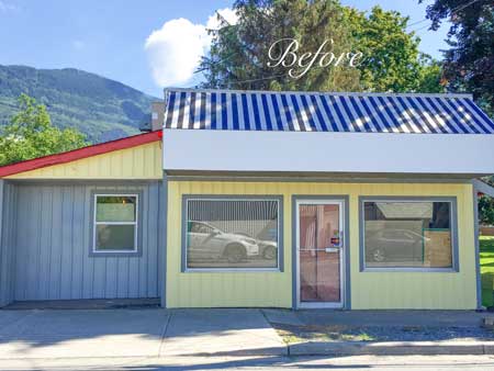
Before
I’ve often said that the reason grey is here, is to provide a fresh backdrop to the clean colour trend.
I’ve also said that beige dies with clean colours.
And it does.
But that doesn’t mean grey goes with all clean colours.
You still have to consider the value or intensity of the grey that you are combining with the colours you are adding to the palette. If the grey is too dark and the colours are too light and pale or clean, the result will be less than awesome, as you can see by this exterior.
Related post: This Pie in the Sky is Clean and Dirty
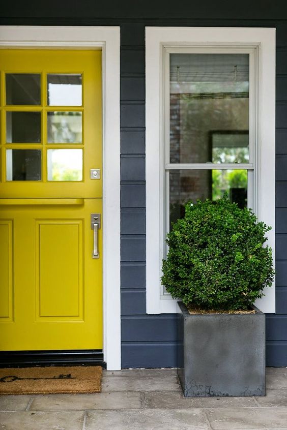
For a grey this dark to work with yellow, the yellow needs to be deeper and stronger like this front door above.
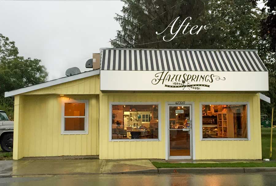
The yellow had to stay because it was the exact same colour as one of the owners sports cars. However, the yellow was really not a problem, It was the combination of the dark, blue grey that made the yellow look like a bad choice. Because the grey was dirty combined with the clean yellow.
Also, you’ll see that I could have chosen black for the casings around the windows but then the casings would have started to visually compete with the stripes in the awning and the combination of black and yellow starts looking a little like a bumble bee as well, although the white in the sign would have helped with that visual.
I had the casings photoshopped so you can see that black would definitely NOT have been the right choice (below):
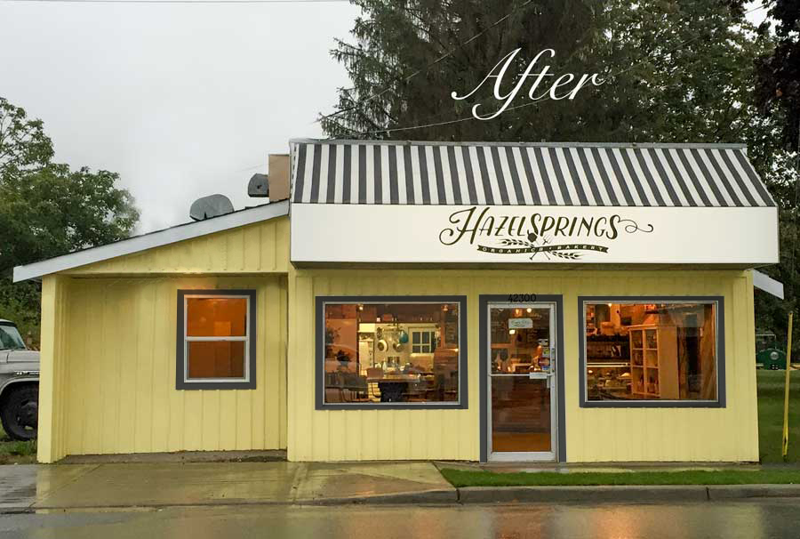
And that’s why I chose white trim instead of black.
In the end the yellow is fabulous on this cute little cottage-looking-cafe-exterior.
I also suggested black containers with green boxwood. Hopefully, that’s coming sometime soon.
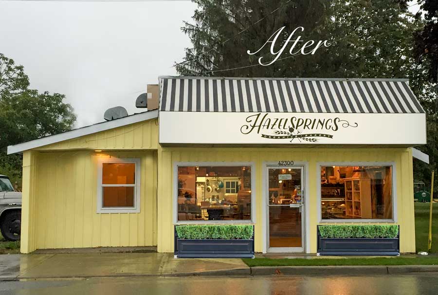
I photoshopped them in so we could see how it looks!
If you’d like to learn how to choose exterior colours with confidence go here to purchase my on-line training.
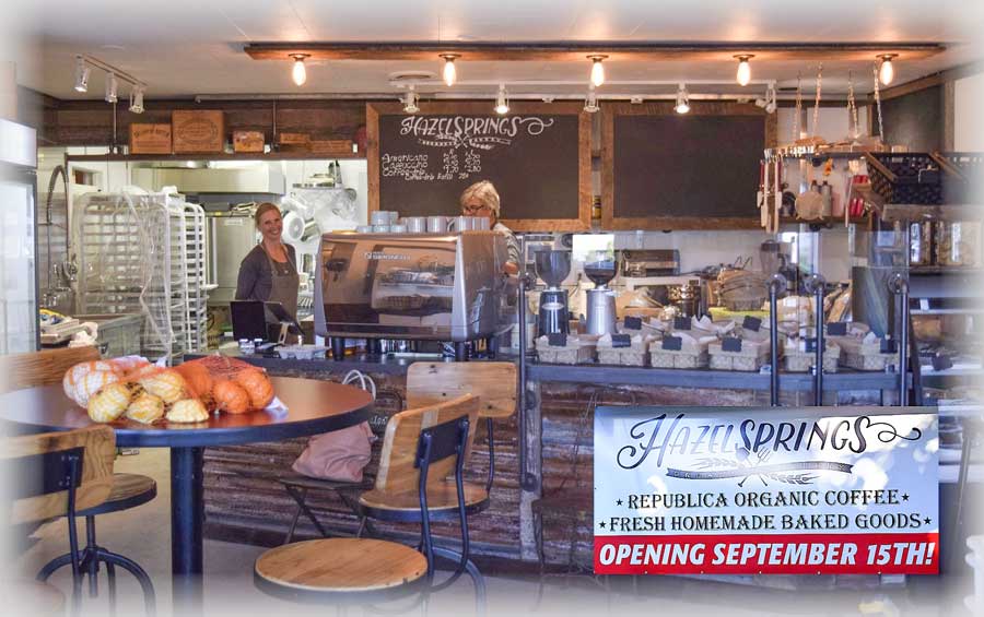
Here’s how it looks inside, I snagged this picture off the Yarrow Facebook page because I missed the most important picture this morning when I was there!
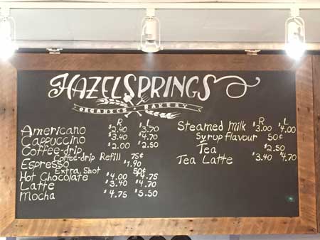
Here’s the coffee menu, hooray!
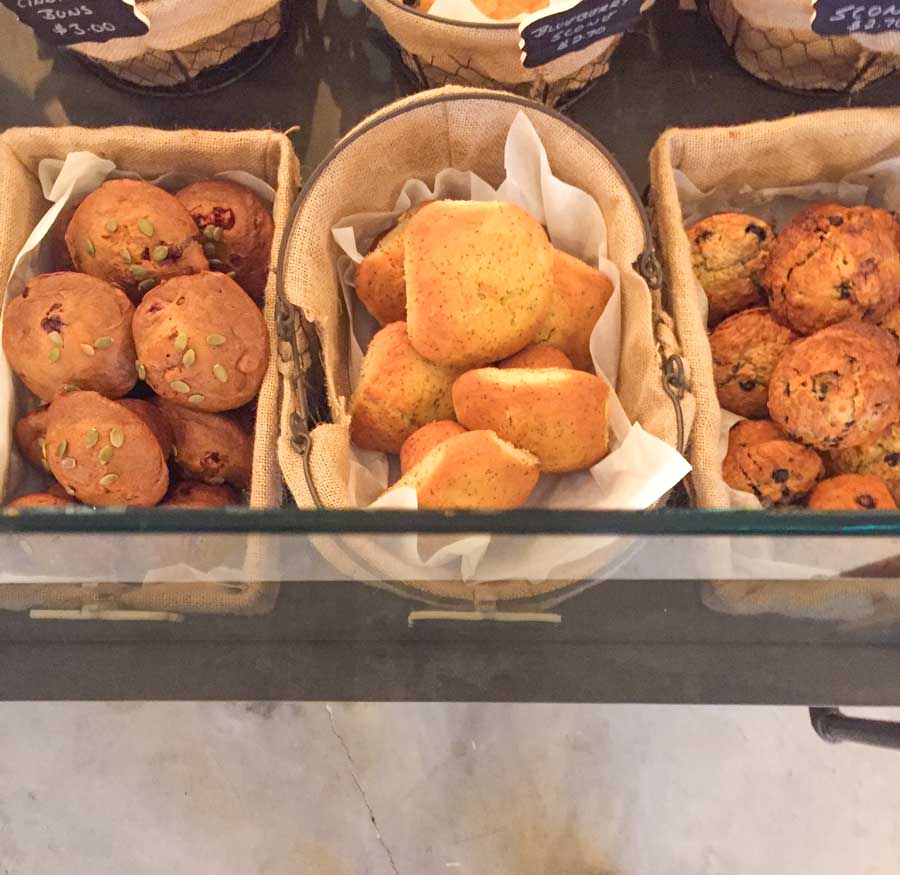
Some pastries attractively displayed.
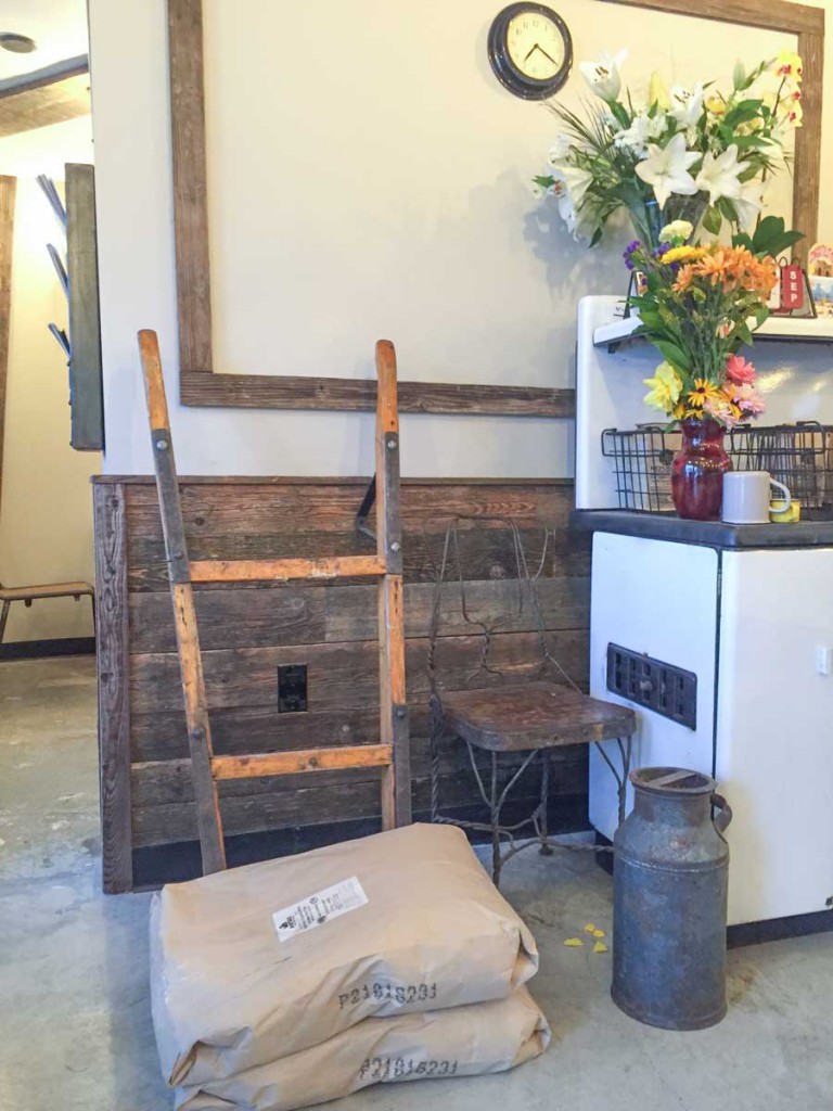
A little farmhouse decor, after all we are in the middle of the country!
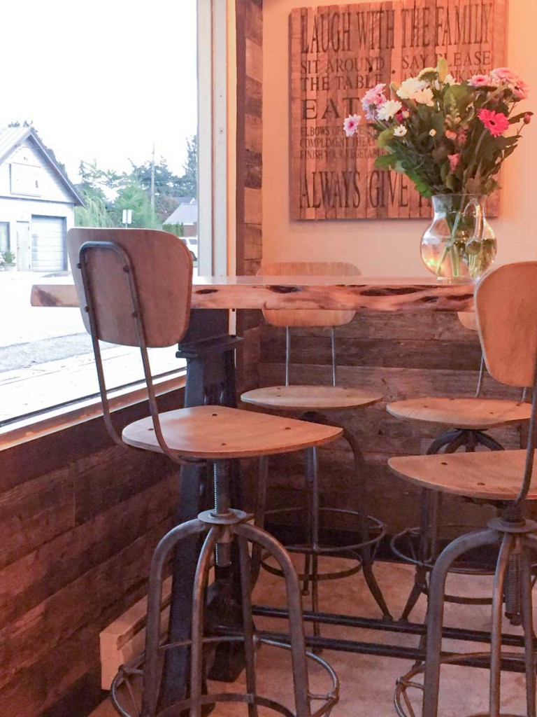
Industrial chic tables and chairs!
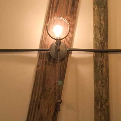
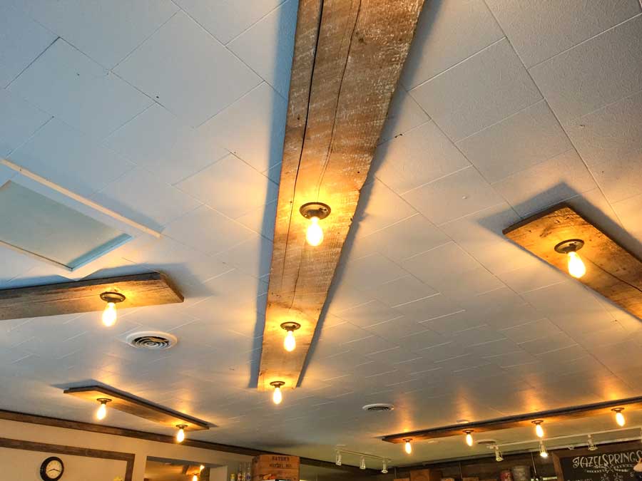
The ceiling was damaged from the previous tenant and looked like it needed to be re-done but his designer came up with a creative solution!
They installed rustic planks to cover up the damage with some cheap builder lights, spray painted black, with $5 LED Edison bulbs.
Such a great, creative solution! That’s what great designers do the best, help you spend your money where it counts!
Related post: Don’t Hire a Designer the Same Way you Buy Oranges
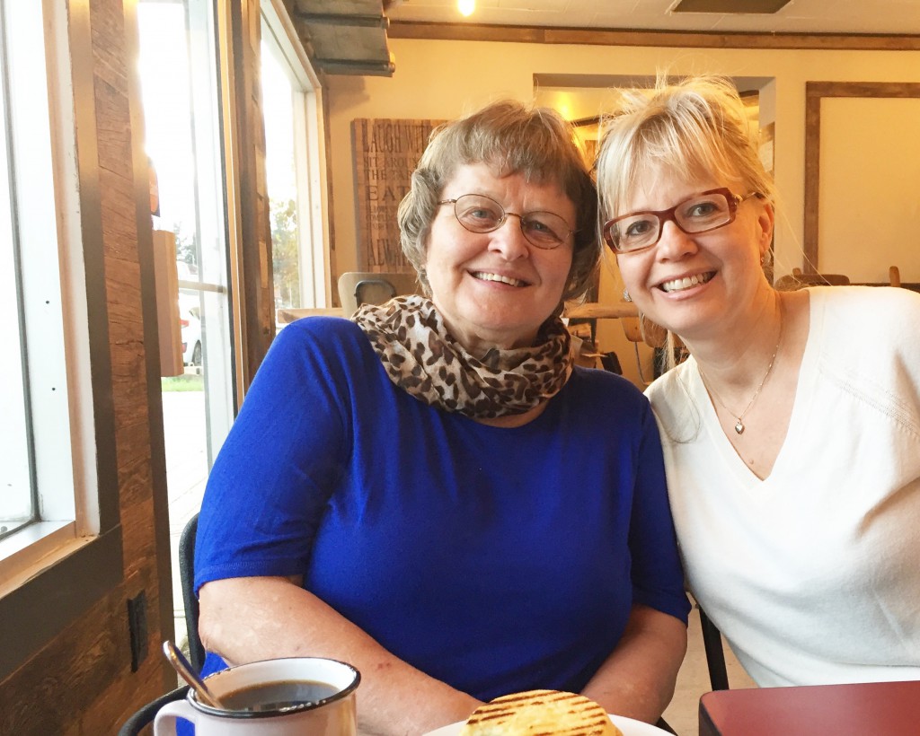
Hellen Junttila & Maria Killam
Here’s a quick photo of my Mom (Hellen) and I with my hair up because I got out of bed this morning, threw on some makeup and came down to check out the new cafe.
We are very excited to have this new bakery in our little town! Welcome Hazel Springs!
If you need help choosing exterior colour go here to purchase our e-Design packages.
Thanks to everyone who signed up for my upcoming Fall courses this past week, I’m excited to meet all of you! The early bird discount of $500 is now over but if you can find a friend to come with you, you can still take advantage of the lower price. The Los Angeles Area (Seal Beach) event is now almost full but there are two spaces left if you’d like to jump in (Sept 28-30). I won’t be back to Los Angeles or Washington, DC in 2017.
Related posts:
How to Test Exterior Colour, 3 Steps to Get it Right
Make Something Ugly Almost Disappear with Disney’s Go-Away-Green
I consider what you do to be a public service. You’re making the world a prettier place…one coffee shop at a time.
I bet your blood pressure doesn’t rise when you see your new place now that it’s been fixed.
Haha that’s right Mary, you know me well 🙂
I am always amazed how color transforms an ok space to an “oh my, that’s awesome” space.
Bravo, now you need to continue Eastward to Rancher’s restaurant, just off the freeway, exit 135. I’ve left my card there many times and have spoken with the waitresses but there is still a muddy green, bright teal and fuschia walls, rust and black leatherette seating.
Vast improvement, and the planters/boxwood will double it.
You were definitely a stakeholder here. The interior colors of my favorite restaurant were recently savaged by the owner’s artless son. The food hasn’t changed a bit but I can no longer endure eating there. This stuff truly matters!
I totally agree! Curb appeal plus interior has a lot to do with where I choose to eat. And so much change can come from such simple and inexpensive efforts. Love the industrial touches-my kind of bistro!
At least it didn’t need to be tweaked on the inside too!
I suffer from the same disease . . . wanting to redo everything I see in the world. I wish I could turn it on and off at will, because it drives me crazy.
Is it a gift or a curse? I don’t know.
The original grey and the blue (looking slightly purple) awning also clash horribly with the surrounding scenery – clean green hills and blue sky. Although the later pictures show the surroundings as deep cloud I have no doubt the colours will work better with nature.
Massive improvement – great job! Your hair looks very stylish pulled up:)
Did the owners change out the awning from blue stripes to grey-black stripes? It seems expensive to do so if they are watching their pennies.
It looks so much better!
No it’s a black and white awning, it just looks different in the different lights. . .Thanks Carol!
Love the change! And the addition of planters with boxwoods serve to balance the composition very nicely. I hope they do add those!
Love the idea of color police! Every town should have her. Definitely push them toward installing those planters asap . Hope you are getting some free marketing from this place, they owe you.
I could spend a lot of happy mornings at that coffee shop! Beautiful job, Maria!
Proofreading Police – Hi Maria, one of your links here reads, “How to Text Exterior Colour, 3 Steps to Get it Right”
Should read = ‘test’ not ‘text’
Cheers,
~ K
Thanks Katherine! x Maria
A thousand percent better! I can’t tell you how many times I would love to do the same thing to a business or house I see…drives me crazy !
Another informative post! As always, appreciate your color expertise. I read even more with interest your post from 2008 when I clicked on ‘married.’ I really enjoyed reading more about your life with Terreeia, sounds like you found your match, and isn’t that what is most important in life? (Kind of like perfect paint matches…haha!) Thank you for your courage in sharing your story, and best wishes to the two of you!
I’ve always wanted to have a little coffee shop! Looks lovely Maria, and how sweet it was of you to offer your talents. A big chunk of a business’ success is the decor and ambiance -although we all look for those little “holes in the wall with great food!” LOL
Drove by on way to Harrison just last week and wondered where you lived.
Darling coffee shop and first impressions do matter
Love your hair up, should wear it up more often
What a great transformation! It went from looking really unprofessional to extremely well-done and inviting. Will be great for their business! I may have to start offering free color consulting services to the buildings in my town that bug me! 🙂
Well what a cute little coffee shop! Amazing thar you know just how to pull those colors together. It looks so happy and inviting now. I love the boxwood which completes the picture
The picture of you and your mom is adorable and you look like you are 20 years old! Love it!
I would love to see an addition of a black bench under the one window to compliment the two flower pots, it seems a little empty as it is.
Maria, could I please get you to come and yell at the people in the rental near our house who painted their house army green with black bahama shutters? YUCK! Still reeling from that mess. Talk about ugly.
I love the transformation at the coffee house. It looks wonderful! They were no doubt pleased also.
Whoa, so much better! It went from dumpy to darling! See, I’m not diplomatic either. Must be a Gemini trait as I’m afflicted too! 🙁
Amazing what a simple change, like just changing the window trim, can make! Though, the before and after photos of the awning reminded me of that blue/black (or whatever color it was) dress photo that was making the internet rounds a few years ago where everyone disagreed on what color it was! I thought the awning stripes looked like royal blue in the first photo (on my monitor) and was surprised to see that they were actually black in the second photo!
BTW-in general, is a warmer gray “dirtier” than a cooler one? Just wondering.
Thanks!
What? Heaven forbid, no tea … ☺. Just kidding Maria as I can smell the aroma of fresh brewed coffee and baked goods from here. Beautiful upgrade with the cleaner colour and possible addition of boxwood planters. All in all, a step up from T.H. and wishing the owners success in their business adventure. -Brenda-
Bravo, Maria!!! Most people would have decided it wasn’t their business and gone on their way but I am sure the owners mentally thank you again every single time they pull up to the shop!
Maria,
Beautiful after. Nice job again!
Looking forward to meeting you in DC, after 4 years of online blog following…
Your hair looks great put up!!
You look great with your hair put up!
I just love your blog, Maria!! I get a surge of excitement every time I see a new email from you!
Your comment regarding the the “right” colors with certain grays sure struck home. I nearly used a dirty blue for my front door with a dark gray (BM Kendall Charcoal) /white exterior. I could see the door would be lost, even just with the paint chip. I changed it out to Behr Asparagus and couldn’t be happier with it still, a year and a half later!
I just am so thankful I found your blog part way through our home building project. I feel you saved me several mistakes!
Wow what a stunning transformation! I dont think
even with all the color knowledge I could learn would I ever be able to “see” what could happen with that building before it was actually done. I think you truly are gifted!!!!
Very cute store front! However, I do love the black casings much better than the white.
Yes, the black casings are definitely a much better look. If the owners see this, think they will be painting next spring. I wonder why Maria doesn’t see this?
Actually I prefer the black casings. It seems to ground the whole scheme.
I much prefer repeating the black in the window boxes which is what I would do if I owned this bakery, I don’t like the way the black casings compete with the black stripes. It’s just my opinion, doesn’t mean it’s right.
Maria
Yes definitely the black in the window boxes will help to ground the scheme!
I personally prefer the black trim around the casings on the windows…Only because it is a business and it stands out!! Would definitely not do it on a house…
Love the greenery in front.
P.S. I like your hair better up…(personal opinion of course)
You don’t know how many times I have wanted to do that…hoorah for you for actually doing that…and a bigger hoorah for them taking you up on your advice (luck them)!
I like you’re hair up too:)
Hi Maria I was looking for help on the Internet and I found your helpful info and great ideas! I just bought a house (not well kept). Today they just took down trees and palms etc etc and I was finally able to see my full house. Now we want to paint the exterior and we would like to pick BM Storm color for siding, we are having modern dark brown/black front doors with all glass in the middle, and thinking to paint garage door in BM black bean. So, should I do white for all trims of the house? Any recommendation for the trim? Thank you so much!