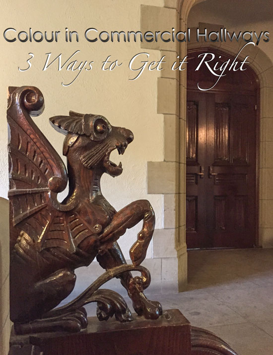
Taken with my iPhone 6 at Trinity College
My Specify Colour with Confidence™ course was in Toronto this past week, and of course, one of the side effects of participating in one of my colour trainings is realizing that beige will never again be just beige. It’s always either pink beige, green beige, or yellow beige.
Grey will never be just grey ever again. It’s always green grey, blue grey, or violet grey.
And then there are the secondary undertones of beige and grey. Really, there are only nine you’ll ever need to worry about. Period. End of conversation. If you’re tearing your hair out trying to choose from thousands of neutrals, know that it can be SO much easier. if you don’t already have my How to Choose Paint Colours: It’s all in the Undertones e-book, you can download it here.
After my course, you can’t go anywhere without seeing the world in varying shades of colour.
Nothing is truly neutral.
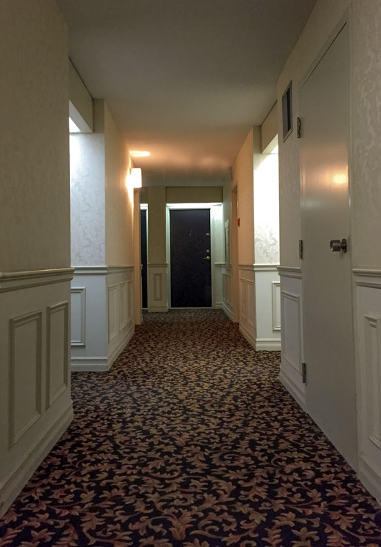
Whenever I’m in the hallways of hotels and apartments, I notice that the neutral undertones mostly don’t coordinate.
My theory on this is that the colours are chosen in a designer’s office, in natural light. Then they get installed where there is zero natural light, which makes the colours look different.
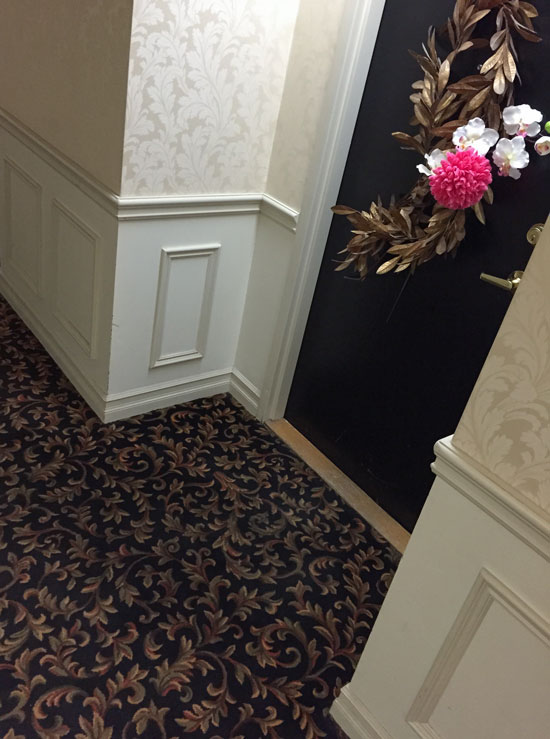
Terreeia and I booked an Airbnb for the first time, and we stayed in this apartment (above) with our host, Caroline Leslie, who was absolutely fabulous!
Before I give you a glimpse of her home, here are my tips if you need to choose colours for an apartment corridor:
1. Choose a dark, patterned carpet that won’t show the dirt.
Hotels know all about this! Their ballrooms are filled with dark patterns that hide all kinds of spills.
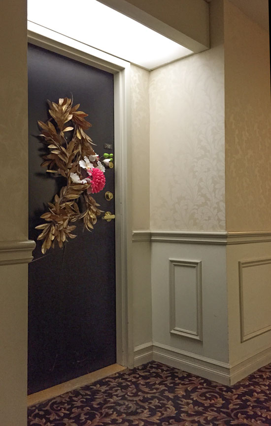
2. Paint the door a coordinating, dramatic colour.
If you go this dark, it won’t look like you tried to match the carpet and failed with a lighter, mid-toned, neutral.
3. Choose lighter colours for the walls.
Notice that the undertone of the neutral in this carpet is a green beige. The wainscotting could have all been the same shade of green, but they chose a two-toned effect here using a green grey and a white.
See that wallpaper? Great choice for this corridor. It’s much more durable than paint. Even though it’s more expensive to install, it’ll last much longer.
The light box above each door is also very warm and welcoming.
Overall, this hallway is one of the better ones I’ve seen and that’s why I wanted to share it with you.
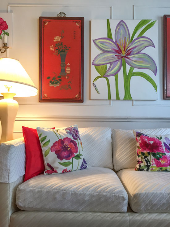
And here’s a glimpse of Caroline’s colourful apartment!
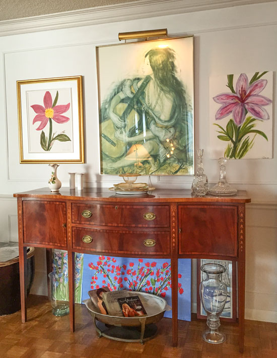
Original parquet floors! Her sideboard is very similar to my white one, which was already painted white when I found it on Craigslist.
Photos by Maria Killam
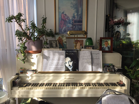
I snapped a photo of the cream piano in her sunroom adjoining the living room. The light was so pretty in here, and I loved the old gnarly jade plant displayed on the top. If you look closely, you can see our hostess wearing a blue shirt in a photo on top of the piano.
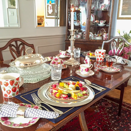
This was what breakfast looked like each morning. With different china and gorgeous silver flatware in different patterns as well.
We loved our stay with Caroline, who was a wonderful cook and hostess. If you are a B&B kind of person and need a place to stay in Toronto, you can contact her here.
Her apartment was close to the University and Trinity College, where my course was held this past week.
See the windows above the entry door (below)? That’s where our classroom was located:
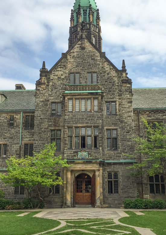
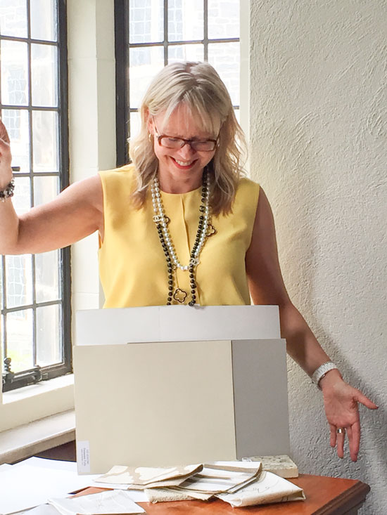
Love the old casement windows. Here I am reviewing one of the in-class exercises with the group:
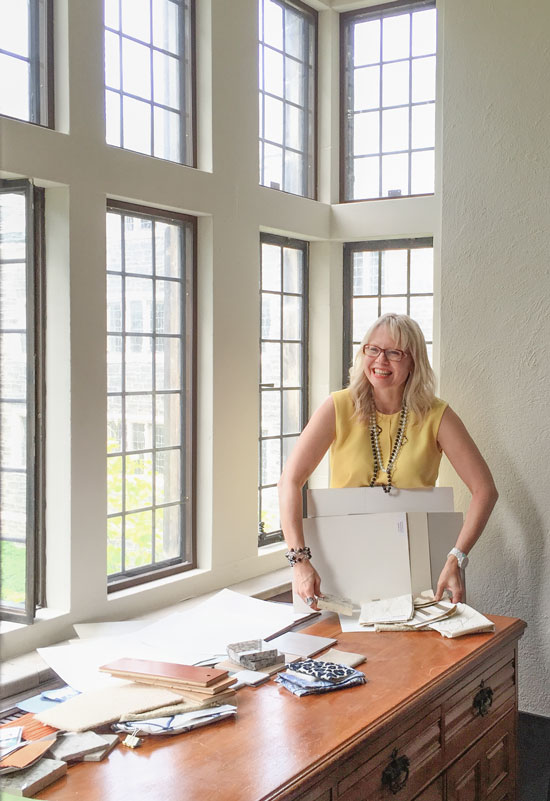 Photo by Terreeia Rauffman
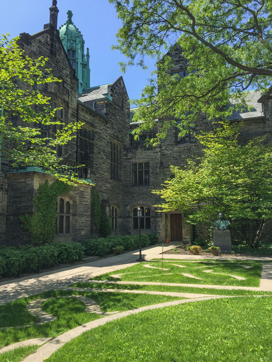 Another view of the courtyard
And here’s my wonderful new group of True Colour Experts™!
 Top left to right: Sue Breadner Guelph, ON; Joanna Colbourne, Milton, ON; Benna Segal, Ottawa, ON; Natasha Kalita, Glencoe, ON; Shari Bernhardt, Medfield, MA; Julia Garden, Lynden, ON; Rachel Segal, Ottawa, ON; Caroline McKay, TO, ON; Michelle Finnamore, TO, ON.
Bottom left to right: Judy Knipe, Pickering, ON; Lorraine Gary, Whitby, ON; Penny Waller, Bowmanville, ON; Maria Killam; Shannon McDonald, Oakville, ON; Noa Simmons, Austin, TX; Paige Kernaghan, Pickering, ON.
Caroline McKay volunteered to support us in the classroom this week, and she was fabulous! And out of all 14 designers and colour enthusiasts who attended, only two were from outside of Ontario.
Having so many locals in a Canadian course is new for me. Obviously, more and more people are talking about this training (hooray!), so I’m considering coming back in the fall instead of skipping it in favour of more courses in America now that I have a US Visa. (Don’t worry, I’m still coming to the US in the fall, too).
Here’s a video testimonial from Michelle Finnamore, a very successful stager and designer here in Toronto! She said she’s been following me for three years, and even though she’s super busy, she knew she’d get her money’s worth doing my course, so she cleared her schedule to be here!
[youtube_sc url=”https://www.youtube.com/watch?v=Z6eC5-ofooc&feature=youtu.be” rel=”0″]
If you’d like to transform the way you see colour, and become a True Colour Expert Register here. !
It’s my birthday tomorrow, June 7! I’m so happy to be home for the weekend!
xoxo Maria
Related posts:
Yes to more Canadian dates!! One in Alberta would be wonderful! I will be the first to volunteer to help!! Always enjoy your posts. Thanks for always thinking of your readers.
Happy birthday!
Happy Birthday Maria!
Happy birthday Maria. May all the good things you give out come back to you ten- fold.
♫ ♫ ♫ HAPPY BIRTHDAY TO YOU
HAPPY BIRTHDAY TO YOU
HAPPY BIRTHDAY DEAR MARIA
HAPPY BIRTHDAY TO YOU ♫ ♫ ♫
…and may you have many, many more!
Glad that your course in T.O. was such as success and congrats to the graduates. -Brenda-
Happy Birthday! Do you know where in the U.S. you will be coming to in the fall?
Hope you never loose your wonderful smile, the love of your work, and happiness in your heart. Happy, happy birthday!
Happy birthday, Maria!
Happy Birthday Maria-have a fabulous day with people that love you and vice versa!
Happy Birthday!!!
Happy Birthday! Thanks for sharing your talent for color and design!!
Happy Birthday Maria- thank you for bringing colour into our lives in so many new and interesting ways.
Happy birthday!
Happy Birthday, Maria. Wishing you a big happy, colorful year ahead!
Happy Birthday Maria, have a happy day!!!
Happy Birthday Maria! Hope your having a wonderful day surrounded by people who love you!
Happy Birthday Maria,
Good health, lots of happiness and personal success
HEYYYY! My anniversary, too! I’ll lift one for both of us!
Happy Birthday and homecoming Maria!
What a wonderful improvement on the former Toronto location.
I remember celebrating your birthday with you 3 years ago….
Enjoy every second of this beautiful colourful season!
Love,
Paula
PS: What are the 2 colours in the closer photo that you are holding? I love them together.
Happy birthday, Maria! Hope this year will be one of your best ever!
Happy Birthday, Maria!!!! Hope you had a wonderful day!! 🙂
Maria, What a beautiful college campus. The things I love about Canada is that is so old world looking. Your students are so lucky to be in such a pretty environment and have you as their teacher.
I pray that one day you will teach a class in So. Calif. and I will be there!!
Again, Happy Birthday Maria! Hope you are having a wonderful day with your loved ones.
Happy Birthday Maria!
Happy happy birthday, Maria. Thanks for your generosity in this blog.
Happy Birthday!
Hope you had a sparkling birthday Maria! Thank you for the never ending inspiration, post after post after post. I’m always learning something new. And no–I will never look at beige and grey the same way again. Ever– lol! Thank you. Take care. 🙂
Happy belated birthday from a fellow Gemini!