


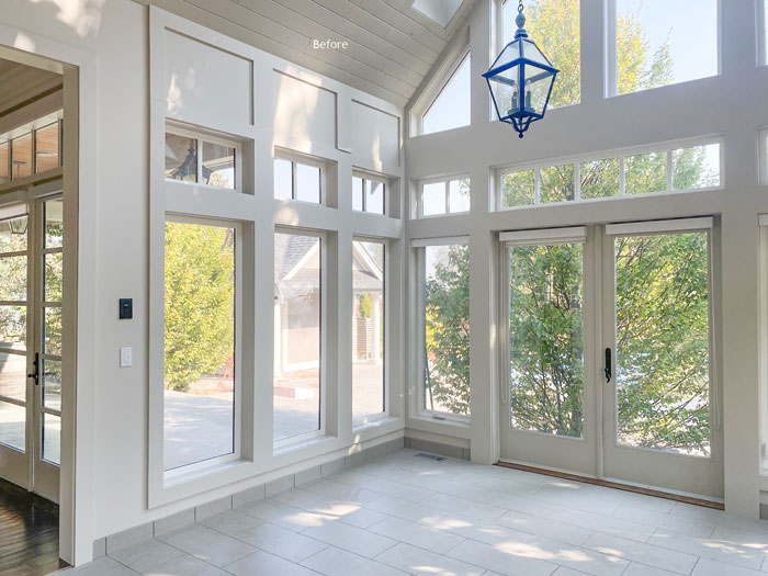
In December, right before the holidays, I decided to paint the dining room. It was the last room on the main floor that had not been painted since we moved in. And it was the ONLY room that had not been originally painted taupe.
It was SW Accessible Beige (a green grey in my system). And it did happen to be the right undertone to coordinate with the drab, uninspiring 12″ x 24″ builder grade green grey tile which I replaced during the renovation prior to moving in.
By the way, this is exactly why I almost never specify 12″ x 24″ tile (there are very few exceptions). I’ve never seen it look anything but builder basic. And because a tile floor can be SO pretty, it looks like a let down.
A new look for our dining room
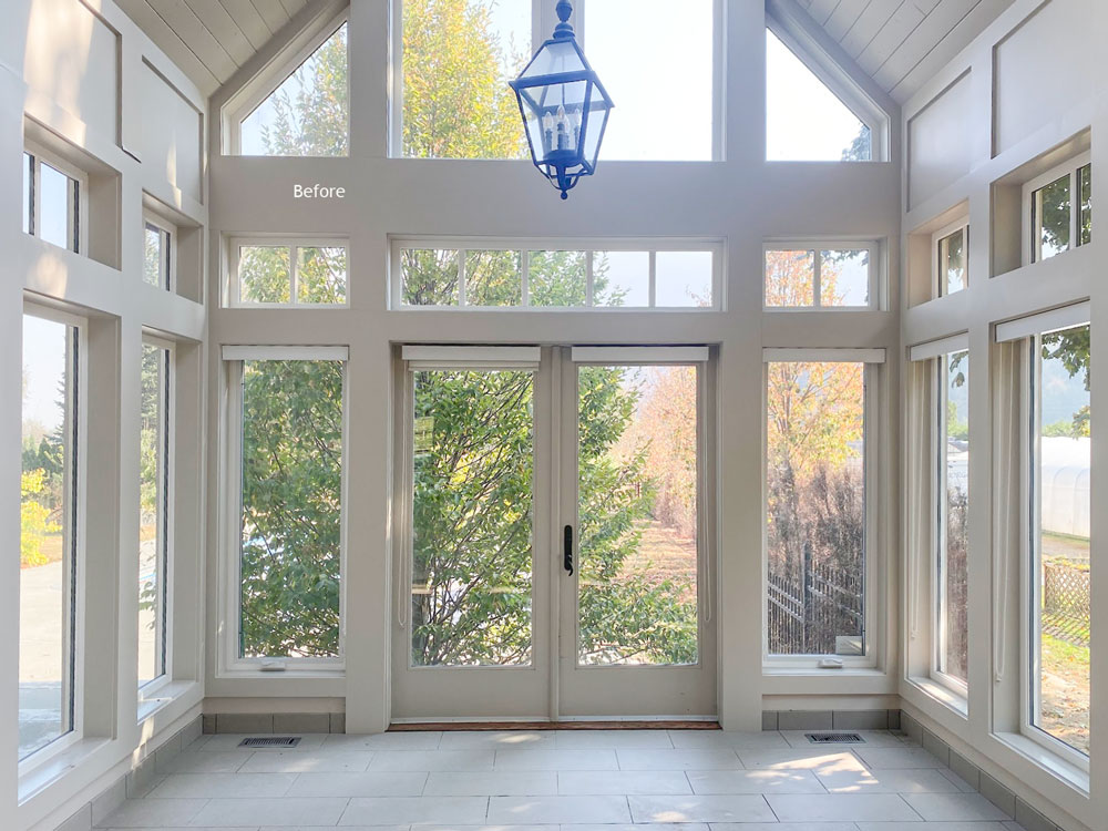
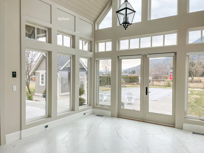
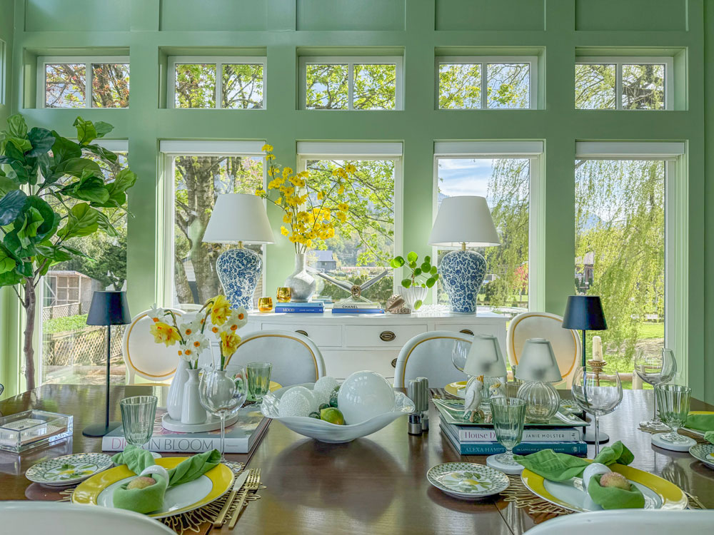
For a large format floor tile I would always choose a large square. We chose a 24″ x 24″ Calacatta look porcelain to create flow from the existing Calacatta subway tile backsplash in the kitchen. It brightened up the space considerably. Of course removing the tree directly outside helped as well. It is a sunroom after all.
Here was the new tile installed:
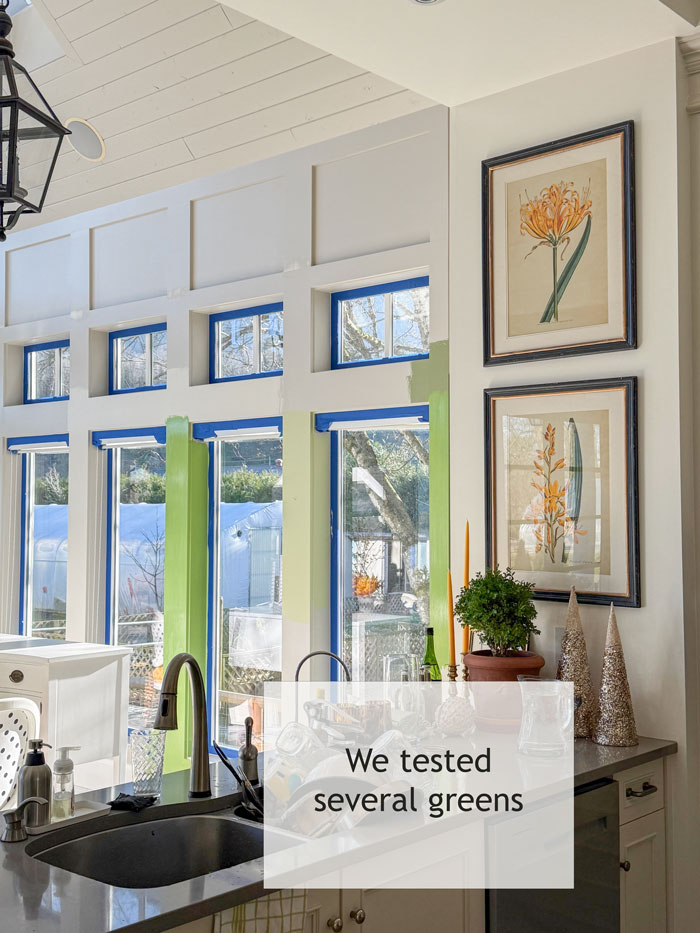
The sunroom/dining room should be painted a colour, I decided, and tested a few greens (below). And my True Colour Insider community got a live video as I went through the process.
This is how you test paint colour (below). Paint test samples in an area where you are not visually comparing to the old colour. Since this room was a sunroom, it was easy to paint test colours in between each window.
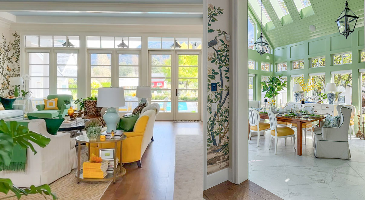
And here is the after!
In the end the green that worked the best was the one that visually related to the green chair and ottoman I had in the living room (below).
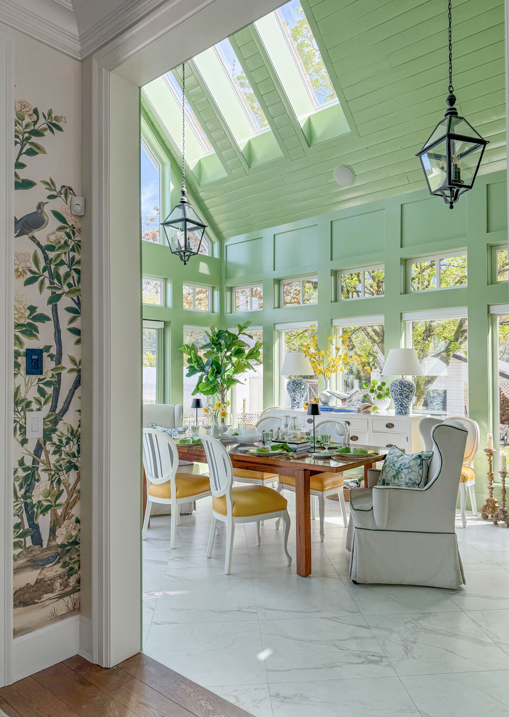
The colour we landed on is BM AF-450 Seedling from their Affinity Collection. You can buy a sample right here. If you like Sherwin Williams, the closest equivalent is: SW 0013 Majolica Green. And in Farrow and Ball, it’s similar to No. 287 Yeabridge Green.
This room is still a work in progress. I will be re-upholstering the chairs and adding an area rug, but I’m working on the millwork in my upstairs entertainment room right now so this project will come later.
In the meantime I thought it would be fun to have it be a colour and when I finish this room, if I need to paint the room again, I will do that.
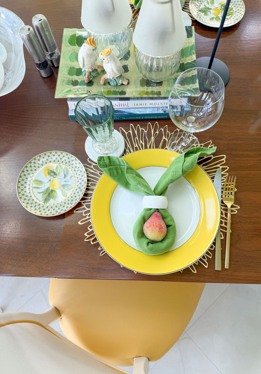
Friday night we had a dinner so I turned the napkins into bunny ears.
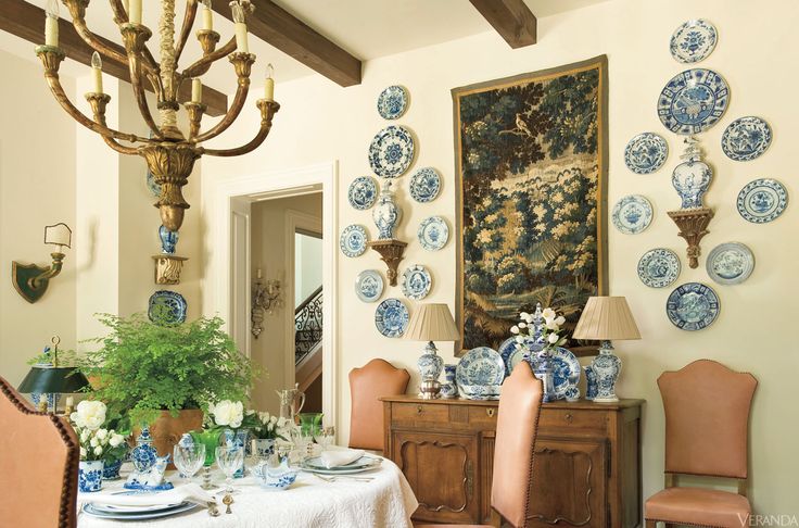
Next I need some blue and white plates! Where shall I hang them?
Here’s my inspiration!
Here’s the before again:
I colour drenched the room (just like the previous homeowner did) because the trim blends into the walls and there’s no good place to stop and start a different colour.
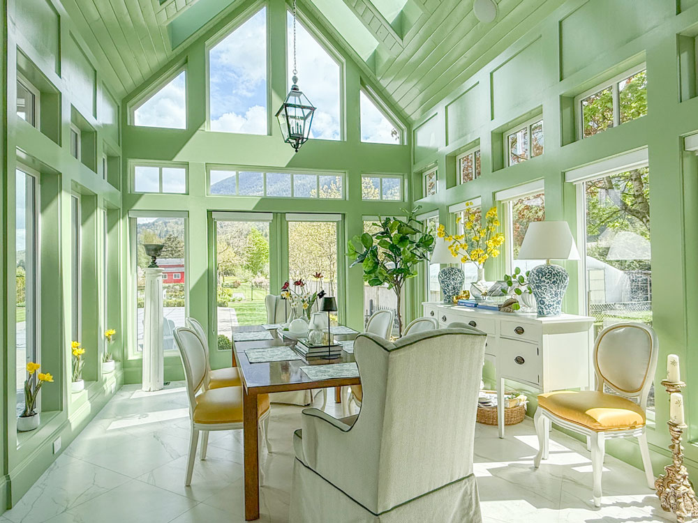 I love how it feels connected to the greens from the outside.
Let me know if you’re considering colour drenching a room in the comments! ⬇️
Oh! And if you are headed to High Point Market this weekend, I’d love to connect with you here.
Get Paid as a Colour Consultant! 💛
There’s still time to join me in Chicago next month at my True Colour Expert Training! Register here.
Join our design community!
Last week, our True Colour Insider Community shared some fantastic feedback on the weekly design meetings we’ve been hosting for over a year. The insights, inspiration, and practical advice that come out of these sessions are truly unmatched—there’s so much valuable content, and always something new to learn.
Nowhere else will you find this level of support and expert guidance to help you make confident colour and design decisions—so you can become a skilled decorator, all without ever setting foot in design school. Ready to join a vibrant, like-minded community and take your decorating skills to the next level? Click here to get started.

Can’t wait to see you inside! JOIN HERE
Related posts:
Creating Flow with Marble Finishes: My New Fireplace


I was one of the ones who said, “Leave it white.” I was wrong. What a happyroom. Love it.
Maria it is so you.💚 You have taught me to expand my color horizons beyond myself. If that makes sense. You’ve helped me see the possibilities in most any scenario. I decorate a unique furniture store that puts an emphasis on decor and home furnishings as well. And it’s your voice I hear when I need to push myself out of my comfort zone and into all the possibilities. And I am so much more confident since throwing myself into your teachings many years ago. Thank you again. And for the warm kitchen color download as well. I’m a better decorator for it. All of it.
Hi Maria,
I love your color drenched sunroom, and it is inspiring! One quick question: One often paints trim in a semi gloss paint so when you color drench your room, is everything painted semi gloss? Thank you!
Carol
I did it in high gloss in this case yes! Maria
That is gorgeous! What a happy space to be in! Even using all your existing furniture, you pulled it all together in a way that looks so fresh. You nailed it! ♥
I liked it white. It was so clean and created a framework that didn’t compete with the beautiful view.
Yes, I agree, it showcased the view and brought those colors in.
That floor! Beautiful.
What a happy sunroom that is totally YOU! Two thoughts I had about the space: would you consider going to one large, oversized statement light fixture to fill the volume of the ceiling and match the scale of the space a little better? Another small detail I always like is to get floor registers that match the floor and outlet covers painted the wall color. They eye goes to contrast, and removing color interruptions from something utilitarian can remove minor visual distractions and bring more focus to the beautiful decor and view.
It would be really hard to incorporate that right now without literally running a cord along the ceiling so I’m keeping the two lanterns. Great question. And yes having the light switches match is a great idea. Maria
I think adding blue & white plates, in your case, will be too much. With all the windows, there is very little wall. It will look cluttered putting plates on those thin walls between panes IMHO Add blue & white in your upholstery, dishes, etc.
I agree with Pamela re adding an oversized statement chandelier in your room. With high cathedral ceilings, one needs to go big to make a statement, plus once up there light fixtures tend to look smaller.
The room is absolutely STUNNING. The room calls you in and begs you to bask in its beauty. I love the blue accents with the green. The colors together bring to mind the new Kravet collection for Pottery Barn. The line has many items that would go in the room beautifully in your room, check it out !
Your sunroom was a perfect room for the color drenching. I especially love this green color! Like others might have mentioned I think the blue and white dishes on the wall would be too much. Although I feel bad saying that since you are THE designer but I think the room is already pretty much perfect. Not sure if a rug would even be too much, but it may be needed to anchor the room. Looks all so beautiful!
Please, please Maria, please don’t put plates on the walls. Just look at that stunning colour on all the angles and ridges of the walls and ceiling. To put plates up there will break the cohesion.
Whenever I see plates on walls it looks so old-fashioned and so impersonal. I love how you’ve added the daffodils along the window ledges, matching the chair seats. Sometimes leaving well alone is enough.
I thought that room would be perfect in green right from the beginning, so naturally I love it!!!
Same, same! 💚
Hi Maria
It’s gorgeous!! I have always loved those side chairs, and don’t think you need to reupholster them. I love how airy it is without a rug.
That room is so lovely! With all the wonderful windows and views, it’s like you are wrapped in a mural :] I know whatever you choose to do to this room in the future will look fabulous and in good taste. Thank you, Maria, for sharing your wisdom and thought processes with us. Over the last decade or so, I’ve learned so much from you!
Stunning! I adore this green, and this room.
Love the room and all of your choices! But you didn’t answer the question- when do you consider color drenching for a room? I’m considering a den in my house but I don’t know if it would be a good choice.
Yes I linked to the DOS and DONT’S for colour drenching your house in this post above! Maria
Thrombosis is beautiful! It’s so you! So, what is a good room to color drenching?
Personally, this green doesn’t match your personality! Pulling one of the greens from the wallpaper adjacent would be bolder than this mint green. Just my humble opinion.
I have loved Seedling ever since the AF line launched but have never used it. It is such a fun colour and I love your dining room. Where did you put your old green gourd lamps and where did you get the new ones?
They seemed too modern with the new garden green so I donated them and found these from HomeSense! Thanks Susan! Maria
Thank you. This green is not the same as Rita Konig’s living room at her farm house but it reminds me of that favourite green room.
This time last year as we signed the contract for our soon-to-be-built townhome in the beautiful Montana prairie I began to look for an anchor by which to pull together all the decisions we would have to make and I found Maria Killam. Her timeless/classic mantra made great sense to me. So I ordered the color wheel and the ebooks and drenched myself in color! Every decision had to pas through the filters I established for color and for timeless and classic. And now one year later as we settle into our happy new home I must come to you and say thank you. We have lived in four different countries and now back in our native land we wanted to bring our history with us in a harmonious way. It works! We are proud of ourselves and we are enjoying the discovery of how serene and joyful we feel from sunrise to sunset in every space in our home. It’s been a delight!
HI Barb, thanks so much for your lovely comment! How we feel in our homes is so important your comment made my day! xoxo