Instead of renovating your house 10 years from now in order to sell it, here are 3 timeless home decorating trends to update your house now so it stands the test of time for the next homeowner (aka won’t go out of style) – no matter when you decide to sell.
12 years ago, Deborah and her husband Paul bought their house located on a quiet street at the end of a cul de sac.
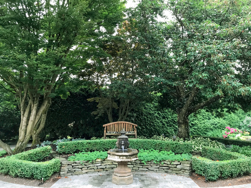
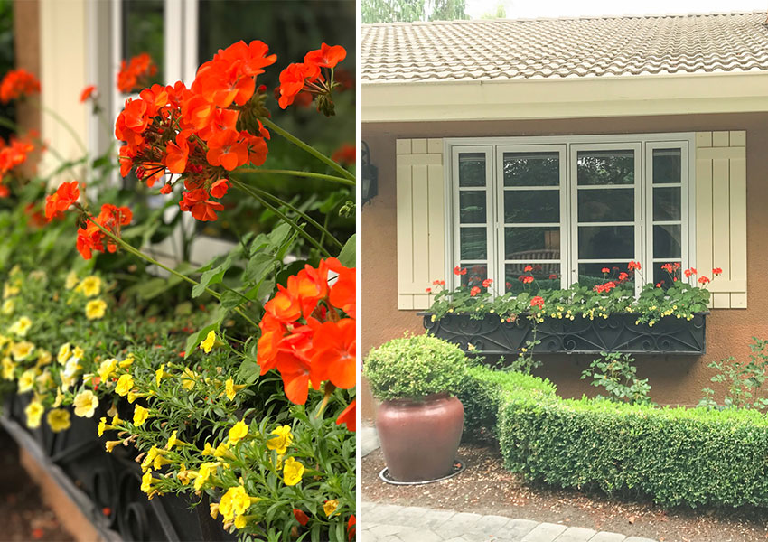
They have a lovely, French Country home with a stunning garden in the front and backyard and a beautiful circular driveway with gorgeous mature trees.
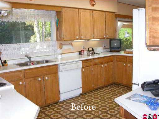
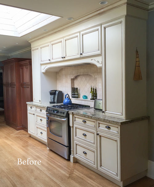
This is what the kitchen looked like when they originally took possession in 2005. The house had never been renovated. So in 2006, they packed up and moved out while the first renovation took place:
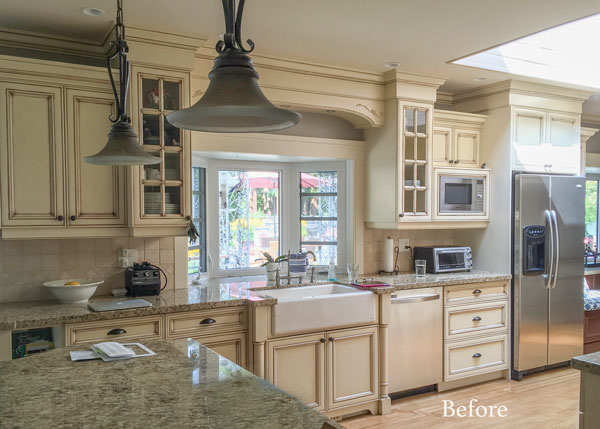
They installed a cream, glazed kitchen because that was the trendy kitchen of the moment along with the espresso brown kitchens from the Tuscan era:
The ‘after’ from the first kitchen renovation
In approximately 10 years when their son is off to University, they plan to downsize.
Instead of renovating 10 years from now to update the house in order to sell, Deborah wanted to love her house now instead of making it new just for the next homeowner.
She had started following my blog and Instagram page based on a referral from another client.
Deborah loved the idea of creating a classic and timeless kitchen that would stand the test of time.
I met with her in January of this year to choose colours, finishes and discuss the overall look and feel of the refreshed kitchen. We also refreshed her dining room, living room, entry and gave the family room a complete makeover.
So what do you choose so that your house stands the test of time and won’t go out of style – whenever you decide to sell it?
Here are my top 3 timeless home decorating trends:
1. Paint your kitchen white (a colour works too)
Remember, when I say white, I mean off-white, when I say off-white, I mean cream, when I say cream, I mean white. I’m talking about whatever shade of white works with the fixed white you have chosen or that already exists in your home. If you aren’t sure, I wrote an eBook on the topic with my favorite go-to white paint colours.
White or a colour is way more timeless than the current trendy neutral (i.e. black in the black trend, gray in the gray trend, brown in the brown trend… you get the idea).
AFTER
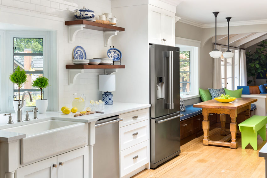
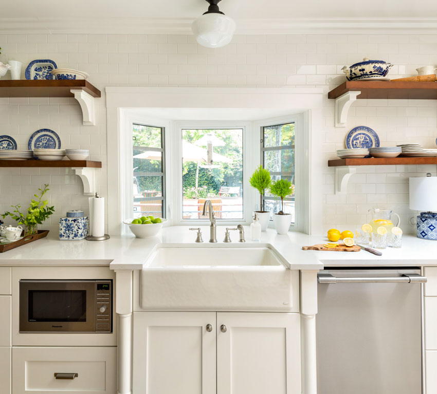
The kitchen is one of my favourite rooms now! Deborah already had the blue and white china so I was very happy when I found the little blue and white lamp for the corner of one side of the kitchen.
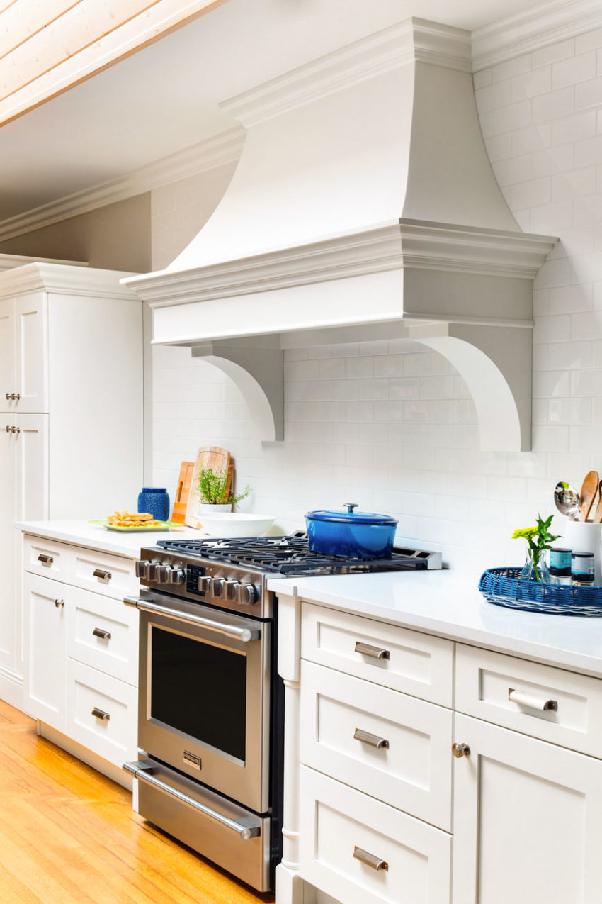
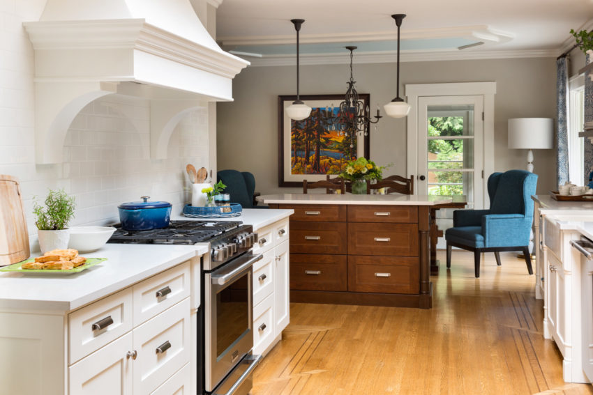
The farmhouse sink was technically too white in the glazed kitchen but now it was perfect for the off-white kitchen. The cabinets are Sherwin Williams Snowbound and the countertops are Caesarstone Frosty Carrina.
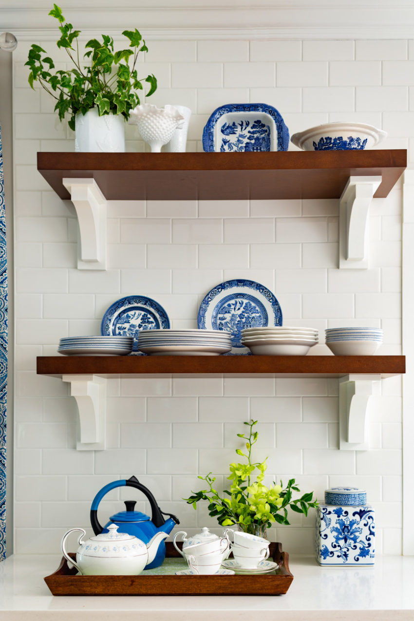
She already had a wood stained island, so we repeated the same medium brown wood stain for her upper shelves. You can see that her microwave was moved to the lowers here.
After the kitchen was complete and I arrived to see it, Deborah had arranged the shelves herself with her blue and white china. I loved the clean look and didn’t touch them on photo shoot day! #chinoiseriechic
This is the other side of the kitchen:
And here’s the after.
Matt at Newcastle Kitchens designed the upper shelves and the millwork free standing hood fan. Deborah also had her cabinet doors replaced.
When I saw her hood fan, I immediately decided to replace my stainless hood fan during my bathroom renovations this past summer, you can see my updated kitchen refresh here.
Simply gorgeous!
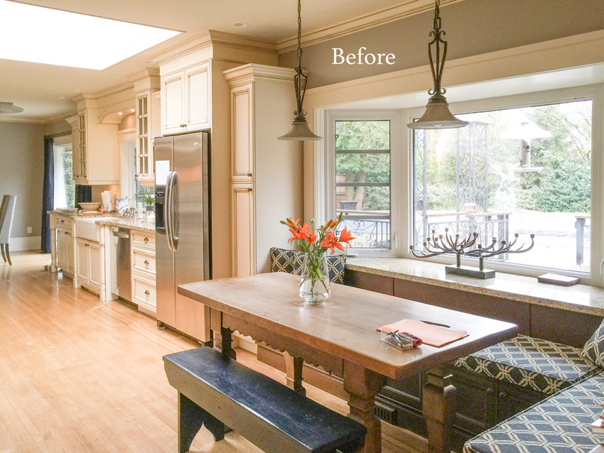
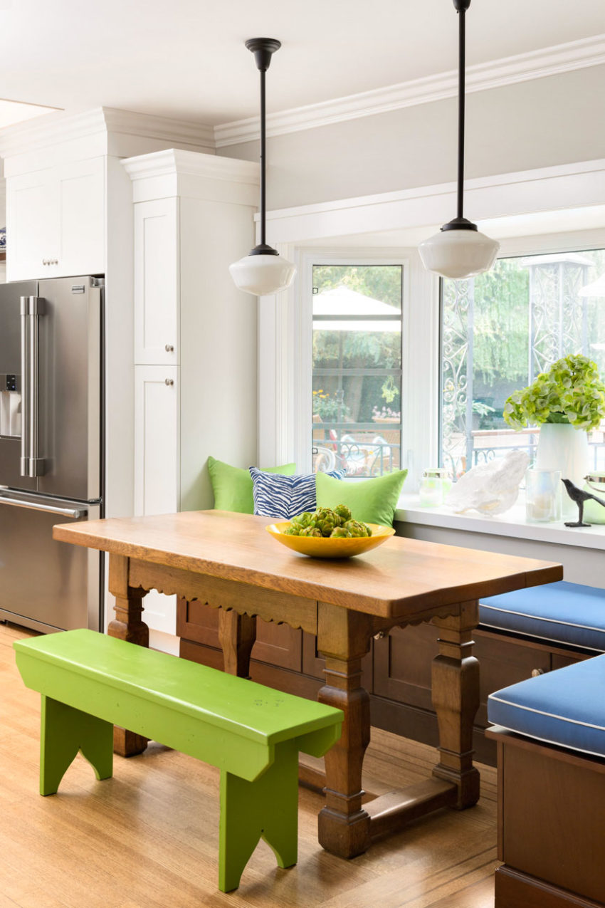
Here’s the kitchen dining area before and after in greens and blues:
Deborah wanted a coastal feel. She loved the idea of introducing green in the kitchen along with the blues as an accent so we accessorized it with pillows and recovered the bench cushions in blue piped in white.
The granite was removed from the windowsill and replaced with painted wood.
I also added my favourite large coral from the Pottery Barn along with some hurricane lanterns on the vignette behind the seating area.
Paul made the bench in the kitchen and carved their initials into it (below):
2. Don’t be afraid to add pops of colour; it’s only paint after all.
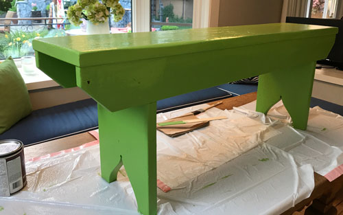
After the installation happened, Kelly (my design assistant) said to me one day “That bench should be green!” I thought this was a fabulous idea, so I immediately selected a green (SW Overt Green 6718) and texted it to Deb, the next day she sent me this picture:
I responded, “You are a woman of action”, haha! She said “I sure am!”
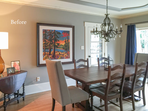
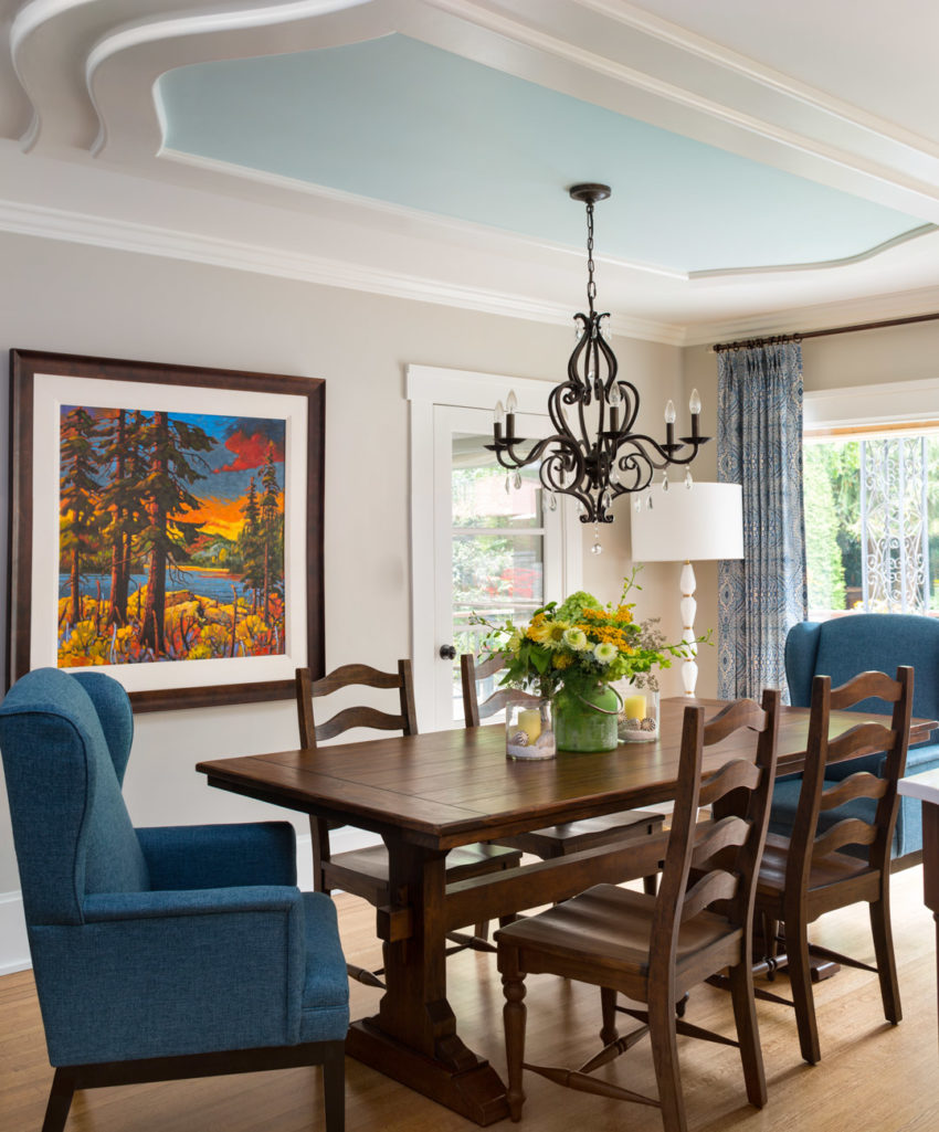
This is the other view of the kitchen that includes the formal dining area which also had a refresh. We kept the original art and added new wing chairs and drapes:
Two years ago, Deborah had painted the house Benjamin Moore Rockport Grey in an effort to update the current look, however, the colour just made her house feel dark and gloomy.
The new colour is Sherwin Williams Agreeable Grey. It’s lighter and fresher and works with all the happy new colours we added.
We painted the ceiling blue here to add colour to the dining room along with custom drapes and wing chairs to coordinate with her artwork.
Photography by Barry Calhoun Photography
Deborah’s floors are original to the house and they are gorgeous. They added the small 2″ mahogany inlays in the entry floor during the first renovation and it took two weeks to install them.
The result is beautiful and totally worth it (below). Not every floor has to be medium brown to be fabulous.
The doorway to the living room is on the left and the hallway into the bedrooms is on the right so this is the only spot for an entry table.
And now for the family room. The living room post was a refresh and not a complete re-do so I’m saving that room for another post.
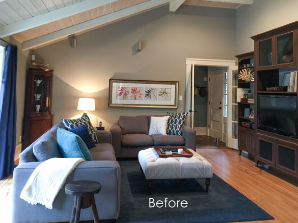
Here’s the before:
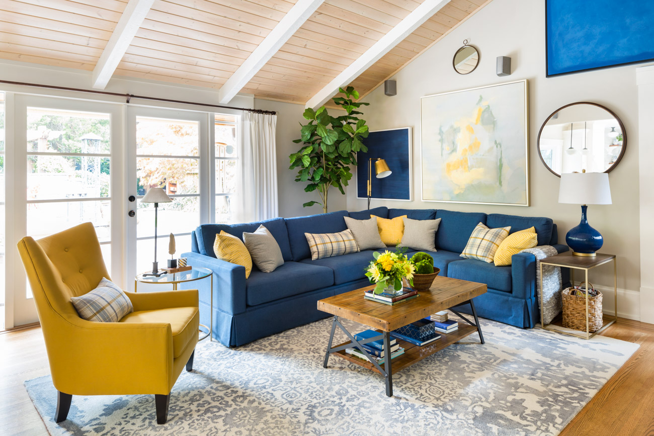
3. Always choose a colour for your sofa over the current, trendy neutral.
The existing charcoal sofa and loveseat will date shortly, however, the navy blue works with the coastal feel we created and I was so happy that she loves yellow too! It just adds a happy glow to this room!
Related post: Which Colour Sofa Should You Buy?
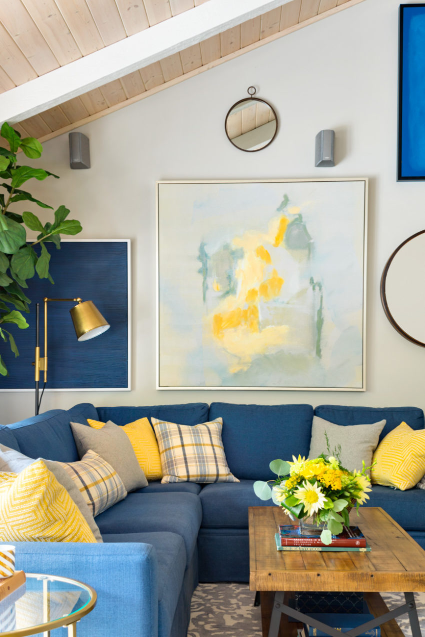
When you’re designing a gallery wall, don’t worry too much if not all the pieces are collected in the serious “Art Collecting” sense. It’s fine to accessorize a special piece or two with some inexpensive finds that simply repeat your colour scheme to create a dynamic looking display and give everything context.
Related post: The Biggest Wall Art Trends from High Point 2020
The shape of the focal point wall in this room was awkward because of the french door on the right. For this gallery wall, we added some solid blue pieces from Kate Spade that I saw at High Point last Spring that repeated the blue of the navy blue sofa in a bold way.
You can also use elements that are not pictures at all like mirrors, sculptural pieces and even sconces to create variety.
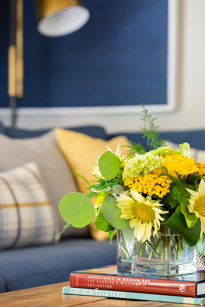
Arrangement from Simply Perfect Flowers
The end result is a really more classic than coastal because we went with colours that were a bit more saturated than your typical sun-washed coastal look. And we didn’t add any cliched nautical elements like ropes, blown glass and beach motifs (not that there’s anything wrong with that).
But I think we came up with a fresh and original look that doesn’t necessarily fall into a recognizable trendy “decorating style”. And fresh is really what most people are looking for when they are drawn to the coastal look.
Related post: My Sister Elizabeth’s New Coastal Living Room: Before & After
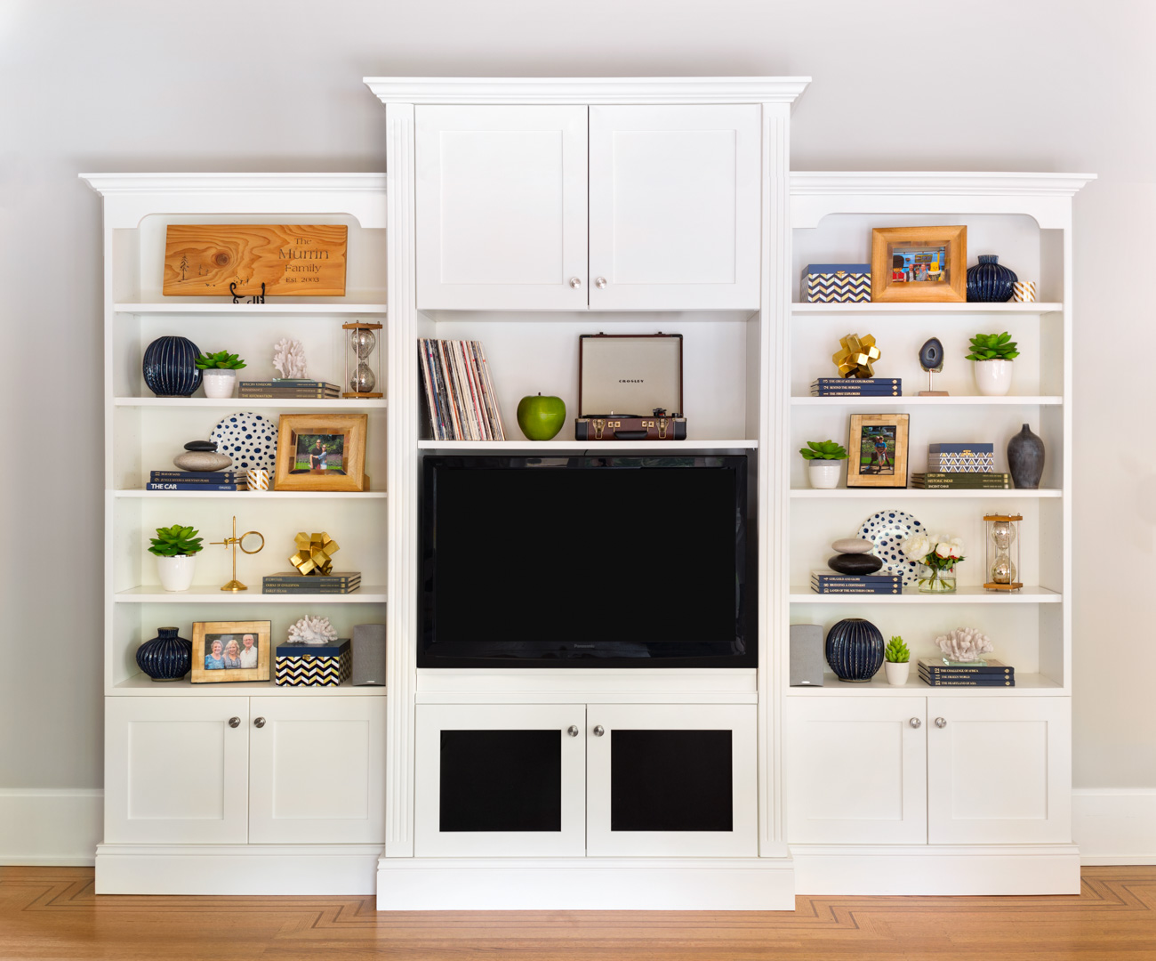
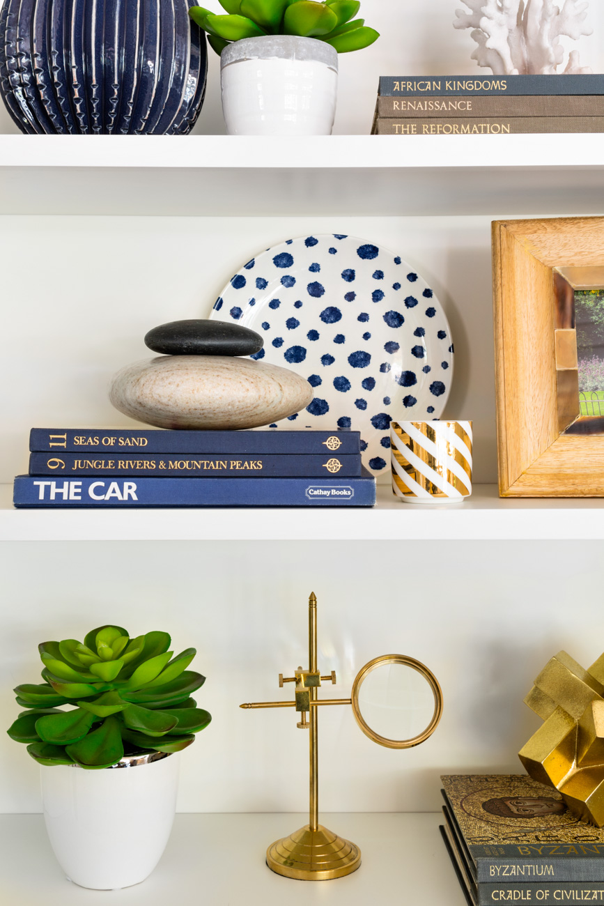
I was very happy with how the bookshelves turned out! We painted them white and I found a big stack of slightly faded blue and grey books in an antique store and they provided perfect pedestals for accessories and some cool, smooth and flat rocks collected by the family.
That is Paul’s antique record player sitting above the television.
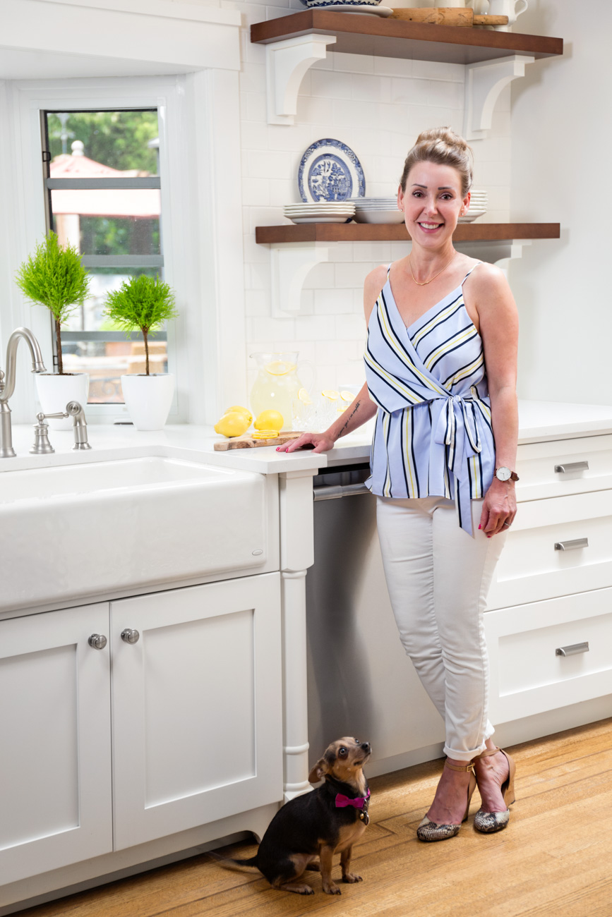
And here’s my lovely client Deborah in her kitchen with one of their 3 dogs:
I felt really lucky to work with such wonderful clients. This is the note Deborah sent me:
“Maria is a dream maker!
We just love everything she has done. She was able to choose colours and patterns so easily-things we never would have thought of (but loved). She was so easy to work with and really listens. We never felt like we were being lead somewhere we didn’t want to go and love the fact that she easily mixed higher end items with items we found on sale and items we already owned; keeping us on budget.
It is so nice to have a house we love to come home to every day that suits us perfectly. With all the light, happy colours it feels like a breath of fresh air. Thanks Maria!”
I still have her refreshed bedroom, master bath and living room to show you, coming up shortly!
Hope you enjoyed the tour and gained some timeless decorating trend ideas for your home too!
Related posts:
Transformation from Brown to Indigo Blue; Before & After
How to Get the Perfect Piece of Art for Your Home; Before & After
How Styling Saved this Kitchen; Before & After



Maria you really are a dream Maker !!!
If I had half your talent
I would be a designer .
What a transformation !!!
I can see why they are Happy !
Made me happy just looking at it !!
Nancy
Great post. Love the colors and as always, reading the description and all your notes… it’s a design lesson… and don’t we love that.
Such a beautiful revamp – how wonderful to get such a great note from a happy client!
Another perfect blend, Maria. The family room is a lovely transformation. May I ask where the yellow chair comes from?
It was custom made from Van Gogh Furniture. Maria
That is quite the transformation! It is a lesson in installing a timeless kitchen so you don’t feel the need to redo in 10/12 years. Kitchens are a big expense.
The painted bench in the kitchen and the bookcase/tv cabinet show what a difference a can of paint can make to the feel of a room. I’m looking around to see what I can paint in my home now. Lol
I can see why Deborah is so happy with her home now that you have used your magic touch.
You know, I didn’t even notice the book/TV thing in the before LOL!
I totally agree with not fixing to sell and fixing to enjoy now. I had close friends in the early 90s put in French doors to their pool and the first couple who saw their house bought it right before the market dropped. They said why didn’t we do that so WE could enjoy it while we were living here?
They were glad to sell, but I’ve internalized that ever since. Plus, life’s uncertain, as I know from my sister getting Frontotemporal Degeneration and mom a rare sarcoma that’s 1/6th of 1% of all cancers. Live in the moment, in a home you like, I’ve learned.
I enjoyed the house tour. Deborah, thank you for sharing your beautiful home. Maria, as always you did a fantastic job.
Love it and the backs of the shelves might look fabulous with a blue behind the shelving, like even wrapping paper discreetly tacked up to see if she likes it. Just a thought from a person loves blue, green and white!
Can you tell us where the couch came from? I am in the market for a new couch and need sources.
It was custom from a made to order sofa company in Vancouver, Van Gogh Furniture. Maria
Louise, look at sofas from Lee Industries. They make nearly every style of sofa that exists and they are a designer favorite for that reason and their great construction.
Beautiful!
I have a friend who has the identical “before” kitchen which makes me cringe every time I see it…in her MCM ranch house.
This is the perfect example of YOU at your BEST (well, you always seem to be at your best, but this shows it all at the same time!), pulling it all together in a beautiful, timeless look (with lots of white!)
Everything to love about this!!
Sigh. Just gorgeous.
Lovely…….do you mind revealing what ceiling blue color you used in the dining room?
HI Denise, THe dining room ceiling is 2051-70 Crystal Blue. Maria
Very beautul changes. I love the cabinets, wall colour, blue couch (which will be my next couch colour purchase) however I don’t quite understand replacing all the top cabinets with shelves or nothing. I guess I have to much to store LOL But other than that georgeus
Everything about this blog is perfect! Great information, high quality photos, but best of all it tells a story!
Maria, this is one of my favorite designs from you yet! Wonderful! So happy and liveable. Great job! And your styling is great! We need more posts on how to style spaces. 🙂
I agree!!! It’s one my favorite posts. While I liked the bench before, the after suits as well and it is just paint. LOVE the range hood, you tease! I really believe in living in the house one loves for oneself. It’s hard to anticipate others’ taste anyway, so go for it.
Beautiful ‘refresh’ Maria & Deborah! Particularly love the blue ceiling in the dining area plus the inlays in the hardwood flooring. Do have a question though re the kitchen and bench seat; were their doors and drawer fronts completely replaced as they appear to be a different style? -Brenda-
P.S.: @Kelly — Re the green bench, spot on … ☺.
Yes they were replaced! Maria
Hi Maria, kitchen looks fabulous! Was curious to know if staining the kitchen table the color of the new open shelves and island was discussed/considered? Or does this fall under the category of wood=jeans and coordinates with everything? (Which I’ve seen you post about in the past.) Thanks and look fwd to seeing the other rooms!
Actually no we didn’t talk about that at all, I love that table just as it is, and all wood does not need to match as long as it is repeated somewhere else and in this case the same tones are in the hardwood floor! Great question! Thanks for your comment! Maria
Thanks! That makes sense! ??
Beautiful. Would you mind sharing the paint colors in the den? The walls seem to have a grey tone – I’m guessing to coordinate with all the blue?
Hi Mary, it is listed in the post, they are SW agreeable grey which is a green grey. Grey is the backdrop for colour which is why it was chosen here. THanks for your comment! Maria
OMG! I love EVERYTHING! Where did you source the carpets Maria? And the hardware in the kitchen?
Fun refresh but the new kitchen cabinets seemed more than a refresh. Wasn’t sure if the plan was to stay with the French Country style of the home. The “before” kitchen seemed more French Country to me. I do love all the added colour and a white kitchen ( I had one in a former home long before everyone had white). The yellows, blues and greens give so much life and “pops”. Impressed by how a few simple changes in the dining room made such a big difference. The blue ceiling is great! You do work wonders Maria!
When I took your class several years ago of course we studied clean and dirty colours. It seems that everything I see in your posts, blog for quite some time now are the clean colours. Is that a trend or more personal preference? After I had all my cabinets, wood work painted white (White Dove) in our current home you helped me select several paint colours for our home and they are in the “dirty” category. It has been a few years…..I still love the look. Grey Mist in my kitchen, family room. Grant Biege foyer, hall, stairwell, living room, dining room.
Thanks Gloria, yes cleaner colours are the trend now which is why you see them everywhere but especially on this blog! Maria
Gorgeous! One of my favorite kitchens yet! And love that Agreeable Gray too!
NAILED It! Love it…I am soooo ready to refresh mine, I get to do others all the time-I want mine to be next and look like this…my biggest hurdle is the cost of my counter tops to update. (Note to self: don’t have such a big kitchen b/c when you update everything costs that much more!) LOL
Ooh, love the new fresh and cheerful spaces you were able to create for the lucky homeowners.
Would you mind sharing the fabric used for the custom drapes in the dining room?
Well you really out did it this time! What a lovely home. I could just walk in and live there. The kitchen is a knock out and the hood is just perfect. The blue, green, yellow pallet always looks so fresh. The cute green bench is an eye stopper. Everything that you did here is worthy of a magazine article. Can’t praise it enough. Good job!!!
So nice!!!! It is such a timeless change and I love that the colors get “punchy” here and there — the green especially. Well done!
Maria and blog followers,
Here’s an interesting article that seems to prove Maria’s philosophy of Timeless and Classic.
http://www.apartmenttherapy.com/the-features-modern-homebuyers-are-looking-for-might-surprise-you-250838?utm_source=at_daily&utm_medium=email&utm_campaign=10262017&recip_id=243956
This house is so beautiful with the update. I love the colors! It is nice to see an update with more classic furniture.
Wow! This really makes me want to ditch my glazed cabinets and go with white! Beautiful transformation, as always!
Great job, Maria. I agree…update your house for you, not to sell it. I’m selfish enough to not want my efforts to be enjoyed by someone else.
Are the window treatments in the refreshed dining room the same ones you had installed at your sisters’s home?
Really love this transformation Maria!
I thoroughly concur with not settling to offer and settling to appreciate now. I had dear companions in the mid 90s put in French ways to their pool and the main couple who saw their home got it just before the market dropped.
Love everything! Especially the family room with cheerful yellow pillows/accents and the blue bookcase with the doors in the entry? Did you paint the bookcase or just happen to find one in the perfect color? Can you please share who makes it?
All the rooms look so much brighter, fresh and clean.
Thanks for sharing.
I posted the link below the photo above! Thanks for your comment!
An inspiring job, LOVE the colors!
We learned the principle of “fix it soon for us rather than for resale” early, when my husband’s career caused us to move often. Avoid the heartbreak of fixing up for others! Also to sometimes do a modest, nice enough update that we could afford and enjoy, rather than hold out for a huge, expensive overhaul some time in the future.
Maria’s faith in the timelessness of white kitchens has played true for us. We bought a big old house in 2010 with a well-crafted white kitchen from 1991. Luckily it had a great layout and hardwood floors. Thin green marble countertops, cutie pie painted tiles on the backsplash, and dated lighting were the only elements that said “1990’s.” An easy fix!
Looking at the bright blue and green for my craft room, so I’m interested in the paints. Beautiful!
For the dining room, the new wall color was SW Agreeable Gray. What is the trim color that was used?
It was SW Snowbound. Thanks for your comment, Maria
Much more my style! But really confirms for me that spending too much for any kitchen isn’t worth it, because no matter how great it is, 10 years later it is out of style. Too much to me means >$50k. Of course if you’re moving walls and appliances, costs can add up more than that. I don’t believe in buying “cheap”, custom cabinets and solid surface counters are totally worth it. But I just did a gorgeous kitchen and could have easily spent 2-3 times as much as I did for the same quality.
My favourite room has the three C s of a family room…Cheerful, Casual, Comfort. Love it.
I must confess, I’m suffering from subway tile overload. Surely, the same tiles could be stacked horizontally or vertically and still have enduring appeal. The medium coloured wood really warms up a white kitchen.
Hi! We were hit hard by Hurricane Harvey so we are taking the time to carefully pick pieces for our Reno. I love learning from your website, thank you for sharing your talent.
I love the light fixture over the sink and the pendants over the counter. Where are they from? Thank you!
They were from Rejuvenation. Thanks! Maria
In this story, could you tell me please who makes the subway tile and what color is it ?
Hi Maria, the cabinets are white and so are the walls, which I like and want to do in my own kitchen, so can u tell me the colours please. How does one use the 2 whites together. Thanks.
I have a rental house that needs a lot of work. I am selling it without doing the work because I won’t get my money back out by doing it. But I AM going to paint everything one color to give it a more uniform flow. There’s a lot going on, with multiple levels and colors, so at least the walls will be light and consistent. On one end of the house (3BR/family) there is beige carpet everywhere. On the other end (lv/dining/kitchen/master) there are: light-medium oak floors, terra cotta tile floors, knotty pine ceilings and trim, including wainscotting in dining room, and super dark brown “railroad tie” style posts and beams. I am planning to whitewash the super-dark posts and beams, but leave the knotty pine. For all the walls I am thinking maybe BM Acadia white (formerly Ivory.) Seem like a good choice? The light is good but not great since the windows are smaller than nowadays. Other thoughts are to go a bit lighter, like Simply White, or a bit darker like Navajo.
Beautiful!! Love those colors! Ms. Killam can you please let me know where does the yellow chair in the living room is from? Thank you!
It’s from Van Gogh Furniture which is located in Vancouver and they sell to the trade only. Thanks, Maria