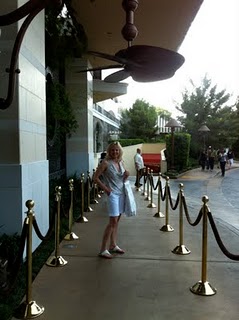
It’s Elizabeth’s 38th birthday weekend and after a little shopping at the Fashion Show Mall in Vegas yesterday we stopped into the Encore Hotel to have a cocktail in the lounge overlooking the pool.
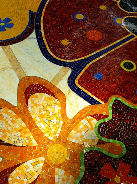
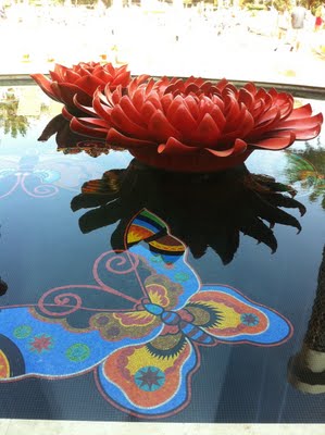
You know the general rule of three when it comes to colour selection? This entire hotel was a riot of colour and yet it still looked classy and elegant. The millions it must of have cost for the mosaic floors alone (above) is incredible and over-the-top but as we sat in the lounge with our cocktail I couldn’t help but notice the colours here.
I was once standing at a bar alone and a guy walked up to me and asked me if I was a designer. When I responded “Yes, how did you know?” he said “Because you’re looking at the ceiling”. And I do have pictures of the ceiling for you 🙂
Too many different colours in a space starts looking too folksy and bohemian. Of course there’s nothing wrong with that if you love it!
Here are 3 ways to keep colour classy:
Focus the colour scheme around one wildly colourful piece
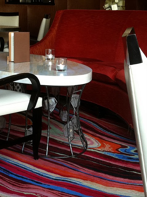
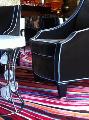
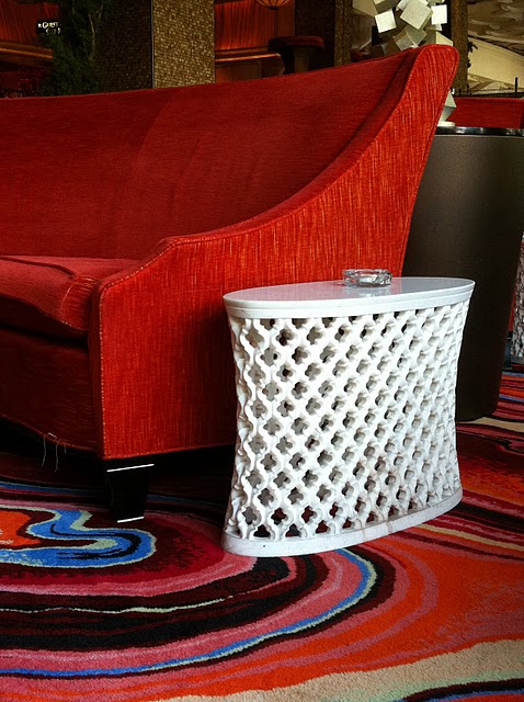
Just like the rainbow patterned rug in this space.
Repeat only one Colour
Notice the orange sofa has been repeated again in the upholstered valance, drapery and the ceiling.
Keep the rest Neutral
Brown, black, and white are the neutrals repeated in the rest of the space. The mosaic pillars, black and white chairs, white marble topped coffee tables and brown upholstered chairs piped in periwinkle.
There’s about 8 colours in the rug. And the orange all alone would start looking like halloween without all the white mixed in with the black and brown!
I really need this white end table for my living room.
The ceiling is brown and it’s repeated again in the sofa tables and in the upholstered valance which actually goes more green with the light from the windows.


It looks like you guys are having a blast – love the photos and that fabulous carpeting! Happy Independence Day 🙂
xo
Kristie
So fun!! Love that the guy asked if you were a designer!
Maria what a gorgeous hotel to stay!! Really gorgeous and the color explanation is perfect!
xoxo
Karena
Art by Karena
Come and join a very Fashionable Giveaway from the Shabby Apple!!
You're so right, Maria: The hotel is saturated in beautiful color, and yet, still looks classy and elegant.
The brick walls and the solid color upholstery are essential elements, providing a subdued and sophisticated balance in the space.
Thanks for another great illustration and color lesson!
What beautiful color! Yes, I'd love that white end table too! Enjoy the heat…there's plenty of it in California, if you'd like to come visit me! Fortunately we were able to escape the roast in San Francisco for the weekend. Take care, Barbara
These are delightful! Don't you think we all bear just a smidge of bohemian deep down inside? I know I do!
judithahall@gmail.com
Can't get tiered of repeating that I love your blog 🙂
My company has recently purchased a new office of about 12,000/- sq ft. As the HR lead I would have a big role in deciding on the final look and feel. We are a young start-up with the average age of employees about 27 with a open and fun work culture. Needless to say, facebook and google office images on the net are our inspiration……
Could you please recommend some good blogs which talk about office interiors? Any other pointers/help. I need to close on the details in the next 10 days or so…whatever we do, want an open, cheerful and colorful space 🙂
Hi Anjali,
That's a good question, I have never hit a single blog that talks about commercial spaces, I love where you're going with it though!
Maria
Love it, love it, love it!
Wow!!! I LOVE this hotel! (I really do go for bright colors. :o)
Great photos!
xo
Donna