
“My husband and I are gutting our white kitchen and putting in another white kitchen but with a better lay-out. While I would love custom cabinets and quartz counters, those materials would be an “over-renovation” for our neighbourhood and type of house.
We chose Ikea cupboards in the white Applad door profile which is completely flat. We preferred the look of the Shaker-style Adel door but its off-white colour clashes badly with our new white kitchen appliances. Our recently renovated main bath also has a flat profile door and since the bathroom is fairly close to the kitchen, we thought a flat profile kitchen cupboard door would coordinate better.
In addition to the white Applad cupboards, our kitchen will have white appliances, a stainless steel sink and faucet, brushed nickel door pulls, a refinished oak parquet wood floor, a white tower fan above the stove and white subway tile.
I have two design questions:”
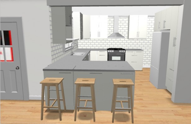
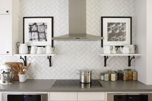
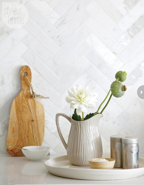
“1. I love all white kitchens but with a white tower extractor fan, flat white cupboard doors, and white subway tile, I worry that the whole look will be a little flat and cold. What do you think about installing the white subway in a herringbone pattern (below)?”
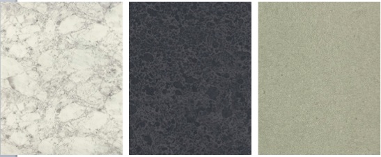
2. The best option for a laminate counter we have found is Formica’s Ideal Edge (the edge is wrapped so there is no brown line and it looks much higher end). The colour options in this line are disappointing; most of the lightest options look very pinky beige.
I think the best options are
1. Bianca Luna.
2. Black Ebony Oxide or
3. Nature Solidz but I am lost.
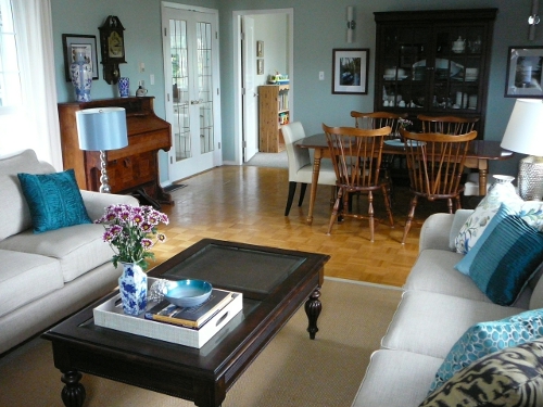
Our living room/dining room, which will now we open to the kitchen, is accented in shades of blue and green, my favourite colours and the wall colour is Benjamin Moore Smokey Green.
Dear Stephanie,
I love your living room and that (BM) Smoky Green colour, it’s my new favourite blue/green!
I think it’s a great idea to install your backsplash in a herringbone pattern and since you are going for a slab profile door which is more contemporary, I might consider a non-traditional subway tile in a longer length similar to this image (below):
Regarding the countertop, I haven’t seen the Bianca Luna sample but if it’s as creamy as it looks on-line I would go for the black/gray countertop instead. Black would have been my second choice after a white countertop.
Since your cabinets are white and not off-white/cream your countertop should relate.
When you choose your pulls/knobs make sure you consider something that looks custom, here’s an idea I really like. This pull (below) comes in something like 16 different sizes, however most people just choose one size and install it on every single door and drawer.
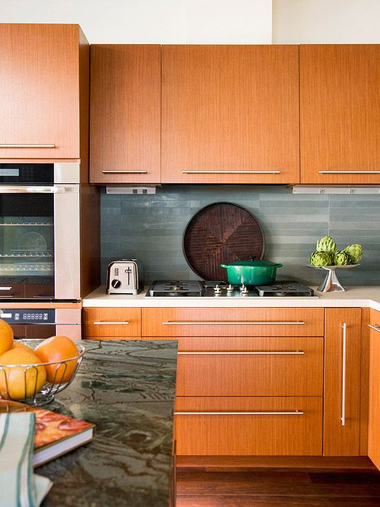
Since hardware can make or break the look and feel of your kitchen, installing this standard pull using custom sizes on each drawer or cabinet door transforms it from ordinary to special and creates a designer look and feel.
See more hardware ideas on my Pinterest board here.
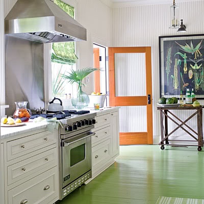
Your wood floor will warm up your white kitchen and the best thing about it is you can accessorize so many ways because you won’t have colours that will boss you around forever (not that there’s anything wrong with that either).
A white kitchen needs a few basic accessories:
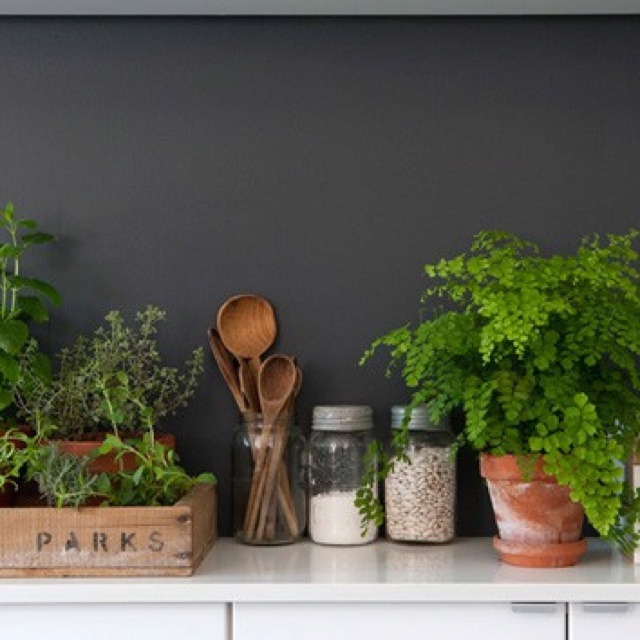
Herbs in pots. Wooden spoons and a matching pepper mill.
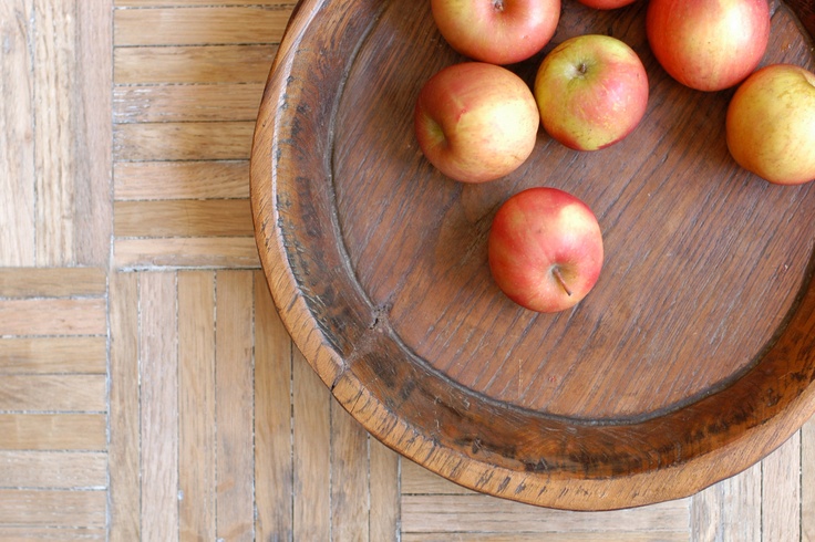
A carved bowl with two faux bananas and one or two faux apples or pears. Then when the avocados or tomatoes that you store in bowls in your kitchen are eaten, your bowl isn’t totally empty.
My nephews have a game they play when they are at my house, which fruit is fake and which is real, haha. I found some fabulous small fake melons at an antique shop earlier this year and I have two porcelain bananas that look totally real!
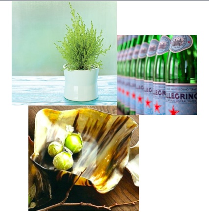
I bought a Lemon Cypress topiary for my kitchen at Christmas time last year, I loved the spring green colour and it lasted in my North facing kitchen for over 7 months!
Here’s a small Cypress plant in a white pot (below) that you can find at any nursery.
Three green water bottles also look great sitting against white subway tile and here’s another cool, organic looking bowl that could warm up white.
One more thing to think about is that if are installing uppers on either side of your hood fan I would either do a regular hood fan with cabinets above or give it some room.
Hood fans that are visible up to the ceiling look better with either open shelving on either side or just some space. See my White Kitchens pinterest board for lots more examples of either option.
Hope this helps make your white kitchen happy Stephanie!
If you have a question for an Ask Maria post, take photos, without flash, in good natural light and email me here.

the suggestion on the horizontal pulls is very stylish, but be careful. when they are close to a wall or side panel of cabinets as illustrated in the photo, the handle can gouge the side panel. Its an ugly situation, that isn’t easily remedied. A restriction on the hinge can help, but still dicey. sometimes a fitting strip of 1-2″ can space the handle a bit further from the side panel to prevent damage.
I totally agree with Ellen. Horizontal handles on drawers are fine but it is tricky on cupboard leaves. Consider playing a game of Horizontal & Vertical handles; since your kitchen is white, which I find advantageous, a game of “strips” can add a playful feeling. I am sure that with Maria’s input on your kitchen, the outcome will be amazing, timeless and very rich.
I never thought of that with these pulls. It’s one reason why I chose knobs over levers on the doors in my house because I can’t stand it when clothes catch on the levers like I had in one house I lived in.
Closed ends would solve that problem. Maria
Great suggestion. I think we’re going to go with 22 inch pulls on the large bottom cabinet drawers (horizontal) and on the pantry doors (vertical). We’ll use the same style pull in 6 inches for the upper cabinets (vertical), lower cabinet doors (vertical) and narrow drawers (horizontal). The style we’ve chosen looks very similar to this.
http://www.restorationhardware.com/catalog/product/product.jsp?productId=prod1166005&categoryId=cat1512023
Great post, Maria. We’re finishing up our new construction home and I’ve had similar concerns about the all-white kitchen we’ve chosen . . . thanks to your blog! Nice tips on warming it up.
Stefanie, I was in the exact same predicament with choosing counter tops. We had planned to go with laminate and preferred Formica’s IdealEdge for the reason you stated. I scoured the internet in an attempt to find the perfect color — their choices are seriously lacking! (It seems Formica could benefit from reading this blog as they develop new colors/patterns.) Check out Basalt Slate by Formica; I remember it being similar to the Ebony Oxide. The downfall is that the honed texture, which I wanted, cannot be done in IdealEdge. Best wishes to you!
Thanks for the suggestion, Melissa. I will certainly check out Basalt Slate!
Maria makes great suggestions, again! Simple changes (tile size, handles) will keep your kitchen current without looking cookie-cutter. I have to chuckle about the cypress. A few years ago we had a holiday house tour of our home. It seemed as if every other person commented favorably on the three cypress mini trees I literally threw up on the kitchen window sill at the last second. The touch of green goes a long way.
Ditto on the gouging from the handles! Also, I am exactly the wrong height for them– the lower cabinet pulls caught my belt loop and/or pocket all.the.time! I changed mine out for something smooth on the ends.
I LOVE that this is a real people house. Lovely, comfortable, and historically in keeping with how people have lived, in a reasonable footprint… Good luck with the reno!
It IS a real people house (it’s my house!). Thank you for your kind words. I now have all the motivation I need to get through this renovation!
These ideas look simple, but when all put together they create the designer look! I love the idea with the longer subway tile arranged in a chevron pattern. Excellent post.
I’m seriously considering white cabinets in the house we will start building next spring. Never having a white kitchen before, I was a little nervous! These ideas are fantastic and now look forward to searching out more white kitchen ideas. Thanks, Maria!
Great suggestions for warming up a white kitchen!
Oiled Soapstone by Formica is another great darker toned countertop option. Basalt Slate and Oiled Soapstone are both great choices!
Thanks, Jaye, for this suggestion. Oiled Soapstone looks like another excellent option.
I always love your ideas. I have my grandmother’s fake (plastic) fruit and the wooden bowl she kept it in. It’s in a box somewhere because I thought it would be “out of style”. I’m getting it out and putting it in my kitchen.
I love white kitchens, and yours will be beautiful when complete. Maria, your styling tips are brilliant! My ‘real’ fruit bowl always looks so empty and out of place when it’s…well…empty. I’m also definitely going to buy a mini cypress.
Maria, this was such a great and practical post! Loved it. Thanks for doing some of these “applied advice” columns.
I totally agree about the gray-black laminate for the counters. That’s what we installed and it was the best decision ever. They show no dirt and match everything. You can see them here: http://gracie-senseandsimplicity.blogspot.ca/2010/08/our-250-kitchen-makeover.html
Grace, you tipped the scales for me in favour of the grey-black counters. Showing no dirt and matching everything is exactly what I’m looking for. Your counter looks amazing (I have long been a silent reader of your blog!). Thank you!
I’m not big on plastic fruits but I found some great lemons, bright and cheery, at a discount store last year; they looked terrific in my little galvanized silver pail on the counter, especially when dreary winter sets in.
Just spec’d Smoky Green for a bathroom that is otherwise cream and beige. Homeowner had picked some accent tile already that looks great with the Smoky Green. It will really make the bath pretty.
Jennifer, I can highly, highly recommend Smoky Green. Anytime we have guests into our house, they ask what colour it is! It’s a really lovely colour to live with.
Also I am re-doing my bathrooms…. both white of course. Every time I’m tempted to do something “interesting” I repeat to myself, “Boring now equals timeless later, haha!”
Thank you everyone for your encouragement and helpful comments! I have spent months planning this kitchen and it is so helpful to receive feedback.
Maria- your advice has absolutely set me at ease. Thank you! Thank you! Thank yo! I’m so glad you like our living room paint! We adore the Benjamin Moore Smoky Green because of the subtle changes is makes in different light (from aqua right to a gray-green).
I love the idea of using a more modern profile subway tile. I think it will give a little bit of visual interest that I’m looking for. What a great suggestion! You have also sold me on a black counter. I think the contrast will be a great addition to the space. Thanks also for the great advice on cabinet pulls.
So far, I have spent most of my mental energy picking the right “big items” but your advice has given me an approach to styling that will pull everything together. I will now be on the hunt for a wooden bowl, some faux fruit and a mini cypress!
From the bottom of my heart, Maria, thank you so very much for honoring my question with your expert advice. I can’t begin to tell you how much peace of mind this has given me (and my husband by extension!) as we move forward with our renovation!
You are so welcome, thanks for your lovely comment! Maria
Good call on suggesting open shelves to flank her column fan. That, more than anything else in the kitchen, will update things. Stack dishes and glassware there that are used every day and you don’t need to worry about them getting dusty. Hope you post a photo of your finished project!
My white kitchen is all about accessories. Here’s a pic of it on pinterest – http://www.pinterest.com/pin/231865080789188184/
Maria,
Loved the Pinterst board on hardware.
On one, you mentioned that although you like the hardware, you would have lined it up differently.
Is there a guide for how to line up pulls and knobs????? 🙂
p.s. I have fake pomegranate and mangosteen as ‘filler’. They were pricey but worth it. And, as no one knows in North America what a mangosteen looks like for real, they don’t question it. grin.
I’d rather see horizontal and possibly oversized for a really contemporary kitchens. White tiles come in larger formats, such as 8×20, which I’m using on a job now. It’s probably too large for this kitchen, But there is a terrific range of sizes now. Samples are important – looking at six different white tiles a couple of weeks ago, each white was a subtly different. Just my take.
One thing that will keep ANY room from being boring is Lighting.
We just installed track lighting, and although I KNEW it would make a difference, holy cow!!
It is a little beyond the scope of this blog, but Maria has mentioned it before. It adds drama, creates a place/space where there previously not one, and wash the room with warmth (or coolness, if you need).
Great post, Maria, and one for my files on my future kitchen. Echo Elizabeth – real kitchen in a real person’s home and so achievable. MORE, please!
On the pulls and knobs. I have a lot of black wrought Iron and black chairs in my kitchen . Would oil rubbed bronze hardware look bad on white cabinet in the kitchen?
Blink twice and they’ll look black.
cool!! Thanks
I could really use some advice: I am planning a new, white kitchen with Ikea slab cabinet doors (satin, low-gloss finish.) I am looking for white subway tiles for the backsplash, but have discovered that they are whiter than the Ikea doors, which, in comparison, seem slightly creamier. Considering the lighting and shadows, and that the backsplash and cabinet doors will not be flush, will the white subway tiles work?
Yes close enough. The whites in subways tiles unless you go with Waterworks are very limited. Maria
Maria, thank you so much for answering me! I value your opinion, as always.
DalTile has a line called Rittenhouse Square often carried in Home Depot or Lowe’s which has various whites, almonds, etc. http://products.daltile.com/series.cfm?series=239
DalTile has a line called Rittenhouse Square often carried in Home Depot or Lowe’s which has various whites, almonds, etc. in a subway
http://products.daltile.com/series.cfm?series=239
Hi Maria; I wanted to update you that our black counter was installed this morning. We followed your advice (and the suggestion of others here) and went with Formica Basalt Slate with an ideal edge. I am SO HAPPY with this choice and can’t wait for the white subway tile to go in next! After seeing your post today about another potentially boring white kitchen, I needed to update and tell everyone that it’s not boring at all. Everyone who has seen it so far thinks it is beautiful. And it is!
“The reason the ‘different’ kitchen you’re planning is ‘not the same as everyone else’, is because it’s not pretty enough to be pinned over and over.” (Maria Killam, January 31, 2014). This quote on your post today hit the nail on the head. I love my new kitchen – thank you AGAIN for your help.
We too like Maria, love a white kitchen…here is a laminate we love..our saying is a good laminate is better than a bad granite any Day! It’s by wilsonart
Home / Commercial / Laminates / Old Mill Oak 7973
OLD MILL OAK SOFTGRAIN FINISH WITH AEON™7973K-
I am happy to share some photos of finished project. The butcher block laminate even fooled our contractors!
I have read and digested all the information in this post very thoroughly as I am hoping to do my kitchen next year and I will have the same financial constraints as Stefanie. Some fantastic suggestions here, and I think your kitchen is going to be lovely.
Also, I love your dining and sitting room!
[…] Pinspiration from Maria Killam. […]
Maria, I know this is an old thread, but I would like to know where I might be able to find the white pitcher vase in the photograph. Thank you!
This is an inspiration image that I don’t own so I can’t help you, sorry about that, Maria