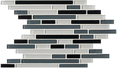
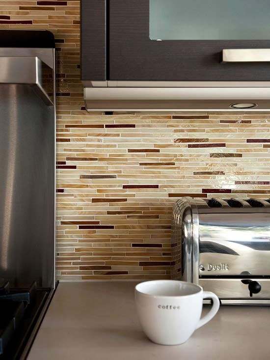
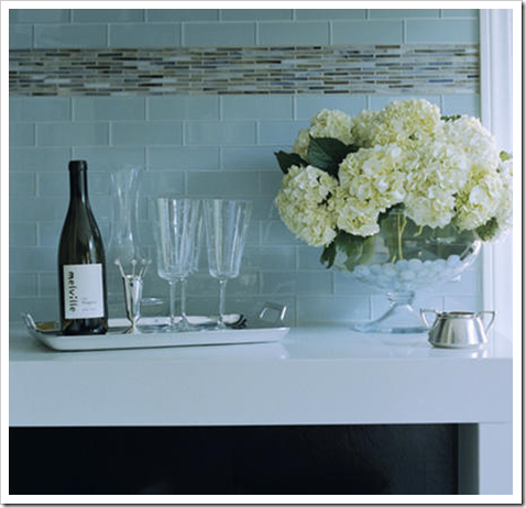
Besides Carrara which is most definitely the hottest thing flying out of tile showrooms and into kitchens and bathrooms across the country right now, I’ve found it; the next trend in backsplash tile, being installed right alongside mosaics. This thin stacked, multi-coloured one:
This tile belongs in a contemporary or modern kitchen period. The end.
Notice the countertops here are pink beige that do not relate to the orange beige and burgundy backsplash tile in any way.
Here is my point. Anything that visually creates such a strong horizontal line belongs in a contemporary kitchen. I have recently started seeing this tile in magazines installed in traditional kitchens and it does not work in my opinion.
“Well”, you might be saying “I love this tile, why don’t I just use it as an ‘accent’ on my kitchen backsplash’ (above) or bathroom (below).
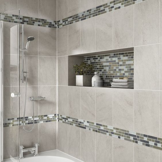
via Pinterest
You could, but will you love it 5 years from now when the trend passes?
That’s the question I always ask, especially when it comes to tile which is not so easy to replace. I still prefer the look of clean.
Like this one. (above)
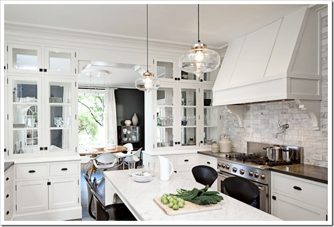
And here’s the Carrara again, in a thin, stacked application. And notice, the kitchen is contemporary. As it should be when it’s cut to create such a strong, horizontal line. This same tile in a traditional kitchen would not be as good.
Again, these are guidelines, obviously there are always exceptions to ‘rules’, however if you are trying to decide between ‘simple’ vs. ‘trendy’ at this moment, consider the style of your kitchen to help you choose.
How do you feel about this trend?
If you would like your home to fill you with happiness every time you walk in, contact me.

I agree – they're just too busy, so with more modern kitchens, which are generally more simple, they fit better.
I love the idea of the Moroccan white tiles – simple color, but unique shape. Perfect marriage!
Well I guess it's safe to say that white will never go out of style and always match your surrounding decor. To me, it's just too safe.
My friend Laurie had some of this backsplash installed in her kitchen. It was very pretty..but very busy. She was wanting to have the grout stained so the white lines would not stand out against the dark colors used. It was very busy..for sure!
I like the idea of a safe route!
xo
Donna @ Comin' Home
Totally agree Maria. Nice helpful post.
I like them… They wouldn't work in our kitchen, because we're going for a country look. If only I could convince Jim to let me paint the cabinets.
I picked white kitchen for the new home we built last year – white shaker cabs, kashmir white granite, and carrara marble (honed) tiles in mosaic pattern for the backsplash. I agonized for weeks trying to visualize our kitchen. WHen it was finally done, I was quite happy.
I hope it will be a very long love affair for me and our kitchen 🙂
Just had the "tile" man over today for a final look at our soon-to-be-installed backsplash. I totally agree: simple, and preferably white. We are going with a just off white 4×8 subway tile. But…the edges have a very slight bevel which makes it just a little unique. And no, I do not want it to be the stand out element in the kitchen, and yes, I want to be happy with it in five, or even ten, years! I'll do a post when it's finished…hopefully in another month!
I alos like the white Morrocan ones. The others would make me aggitaged just getting my first morning coffee.
I like them and was thinking of putting them in my laundry room which has IKEA glass & aluminum cabinets but now that I read this post I think you're right and they will look too busy.
We're doing a lot of horizontal grain veneer doors, so the multi-colour bullets work really well together. I know what you mean about a more traditional kitchen, but in this kitchen I did a while back I think the design of the door is simple enough that it works.
All depends on what else is going on.
I just finished a kitchen with a marble thin stack, it turned out amazing, you can see images here…
http://www.houzz.com/photos/120145/White—Grey-Kitchen-contemporary-kitchen-
It was a more contemporary kitchen with white perimeter cabinets, gray island, and Manhattan marble counters…I love the way it turned out.
For the more modern contemporary kitchens it works. I am using a similar backsplash in an upcoming kitchen but I will be having it laid vertical rather than horizontal. Can't wait to see that one completed as well!
With out next home it is going to be more traditional so I am sticking with a solid slab marble backsplash, I think that will work better with the overall vibe I am going for there.
I have been looking at backsplash tile for what seems like forever. I have been seeing this, but I am not a fan. It looks too contemporary (and temporary) for me!
I have the thin Carrara and bluish white glass backsplash
With Carrara countertops and shaker cabinets. It is breathtaking and everyone who sees it loves it. It feels fresh but still traditional because there is very little contrast like some of the more contemporary ones. There is nothing agitating about it.
mmm I'm not a big fan of trendy decorative tile. I'm SSOOOO drawn to the colors, the sparkle, the variety of textures and shapes, but when push comes to shove I really like simple honest finishes on the wall. Subway, stacked marble, even slate. But start adding patterns and colors and motifs and I'm out. (OK unless we're talking about a Moroccan look and then I'm all over that!!!)
I love the white Moroccan 🙂
I am sure I would be sick of it in about a year so my vote would be for the Carrara marble…see you Thursday…Regards, Carol Ann
I love to look at all these trends in magazines (and blogs!) but feel they are just that…trends or fads..and will not last any distance before being overtaken by another trend and date your house accordingly. I have a simple square white tile with a single line of stainless steel mosaic tiles and have lived and loved this as my splashback for the last seven years. I am happy to live with it for the next few as well. It has been easy on the eye and easy to clean..goes with any accent colour I put with it and looks fresh. What more could you ask for of a splashback!
Pretty, but busy, and yes, it smells really trendy. (Installing it vertically echoes the form of the bamboo plant and goes with a modern zen look.)
We are among the millions with an accent strip of 1" square glass mosaic. Although I still like the tile, the fact that it's an accent just screams, "I'm surrounded by a whole bunch of cheap field tile!"
In the downstairs bath we went with white subway in a horizontal grid, and white hexagon dot. Love the way the monochromatic look shows off the simple shape and texture of the tile.
Nay. It's starting to be done to death, particularly by DIYers. I do like the tile, but generally speaking, not in the kitchen.
Here in the NYC area, seen this for about 2-3 yrs. in high end metro modern condos – just like in your first photo.
I had wanted to do this in my new kitchen so we ordered a board and so glad we did. . . It is imperative to note that these all come on a mesh and when the grout is put in by the installer, it looks terrible since the spacing is too large. The tiles are glossy glass and the grout . . .well . . .dull at best. To get the effect seen in the photos the installer needs to take them off the mesh and minimize the spacing. You may wish to remember this since it adds significantly to the cost. In the end, I decided against the mini random bricks as the overall look was just too busy closeup when working at the kitchen counter. Looks great in photos though. -K
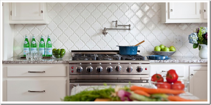
We built in Oct. and we had the"Moroccan tiles"installed.They also come in wh.and off wh.The wh. was way too bright. I've been eying them for a long time and am so happy we spent the extra $. EVERYONE loves them.I have wh. cabinets. It looks classic and clean to us.
I love to look at these but I would never use them, they are way too trendy, even if I had a more contemporary home. I guess it's probably because I have yet to be in my "forever" home, so I always think about resale. Is there such thing as a "forever" home these days?
I really like the carrara, but I wouldn't choose the other ones. Too busy. But, have that said, I think, as all the trends, it will look outdated. The best deal and choice is choose classic designs as subway tiles. That's a better investment. 🙂
Have a Great Day!
xo
Luciane at HomeBunch.com
Post of the Day: A Rustic Modern Barn.
Funny, I first saw this 5 or 6 years ago in a Suzanne Kasler designed bar area. I think it looks a bit 'retro' for me – a look that will be dated in a few years. Suzanne has been great about balancing a fresh, streamlined traditional look without going too retro.
We are doing a slab backsplash in our kitchen, same material as the countertop. We actually have two backsplash areas – one with a sink on a wall (this will be 18" high, under the cabinets, the width of the sink and two cabinets), and one behind the range between two windows – this one is going to have a decorative shape to it, so pretty and classic but soft and peaceful too.
I love that Walker Zanger tile – Arabesque – kind of wanted to use that somewhere, but it is too expensive for the kids bathrooms (doing very simple white subway tile for them), and doesn't fit the look in the master bathroom.
Hey great comments everyone, I'm obviously behind on tile trends but I have never noticed this stacked busy tile as much as the last 6 months so in my world it's new.
Thanks for posting about this very hot trend right now. I love the look of this tile, but every time I see it being used, I think of it as a trend that will look very dated a few years from now. Yes, tile is not the element you want to have to update in the not to distant future. Love your site, by the way. I feel like it's the design blog I learn the most from. I would love to take your class, but for now, I just try to glean as much knowledge as I can from your blog and your great newsletters. Thanks so much.
Oh, I LOVE those white Moroccan tiles. A client of mine used them and they are sooooo fabulous!!! I'm with you – skinny little tiles only in contemporary kitchens. I've used them once, and it was a modern kitchen …
I put a very similar Ann Sacks thin stacked glass tile in my kitchen about 3 years ago after seeing it in a few ads. Its true that my first reaction was 'Oh no; it looks like the circus came to town!' It was so busy and there seemed to be too many colors. In the end, I did grow on me, as I feel like it pulls together a lot of different elements in my kitchen, which is very contemporary. I do dread the day when I wake up and want to change it out- my husband will want to kill me, after what it cost!
Here are the photos
http://nightsinlights.blogspot.com/2008/09/more-tile-photos.html
I like your choice. My backsplash needs something but I cant afford to hire anyone is there anything good looking I could do myself?
I love it, I agree that it looks best in a clean, contemporary kitchen, but I love it. I think of the backsplash as such an easy way to change and update your kitchen that I don't mind something that needs replacing every 5 years.
I agree that the horizontal glass tiles look best with contemporary kitchens/baths. I think they are gorgeous, but my house isn't modern. I'm dreaming of installing the carrera tiles in my master bath. Love them the most!
I will have a mosaic of white glass tile….in my kitchen.
I love it – trend or not, I guess one has to love it….
I love clean back splashes….one color – or a mix of shine and matte.
pve
The trend isn't for me. I think it's too busy and would look dated before the grout dried. I think it could look appropriate in a certain style of house but not in my 1930 traditional.
The thin stacked tile is so fresh and great, as you said, for a more contemporary look. I just recommended it for a bathroom behind the vanity. Your are also right on that it does not mix well with other tiles as an accent strip. I however am considering it as a strip around the shower in the same bathroom as a tie in to the vanity backsplash. Done carefully it can work. I think it is a stunning look but since I prefer a more old world look for my kitchen, I can't use it for myself. But that does not stop me recommending it.
Ms Givens – You can tile. It requires patience and a bit of skill.
Thank you for your comment, Maria.
I really like to read your comments… they're always interesting! 🙂
Have a wonderful day, sweetie.
xo
Luciane at HomeBunch.com
No, No, No!!! Plain tiles or if you want a more contemporary look a sheet of glass – there is no more to be said. Talk about opinionated – that's me!!…B:)
I've narrowed my possible backsplash choices so much by now that glass over bland paint is sounding good.
I don't want to walk in the kitchen in the early morning, look at the stove area and suddenly think "why, why, why?"
Love your blog, and I couldn't believe my eyes today! That's MY kitchen with the Beveled Arabesque Tiles! I absolutely love it and the way it shimmers when the under cabinet lights are on is amazing! I just can't believe you, Maria, like my backsplash! xo
Now that you mention it, our personal experience completely agrees with your advise.
In our first home, the kitchen had beige tile with beige,pink and blue flowered accent tiles (think 1980s!). The first thing we did when we moved it was to demo that wall and install white square tiles (I had never heard of subway tiles back in 2000).
In our second, much older home, we had white tile with black trim from the 1960s. While I don't love it, I knew I could work with them(and concentrate on the rest of the house). We still have these tiles 6 years later and they look fine. Sure I'd love to change them, but it's just not the most pressing project right now. I'll know in the future to keep it simple for a lasting project.
Great advise. Thanks!
Maria,
I agree that this tile should be used in modern spaces because those spaces need something to draw you in. They are great in expansive spaces with lots of light to guide your eyes and I find they are great to visit but not to live with.
Bette
Interesting. I like it in the right room. But will it ever date the place it is used. I go for a more timeless look for my surroundings. You are so right about using it with a more contempary room.
Another great post.
lovely write up.
I give the trend as a whole a nay. They are simply too specific to work with multiple kitchen styles. But that's more my personal taste talking.
Agreed. While I really like the trend of the glass tiles in squares, the stacked horizontal ones are too contemporary for me. Great point!
agreed on the clean look of the white morrocanesque tiles. i am not a fan of the thin and stacked – too contemporary.
Yikes. I just installed this tile as an accent along with beige colored walker zanger subway tile. My kitchen is more contemporary, however. Hope I didn't totally screw up. But I love it. It adds some color and drama in an otherwise bland space, I think. Personally, I think some of these higher end materials look out of place in most homes. Carrera would have been way too hoity toity for my simple suburban house.
Kitchen are the most expensive renovation, usually, so I would stay away from trends. As you said a simple treatment goes a long way. Carrara marble is timeless, so is travertine.
I fully agree with you! Traditional kitchens are lost with such contemporary backsplash tile options. Yes in a modern kitchen! It's a great look! But I would go always with subway tiles to make it now in a traditional kitchen.
Maria– The white Moroccan tiles are gorgeous! That's a kitchen that will look great for years to come!
Loretta
Not into the "trendy" option, but that white Moroccan (?) tile is to die for. To. Die. For.
At Mission Stone & Tile we offer the Beveled Arabesque, Carrara, and many glass tile options! We thank you for posting our images of the beautiful Beveled Arabesque, which is available in White and Ivory.
I don't go for trendy because as you stated, what happens when it's out in 5 years or one grows out of love with it? Clean lines are best!
Melissa @ Veranda Interiors:
That kitchen you posted is fabulous. I love the backsplash!
LeeAnn
I have always liked the idea of white tiles. They always make the place look neat and clean.
I guess I'm an outlier…we just redid our Boston 1840's brick townhouse and went with a "west coast modern", we used 1×6 glass tiles in our kitchen in shades of red, carmel, ivory, chocolate, and butterscotch. We have dark wood cabinetry on the lowers and a floating glass ivory upper cabinet
(from Pedini, and we love, love, love it! The kitchen is bright and open with lots of windows. And yes, this is our forever kitchen!
I wonder whether the moroccan tiles are trendy. I recently put them in my kitchen and (of course) it seems like I'm seeing them everywhere all of a sudden.
Hi Anonymous,
I think they are trendy but they are WHITE. Which will be way easier to live with than any other colour when you decide to change the walls which at least won't be dictated by the backsplash tile.
Thanks for your comment.
Maria
We did a glass mosaic 1"x 2" I think it looks great. I also
Am not too worried about changing it out when I want a new look. If you do the demo yourself, you can definitely
Reduce the cost.
I have always loved that kitchen with the white shapely tiles – do you know where to get those. It is so hard to find pretty tile. I am putting in statuary marble and I don’t want it on the walls. I want to find a nice tile that will stand the test of time (: Your new site looks fantastic! ~Page
Page, the kitchen with the arabesque tiles is mine. (well, for now at least–the house is for sale). They are from Mission Stone & Tile in Nashville, TN. http://www.missionstonetile.com
As for glass tile, don’t make the mistake I did. Picked out a beautiful amber tile for a backsplash of our Absolute Black granite (with the gold specs in it) and white cabinets. Tile looked beautiful (on the board) in the space. Saw no problems then…
Tile was then laid but I stopped the grout being put in because I saw that the light of the tile was bouncing around in the southern-western exposure and there was an intense pink/purple iridescence thing going on. Bubble gum effect must have been IN the tile itself and only seen when a large area was laid. Three years later still trying to consider yanking out the expensive investment and starting over or trying to play up the amber and mute everything else.
We are stumped. So….
Be careful with some glass tile.
Hi I just love the clear glass pendanta in the decopad picture and spent literally all day trying to find them. Can you please HELP! Where can I find these?
Thanks soo much!
I love the Carrera stone coloured backsplash. Absolutely amazing. The kitchen is beautiful too.
I’m remodeling my kitchen now and wondering what to do about the backsplash. I have glass mosaic accent tiles in the master bath and I am already starting to tire of them after a few years. Still, I like mosaics in general.
White enamel tile in any shape reminds me of 1980s builder-grade bathrooms.