I have a confession. Lately I’ve been feeling like a one-trick pony. Because I’m specifying the same grays over and over and over.
Thank goodness I know better.

Shaker Beige (source)
Because here’s the thing. When the brown trend was here, it was the same, “Oh, you have an espresso brown sofa, brown floors, and you want a neutral?” It was Shaker Beige, or Stonehouse or Wild Mushroom.
When I first started working at a paint store years ago, there was a very experienced colour consultant who seemed to specify the same colours over and over and I secretly thought, “You must only know 10 colours.”
Then the more experience I gathered the more I realized that 80% of the time we specify 20% of the colours. Especially when it comes to neutrals.

Now that the gray trend is here, we’re all buying the same furniture aren’t we?
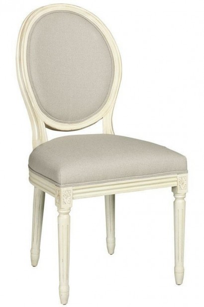
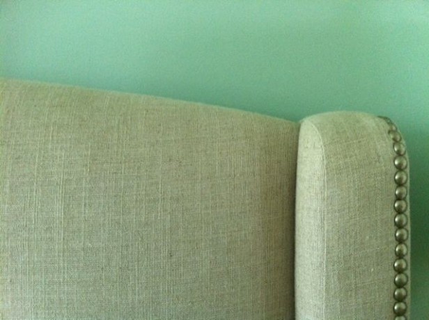
If you buy a French chair or an upholstered bed in linen, it’s got a slight pink undertone like most plain linen does. So then BM Muslin is the solution. Now that I’ve painted my bedroom turquoise, the pink in my upholstered linen bed is more noticeable (below) than my last house when the walls matched the bed.

Photo by Maria Killam
And it kinda bugs me.
Not enough to re-paint the room (but if I was so inspired, I’d paint it Muslin) I am loving the turquoise, I think blue really comes to life in master bedrooms. But of course I notice every nuance–always.
So here’s how you know if you truly are a one trick pony designer (maybe):
1. If you have a small selection of go-to colours that you use over and over and over no matter what the situation.
I once led a workshop where a participant said she used to work for a designer who only ever specified Muslin. Doesn’t matter what the client asked for, all colours came back around to Muslin.
2. If you walk into a client’s home and know when you should specify a blue-gray vs. a green-gray vs. a purple-gray vs. a colour. Now you are a designer who understands undertones.
Bottom line: Do not make the mistake of thinking “I’m bored, I’m going to specify _____ colour because I haven’t seen it up yet”. You will regret it because it will not be as perfect as the colour you already know is as right as rain.
Related posts:
The Difference Between an Experienced Colourist and a Novice
What Everyone Should Know about Gray
Does Your Colour Consultant Understand Beige?
Download my eBook, How to Choose Paint Colours – It’s All in the Undertones, to get colour to do what you want.
If you would like your home to fill you with happiness every time you walk in, contact me.
To make sure the undertones in your home are right, get some large samples!
If you would like to learn to how choose the right colours for your home or for your clients, become a True Colour Expert.


Great post, Maria. My analogy is that I’ve stopped experimenting on dinner guests. Instead of always trying a new receipe (with some undesirable results) I’m sticking with the tried and true.
maria, I remember thinking the same thing when taupe was the go-to wall color. I did almost an entire street and kept trying to give each person a different taupe and then I realized certain taupe’s would work no matter what. It was less fun and less challenging, but the homeowners got what they wanted and the best possible taupe for their situation.
If I were still consulting I am sure I would be on the gray train too!
Kathysue
There are so many paint colors out there that I think having a tried and true set of grays (or beiges or whites) makes life a whole lot easier. I am also slowly gathering a set of blues that I really love since they’re so nice for bedrooms and bathrooms.
Wow. I love that blue. I ended up using SW Quietude. It is great. It reads blue, green and gray. I was too chicken to do a pure turquoise. Now I wish that I had.
So, um. Er. Are you going to post a picture of your bedroom? My bed is very similar and I would love to
copysee your ideas.Hi Micki,
It’ll be a while before I post a photo of my bedroom because we’ve just moved in and it needs drapery, carpet, etc. This is my bedroom with the same bed in the townhouse we just moved from: https://mariakillam.com/2012/04/marias-master-bedroom-before-after.html
Thanks for your comment. Maria
If you are a one trick pony designer, the colors your using are beautiful Maria! Is gray the new trend? I really don’t like gray in a house… I saw a designer show house on another blog yesterday and all of the gray was so cold and death like. Say it isn’t so!
Maria, I think the linen headboard looks great with the turquoise colour – it seems to be just enough of a contrast. I’ll be the first to admit I don’t have your eye for colour so if you ever re-paint you have to give us a ‘before’ and ‘after’ shot.
Louise
of course I love your bedroom color! mine is turquoise also….
Annoying isn’t it? That’s like the “Color Consultants” in the paint stores CONSTANTLY suggest, Mannered Gold, Kilim Beige, Believable Buff, Ivoire etc, because they are super safe, go with most decors and granites but are horribly boring and dated. I did a post on them called the ‘Model Home’ colors. However, there are some go to colors that are just that good and that’s why they are used so often, but seriously, open the paint deck a bit more.
Maria:
Where can I purchase a French chair just like the one that you show in this article?
Please, let me know.
Hi Casilda,
Well I just found this image from the web but similar chairs are everywhere including Restoration Hardware for a good price.
Maria
Michele, I believe what Maria has said about using gray is that you must use pops of color to bring it to life. Gray begs for color accents, that sort of thing. I hope Maria will comment on this. Am I remembering correctly?
Hi Cherie & Michele,
Grays that read cold are usually blue grays which I rarely specify because it’s like painting your entire house blue which is too cool in general.
And yes, gray is a great backdrop for colour but it dies if there isn’t enough.
Maria
Hi Maria
I have a group of “go-to” colours depending on the undertones of whatever is in a clients house. But sometimes a client will specify “a colour” (hopefully never pink unless it’s a little girls room) and that is what I have to give them. Most clients though in the Greater Toronto Area seem to be drawn to the neutrals. Us Ontarians are boring and conservative people. I recently did a colour consult for a young couple and tried to create some harmony when walking from room to room. However when I went back to pick something up that I had forgotten she invited me in to show me how the house looked, I realized she hadn’t painted the livingroom/dining room the specified colour. Of course, not being able to keep my mouth shut I asked her why she painted the room this awful goldy beige (I didn’t use those words) she said they “liked it in a friends house”. All I could say was “oh” but that’s not was I was thinking. The old adage always seems to ring true “you can lead a horse to water, but you can’t make him drink it” Just hope she doesn’t tell anyone I picked this colour palette for her.
Susan
What is the Color of turquois you used in your bedroom. I am thinking about painting my office that color with black accents.
Great Post!
Thanks!
Beth
Great thoughts about color, Maria and all. Had to laugh when Donna mentioned Kilim Beige — the go-to color for “updated” Sun City West houses (built in the ’90s) with their pickled oak/pinky beige cabinets. Everything I read said Kilim Beige had a pink undertone but every house that used it looked off to me as did my own when I put up a large sample next to my kitchen cabinets — it looked greenish to me (which I actually liked) but it just didn’t click with the cabinets. Maybe it had to do with the high (9 and 10 foot) ceilings, lots of windows including numerous clerestory windows and all the light that came in, even if not direct sunlight. I’m sure good designers have their “go-to” list of colors because they work, but Donna’s idea about scanning the paint decks periodically to find new colors to add to the “go-to” list sounds like a good idea. And Donna, all that Kilim Beige in Sun City West probably stemmed from the first time the self-educated color consultant at Sherwin Williams suggested that color in the paint store absent anything except a request for “the right beige”. Aaaargh!
Maria, I truly enjoy your honesty,I live in a mid size town, 10-15 years ago when everything was “the hunt club” decor, a very popular designer was used by several of my friends, thank god they all were not friends, because every house I walked into had the same exact wallpaper or paint, but either a wide striped burgundy, or wide striped Hunter green foyer-the powder rooms,kitchens,living rooms all had exactly the same motif, but different colors-it was a bit spooky-they paid a lot of money for their”custom designs”-Its hard work and takes a lot of talent to be a designer,but designers
beware-they are really small towns after all!
Hi Maria,
Thank you for the wealth of information you put in your blog, and some fun too! I design custom wedding invitations and there are always 2 main colors each season…by the end of the season I’m so over the color!! {ruby purple and gold leaf this year and lavender and blush pink last year} Color trends come and go {thankfully burgundy and pink went quick!!}
That’s really interesting that wedding colours go through those kinds of specific trends. When I see a wedding party in chocolate brown and blue I see that someone was in love with the brown trend (which is totally fine) but interesting that a specific combination like Lavender and pink would also make the rounds. Thanks for your comment! Maria