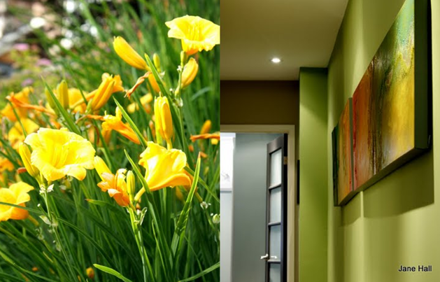
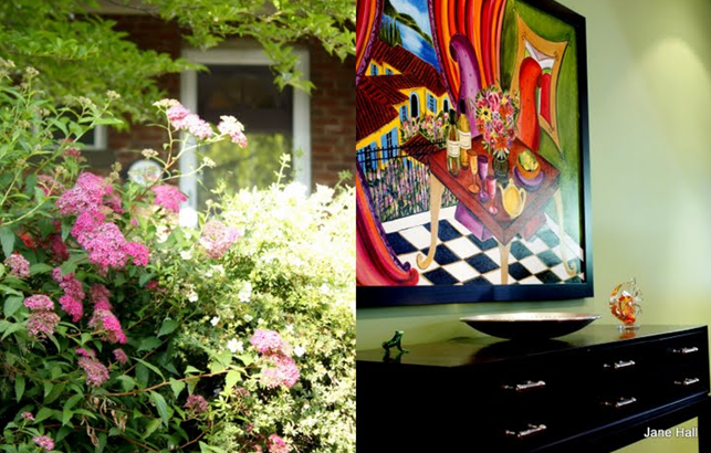
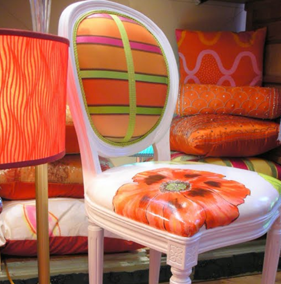
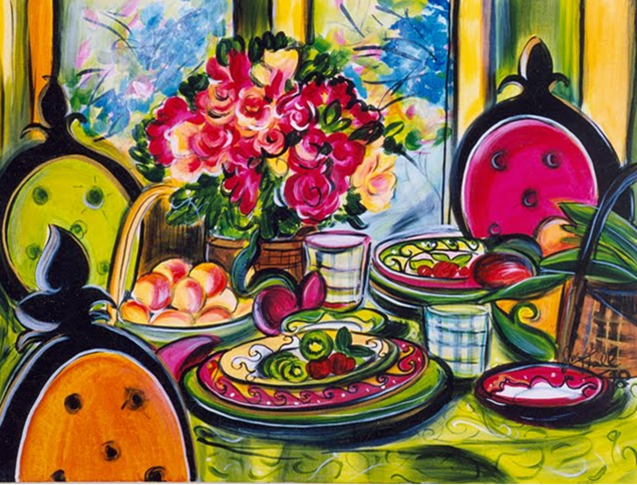
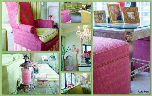
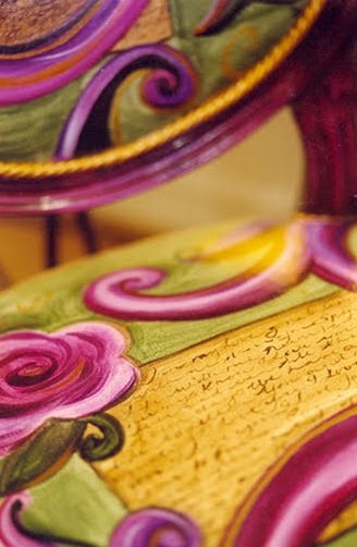
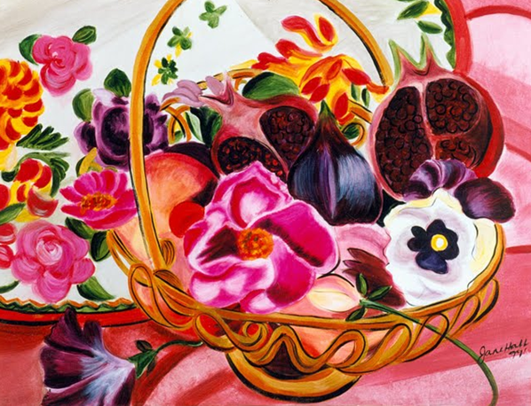
I am delighted to introduce my latest colour expert interview with Jane Hall. Jane has a wonderful store in Toronto full of colourful fabrics, furniture and accessories, she is The Voice of Style and her website is filled with the most fabulous colour to drench your home with personality! And her talent extends to art as well (all images below from Jane Hall Design):
[JH] I adore spring green. The arrival of spring seems like a miracle, as almost overnight the landscape changes like a moth into a butterfly….. from a grey environment to one filled with life and growth. The new leaves are the perfect shade of yellow green, the tulips are in bloom, the blossoms on flowering trees are bursting, but this stage is fleeting. It is only this fresh for a few short weeks and I love it. Spring green, the colour of nature really is the “neutral”. Green goes with everything…. look at a garden in bloom does it clash? Is it too much? Has mother nature made a mistake? How can these colours not make you feel good?
Think for a moment about how you feel on a grey, cold November day and how you feel on the first day that spring firmly takes hold. That is what painting your rooms the right colour can do for your sense of well being. It transforms your sprit from the way you feel during those long days in February to how you feel during the first weeks of May.
If I could banish a colour from a paint deck, it would be any “beige” that has a pink undertone to it. It just says blah!
[MK] What was your biggest colour/design mistake?
[JH] This is a tough question to answer! I sat all day trying to remember jobs where the client was unhappy with the end results. I have made mistakes in execution with a wrong measurement, or an incorrect order of fabric but not with my design choices. I believe this is because I have worked in the field for over 30 years, and experience is everything!
As an artist who mixes colour, I actually started dyeing cloth 40 years ago and then moved to using paint on canvas fabric, jewellery and furniture. This gives me an understanding of colour undertones, what is warm, what is cool, what is value and what colours look good together. My art is available to view on my website.
[MK] What is the most important colour lesson you’ve learned?
[JH] Colour has the ability to transform people’s lives. I have been able to make people’s lives better by surrounding them with colours that feed them emotionally. It is not just about how your house looks; it is also about how it feels. In my store, I have people come in every day and say that all of the colours that they see in here make them feel better, put a smile on their face, take them to some other place in the world that is exotic, or back to their childhoods when life wasn’t so restrained.
So it touches them in some way that is very profound.
[MK] When it comes to colour, what’s hot? Which one do you think it timeless and which colour trend would you love to see disappear?
[JH] I am not a big believer in what’s hot and what’s not. I do understand that it makes it easier for manufacturers to produce product for the upcoming season but I don’t think these rules should apply to choosing the colour of your walls. This is a much more personal statement which will be with you for a long time, much longer than the newest colours in towels, vases, linens and accessories. If you like the colour lavender, then it is in! I am personally very tired of neutral interiors and believe that people really do want colour but they just don’t know how to get it.
During public speaking engagements at home shows, I used to poll the audience about how many of them liked colour. Eighty percent of the hands would go up. When I asked how many of them had colour, only 20% would raise their hands. Neutrals are the colours people choose because often they don’t know how to select the right colour.
[MK] What do you think is one of the biggest mistakes homeowners make with colour?
[JH] I believe the number one mistake people make when choosing paint is picking a colour that is too light from a colour strip that shows a colour from the lightest to darkest value. Most of the time the consumer will choose the lighter colour believing that the others will be too dark. When they get it on the wall they say, “That’s not the colour I picked.” Unfortunately, it is the colour they picked; it’s just not the colour they wanted. On a small paint chip the colour is saturated and surrounded by white, and every time a paint chip gets bigger, it gets lighter.
As an expert I do not pick colour this way. When I go to clients’ homes I take a paint chip that’s 8 x12 inches, which allows them to see what the colour will actually look like. I highly recommend using a large paint chip (many companies do have them) or buying a tester or a quart and putting it on the walls. A colour will look different on every wall, different at various times of the day, and different as the seasons change.
[MK] What are the 5 things in life you cannot live without?
[JH] Of course the absolute given would be my children and my wonderful granddaughter who at 5 years knew the difference between a pastel yellow green and blue green!
1) My work, which is really my play….. I feel blessed to be able to get up every day and do something I am totally passionate about.
2) My SLR Camera
3) Anything that sparkles and shines… antique crystal chandeliers, beaded trim and fabric, cut glass, disco balls.
4) Music. It feed my soul and fires my neutrons, keeping my mind ever active and forever curious…
5) FABRIC, FABRIC, FABRIC and more fabric. Fabric is perfect as it has COLOUR and TEXTURE. It adds to a decor like nothing else can. Fabric over the windows, at the doors, across the bed, on the furniture. Glorious silks, luscious velvets, complex woven’s; I love them all.
[MK] Why is the use of colour so important in design?
[JH] Color is critical to design because like sound, it travels on waves and therefore affects our subconscious in a very profound way. It helps clients take emotional possession of their homes, and infuse them with their own personalities, instead of the latest trends in the magazines, or their neighbours’ taste or the previous owners’ style.
Many people move in their homes with boxes but never arrive emotionally.



Fabulous interview 🙂 I loved reading Jane's answers to your questions — they're so interesting and informative.
Now I have to go check her web site 🙂
Kelly
Thanks Maria… I love that you have joined the colour revolution. Lets all step outside that can of beige paint into a can of, lilac, or fuschia or grape and be nonconformists. Be sure to check out my philosophy about colour on my site and sign in to receive my monthly newsletters.
Thank you for introducing us to Jane. I haven't been to the Beaches in a while so now I just have to go and check out Jane's store. I love the Flirt palette and the gorgeous drapes – just gorgeous!
This is so great to read! I have been reading some design blogs that are very biased (or it seems to me) on neutrals….while I am extremely partial to bright clean colors! I LOVE color overall, and I love to read about the perspective of one who studies color for a living! I really appreciate her perspective.
You are welcome to see how I have infused colors into our life at home…here! =)
Thanks Maria. Your blog is pretty and instructional.
Hi Rachel, I looked at your photo's and really liked that you used black and white with colour, fabric, cut glass, chandeliers. This months newsletter was about Paris Style and your place reminded me of that. This fall's collection in my store is built around the idea of using black and white with colour.It is a classic colour combination and works with any colour (except beige!) as an accent. Check out the looks on my What's New section on my website.
"I adore spring green. The arrival of spring seems like a miracle, as almost overnight the landscape changes like a moth into a butterfly."
Hilarious post! Unintentionally, but still….
The pictures on this post are so colorful. I agree . . my slr camera is one of my favorite things.
She can come and drench my home in personality anyday!
Great interview, Maria! Jane is wonderful! I will be visiting her website after leaving this comment. I find that I am in total agreement with what she has said here, from banishing the beige with pink undertones to bringing the larger paint chips to a client {I always order the 8×11 size for my clients}. I love her art ~ the colors are wonderful, and I also love that one chair in the pink and green; those are my favorite colors together.
Maria, I'm in love! I love color! I love colors! I had no idea that there's really so much of an industy revolving around color. Maybe that sounds silly, but I've spent my life using my logical, scientific mind. But in recent years the logic and science of color have begun to facinate me. Color theory…I never knew, now I do. I'm looking into more, doing it, really doing it! I can use my scientific logical side with my creative crazy side! Who knew. Thanks for doing what you do, these interviews are great! 🙂
Hi Sedona, Did you know that that they actually use a particular shade of pink in prisons to calm the prisoners down. Blue is an appetite suppresent,red represents passion or danger, purple royaly or healing. There is a whole science to colour which is why I don't understand why its not incorporated more in institutional setting. Wouldn't it be great if our children's classrooms were painted colours that stimulated their imagination, or workers had a say in the colours their offices were painted, so that they could be more productive. Beige does not even exist on the colour wheel!
Great interview, wonderful artwork, love all the colour…pinky beige walls and carpet should be outlawed, would make my life easier…
Regards, Carol Ann
PS working on starting a collection of large painted boards to help clients with paint selection
The only thing you can put with a pinky beige carpet is some shade of green.I agree that colour of carpet just banished from the planet it's just a travisty to design!
Jane is a breath of fresh air. Ahhhhhh! Loved her answers. I found myself just sitting here nodding my head as I read answer after answer!
"Prison Pink" is also known as Baker Miller Pink. It looks quite similar to Benjamin Moore's Deco Rose or ICI Dulux's Strawberry Crunch.
Hi Funcolours. I love being a nonconformist and thinking outside the box. I wrote about it in my August newsletter titled How did we Morph Into the Beige Generation?
http://www.janehalldesign.com/pages.aspx?pageid=681
Great interview! I especially liked her answer to the final question, about how color affects our subconscious and how it infuses homes with the owners' personalities. All so true and eloquently stated!
Wow these images really use colour to celebrate life! Everyday should be filled with colour!
Cool, thanks for the link! The beige generation indeed. I'm off to check out the newsletter.
Lori
funcolors
Hi Dale
I am starting a colour revolution as I don't understand why people want to live inside a dead mushroom ! When there are so many colours in the rainbow why does everybody have to choose the same one????? To all Maria's wonderful followers out there lets banish beige and its new twin sister gray form the paint deck.
I arrived home tonight shocked to see 20 comments when I just posted this before I left for dinner tonight!
Jane, so fun to see you chatting with my readers!
Love it!
Maria
* Dear Maria & Jane~ How delightful to read your thoughts, Jane! I ESPECIALLY loved your last sentence~~~ wonderfully and oh-so-accurately stated!!!
As the wife of a NOW (as in "FINALLY"! Smiles!) retired Army officer, we moved 27 or 28 times in his 38 years of service, living all over America & spending approx 18 years living in Germany, 2 years in Vienna, Austria and even 2 years in the Middle East. I REALLY E*N*J*O*Y*E*D, & even LOOKED FORWARD to creating a new home in each & every place, as did some other wives… I would tho, occassionally run into one of your "box" people and it would always make me feel soooo SAD~ for the woman AND her family!!!
The BRIGHTEST & MOST HAPPY SPACE in OUR home has always been the door my darling hubby & dog, after a little "training/hunting exercise", come thru at the end of their beautiful "bonding/play/teaching time" together! Then "I" am the recipient of their joy!!!
Delightful blog today~~~ Sincere thanks to you BOTH!!!
Blessings,
Linda in AZ *
Maria and Jane, thank you for doing so much to opening people's eyes to color. I have a fashion background and have always loved color. I think people are just realizing how powerful it is. The photos are beautiful! I look forward to looking around Jane's website.
Love the living-in-a-mushroom metaphor. And each word of the post.
Interesting about spring green filling our spirit & nurturing our senses.
Trees nurture themselves by letting go of their leaves, enriching the soil. Leaf color in fall, reds-oranges-yellows, are a leaf's true colors. Green is their photosynthetic color.
As fall approaches leaves stop photosynthetic activity, unfurling their true colors. Hence the slow motion of color changes.
A bit of gray is needed in a garden to bring out all the shades of green, intensifying them.
I adore the moments, mere seconds, of chiaroscuro in a landscape. Magic. All the colors taken to black/white.
Garden & Be Well, XO Tara
I browsed Jane's website and her artwork is absolutely wonderful and her upholstery designs are such a delight.
Enjoyed the interview as well Maria. -Brenda-
Another great interview, Maria. I too am a fan of Jane so it was fun to read her responses. I love her statement about taking emotional possession of our home. So very true and well said.
What a great interview loaded with passion and colour, of course! I love Jane's artwork, the colours and styles just smack of feeling good at home. The last line about moving in boxes yet not moving in emotionally is so true.
Amazing answers. I am so pleased to read such a refreshing take on color…and Jane, I love that you call it a "color philosophy" – because that's what it is. A whole new perspective, a whole new way of thinking about color. And it shines through that you truly care about the well-being of your clients. That's really beautiful. Thank you!
It was wonderful to meet a talented Canadian who obviously adores colour! I always thought Chartreuse was the best colour, yet I could never get a client to try it. Maybe I should have called it spring Green and that might have worked-lol! Lovely interview and I shall visit her website.
Well, one of my signatures is colour. I cannot live without a splash of colour. And whoever requires my interior design services knows we'll have colour everywhere…
In a few things, I have the same opinion as Jane Hall, but still, I've learnt so much with this interview… specially finding words to express what I feel about it.
Thank you 🙂
Wonderful interview! It really is amazing how our society has almost been taught to be scared of colour. There are so many other colours then beige, we don't need it. Loved her answers and can't wait to check our her site. Thanks Maria!
oh… forgot to say: fantastic collection of photographs to illustrate such interview.
Unfortunately our schools are not teaching students to think outside the box and take chances. What is coming out of the schools are cookie cutter designers. I once had a co-op student go on to a community college where she had marks deducted for using lime green in a child's room! As a result designers are not confident in using colour and clients are often talked out of using colour by the designer, the fellow at the paint store, the TV shows and the magazines. Colour is being erased from our consciousness. Let's all work together to save colour!
Jane – you are singing my song! You are so right. We have so much fear of using color. Check out my blog on this topic, if you are interested: http://www.artestyling.com/Arte_Styling_Website/Blog_/Entries/2008/11/4_The_Fear_of_Color.html
Thanks, Maria, for sharing your wonderful find. I've also linked to your blog entry today. I'm just so impressed with this Q&A!!
Maria, thanks so much for sharing Jane's work with us. I can't wait to intoduce my clients to her art. Thank God for you Maria.
Hi Kelly, I checked out the link and absolutely loved the Danger Conformity Zone. I say its someone like the dreaded Borg on Star Trek we must assimilate. The whole staging trend has made it worse. If I see that same chocolate brown couch, bowl of lemons and candles lined up in a perfect row I am going to tear my hair out! Every home now looks like a model home where which has no personality.
Just wanted to let you both (Maria and Jane) know that I was so inspired I made a little post linking to both of you today. =)
Hi Jane,
Amen to your comment on the brown!! It's just too much!!
Maria
Hi Maria, While we are on brown which as a colour I like done with my favorite spring green, or hot pink, terra cotta, turquoise anything but light blue. I did that look in 2002 and I am sooo over it. It keeps the costs of manufacturing down because they only have to use one colour of dye!
That's why I love to pop over here to Colour Me Happy on a regular basis.
I don't always comment, I know, I know, I'm a free grazer and shame on me! But I think the signature M.K. styling is above and beyond just a bowl of lemons or green apples and I love to see what she is doing.
This is a fabulous interview. She is so talented. Love her paintings. wow.
xo,
cristin
jane, i firmly agree… can we please throw the flesh tone beige colors out…immediately?? who uses them? and there are so many of them?? brilliant interview… and maria… lovely blog… i am truly intoxicated with color …so nice to find others obsessed as well!
hope you all had a lovely weekend… x pam
Hi Red Ticking, Unfortunately about 90% of the population uses some form of sand, parchment, mouse, pebble, brown bag, and all those other names for what is essentially the same thing BEIGE!!!! I know that gray is coming up behind, and how many names are there for gray. All I can think of are Grey November days, London fog, seasonal effective disorder, mens suits and conservatism, In addition there are very few colours you can use as accents to gray. Red, black, white, purple, and maybe a deep teal but forget any warmth!
Thank you SO much for introducing me to Jane Hall! I LOVE her website and will be visiting her store soon! 🙂
Lovely and interesting. I learned a lot. Thanks, Maria, and keep up the good work. Your blog looks, and IS, so fab. xo