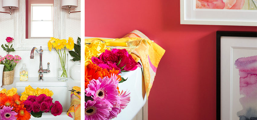
When I started planning my bathroom renovations, what I kept in the back of my mind was this presentation by the Co-founder of Waterworks, Barbara Sallick which I posted about five years ago.
Barbara says the best baths happen when you set out to create a total experience. You have to design in the experience, you can’t just buy the perfect bath, you have to create it personally and tastefully.
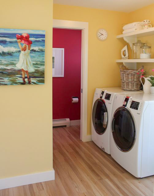
Laundry room with the adjoining raspberry powder room
Our powder room is located close to the back door of our rancher just past the laundry room (above). When we first bought the house, I remember thinking what a bad location that was, however, I quickly changed my mind after we decided there wasn’t enough room to install a small powder room in the studio located in the backyard.
Now, anytime a client or anyone working in the office needs to use the facilities, it’s a short few steps from the back door, no one has to traipse through the entire house to use the restroom.
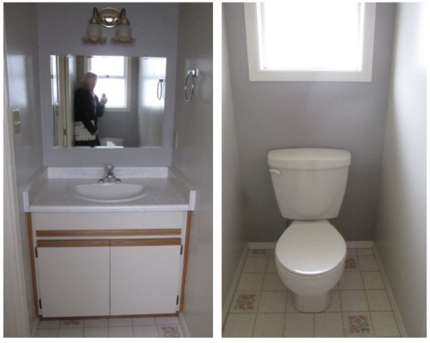
Before
The current 80s sink (above) was totally inadequate for hand-washing clothes for example, as this sink also had to function as our laundry sink.
Also, anytime I have cut flowers to put away (which is often), I’m totally in Terreeia’s way if she’s in the kitchen preparing food. However, obviously, the existing sink couldn’t fit even the most basic of vases. It would also be nice if I could fill a watering can or pail while working in the garden.
So this bathroom needed to function as a powder/laundry and garden room.
When I posted about this dilemma three years ago, one of my lovely readers posted a link in the comments to this vanity from the Pottery Barn:
By the way, if you are not someone who reads the comments on this blog, you are missing out on half the post. The comments are always filled with great links and awesome advice that move the conversation forward. I truly love and appreciate all of you, thank you so much!
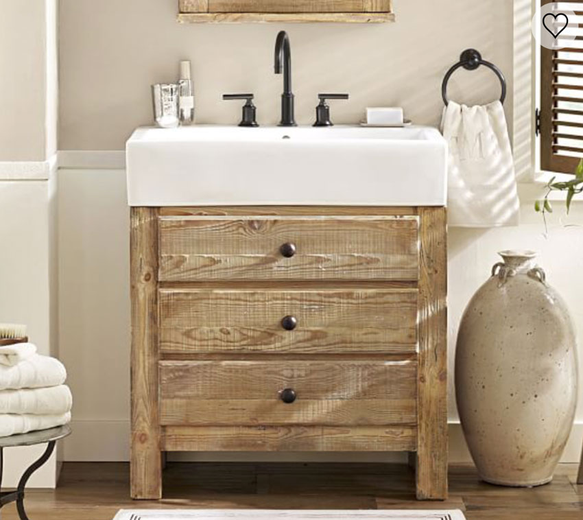
A farmhouse sink with a gooseneck faucet was definitely the solution for this bathroom.
We had enough space for a square farmhouse sink and 8″ of counter space to go all around the sink.
I’ve always loved the look of penny tile so I had the entire back wall tiled in it.
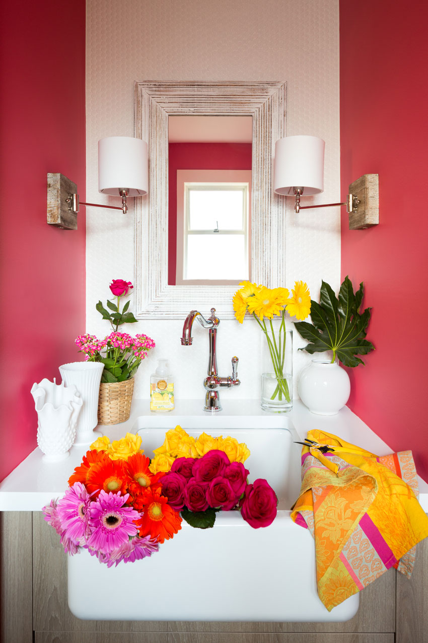
after (Custom cabinets by Quality Cabinet in North Vancouver)
The vanity has two drawers in a rustic, reclaimed oak finish which is darker than my light wood floors.
Notice that my countertops and backsplash are white. This gives me all kinds of freedom to change the colour of this bathroom anytime I want. The wood stained vanity will not dictate colour changes so there’s nothing wrong with introducing a wood stained vanity in your bathrooms. It will simply add contrast.
I found the distressed, whitewashed mirror from HomeSense.
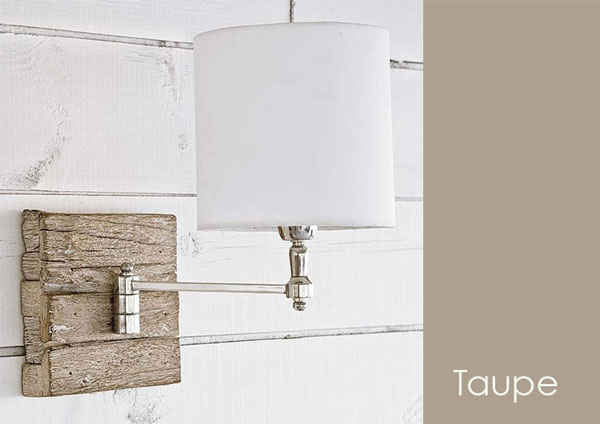
My favourite decorative item is the swing arm sconces. I love the way the backplates pick up the garden, rustic vibe of this bathroom.
The undertone of the wood finish on my vanity reads taupe. And you can see that the overall read of the stain on this wood plate (below) is also taupe. Which means, I was 95% sure it would coordinate well and when it arrived, I was happy that it most certainly did.
Related post: The Best White Bathrooms
How many times have you stopped yourself from buying something because you’re not sure it will be the right colour? On the 3rd day of my Specify Colour with Confidence workshop, you’ll discover how to shop and specify items on-line.
When you learn the 9 neutral undertones in my system, you’ll be able to add this lucrative service to your design business. Or if you are a colour enthusiast, it’ll give you the confidence to be able to shop for your own home.
The existing colour was a raspberry shade to relate to the raspberry drapes in my living room. But I wanted something different so I started looking for wallpaper. Shopping for my own home takes time, however, because I need to turn over every stone so I haven’t found it yet.
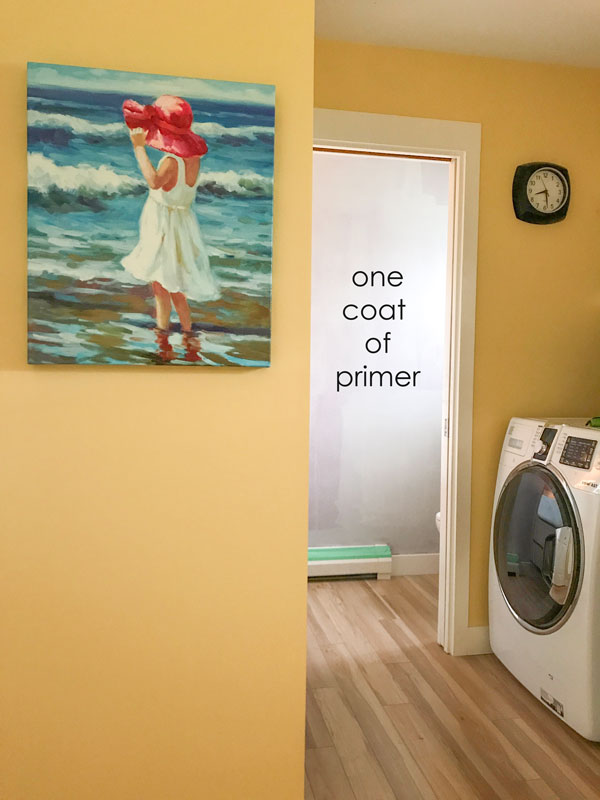
In the meantime, I told my painter to paint it white. But I didn’t like that at all (below). You can see the powder room through three rooms in my house. When you walk into the family room, you look through the kitchen and the laundry room into the powder room, and in one coat of primer, it just disappeared and looked completely unfinished so then I chose a lighter shade of pink.
But the lighter shade of pink was still too close to the old raspberry shade, so a few days before my painter was due to come back and finish the job, I added orange colourant to the gallon to make it more coral:
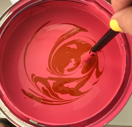
It’s not a massive tweak from the pink, it’s even more accurate in the close ups so keep scrolling.
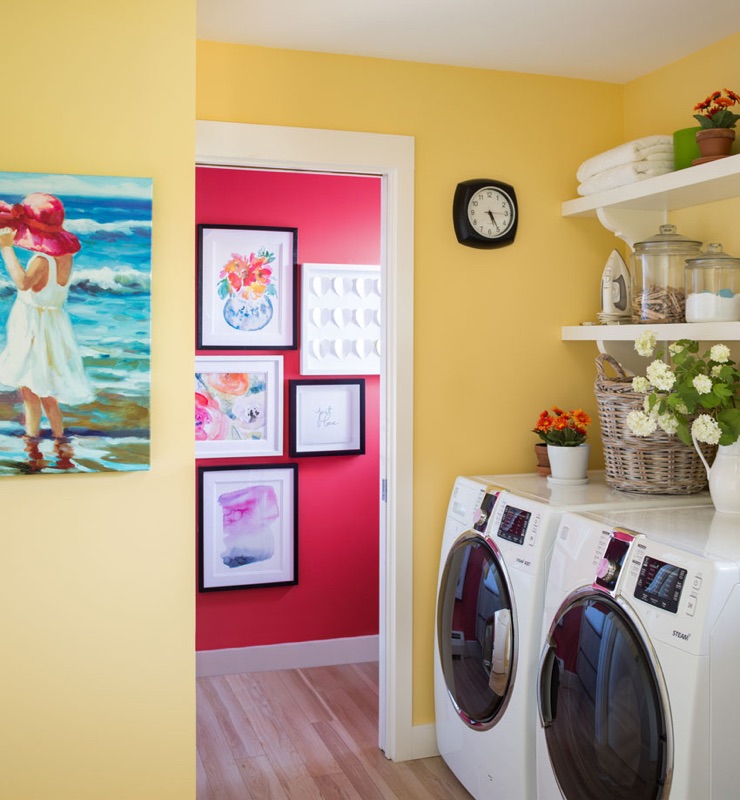
I found some flower art in watercolours to relate to my beach girl in the laundry room. As this wall is the focal point of the entire powder room it’s fun to have a grouping of art while I take my time sourcing wallpaper for this room.
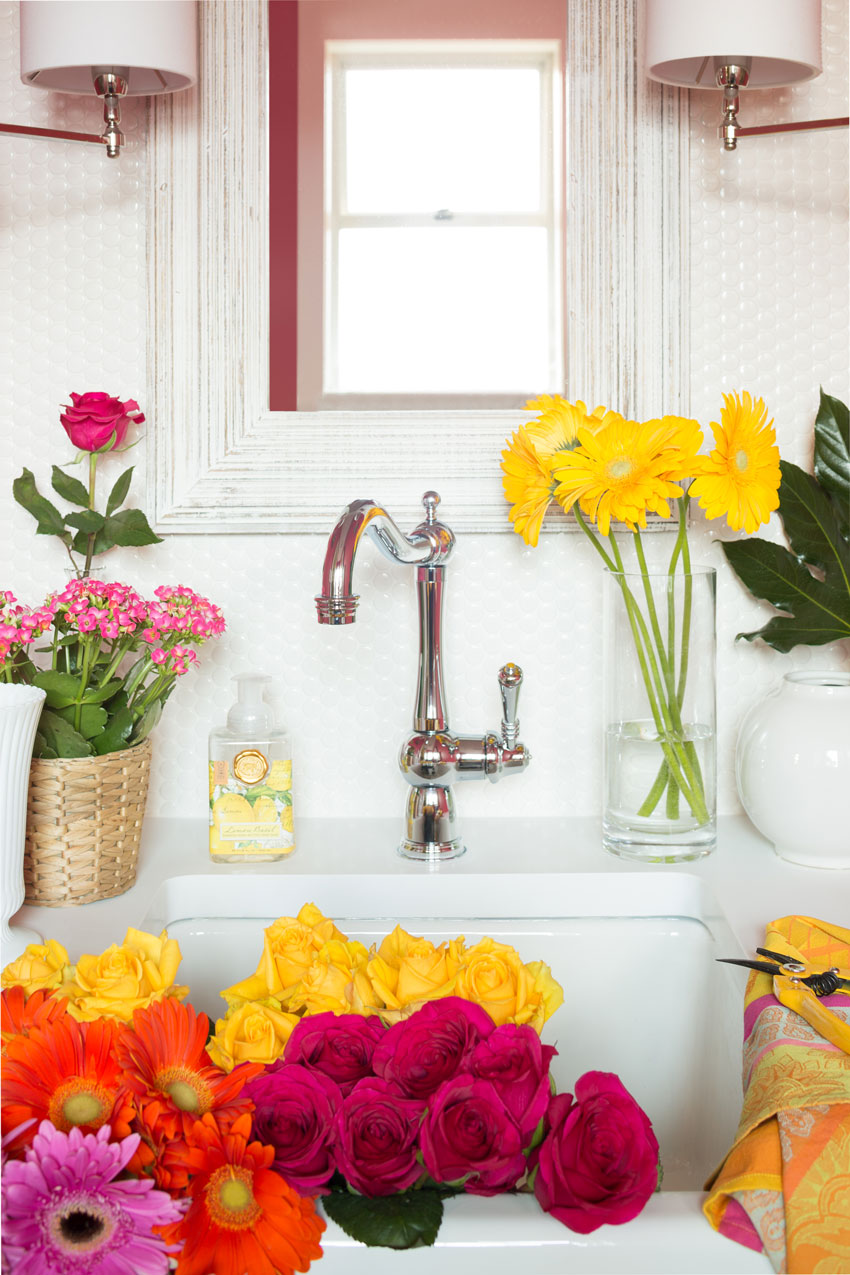
Here you can see the penny tile a little clearer.
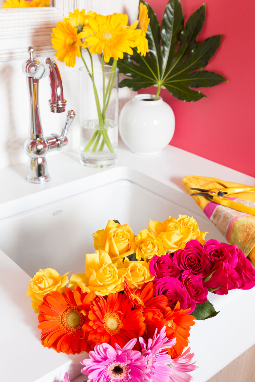
Brizo Faucet | Pure White Caesarstone Countertop
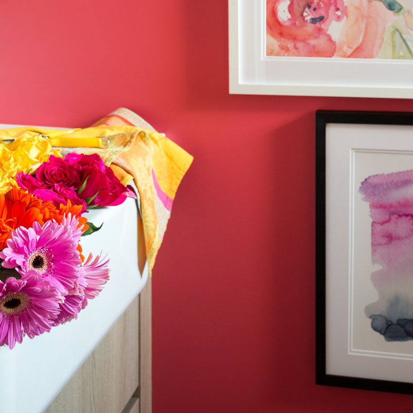
This is the accurate read of the custom coral shade.
Here’s the before picture again:
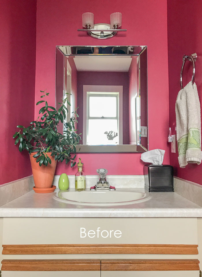
Before
 After (Photography by Barry Calhoun Photography)
The first time Terreeia was in the kitchen and I had flowers to put away, wow did it feel like a luxury to be able to arrange them using my fabulous new farmhouse sink!
I’m still waiting for sconces to arrive for my master ensuite, they were back ordered until late October. So then I’ll have Barry back to shoot both of the other bathrooms. Stay tuned for those!
I’ll be in downtown Vancouver this week to lead the first of our five Specify Colour with Confidence events this Fall!
Related posts:
Wood Flooring in the Bathroom, Yay or Nay?
Maria
One word
BEAUTIFUL!!!
Nancy
Simply BEAUTIFUL…classic style and Srop Dead color…you nailed it, Maria❣️❤️❤️
I *LOVE* the wall color of both your powder room and laundry room. The watercolor in the white matting and white frame is beautiful. … Inspiring as I consider some updates we need to do at home.
I loved the paint shade you had before but the new shade is fantastic! It has a lot of depth–so beautiful! Darn I was hoping for your post on your bathrooms. We had a small flood before the hurricane hit! Now I’m left with a house in chaos. I’m working with the insurance company but I’m sure I will be on a tight budget. (We have a high hurricane deductibe ?). I could use some practical, low cost, and beautiful solutions!! I wish I could see your beautiful new baths before I have to make some decisions.
Hi Ann, my bathrooms weren’t exactly low cost (I was shocked when I realized how much it all cost) but I will think about your question and see if there’s a post I can write. So sorry this happened to you! Maria
I’m almost 55 and just realized I’ve never remodeled a bathroom either! This looks gorgeous. I love the penny tile and especially all the way up the wall.
Fabulous! Fresh clean and bright. Love it! Can you tall us the penned tile source?
And also the width of your vanity?
Thanks so much, a great job!
Vicki
What a happy place! I love how the powder room color picks up the girls hat in the picture! Good call on the color tint. Your home has an upbeat happy classy feel and look. That probably reflects the personalities of the ladies who reside there. Great transformation. And thank you for sharing the journey with your readers!
Forget the wallpaper!! Room looks fabulous with pictures coordinating with girl picture and wouldnt be able to see much of it anyway. Use the money on your flower budget! ???
I agree with Ann! I love wallpaper too but I would say forget the wallpaper here. It’s fabulous as is 🙂 I love the wooden plates for the sconces!
Me three! Absolutely beautiful as is. We just hung wallpaper in our downstairs bath -first time for wallpaper. I love the way it looks- MacKenzie Childs Courtly checks with antique dark wood mirrors. It makes me happy every time I walk in!
Would love to see it!
What a bright and cheerful powder room. Love how you can see the picture grouping from the other room.
I love that sink and faucet! Looking forward to seeing the wallpaper you choose for this space. It looks great as-is, though! Congrats on your brand new bathroom!!
I hate to hear that your home was flooded. We live in Louisiana and I feel your pain. I have done a couple of bathroom remodels within the past five years (before I started following Maria’s blog). I made the mistake then of using busy granite and mosaic tile backsplashes with dark oak cabinetry. The master bath reads too much brown. You can’t go wrong with white subway or penny tile like Maria. Keeping the room light and white gives a fresh clean look which is classic. You can always add color with accessories, painted walls, art, and towels. I wish I had known that then. Good luck with your remodel.
This room became so attractive! It literally brought a smile to my face and made me want to touch the penny tile wall and the beautiful faucet. The colors are so inspirational! I am off to my garden to find what is still blooming and grab a little vase. Thank you for sharing!
Maria, you must have the most cheerful home in all of Canada. I love your sink, vanity and sconces – just perfect. I also am happy to learn that not all farmhouse style sinks are large. You really achieved all of your practical needs in one strikingly beautiful space.
As I scrolled it literally took my breath away. It is beautiful! I love the color, the sink, the penny tile, just beautiful!
I love it. I don’t think you need wallpaper… So happy for you that you got to do all the bathrooms!
Maria, my 2,favorite things in this post are the way you took the 2 planes of color – vertical & horizontal and repeated them as a flow. It makes the space appear taller as well.
And….. your thankfulness for what you have now. A good illustration of the satisfaction in delayed gratification!
I’m so encouraged by your blending of the taupe with your lighter wood floors, although I think I’ve heard you say wood shades read neutral easily. I’m also thrilled that you added orange to get your perfect paint shade! (It’ll probably help you zero in on your wallpaper – just having that tweak in the back of your mind.) I’m convinced that a smidge of orange added to any new color choice just makes the magic happen – at least in my home of over-the-top eclectic mix of colors and patterns! (Adding to my joy was your brief comment about cognac leather also easily reading neutral!)
This is a SUPER DOOPER, DROOL-WORTHY solution. It
Screams JOY! Simply FANTASTIC work of art!!!
I wish I could come up with a new way to say it but you always amaze me!!! What a gorgeous, beautiful, inspiring powder room, and also fun working room!!!!!!! You must just be tickled pink ?
every time you use that room.
Breathtaking today and in a few years it could have a whole new look because, as you have taught us, you used basic, timeless and classic items. I can imagine it with blue /greens and a coastal feel, or if you wanted a more rustic vibe with teals, rusts and browns. All easy changes with paint and accessories. No hard finishes to keep yelling at you. All the things I have learnt from you, soft finishes that are easy to change out. With your incredible styling ability that room could morph continually or stay exactly as it is… captivating just like you! Cannot wait to see the other bathrooms!!!!
I’m so completely in love with your bathroom Maria! There isn’t a thing I would change if it were my own!
I love everything about the new powder room. No need for wallpaper as others have said.
No wallpaper needed, it’s great the way it is. Very pretty, very Maria! LOVE the faucet. Brand? Is it a touch faucet? Thanks.
It’s a Brizo faucet and the link is in the post. It is not a touch faucet. . . when I posted about faucets many readers left some good comments about them. . . that a cat walking on the countertops turned it on. . . one person came home and the faucet was on, triggered by something in the house. . . the more technology you have, the more stuff you need to fix. I agree with that. Thanks for your comment! Maria
Stunning!
Love it all!
Penny tile in your bathroom looks terrific. Would you ever consider using it in a kitchen for a backsplash? Or does the scale only work in a small room like a powder room? I just love your beach picture of the young girl. It’s delightful!
I think it could work in a kitchen. . . I’ve seen it on an entire bathroom floor. . . I don’t think penny tile is used enough. And as someone said, you do have to have someone good to install it. . . my installer was VERY expensive but he did a good job. Maria
Your new look powder room looks so bright and cheerful and I just love the penny tile wall – it fits perfectly and adds a touch of glamour. It’s a wonderful new look with the picture wall. I await to see how good it will look with your choice of wallpaper, as I’m sure that will stun us also.
Great work, Maria!
Maria, I am going to move into your powder room. Are the flowers included? 😉
Also, I DO see the difference in wall color and I love the new color a lot more.
So gorgeous Maria, cheerful, fun, happy and your own! I love wallpaper and use it, however, many a time, it is needed as a focal, or to give a space something more. I don’t feel you need it in this lovely new bathroom of yours.
I love the color, the sink, vanity, sconces, stunning room!
Hi Maria,
It couldn’t be any prettier! But you took a big risk putting in penny tile. I’ve seen many bad installations. It takes a good contractor to know how to install it so the seams don’t show.
I agree with a lot of your other readers. I don’t think you need wallpaper. No need to over-decorate.
I love the faucet you selected. But is it only practical if you’re right-handed?
Thank you for sharing your beautiful powder room.
Be Still My Heart. So beautiful. I love your inspired “lipstick” walls. This room reflects you and your entire home.
Love the name garden powder room and the room!!! So joy full!!!!! All the color is so dazzling!!! Love, love, love!!!!!
Oh Maria what a happy room! Normally I am not a fan of farm house sinks but this is such a perfect solution for this bathroom. Your choice of counter top with the penny tile is spot on. I had to scroll back to see if the whites were the same and of course they are! Why would I ever doubt? I also love the penny tile. I even like it in a kitchen. Don’t put in wallpaper even though there are some fantastic papers out there now. Think about the steam or water that can ruin the paper. Like others have said it looks just stunning the way it is. And oh the flowers! I just love the whole look!!
In actual fact, the countertop is true white while the sink is off-white and the penny tile is white and the grout is off-white (the whitest grout still reads off-white in my opinion). It was so interesting to watch it all go in and notice the whites like I’ve never noticed them before. Conclusion. White and off-white are just fine together (as I’ve said before) to try and match them perfectly, well I would have had to look at the sink colour in advance which I did not do! Good eye Lucy, and thanks for your comment as always! x Maria
The flowers show so well with the background. The reflection in the mirror will be a part of your wall paper selection if you decide to use it. I never thought of that section before. Beautiful work with combining a powder room and laundry sink!
Wowzers! That powder room is scrumpdillyishous! I’m a gardener and need a deep sink and a gooseneck faucet too, so you’ve given me a wonderful idea! Every detail is just yummy, and I agree with some of the others on no wallpaper! That shade is divine!
I cannot wait to see your other bathroom!
What a transformation! Love your fresh pretty powder room!
Well done!!! I wish I had your vision. Someday my kids will grow up and I’ll take one of your classes! Your work is beautiful. Hope your other sconces come in early! : )
Absolutely ‘a gem’! Love its elements but I think if it were me, I would opt for wall paper at a later date when the area requires a refresh and enjoy the luscious new colour and art gallery during the interim. That said; due to the layout of the space and lack of a vanity apron my inquisitive mind would like to know, are you going to be using (disposable) guest towelettes or is a wall-mounted towel bar/or ring just not in the photo shoot? Looking forward to seeing your mother’s and sister’s newly decorated spaces as I am sure they will be just as beautiful. -Brenda-
Hi Maria, the changes look fabulous. Why not try a stencil on your powder room wall. It would give you total flexibility with colours and if you ever get tired of the design it’s way easier to change out than wallpaper.
In My Own Style just did a post about that. Hard to believe it isn’t wallpaper. https://inmyownstyle.com/2017/07/create-faux-wallpaper-using-paint-and-a-stencil.html
I love that color. I once painted my bathroom that same shade and every time I went in there I felt happy. I also love that you chose the aged oak finish and paired it with the bright color. It seems to me that most rooms with the reclaimed woods stick with the whole neutral theme, like the Pottery Barn picture.I am remodeling a mudroom and was thinking about doing wallpaper, but now I’m thinking maybe a stencil. Every time I go on Pinterest or Google search for inspiration it is one gray and white paneled room after another. How is that even practical? I am craving green.
Love it!
Love your custom paint color and the outcome of the redo. Fabulous.
Enjoy your blog immensely…
If the quest for wallpaper is actually a desire for pattern, perhaps you could figure out a way to dress the window (not very attractive) that is reflected in the mirror in both the before and after shots.
True, haha otherwise we would never know that I didn’t add a window treatment yet 🙂 Maria
Love that pop of color! Tie in with art is a wonderful solution for now. I am curious, as you will be using the sink for messy projects, why the side walls are not tiled?
LOVE love love the new color! The color kicks everything up a few notches, at least.
Love everything about this including the fabulous styling. The light fixtures are a mix of dainty and hearty, and by breaking up the solid rasp/coral wall with art you’ve solved the need for wallpaper… though I do love it, and a powder room is the perfect place for it. Wonder if you have seen any of the wallpaper from Hanna Werning… I am obsessed with her Scandinavian prints. They are pure whimsy – vibrant, colorful and fun. see her many beautiful things here http://byhanna.com. In the US, her wallpapers are distributed by Brewster. I tried like crazy to get my clients to use one of her patterns in their powder room, but they stayed safe. (I believe the quote from the 17 year old son was – “no baby animals!” Heavy sigh. You’ll see what I mean!
Here’s the link to the Wonderland wallpaper collection by Hanna Werning. Enjoy! http://www.byhanna.com/wonderland.html
THanks Pam, I appreciate the link! Maria
I am so in love with your bathroom. Skip the wallpaper and keep it exactly as it is!
Hello Maria, you spread so much happiness and I’ve enjoyed following your blog for many years, admiring your work and happy to see your success blossom. Your JEM of a powder room is gloriously RADIANT in Coral! You’ll be smiling with laundry or garden tasks and give your guests a reason to smile as they visit your perky powder room all full of happy! I have needed to see something beautiful since we suffered from recent hurricane Irma.. and before there was Harvey, that pair of storms left 1000s of homes in mayhem, chaos or completely gone. So many Florida and Texas people face rebuilding, and at the same time we see more storms heading to our south and eastern coastlines. Insurance companies are limited to restoring function…and I know many need that sense of home and beauty and have few resources. Your imagination and talents are many so I thought to ask.. could you and maybe your many designer friends get busy to help our sisters, friends, moms, aunties and daughters to re-feather their nests through low cost DIY touches (like the ones we used when we were young and had little but our imaginations? ) I am helping where I can here at home…online not my thing. How about an initiative “ Home after the Storm…broke but not broken” with posts on many blogs to provide how tos, simple ideas, tricks with low cost items (remember no-sew napkin throw pillows?) to help these women as they put their battered homes back together again. Keep spreading your happy Maria, you are a joy to this world!
Wow I love that coral color and I would like to try my hand at this for the powder room in my dated 1990s house. Please forgive the dumb question, but where do you get colorants? Would my local Benjamin Moore store have them? Your blog and Instagram give me courage to try color because greige makes me sad ?
Hi Susie, I added orange to the existing pink shade that I had already ordered. . . you just need to go and choose a coral at the paint store. . . Maria
Oh my! That is gorgeous! Is there anyway we can match that custom paint you did? It’s perfect!
Hi Maria,
I love how all the colors take you on a beautiful journey through your house. I am not as brave with my use of color as you are but I do love the sunny yellow in the laundry room guiding me to the coral/raspberry powder room. Your personality shines through every step of the way. Thank you for such a wonderful blog and I have learned o much from you just by reading all your posts.
Karen in Cincinnati
This is a great solution! We have the same type of half bath/laundry room. The farm sink allows such better utility for the area without being overpowering. I will keep this in mind for our space. Thank you.
Breathtaking! Go for the wallpaper… Bathrooms look fantastic with wallpapered.
I don’t think ANY wallpaper could look as perfect as the new paint colour. I agree with a previous comment: just add a window treatment and call it done and done!
Wow, those flowers make that room pop so much!
This was cool!
Oh my that’s beautiful!!
Question – at what point in the process did you put the hook that holds the mirror into the penny tile? And how did you figure out the measurement? Did you already own the mirror? Did you nail a hook INTO the wall pre-tile? Post-tile? Thanks, looks so fresh!
Hi Thea, that’s a great question. . . behind the mirror is one space where a 12 x 12 tile should go, my tile guy did not have enough tile (because it was measured perfectly) to tile the entire wall so he left a hole and I nailed the mirror in there. I did not have the mirror before it was installed. . . found it later. . . specifically chose one that would start right around the top of the faucet so water won’t splash on the mirror.
I think I would have been able to stick a nail into the grout anyway because the penny tiles were so small but otherwise you’d need a diamond bit to drill through it. (I think that’s right).
THanks for your comment! Maria