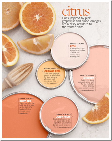
One of my blogging pals Kelly at Arte Styling is in the annual Colour issue for Better Homes & Gardens for February! It’s such a great interview I had to share it with you!
I especially love how she answered this question as it relates to a post I wrote last year:
BHG} What sort of message do some of these brighter pinks and oranges send, especially when used in an interior?
KB} They send the message of energy and warmth. They are youthful, playful, fresh, sassy, friendly, approachable, social, lively and open. When you use these colors in your home you are expressing these qualities in yourself. Citrus-infused colors tell everyone who comes into your home that you are full of warmth and energy. If that’s the message you want to send, then these hues are right for you!
 Images from Arte &Styling Blog
Click here to read the interview, it’s so great! Congratulations Kelly!
If you would like to transform the way you see colour, become a True Colour Expert.
Related posts:
Warning; You are the Colours in your Home
Rules are for Breaking by Janice Lindsay
Bobbie Burgers in Full Bloom; Inside House & Home Magazine
A Pink Tablescape with Sarah Richardson
If you are new to this blog, click here to see the Best of Colour Me Happy.
While you’re here, subscribe to this feed so you don’t miss out!

I ADORE those colours!!!
I love these color lessons in BH&G and have been tempted to tear them out and keep them. (now that I "said" that out loud, I'm thinking I'll definitely do it) Yay for your friend to be featured! And on such a pretty page!
Maria!
What a treat to be featured on your blog post. Thank you SOOOOO much. This is such a lovely compliment. I hope all of your readers enjoy these colors as much as I do. Thanks again.
Kelly
Oh I'm so excited! I love a good orange & pink is another favorite of mine. I so love bold colors in homes 🙂 I can't wait to see how these translate in the next year at stores so I can buy me some orange!
Gorgeous colours and a great interview. Thanks for the link, Maria. I love the bedroom photo and want to add some of that colour to my room.
i agree so much with the energy transmitted with orange. and it's funny because i just post about gervasoni, which dark collection with browns and blacks really brighten up with the strong orange as details. i love to wear my orange scarf, it makes jump 🙂
colour is the most untouchable thing with the biggest impact on all of us. amazing!!!
first time i tag a blog: your's the one 🙂 couldn't find a better opportunity: posted about 3 different brands displaying at the Cologne fair which background colour is orange.
I love those colors, they give life to any room (I have lots of orange, peach, apricot in my latest posts)
Loving the citrus colours… the shop is full of it right now but you what? It's a hard sell. Many people/customers just don't get it….yet! 🙂
Susan
I really liked that article, and especially the colors.
Wonderful interview – congratulations Kelly!
I love the Ruby Red and it does look delicious doesn't it?
I agree, we are the colours we choose.
As always, I love your post, Maria! I like this one in particular because I have a wall painted in a very similar color to the ruby red in the paint can in the photo. So, does that say I am warm and friendly, sassy, playful,etc? Thinking that I am just gets me in a good mood right from the start today!! Thank you! Maybe I will take a photo of my wall, post it and link back to this post. Have a great weekend!
Growing up, I was always attracted to friend's homes that were glowing with pink grapefruit and pomegranate colors. A dear friend's Mother who was full of style had a kitchen that was so cheery, it was that citrusy sort of tangerine color with a kitchen garden right outside. Pretty colors.
pve
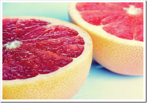
The picture of the grapefruit is makingme thirsty . . . All these bright citrus colours is reminding me of spring. That peachy – orange would be so nice in my bathroom.
Maria,
I have changed my blog lay out and your earlier post about a good blog design was very helpful to me! Thank you for that!
xx
Greet
Yay for Kelley! i'm always thrilled when a professional color consultant is quoted in shelter magazines. So much better knowing the comments are from a credible, knowledgeable source.
Thanks, guys! And thanks again, Maria. These colors seem to be very popular right now. Guess we are all ready for spring? 😉