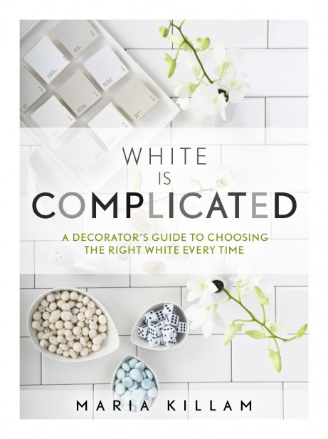
I am very excited to announce that my Sherwin Williams colour boards are ready! They are called The Essential Collection and were designed to go with my new White eBook which you can download here.
My colour boards are though, and I specifically chose 25 of the most popular whites and greys from Sherwin Williams so that anyone who needs to choose a white for walls, trim or cabinets can now get it done for a more reasonable price point than having to buy an entire set of 50 from the Benjamin Moore collection.
I have a very limited selection because they are hand painted by real people so snap them up now while you can. When these sell out, it’ll be 6 weeks before the next set are ready. You can get them here.
The following is a guest post from one of my True Colour Experts™ Claire Jefford! Read on to see her beautiful bathroom transformation and she’s talking about how she chose the best white:
Have you had moments in your life where you wondered ‘Why is this happening to me?’ That was how I felt with my very first client. I was a brand spanking new designer, very eager to please but I put a value on my service that was way too low – not a good combination. However, you live and learn from your mistakes and I am a true believer that everything happens for a reason.
The ‘better thing’ that resulted from that experience three years ago now was this:
That client introduced me to Colour Me Happy and I was instantly hooked! In January, 2012 I bought Maria’s e-book as well as her large colour boards. Hell, I was like a kid in a candy store the day they arrived on my doorstep!
Today, the boards come with me to every consultation and they played a major role in my two largest projects to date. The first was my Toronto clients’ bathroom renovation that saw the space transformed from ‘Blah’ to ‘Beautiful’.

Bathroom Before
And now….
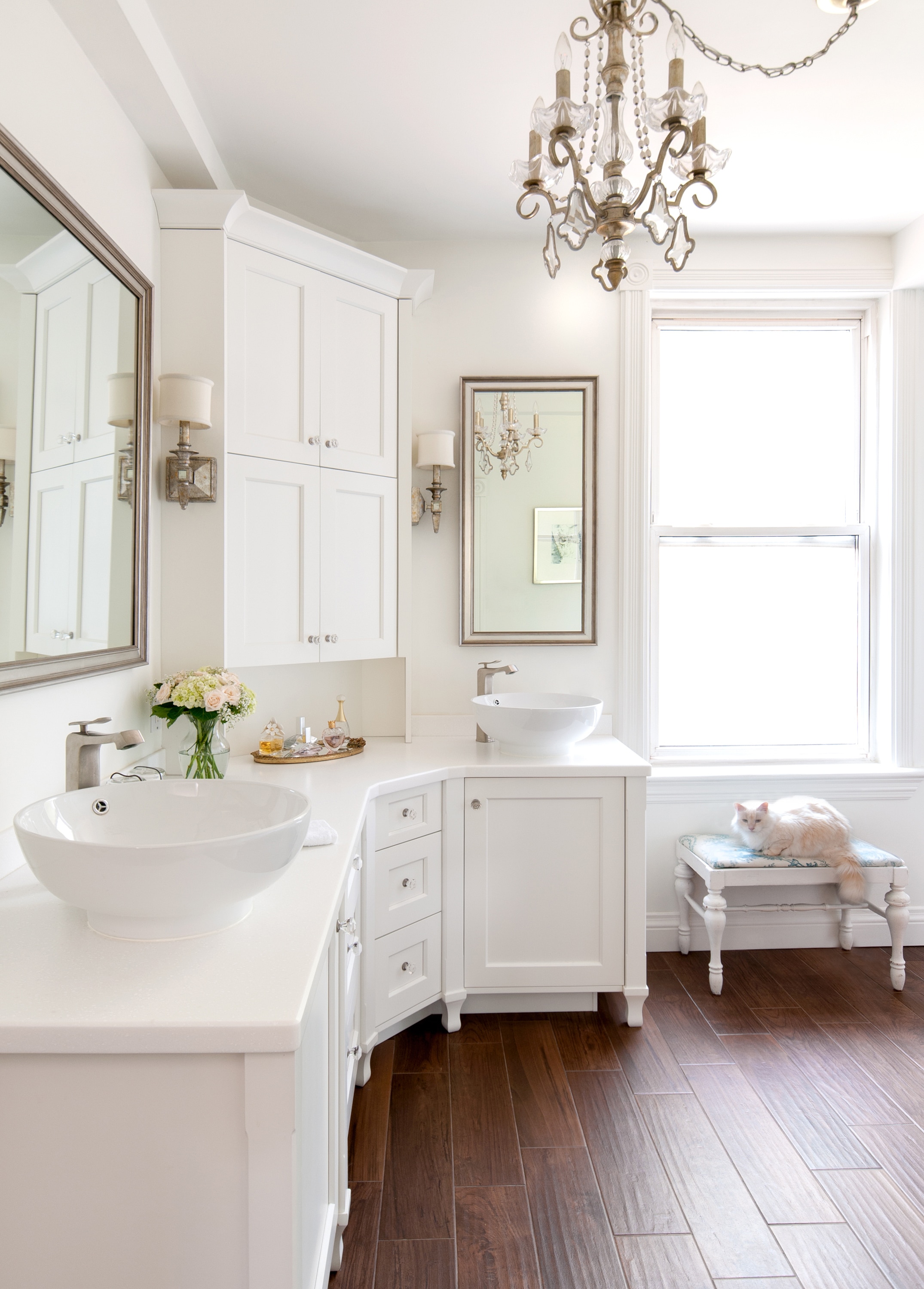
Bathroom After
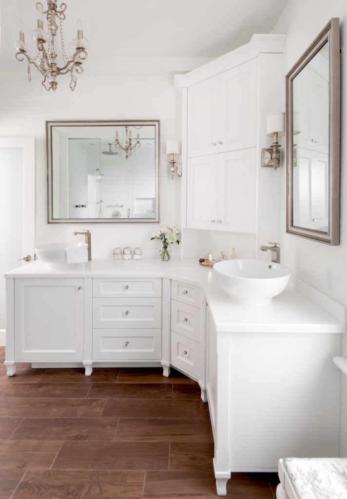
I was able to choose the right white confidently and in a snap by comparing the selected shower tile with all the whites from my large colour boards. I could easily see that BM Snowfall White, OC 118 was the obvious choice. We then used this white for the entire bathroom including the walls, ceiling, trim and custom cabinetry.
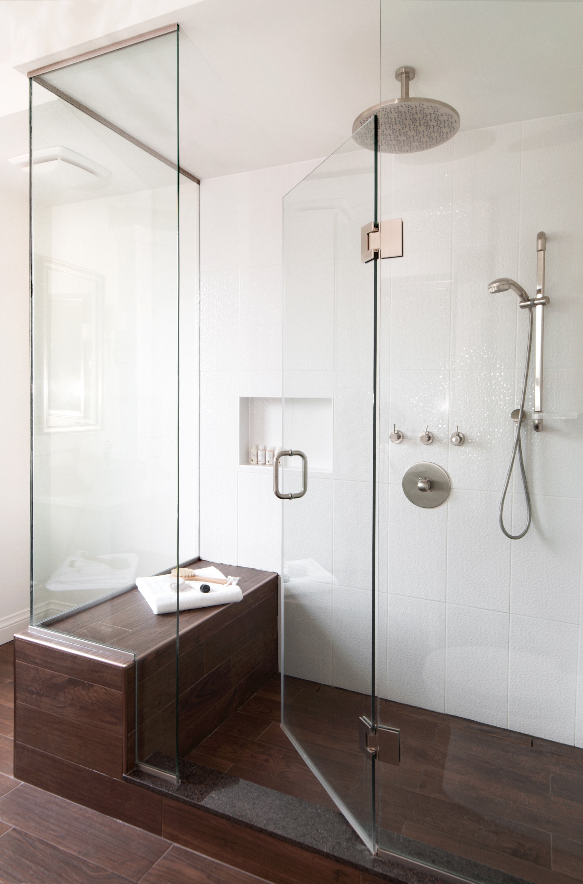
Custom Shower- Photography by Stephani Buchman
The heated floors are a wood look ceramic tile that adds warmth and helps ground the space. The walnut hardwood used throughout this second floor renovation perfectly matches the ceramic bathroom tile, so there’s a natural transition from room to room.
The flow continues with the colour palette where the walls and ceiling of the newly created closet lounge were painted BM Gray Cashmere, 2138-60 – also from my large colour board collection – with the Snowfall White repeated on the trim and crown molding.
That home photographed better than I ever imagined and my clients were thrilled with the result!
For my dental office project (before picture shown below) it took some time to create the overall design, but less than sixty seconds to knock the socks off my client during the presentation.
My client loved everything but asked me if we could go a bit lighter on the wall colour. Just at that moment, the office manager politely interrupted to tell the Doctor there was a phone call he needed to take. He excused himself and within the minute, he returned.
In the one minute that he was gone, I went through my boards, grabbed Gray Owl, OC 52 and put it in the place of Stonington Gray.
It still amazes me to this day of just how easy it was to choose that alternate colour so fast, but how difficult it would’ve been if I was fumbling with a fan deck of hundreds of tiny colour chips.
Attending the True Colour Expert Course in 2012 and purchasing Maria’s large colour boards are two of the best investments I’ve ever made, not only in my business but also in myself. Having exclusive access to the TCE private facebook page is an added bonus as it’s the perfect place to share with others who empathise with the struggles and successes of similar experiences and I’ve created lovely friendships along the way with like minded people I would otherwise never know.
Thank you Maria for doing what you do so fabulously, that has allows me to do what I do so fabulously! xo
Claire Jefford is a Certified Interior Decorator and Owner at Creating Contrast Designs in Southern Ontario. To see more on her stunning bathroom transformation, click here.
If you would like to learn how to choose colour with confidence, become a True Colour Expert.



Maria, once again great examples of chosing the right color. I want to share a website I found because I am looking for a bed as well. CHARLES P ROGERS BEDS DIRECT has a very nice selection of black iron beds.
That bathroom is stunning!
Yes it is! Have I seen it on Houzz or somewhere else? Also, what is the while tile on the wall?
The dental office looks great. My dentist just redid his from 1970s earth tones and it is too dark and the wrong gray for his north facing windows. Luckily I pretty much only go for the teeth cleanings. LOL!
Read blog post: Check!, buy the boards with the most popular whites and grays from Sherwin Williams: Check! And that bathroom by Claire is truly amazing. Thank you Maria and Claire.
Your work is exquisite, Claire! I especially love the bathroom. Great job and thank you, Maria, for showcasing her!
Thank you Laura!
Love the chandelier in the bathroom – where did it come from?
Hi Mary
The chandelier in the bathroom is from Kichler, link below.
http://www.kichler.com/products/product/mini-chandelier-5lt-srm-42115srm.aspx
That might very well be my favorite bathroom I’ve ever seen, Claire. Well done!
I’m glad someone else likes OC118 too. I never see it mentioned, but it works perfectly on my kitchen cabinetry (blends well with all my white appliances without appearing too stark).
I just want to clarify…if we order the new 25 SW paint samples straight away, we will receive a free copy of your new e-book on whites when it is available?
Thank you!
Yes they are included with the boards and will be emailed to you as soon as it’s ready.
Maria
That bathroom re-do was exceptional!! franki
So glad to get Sherwain Williams colors! BM isn’t as available as SW is in my area of the country. So excited to get these!
Same for me in my area, but why can’t you take the color swatch from one company to another and have them color match with their computer? Are the tint bases that much different? Or is it that they have more sheens? I don’t think I’ve ever seen this question addressed.
I saw a presentation a few years back when they added SW stores in the area and if I remember correctly, the speaker said the tint base for one company–can’t remember which one–was clearer than the others.
Could you please answer or explain?
It’s bases and pigments (tints). Plus each company has different bases depending on paint product, as well within a product line. For example, Ben Moore’s Aura has 4 bases.
Companies will tell you matching can easily be done, but I think their computers only get you part-way there in most cases, and then you need a counter person with a knowledge of color theory, a great eye, and the ability to check under different kinds of lights – incandescent, fluorescent, etc.
Even then you might get it just close enough to look “off” when in the client’s light. I only match in very rare cases now. Just my take.
My thanks to you both–I know a paint tinter in my area who does have a good eye, but I didn’t realize the pigments were different too. She’s always said that the greens are the hardest to match.
Beth has a fuller explanation than I can give. All I can do is speak from my own experience. There was a green that I fell in love with from Lowe’s. But from reviews I knew that it wasn’t a good paint. When my local BM store tried to match it, it just never worked out (and we tried more than once). Thankfully I was painting posterboard size samples so I could see that the color was off from the chip (at least in my lighting at home). When I had SW do a sample, theirs was much closer. It’s the only room in my house that has SW, because they were able to better match the color, though I’m sure they’re not always “better” at matching, just with that particular color.
jumping on the bandwagon here, if I may..:
competitor paint stores can scan a paint chip (or almost anything you bring in), but, another reason colors will never be exactly the same is the computers are using luminescent light when they scan the color, to try to reproduce reflective light color (paint chip). (I am a computer geek with a minor in physics and can talk for hours on this.)
they can get dern close, very close sometimes. almost identical, if you are lucky. but it is physically (as in ‘physics’) impossible to match exactly what is scanned. the computer that the paint companies use have algorithms to ‘guess’ and compensate. but it never ever ever ever can be the same color.
because of this reason, and the above post explaining the chemistry reason why (Thanks, BETH SAYS, for your description!) , having them scan a paint chip (or other item), it just won’t be the same color.
(they now have competitor formulas on their computers, often, but, for reasons described above by BETH SAYS, (chemicals), can’t really match them, either
when they say in the store they can match, they are using what i call ‘language shortcuts’. ’cause to explain the issues is too complicated (or they may not know). AND many times folks don’t care / mind the small differences, or can’t discern. (many times it is indeed verrrrrry hard/ almost impossible to see a difference, and then, it depends on the lighting when you are comparing)
it is degree of caring or noticing.
i use swatches from all over, take them to my SW store, and simply can’t be bothered with a minute difference. *I* know it is NOT identical, and 98% of the time am marvelously happy with the outcome and merrily go home with my ‘not-exact’ match, and love the color on the wall. (but when folks in the paint stores insist it is an exact match, i just smile and giggle.)
I don’t care if it is an EXACT match (usually). but I also know what I am getting into, nor am i believing it is a perfect match.
so the moral of the story is, “exact match” is a pretty tough criteria to meet. but, you prob won’t care. it will prob be close enough and you’ll be glowingly happy with the results.
(have not tried green to be honest. interesting to read that it is hard to match!)
the other nugget i learned here, from Maria, is, the chips are PRINTED these days, on a four or five-color printer, not actual paint swatches. another reason to buy her boards, should you be so inclined.
her boards are the real paint, and are ‘true’ and reliable. (here again, you get into chemistry as to why four color or even pantone/true color, etc., are simply not the same as what is in the can. most of the time, it is close enough. but if you want the real deal, Maria’s boards are what you want.
fun topic!! (did not intend to be so wordy, sorry!)
A truly perfect space Claire..elegance and comfort all rolled into one. The homeowners must be so happy with it. I had never heard of a ‘closet lounge’ until now, but now I want one!
Question- Is BM Snowfall close to BM Chantilly lace as far as having no undertone?
Gorgeous bathroom, Claire!
But one practical question–how do you turn the shower on without getting hit by that first blast of inevitably cold water from the overhead rainfall fixture?
What you can’t see in these photographs are the 4 jets that we had installed on the right side of the shower wall (the photograph looks cleaner this way). There are also 2 potlights either side of the showerhead that have been ‘photoshopped’ out. In order to work everything in and space it all out accordingly, the rainfall had to be centrally located. Clients were happy with the layout and tell me they love how it feels to shower!
Re: white bathroom. I love it that you matched the kitty too! All gorgeous, thanks.
Yes Sandy, Charlotte is the darling white cat and she was more than happy to pose for the shoot!
Excited to add 25 more whites and greys to my collection! 🙂 Just ordered them.
Claire, beautiful spaces! Thanks for sharing the photos and your design process.
Jill
Hi Maria,
I love your colour board technique but I work with General Paint. Any chance you’ll create a set of colour boards for GP? I’ve bought your ebook & BM colour fan with the idea I’d try to match the BM neutrals with the GP neutrals… A challenge so far!!
I always learn interesting tips from your blog!
Elizabeth
No because most designers specify BM or SW. Maria
HOLY SHIT! That bathroom!!!
I love how the things you did turned out. And yes, the boards are the greatest!!!
Claire, gorgeous room. My first reaction, looking at your client’s bathroom, was “WOW!” My second reaction, looking at my bathroom, was a hysterical “Ha ha ha!”. My third reaction, happily, was “Sure, my bathroom is only a third or fourth of the size of hers, but…”. It’s that INSPIRATION that’s the best gift. Love the chandelier and love the use of the wood-look tile floors. What I CAN duplicate is the beautiful Miss Charlotte sitting on the bench. I have 3 white cat people, one of whom, Mei Mei, a snowshoe, already often likes to sleep on the little chair I have sitting in the vanity area. Perfect finishing touch on a beautiful room. Thanks, Maria, for asking Claire to share with us.
Am now inspired to use my cat as color palette.
Have known they are extra great decorative object d’ art, but had not thought to base my colors on their fur. Brilliant!!!
Will go take some photos and use the Sherwin Williams palette making software.
(here is link, cause i know you will ask:
http://letschipit.com/?WT.srch=1&WT.mc_id=OPT%20PPC%20DIY&mkwid=skCWBMFHC_dc&pcrid=27102461458&pkw=sherwin%20williams%20chip%20it&pmt=e&gclid=CI7ajOyB270CFcg7MgodRzkAaQ)
🙂
You guys rock!
One of the prettiest bathrooms I’ve seen. However, I’m confused on the flooring; in the first pic, it looks like wood running parallel to the cabinets. In the next pics it’s clearly the wood-grained tile running in the opposite direction. What am I missing here or is it my computer screen? Both look fabulous and especially like how you married the functionality of tile to the warmth of wood.
Just looked again and it does all run in the same direction. It must be the lens that makes it look narrower in the first pic and much wider in the following ones. It’s gorgeous either way!
Exquisite bathroom! And I’m not a fan of white walls! Faves: chandelier, floor, cat. I’ve used wood-look tile in my own enclosed entryway, showrooms, houses. It’s wonderful.
People in the first showroom I used it in – 5-6 years ago when newer? – would squat down and scratch it when told it was tile since they couldn’t believe it.
That’s funny Beth and I totally believe it. When I first showed my client the wood floor and the ceramic tile next to one another, he said, “oh, I like them both but if I had to choose, I’d go with that one”. I told him that he didn’t need to choose, as one was the tile and the other was the hardwood. He was amazed!
And the varieties have expanded so much in the last few years – wider planked, etc. I love the ones you chose. Did I say I love the bathroom? : )
It’s funny about the chandelier. My style for my own home is what I’d call natural contemporary + a bit of Asian influence. But for some time I’ve wanted a chandelier similar to yours for my master closet or even our master bath when we re-do it. To heck with clashing styles. ; ) A client sells Kichler so I’m set.
Beautiful bathroom! Well done!! The dentist office is also so well done and the artwork is a happy accent.
Hi Claire! Beautiful , beautiful work on both spaces!
Have you found that since Maria’s class and your blog taking off, that your calls ahave inceased exponentially? From the photos I remember you bringing to class and now….the elegance factor seems to be a world of difference! You are a great example of a teachable student! Thanks for sharing both places!
Paula
Hi Paula. It’s true that I have been much busier and I also credit professional photography. I have received a lot of interest from this bathroom and just like Maria, I agree that having your work shot professionally is well worth the investment! Hope you are well. Thanks for your comments.
Neither BM nor SW is available in Australia. When I built my current home 2 years ago I found it a challenge to find the right white as the national brand paint the builder used had predominately yellow undertones. We tried 11 different while samples which once on a board in the half constructed house turned warm white. I told the builder I would pay the difference for another brand of paint and went to Resene, a New Zealand manufacturer who has the best range of whites and neutrals in the South Pacific. In my opinion anyway. I settled on (quarter) Tea which is a soft ‘green’ white and everyday day now I look at the walls and think ” I love that colour”. Not settling for what was offered certainly paid off for me.
good story — i used to live in your neck of the woods, and yes, the color choices (at that time at least) were quite constrictive.
🙂
I am so excited about the new e-book. I’m thinking about the cards. I’m “just” a homeowner who is remodeling a large house with my husband. The e-book will be a positive YES for me, as I have your “How to Choose Paint Colors” and LOVE it and am looking forward the your new one. We have a Sherwin Williams in our small town, with the nearest BM being 100 miles away. So, I made a trip, picked up all the BM color swatches in your e-book, and have been comparing them to SW paints all along the way. Are we permitted to ask what the price of your new e-book will be? I am bouncing back and forth between color cards + free e-book or the e-book by itself when it comes out. If I were a designer, the decision would definitely be for the whole ‘shebang.’
I love making design decisions in the home we’re building, not a pro, just amateur having fun with planning my white kitchen, etc. Love this bath and had decided weeks ago a chandelier with dimmer would be delicious over the new tub! I learn so much for you all!!
Maria – I like the look of the wood-look tile floor, but am concerned its a fad and will look dated in a couple years. Do you consider this timeless since it looks like hardwood, or at risk of being a fad? Or… Something else? Thanks in advance for sharing your thoughts.
Claire – love the sophisticated, serene feel of the bathroom – nice work!
Janet
Because it looks like a wood floor and here it’s done right, I think it has a timeless look and feel. Maria
Can you describe or show an example of wood tile that isn’t done right? That would be very helpful. Thank you!
Janet
Yes, if someone added granite countertops or wall tile that made it look ugly and bad and wrong.
In this bathroom, it looks like wood floors so that = beautiful with the white.
Hope that helps,
Maria
Janet, to add on to what Maria has said, I feel that when a wood tile is blue or gray or any other colour than natural wood, that is when it is more of a fad. As nice as some of them look, it will be obvious in years that it was designed during the ‘gray’ trend.
Did not think for a minute it looked like hardwood. It instantly looks like tile.
Having said that, it looks TERRIFIC, and I would do it in a heartbeat. Am considering that solution for my kitchen. It has charm and whimsy, and what could be better for a space where you’ll be so much of the time.
Thinking out loud here: Not many tile floors are ‘forever’. Most of them look dated, eventually (exception: the tiled floors you find in Italy, or that old hexagon small tiled floor in bathrooms (LOVE THAT STUFF!) But, there are folks that hate it. so…
Even hardwood is not forever, if you think about it. There were decades when folks covered them up in droves, with wall-to-wall carpeting.
This tile ‘resonates’ as wood, so we react well to it. And Maria’s advise seems to be spot on (as usual), about the surrounding surfaces. Real wood might hold up to ‘competition’ such as granite or wall tiles. She seems to have gone right to the heart of this. (not surprised!) and shown us, again, how to ‘see’ things.
Maria, so glad to have found your blogs and learn from you!
I absolutely love everything about this bathroom top to bottom! Can you tell me where you got the vanity for the sink ?! Thanks!
It would have been custom made.
[…] a design has been thoughtfully put together, the result can be stunning. Maria asked me to write a guest blog about a white bathroom design I did for clients a couple of years ago, and I still believe the look is classic and […]
[…] only an inspiration to me but as one of my main mentors for my Design Business. You can read my guest posting here and find out more about her E-Book called ‘White is Complicated’ which features my […]
[…] only an inspiration to me but as one of my main mentors for my Design Business. You can read my guest posting here and find out more about her E-Book called ‘White is Complicated’ which features my […]