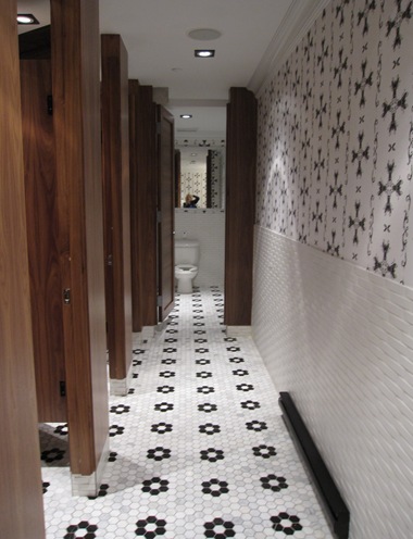
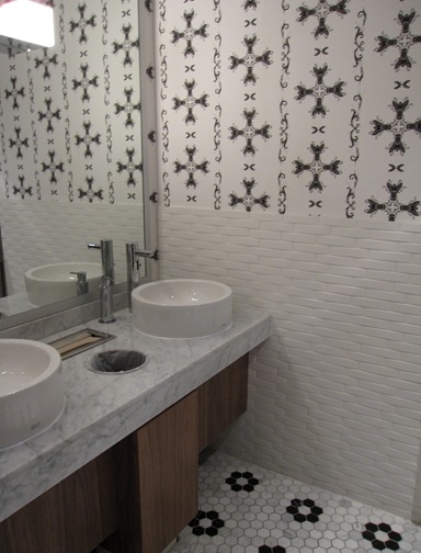
I was at a new ‘Joey’s’ last night on Burrard and Pender and I thought the washrooms were so great!
It seems like all the trendy, ‘upscale casual’ restaurants these days are in competition to see who can design the coolest bathrooms so here’s yet another one.
I especially liked the floor tile I think because it’s in the shape of a flower.
Also I’m tired of chocolate brown, it’s just everywhere and overdone, so I quite liked the the black and white combination with the cherry stained wood.
I don’t know if I would have picked that wallpaper in combination with the tile if I was the designer here, but I think it works.
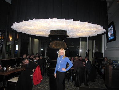
This ‘mushroom lamp’ as I’m calling it, was apparently $125,000 and came from Denmark. The installer had to fly in from Denmark as well to install it!
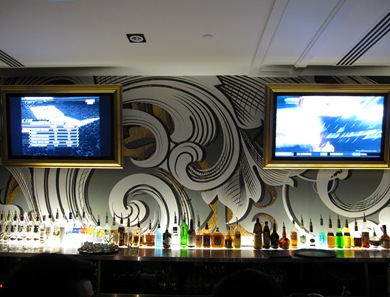
How great is this very large scale wallpaper at the bar!! I just loved it, along with the gold framed flat screens!
The gold is the only accent colour in this otherwise ‘black and white’ restaurant. Personally I think they could have introduced a more vibrant colour but it’s easier to be a critic than to create from nothing and the place was packed so obviously people like it!


Absolutely stunning… That wallpaper at the bar is breathtaking, and I love love love the picture frames around the TVs — a trick that I feel rarely works in residential applications, but is perfect here.
A friend of mine was on the design team for the downtown Joeys…they certainly pay attention to design!
I agree, some colour would have been nice…mind you the people there are the colour!
Yellow or green would be my choice.
Great post!
I love the wallpaper behind the bar too ! How cool is that huge light. Makes me want to make the big drive and have a night out at this place.
Oh I love the bathroom tile. So pretty. The floor with the penny tile in the shape of flowers and the basketweave type wall tile. Love it. Like you I’m not sure how I feel about the wallpaper. I probably would have gone a different way, but over all I really like the look of it.
Great post – I love love love those floors in the bathroom. Gorgeous!
Hi Maria…I love your blog !! thanks so much for visiting mine …. don’t know how I’ve missed out on seeing all this before !!! I’ll be back !
thank
michelle
I was at Stone Tile this week and admiring their wall tile. They mentioned it had been installed at Joey’s in the washroom, and to my suprise here you have shown a picture of it. The tile is from Japan and has such a beautiful sculptural quality to it. Thanks for the pictures.
I wish they broke the line between the chair rail tile and the wallpaper with a tiny black line with tile. The transition feels forced.
The over scale lamp is a lot of fun.
I agree – I am so sick of brown and it is so overdone now. I’ve gone to look for new furniture where I live and everything here is brown. I’ve asked the sale clerks why they don’t introduce other colours for people like me…his response..”it’s the in colour” . I wish they would realise that not everyone has same tastes. Guess that’s the way it is in smaller cities. I just did my powder room and it’s bright yellow and black – it looks so funky and fun. Love black