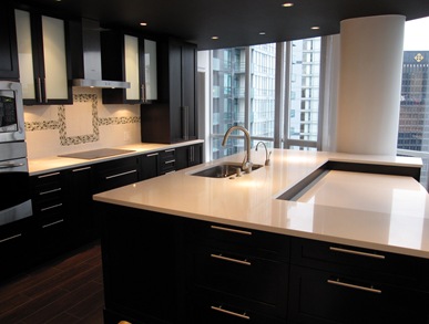
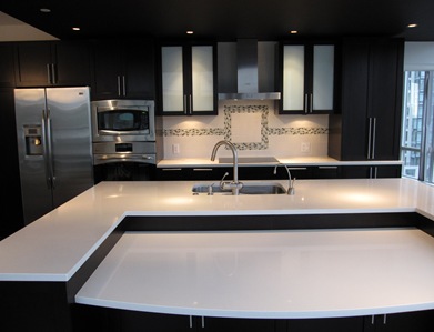
Remember in my post ‘Styling for Photo Shoots’ I said that most kitchens look ‘contrived’ when they are styled and photographed? Well this week I was hired by Revision Custom Home Renovations to style a kitchen they just completed, so I had an opportunity to prove that I could do something uncontrived 🙂
My photographer Anna Beaudry referred me to her client after she shot the homes I had decorated and styled for my website.
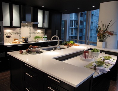
The challenge here was to bring this primarily espresso brown kitchen to life with some colour!
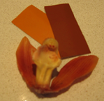
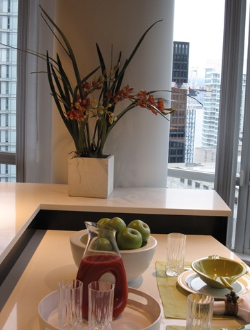
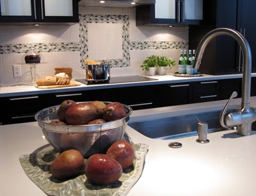
My inspiration for the entire palette started with the orchid (below) so I plucked one, matched it to some colour chips (as shown above) and that’s what I used to pick everything else.
2167-20
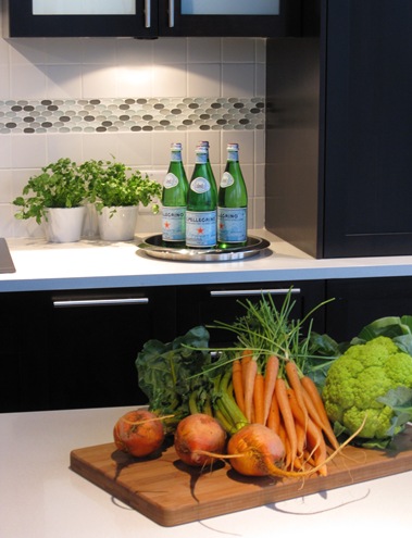
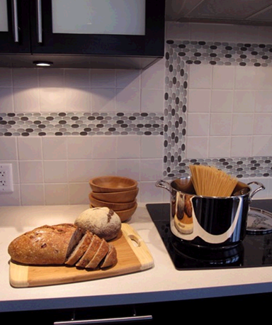
These of course are taken by my little point and shoot and don’t look nearly as great as the professional ones. . . I’ll have to link those later to this post.
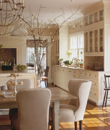
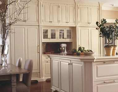
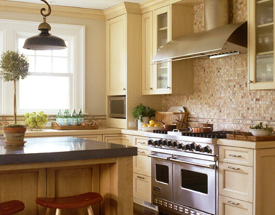
The kitchen site I used for inspiration is Lindy Weaver Design Associates. I found her site from this fabulous post on Things that Inspire. I think these are some of the best styled kitchens I have ever seen, all in one website, so beautiful!
Of course it helps that most of the kitchens on her site are white or cream (which are my favourite).
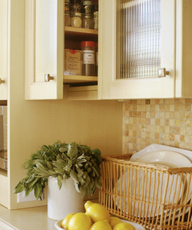
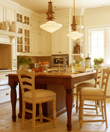
I love the way she showcases the little storage details that make a kitchen work like this spice cabinet right next to the stove.
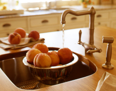
I especially loved this image with the water running on the peaches, I wanted to do that in my kitchen but the water wasn’t on yet!
You can see where I got the idea to stick the pears on the counter with the dish towel underneath the strainer.
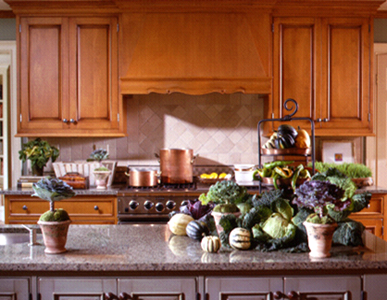
Check out this one below – seriously over the top styling but the colours and vegetables are stunning, Also notice the copper pots that match the upper cabinets!
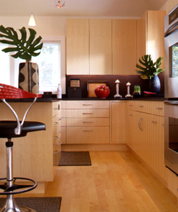
The piece that makes a ‘styled’ kitchen look contrived (in my opinion) is doing something like these big leaves in the urns below (Hopefully Lindy won’t mind my little critique since I’ve raved about every other kitchen on her website) in addition to things like candleholders on the countertops, underneath cabinets. It’s stuff you would NEVER have in a kitchen in the real world, so that’s what I mean about being contrived. And kitchens are challenging because is mostly hard surfaces without any of the softness created by drapery, etc.
And as always, it’s much easier to be a critic than to come up with something that works. I have nothing but respect and admiration for my fellow designers because it takes something to create from nothing! Well dear readers, thoughts?
Related post:
The ‘money shot’ for Revision Custom Home Renovations
While you’re here, subscribe to this feed so you don’t miss out!


Great job! María,
I love the contrast of your colours against the espresso finish. You have a magic touch, you totally resurrected a quite kitchen for one more loud.
Congrats!
I feel as though I could be in that kitchen, moving from one work zone to another, utilizing the items you’ve positioned on the counters… it really looks like someone is making a terrific dinner for two! Great use of colour… and the orchids are a beautiful inspiration!
Victoria (one half of Design Ties)
That first kitchen, with no styling, with all the beautiful counter space makes me want to start cooking. That cool smooth white counter . .I want to roll out a buttery pastery dough for a pie . . . chop up the veggies for a nice pasta sauce to simmer away all day on the stove . . . and the two ovens . . I could fill ’em up with all sorts of goodies. Has anyone moved in yet? Can I use that kitchen to cook up a storm for a day? *sniff* I want a new kitchen.
Brilliant post. I absolutely love that you took the colors in an orchid and used them elsewhere in the kitchen.
I adore Lindy Weaver’s kitchens. I first found her when reading an interior design magazine based out of Fairfield, Connecticut. I saw an ad for her firm, loved the picture and went to look at the website, and fell in love with her work.
I am working on a post and I am going to mention you! Your blog is truly one of my favorites now.
Beautiful job. I love the shot with the carrots & other vegetables & the herbs in the background with the Pellegrino bottles. Gorgeous.
I also love Lindy Weaver's kitchens. Her tone-on-tone schemes are beautiful.
Well done Maria!!!
Love the burst of colour…makes teh kitchen shine! Mooooi!
I’ll have to check out more or Lindy Weaver’s work.
Fantastic job! It all turned out lovely!
I adore the lindy weaver kitchen style as well. I read where milk paint was used and tone on tone glaze on the cabinets. Does BM make milk paint? I would love your opinion on what bm paint color would be closest to the paint color used on the cabinets in the cream kitchen (with large branches in vase pic). Can the same affect be attained with regular paint?
Love following your blog Maria:)
Wonderful styling in the kitchen!
PS I found your photos more appealing than the pros.