


Some of you know that I recently purchased Janice Lindsay’s new book called “All About Colour” [below] and then wrote a post about the first thing I read when I opened the book here.
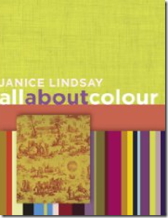
Janice Lindsay is one of Canada’s leading colour designers. With a column in The Globe and Mail newspaper and her newly published book, Janice is a sought-after colour consultant for residential, commercial, and institutional projects.
When I received her book and started reading it, I decided I had to interview her for my blog! And given that she is a Canadian, I thought it was even more appropriate that she should be my first interview; so I am pleased to introduce Janice Lindsay:
[MK] What is your favourite colour?
[JL] I am red by nature and mauves are not me but I don’t have a favourite colour. That would be like asking a mom which of her kids she liked best.

[MK] What colour would you like to see banished from all paint decks?
[JL] Pinkish, grey beige.
[MK] What was your biggest colour/design mistake?
[JL] In an insipid office hallway I introduced too much colour. It wasn’t that the colour was wrong but I did not take into account how much people hate change! (70% of all change is perceived as negative!) Now the people who weren’t happy would probably squawk if it were painted back to its original blandness.
[MK] What is the most important colour lesson you’ve learned?
[JL] I am still learning so it’s hard to say. One would be trust your instincts? Or colour rules are meant to be broken, or at the very least, bent. That colour is not tiring but to many, too much colour contrast can be. . .
[MK] When it comes to colour, what’s hot? Which one do you think is timeless and which colour trend would you love to see disappear?
[JL] All colours are timeless. It is combinations that go in and out of style. When others ask me what colour is hot you can’t just say ‘yellow’ or ‘chartruese’. A colour trend is not about a colour so much as how and where a colour is used.
A few years ago at a Color Marketing Group conference I said greens would be very big. The leader in my group took me aside and said greens were always big in interiors so it was not a trend story.
She missed the point. I was saying green would divorce red and show up alone in the most unexpected places—grass green on an expensive Italian sofa, for example—and in unexpected combinations—primary green with olive with yellow-green. And that citrus green would replace red as the attention getting colour in everything from advertising to purses and home accessories. Green as in celadon and sage, is a constant in home decor always, but this greenness was totally new.
[MK] What is the most under utilized colour?
[JL] Black. Because when it is doing its work you often don’t see it and that is its magic. Because we associate it with negative things and forget that it is strong and elegant and quiet – the yin to white’s noisier yang.
[MK] What do you think is one of the biggest mistakes homeowners make with colour?

[JL] Actually there are a lot of mistakes that people make – like under estimating the power of colour to not just decorate but renovate on a physical and an emotional level. Like not using enough or using it crudely. Like being obsessed with white ceilings and trim!!! Or thinking that colour is always about look-at-me decorative colour when it is the less attractive work horse hues that are just as important to balance up the final result. They are the ones that you feel but don’t notice. I could write a book about this—-oh, I did?!?!
[MK] What are the 5 things in life you cannot live without?
[JL] Hmmmmm. If you mean material things rather than family, friends, travel, music and a good game of tennis – then:


Maria, great and very interesting interview with Janice!
Thank you for visiting my blog. I love black (especially black pools!) Colours are such a challenge and yet the most satisfying part of a design project. I am working on the inspiration for an upcoming showhouse in New York and am thinking of a….black room where a very complicated TV character would go to find solace.
Maria – great post, especially what she ways about black "strong,elegant and quiet" – I love that. I agree about the colors that we feel, but may not notice is such a good point – similar in point might be art in public spaces – people may not always notice it specifically, but it makes for a more interesting space…… Also, because I got blisters walking yesterday, I am really thinking about shoes today and I LOVE those blue shoes!
Maria, Wonderful interview; excellent questions and a perfect choice for your first -and I hope not last interview. You should make this a monthly feature!
As soon as my personal library budget allows I'll be purchasing this book!
And I love those blue shoes too!!
Susan R.
Maria, great interview! It was very insightful, and I really enjoyed it.
Great interview, Maria — thanks for introducing us to Janice 🙂
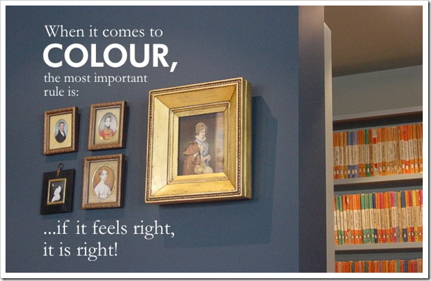
I love the quote "…if it feels right, it is right" 🙂
Kelly
Thanks for this post! I struggle with choosing paint color, though I feel like I totally get color on textiles. I'll have to check out her books.
great interview & love what she said about bending the rules- reminds me of you!
more interviews! really liked it.
Very interesting! I had never heard of her before!
Maria,
Great first interview! Loved it! Another great
book to update understanding of color and it's
many benefits. Thanks for info.
Bette
Well done Maria! You are "natural" interviewer! Can't wait for the next.
Blessings…
Interesting interview- I shall look for her book. I found her comments about black interesting. It reminds me of a quote I heard a colleague say about us in the engineering world, "if we do our jobs, no one notices" meaning unless we screw up, people don't notice the engineers of the world. Same is true for black – we don't notice it but it is so useful in grounding a room, bringing highlight to lighter colours – I was striving for a light airy living room, and not until I added some dark notes did the bright light colours pop the best.
Interesting, thought-provoking remarks. Thanks Maria.
xo Terri
I am really enjoying Janice's book. Loved the whole history of color. Just fascinating.
Great interview, Maria. Thank you again for sharing your colorful world with us.
xo
Brooke
Great interview! Color is a tricky thing for me so it's always nice to have an expert's thoughts.
I wanted to thank you for all your info. I love reading your blog, I have a painting business and you really help out with my homework!!!! Thanks, thanks, thanks.
so cool!!! i think u r way cooler than her though. ur my color expert!!!
I loved this interview. Very informative, and now I want to read her book. The idea that colors aren't in or out but it's the combinations that are trendy. Makes a lot of sense.
Thanks, Maria. Also, thanks for your recent visits to my blog.
xo, Sallymandy
I"m keen to read her book – sounds fascinating!
I liked the part about trends-no trends and the interview is a great way of knowing more about designers, authors, experts. Good job.
Maria – how wonderful (and generous) of you to support fellow Canadians. As much as I love reading about the enormous talent around the world, I think it's especially cool when you introduce us to folks from your very own home 'n' native land. Wonderful post.
Congratulations on the blog watch! I am out of town right now, and my sister emailed to say that we both made it on the list this week! Exciting day!
great interview! love the answers. i totally agree – no more pinkish grey beige colors! yuck. just had a new police department built in my city and it is that exact color. sends such the wrong message. (perhaps a future blog as soon as i can get photos…)
can't wait to check out janice lindsay's book.
thanks for spotlighting.
(and, terri – same goes for set designing as for engineers. you never notice the great job of a set designer because it feels so comfortable, natural and acceptable. good set designers make it appear as though no set design has been done at all! so ironic.)
Great first interview Maria you're a natural.
Loved the 'When it comes to colour.." quote and the distiction she made between color and color combinations going in and out of style.
Hi Janice,
I'm a color consultant in the Dallas area. How does one join the International Society of Color Consultants/designers mentioned in this article?
Is it open only to ASID or related professionals?
I am self-taught, worked as a consultant for 7 years for a major paint company, and have been on my own for a year now.
Thanks for any info.
Hi Juli,
Anyone can take the courses offered by the IACC/NA (Janice and I have both completed the first 3 out of the 4 courses offered) in San Deigo. Just look them up on-line and you are good to go!!
Maria
Love the quote, " if the color feels right, it is right." That rule applies to so much in art/fashion and design!