I’m guest blogging at Pure Style Home today! Lauren Leiss is one of my favourite bloggers, she has great taste and style and I’m delighted to be featured there today!
I’m showing some of the ‘before’ photos from this project (below). I have not even posted them on my blog so click here to see them!
Related posts:
BC Home Interview with Colour Expert; Maria Killam
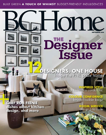
Vancouver Colour Queen on the Cover of BC Home
The Difference Between a an Experienced Colourist and a Novice
If you are new to this blog, click here to see the Best of Colour me Happy
While you’re here, subscribe to this feed so you don’t miss out!


Hi Maria! Loved the before and after pictures. If only had half the talent you have in your baby finger…. 🙂
~ Liz
I always love seeing before and afters–great work. And with that beautiful new duvet cover, I don't even mind the pine furniture, which I guess is the point!
congrats on your article in Pure Style Home! before and afters are such fun. and a blank canvas to boot. wow.
I've always struggled with the photo styling aspect. As a color designer, I've found it's very challenging to get access to a client's home once their project is complete. I generally can squeeze back in for a half hour or so to snap some pics, but most are resistant to the hassle of having a photographer and designer take over their house for a shoot. not to mention the extra visits to figure out what sort of "staging" is needed to make the shots look polished. Usually, I'm just shoving kids toys and piles of clothing out of the picture frame!
Maria, you've selected a fantastic space to talk about. Great to see those 3 photos showing 3 different style stages. Love the movement you've given to that cute bookshelve. It's the way i do it 😉
Really enjoyed this! Loved seeing the progressive pictures to the living area. beautiful and bright!
Love the design & colour scheme and sometimes I flip back to your original post to study these pictures and try to figure out why you did this or that.
I've been wondering why you added the green colour block and I believed it was to either balance the prints on the opposite wall or to ground the cabinet. I see now that it was a way to insert some colour since painting the entire place wasn't an option.
Gosh, I spent all that time coming up with design theories and it was as simple as needing some colour on the wall! 🙂
headed over to Lauren's to take a look!
xo,
cristin
I love it, Maria! That room is sooo beautiful … and I absolutely adore and appreciate your attention to detail (as reflected in search for the purple leaf)!
What a design genius!
I absulutely adore your style. Just lovely.
Your are so talented Maria.
You transformed that bedroom without changing any of the furniture! Love the splashes of green.
Great job!
xo
Brooke
Congratulations, Maria, on being featured in BC Home and for guest blogging on Laurens blog! Your work is lovely!
Wonderful and I adore Lauren as well as having guests.
Congratulations to you on your BC Home Interview!
Well done.
pve
Fantastic job on your guest blog and, of course, that amazing house. You can tell you put your heart and soul into your work.
Susan