True Colour Expert Traci Zeller had a budget to manage for the model house she had been hired to decorate and she had to spread it around strategically to get the biggest bang for the buck.
This is what a great designer does best and I talk about it all the time in my events.
My favourite part of helping my clients choose a look and feel for their new build or when decorating (because it is just as important when you aren’t starting with brand new everything) is advising them exactly where to spend their money.
For example, if you have to choose between a $10,000 Sub Zero refrigerator or $10,000 worth of millwork in your great room, well then I suggest you install the millwork. It’s way more fun if your entire house fills you with happiness when you walk in the door, not just the one or two rooms you spent most of your money on.
Likewise, when you only need a single, small piece of stone for a secondary bathroom, you’re not going to dish out for an entire slab. So then you might have to compromise on your first choice and look at what is available in smaller sizes. Because of course, the cost of an entire slab is a good chunk of the budget that could be better allocated elsewhere. Like decorating.
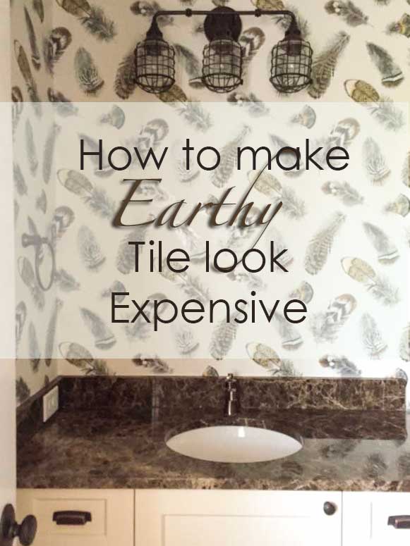
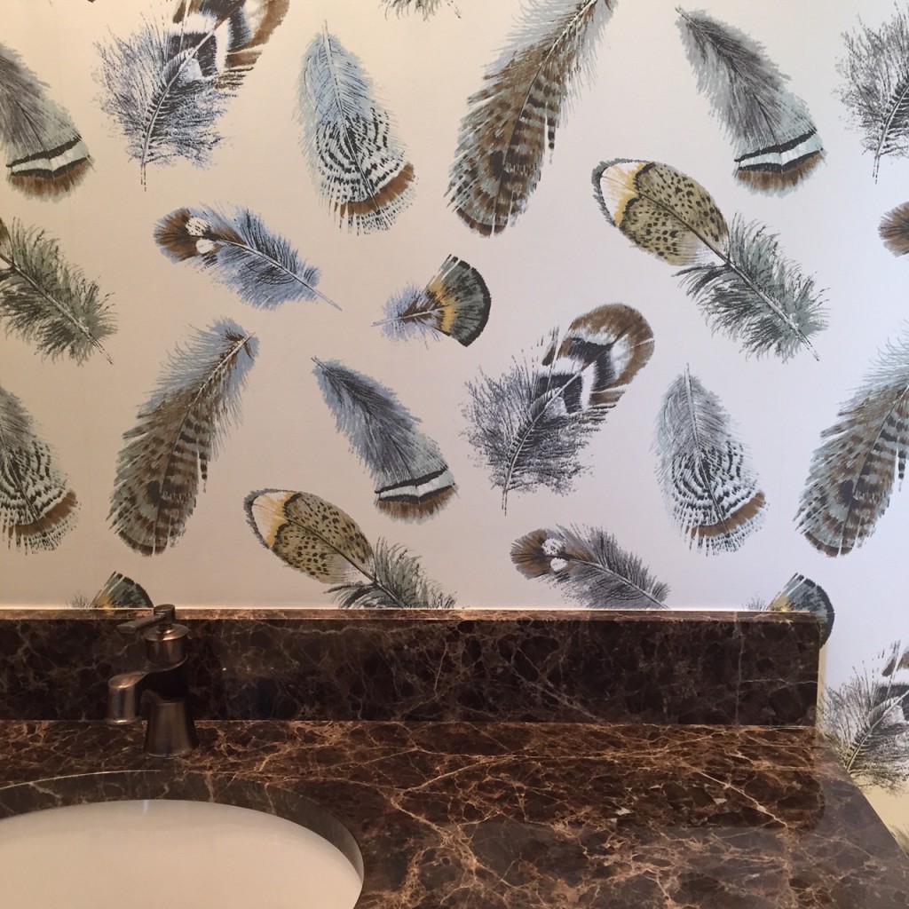
Traci found the Emperador marble (above) which she was happy with because it is a quality piece and she went about choosing tile to coordinate with it.
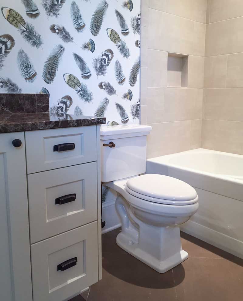
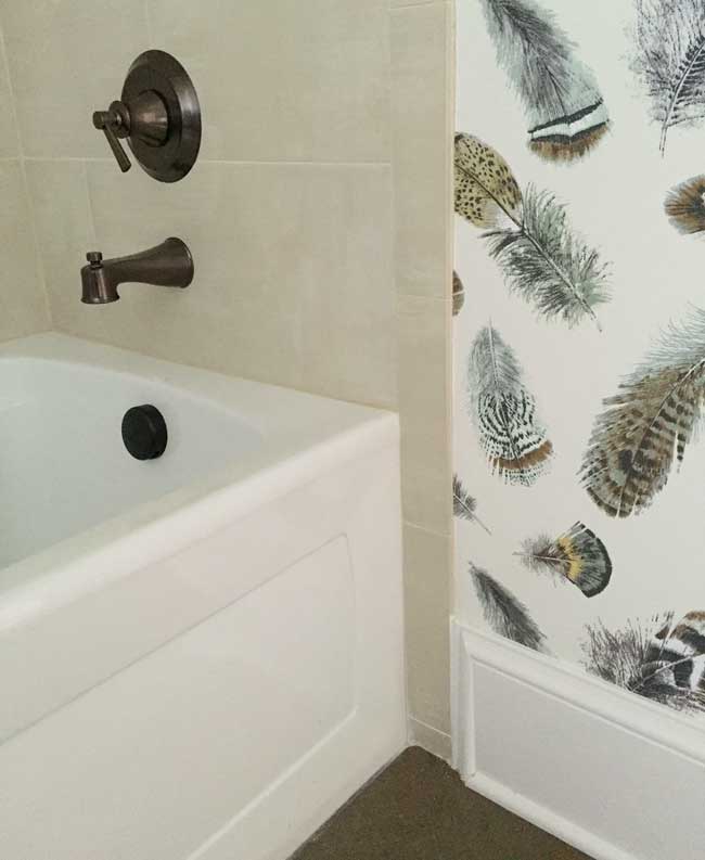
When she went tile shopping, she noticed that most of the reasonably priced tile was earthy so she chose solid tile. She also selected solid tile because her pattern quota for hard finishes was already used up with the countertop.
By simply choosing a wallpaper pattern that relates to both the brown floor tile and the surround tile, this bathroom is already awesome and there’s nothing else in here yet.
This is designer wallpaper from Thibaut who sells only to the trade so if you are interested in this paper, contact Traci here.
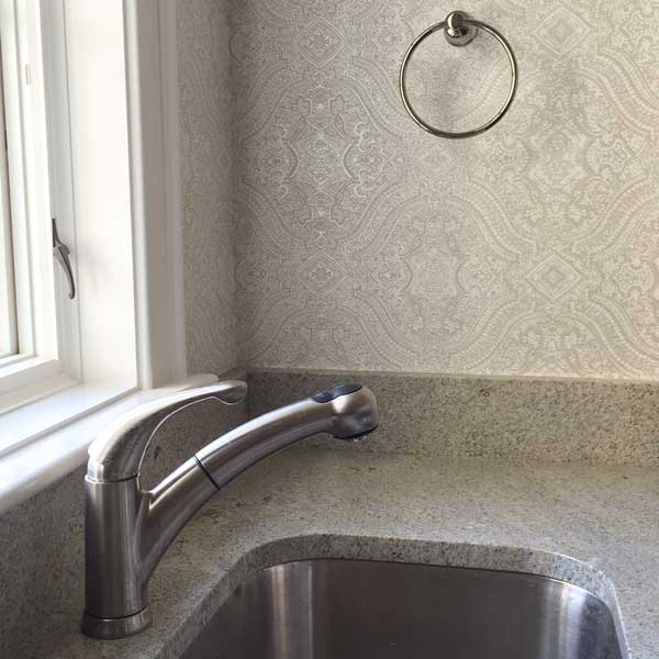
Here’s a quick snap of the laundry room. I love how this wallpaper takes a very standard, builder granite and makes it look more expensive.
Small spaces like bathrooms, powder rooms and laundry rooms are perfect for getting creative with a fun wallpaper pattern.
Hard finishes add up fast so if you are working with builder finishes that you’re not really excited about then the decorating has to be the star. Knowing this and how to apply it is one of the greatest values you provide for your client.
These are two great examples of how decorating with wallpaper completely elevated both spaces.
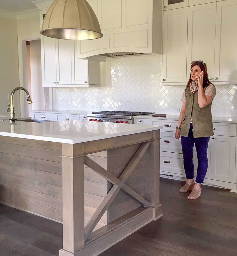
Pendant from Currey & Co.
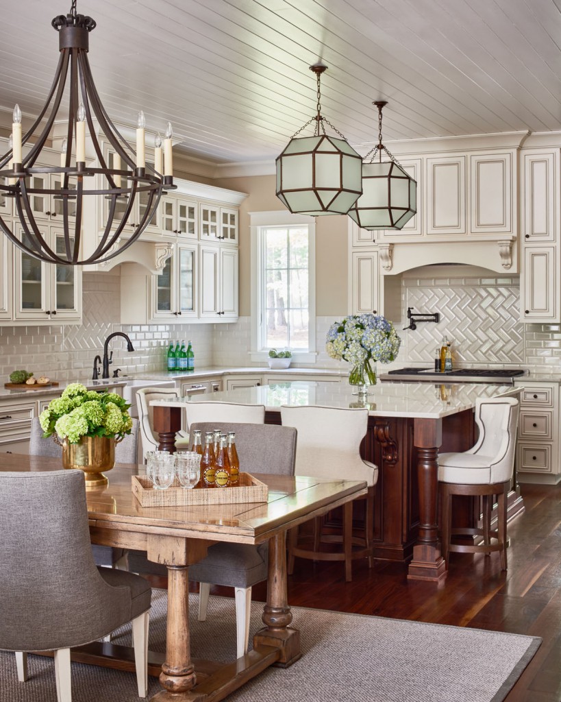
Here’s Traci standing in the white kitchen she designed! Love the herringbone subway tile. The countertops are relatively inexpensive Frosty Carina from Caesarstone. She spent more money on statement lighting, the master bathroom and kitchen (above).
I know I’ve mentioned this many times on this blog, but Traci Zeller was the first person to register for my first course back in May 2010 (actually her husband surprised her) when I launched my Specify Colour with Confidence event on my website.
She was a lawyer turned Mom who had a part-time hobby business as a decorator which was her true passion!
Her kids were getting old enough that she could pursue it more seriously and she decided if she was going to get serious, she needed more training. So she told her husband she wanted to come to Vancouver and attend my event!
Six years later, Traci is one of the 50 finalists for Traditional Homes New Trad List, you can see her entry here. Stunning!
Traci’s note to me after she won was: “I wouldn’t be in this place in my design journey without you. You, my sweet friend, were a game-changer!”
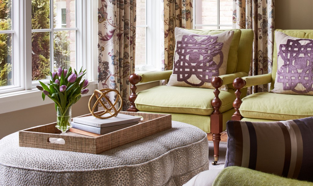
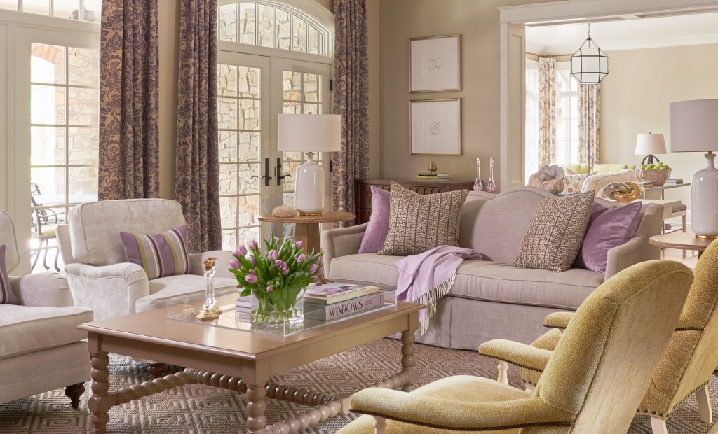
Here is another one of her projects, the throw pillows (below) are custom designed by Traci:
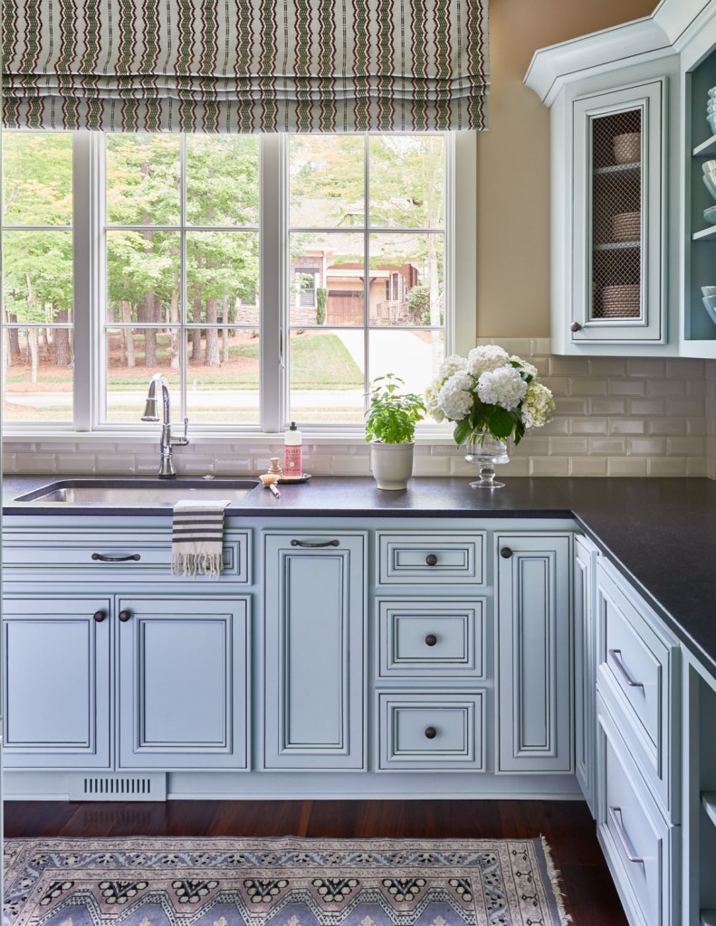
The scullery
Interior Design by Traci Zeller
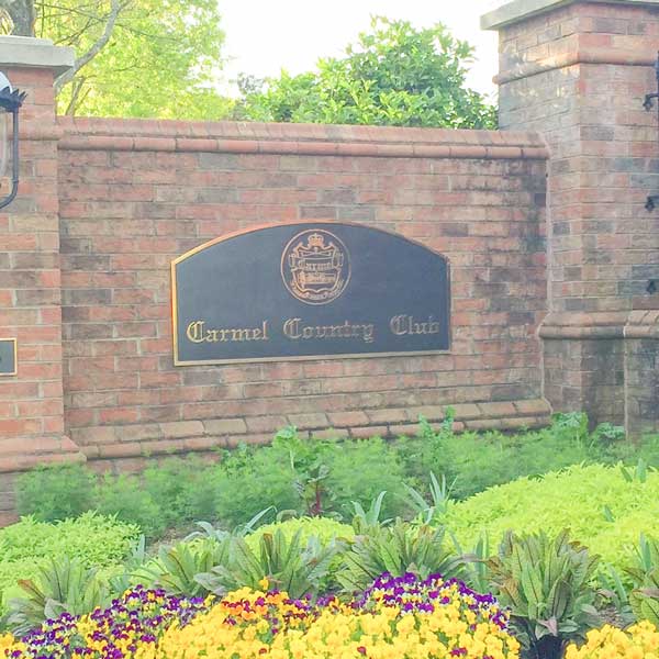
My Specify Colour with Confidence course just finished in Charlotte this week and we hosted it at Traci’s country club in Carmel.
The course was sold out for two months and we had a wonderful group of designers and colour enthusiasts as well as new careers blooming!
At dinner one of the participants confided to Terreeia that she’s taken many courses over the years and had learned to accept that they don’t usually live up to the billing and as long as she learns something she’s okay with it but this course MORE than exceeded her expectations. There is so much more than she thought was included.
Kimberly Wright & Malissa McLeod
Two former True Colour Experts who volunteered at this event! Thanks so much to both of you!
If you would like to transform the way you see colour, become a True Colour Expert.
I’m at High Point Market this weekend so stay tuned for my trends for 2017 post!
Don’t you want to run out and look for wallpaper right about now?
Related posts:
Danger: Free Advice will Sabotage your Expensive Renovation
I Heart New York: Where to Start When Defining Your Look
Anyone can Pick a Paint Colour, it Takes an Expert to Choose a Neutral


Maria, As usual what a great post! Traci is such a good designer! Wallpaper is more in now than it has been for ages. It disappeared for a long time. It has come back with new dimensions, colors and textures. The feather paper that she chose is right on and lots of fun. It really does tie the room together.
Have loads of fun at High Point and bring back lots of new ideas for us who didn’t get to go!
Great advice, Maria – thank you!
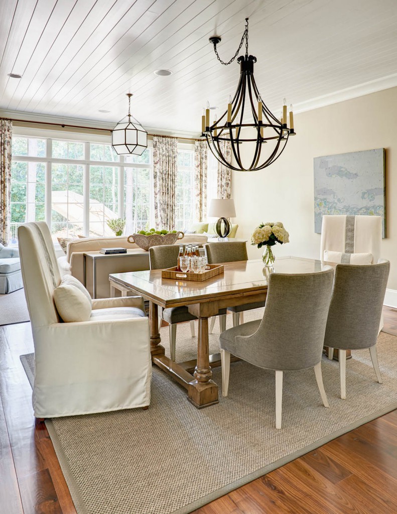
Love the painting in the dining room. Any idea who the artist is? Thanks.
Maybe it’s just me but I don’t see how that wallpaper really relates to the tub surround tile. To me it doesn’t flow whatsoever. I also wouldn’t have chosen that tub surround tile either. It relates to nothing in the room. White would have been a much better choice. Saying that, I think that it would have chosen a more beige background flowing abstract print that had an equal amount of all colours of tile, granite and fixtures so the tub tile looked more intentional. Maybe a striped shower curtain incorporating all the colours will help to marry the existing elements of this bathroom.
I agree-each element is pretty but do not seem to make a cohesive whole
I also had a negative reaction to the feather wallpaper in the bathroom. It doesn’t look good with the tub tile and I don’t like it with the rather busy granite either.
Mind blowing ideas! Right to the point so many face when renovating on a budget! Thank you sooo much for opening my eyes to possibilities!
How did you know I’ve been looking at wallpaper?
The laundry room is getting a make-over.
Traci did a great job with her model home. I’ve always wondered if decorating a model home is easier than someone’s actual home.
Love the feather wallpaper, and think it perfectly ties together all the colors and tones in the room. We aren’t seeing the tub curtain in these pictures, but I’ll bet it ties in well also – maybe matching fabric to the wallpaper? Were the tub and floor tiles what Traci had to work with? I think white tub tile would have been so limiting, and looks ‘dirty’ down the road because no grout ever stays pure white. Great job, Traci. It is easier and less costly to work with what one has in a house rather than try to replace all the hard fixtures in a house – speaking as one living in her 11th house… and counting! I learned early that it is better to spend on what one moves than on what is left behind.
I agree and also think that it’s really pretty. I think that it is modern and fresh and makes a wow statement.
With the budget Traci had for the bathroom tile white was not an option because it was more expensive than the tile she chose! Also keep in mind that photos taken without natural light in the room are not totally true to colour! Trust me when I say this wallpaper turned that tile from ‘meh’ to fabulous
I ‘trust’ you Maria …. ☺. That said; if one takes the photo of the bathroom and saves it on their computer and enlarges it perhaps they too will see that the feathered wall paper is ideal for the space as with even my tired old eyes I see that it does. -Brenda-
Thanks Brenda 🙂
I think it looks fabulous and I don’t like wall paper. Nice work and congrats to you!
Gorgeous decor but sorry, the feather wallpaper does not tickle my fancy. Also, it is difficult to live with an area rug under a dining table – all sorts of issues from trying to stay clean (picture face down pbj sandwich), to trying to move the chairs easily (unless on wheels). I saw a 10-year-old child push hard away from a table and totally flip back on the floor because the chair legs got caught in the rug; did it once because it looked so pretty but NEVER again.
I had one, almost outdoor like, when the kids were younger. Spent next to nothing on it and thought when I got tired of spot cleaning that it could be easily changed. Moved before it was an issue 🙂
Great advice about tying tile and granite together…”ride the horse in the direction it’s going” is what I always say.
And, Maria, what is the brand of your cute swing coat in photo???
It was from Zara a couple years ago, but I always buy my colourful coats and jackets from there!
That must have been so heartwarming to receive a note of recognition from Traci. I’m sure your course helps everyone that takes it become a better designer or stager. Love the feather wallpaper!
wow amazing how a room can be transformed with wallpaper and not a gut job. Can that be done with golden oak cupboards in a kitchen without a paint job?
Well a kitchen is harder because there’s so much more wall space so it would really depend on the space but why not? I was so impressed with how the wallpaper transformed both the bathroom and the laundry room!
Sharon, if you are hesitant to paint your cupboards because the oak grain tends to show through the paint, try to locate some C2 Cabinet and Trim paint. I used it on my kitchen cabinets and it looks wonderful. The grain is still faintly visible but doesn’t jump out at you. The finish is comparable to a traditional oil paint.
Of course! Do some Google search and you will find amazing transformations without changing cabinet color. That is what I did with my kitchen and its cherry wood cabinets and I love the results. No need for painting them.
Yes, I absolutely want to run out and look for wallpaper. I took down all of my wallpaper about 12 years ago, and now I’m ready for it again! Great post!
I was one of the Charlotte attendees and I found Maria’s class to be invaluable, especially in terms of the contacts made and support received. It was worth it! With regards to Traci’s work, I’ve viewed her online portfolio and her work is gorgeous. I love her use of color and her ability to pull together all the fixed elements with the decor is great. Although that feather wallpaper is rather taste specific, I do think it upgrades the look of the bathroom. I design new builds and it is much more difficult to design something on a tight, builder’s budget than it is a high-end client.
My mother was a super talented decorator, and this is what she always advised. “Upgrade” your less than ideal finishes by decorating around them and with them to make them look better. Don’t spend a ton of money on a faucet for example, decorate the bathroom with paint or wallpaper and accessories.
I agree. Work with what you have. And that is even a more sustainable option in the long run, for your budget and the whole of the planet.
I have seen Tracis beautiful work. She is very talented. Hard to believe this is really her work and it’s in a model home. This appears to be a remodel of a prior remodel. No doubt the wallpaper is lovely in person and does a good job of trying to tie together all of the many tones and colors in the marble, tile, flooring and wall and cabinet color until the owner can afford to remodel.
I sent the photos (without comment other to tell her it was in a new home) to my designer friend who has assisted me in selecting and buying my homes over the years. I often send her photos from home listings. Her first comment was, from the photos the builder appeared to be using his leftovers from multiple other builds. Leftover tile in shower from one job, leftover flooring from another, of which neither related to each other or the counter. Her second comment was the wallpaper was a great attempt by someone to coordinate the builders mismash leftover materials. Third comment was it was unfortunate the builder didn’t hire a designer to pick out more current tile instead of spending the labor to put in the leftovers, because the labor is the same.
Again, Traci is a fabulous designer and she did a great job making something work with all the competing finishes.
That is very typical of builders to use and reuse leftover and surplus materials from other jobs. They do that often here in my area. They love building cheap to get a lot of profit back. They did that on some areas of my own house before I bought it and I had to find ways to make it all look cohesive.
Congratulations Traci on creating the career of your dreams. How deserving your recognition. And, by the way, I love the feather wallpaper, the various shades in the feathers really bring it all together in my eye!
I loved the entire post. Can you tell me what the kitchen island is made of? It is my dream island.
It looks like real granite or imitation granite like Corian.
Hi Maria
Could you clarify something for me? I would have thought you would have said the laundry room granite and wallpaper were too busy together. Why is this not the case? I love your blog, I’m just trying to learn.
Thanks
When I saw the laundry room I told her I would probably not have picked it but it was so great with it. Totally elevated that builder granite!
Great question!
Maria
This may be my favorite post ever.